RESOLVE
Another project from the recent archives, this brand was created for a new business interest that has been put on hold. This explains, in part, the lack of contact details shown on the mockup but in all honesty the scope of their work and the area in which they operate wouldn't require the vehicle liveries to drive business their way, although a small reference to their website could potentially be made on the rear door.
As an asbestos surveying, analysis and environmental management company, the aim was to keep the overall brand identity very clean and simple, yet not too utilitarian or construction-oriented in order to cut through the competition.
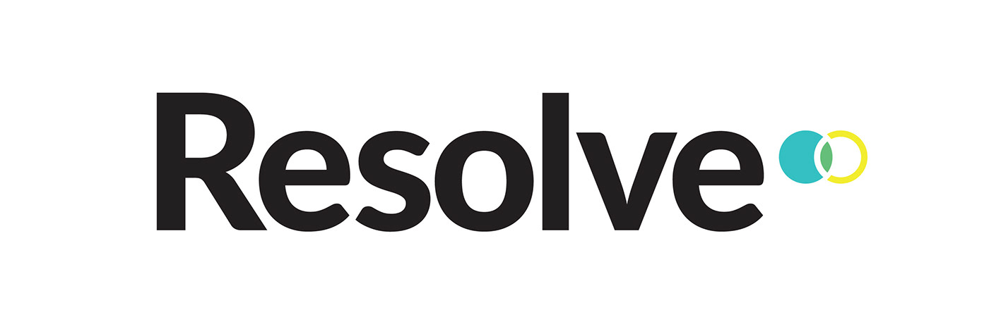
The double circle device represents a particle (teal-coloured solid circle) being viewed through a microscope (yellow ring) and the area in which they cross over, the green shape (representing a positive outcome by association with the colour green) represents the successful detection of the tiny particle of asbestos. The name itself was chosen to complement the device with another positive association to counteract the often fatal substance asbestos that they're setting out to detect and safely manage - resolution. I also wanted to provide a name that didn't pigeonhole the company or stifle their growth into other related environmental work in the future, and Resolve covers all bases.
Created in 2016, all text and images copyright of Russ Atkinson.


