The form of typography — College project
Typography, editorial design
Professor: Luis Giraldo
This project was an exploration of typography through the forms and space that compose it. Paul Renner's Futura was chosen as the main typeface family to do the exploration exercises.
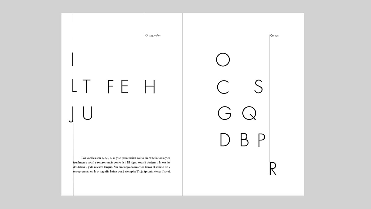
The letters of the alphabet were classified into different categories: according to the strokes that make up the letters (orthogonal, curved and oblique), the level of complexity of the strokes (from simple to complex) and the level of luminosity that the letters have (open or closed).
Through the course of the book you can see differents relations between content and form, creating tensions and connections between the elements that conform the pages, as well as contrasts through color or structure changes.
_________
La forma de la tipografía — Proyecto universitario
Tipografía. diseño editorial
Profesor: Luis Giraldo
Este proyecto se basó en una exploración de la tipografía a través de las formas que la componen y el espacio que crea. Se eligió como familia tipográfica principal a Futura de Paul Renner, para hacer los ejercicios.
En el despliegue se clasificaron las letras del abecedario en distintas categorías: según los trazos que componen las letras (ortogonales, curvos y oblicuos), el nivel de complejidad de los trazos (de simples a complejos) y el nivel de luminosidad que tienen las letras (abiertas o cerradas).
A través del recorrido del libro se pueden observar una serie de relaciones entre el contenido y la forma, creando tensiones y conexiones entre los elementos que conforman sus páginas, así como momentos de contraste a través del color o cambios en la estructura.
_________