

Client
UpTime
Logo
About the client
UpTime is a B2B company that offers employee tracking software. The software is designed
to calculate how much time the workers actually spent on their daily activities.
Challenge
From our collaboration, UpTime wanted to receive a logo that would suit their
business and would be a visual representation of the service they provide to other businesses.


Strategy
Our team of designers based the creation of the UpTime logo on experimenting with the letters U and P, envisioning a cohesion that would be fresh and funky.
We went for a juicy green as the main color, which in our vision is connected to the concept of productivity.
The other color used is black, which balances the boldness of the green color, creating a nice looking contrast.

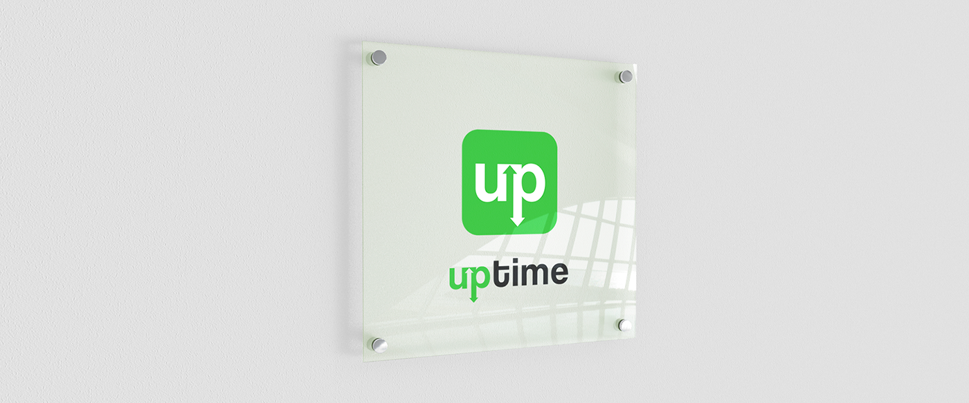
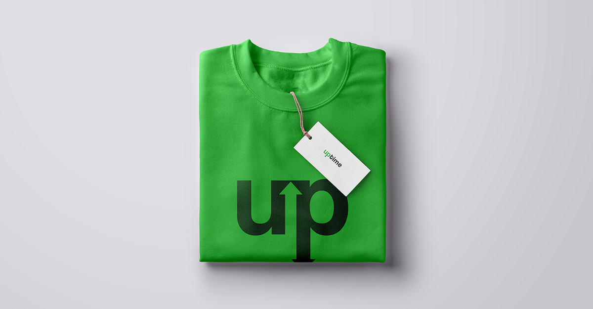
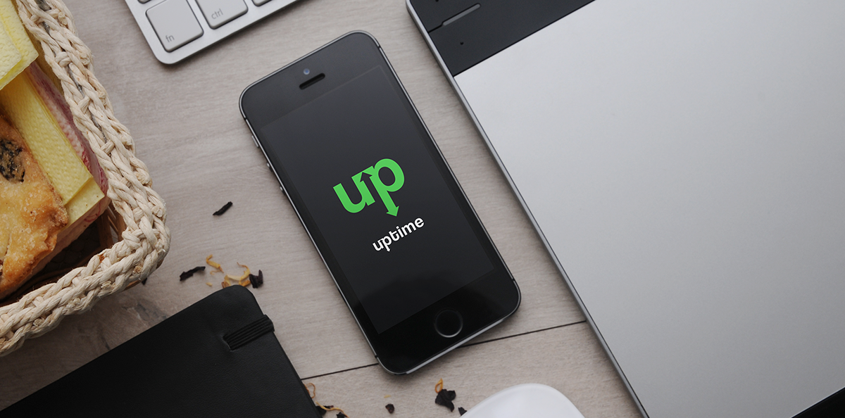
The final design marked this link between the letters with two arrows, one going up and the other that is actually the descender of the letter P, pointing down. The design we created is a symbol of the employees’ productivity increasing or reducing.


Result
The final result of the logo turned out to be fresh and suggestive of the service that UpTime provides.


Thanks for watching!
Copyright © 2018 Cherry Digital Agency.
All Rights Reserved.


