
When I stared work on this grand opening campaign, I wanted to crate i memorable logo that screams professionalism and a laid back attitude. The partly eaten Turkey leg brings that laid back vibe that I was trying to achieve. Its funny and almost impossible to forget once you see it. The element that brings in the professionalism would have to be the style of the text. I used the Impact font for the text with a few modifications to make the name really leap forward. I use a kind of typography with the words in order to convey a sense of speed. The company name is Food Runners so why not show that in the name itself? By doing this, I believe more attention is brought to the company which is ideal since the company is about to have it's grand opening. I picked yellow to be the color of the font in the logo because it contrasts well against the brown of the turkey leg making the name jump at the audience. Once again, an ideal aspect for a grand opening.


For the business card, i decided to go with a very basic design because anything over the top would be pointless since this is for a food delivery company. I don't mean that in a bad way, but in a logical way that a delivery company has no use or need for a very fancy business card. So the top is the front of the card that has all the information. As you can see, the general manager's name is the biggest text on the card in order to show that this is the man to talk to if the costumers have any questions or complaints. Note that I am still using the "impact" text for this as well. The info is very generic, the only thing truly special about it is that the background is the same costume yellow used in the color of the "food runners" text in order to have the rest of the text pop more for the viewers. The second card is the back of the card. I decided to go a simple route here too and just have the logo sitting centered on a field of gray. The gray field is to help all parts of the logo to pop as well.
Now with the envelope, I decided to not do anything out of the ordinary. Envelopes are suppose to be kind of plan and dull. What I did do was simply put the logo in the corner with the location of the store right underneath. The font for the address is Impact, which is the font of the entire Project. I will discuss why I picked that as my font later on. One thing you will notice about the address is the black dotted line underneath it. I'm using that dotted line as a means to focus attention to the address its self after attention is drawn to the very obvious logo. The dotted line is, not only a second attention grabber, but as a way to show people where the business is located.
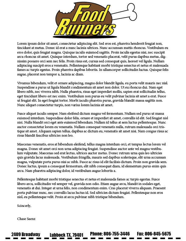
I felt the same way about the letter head of the company as I did with the envelope, it shouldn't be anything fancy. I did change some things so that the letterhead isn't identical to the envelope but at the same time still complement each other. I placed the logo at the top of the page so that eyes are immediately drawn to it. I feel that it will act as a guide and send the viewers eyes down to the sample text, so people have an idea what an actual letter on this would look like, and then all the way down to the important information at the bottom of the page. Now I added more information besides just the address as a means to further inform my audience. I felt that the most important part of this project is the information because the business is so new and word has to spread for it to succeed. While looking at the information, one can see that I am still using the impact font. This will be explained very shortly. I also had the dotted line make a comeback to still indicate that this information is important so viewers will stop and take the time to read and remember it.

Finally, my favorite parts of this grand open campaign, the advertisements. Finally, the question that has been driving you crazy will be answered. Why am I using the Impact font for every work for this campaign? Well as you can see, there is a costume made internet meme for bot the magazine and newspaper ads. I'm using memes for advertisement because the target audience of this new company are the students of Texas Tech. College students around the world are familiar with internet memes, so I am using them to reach the targets. The company's target audience is also why Impact is the font of choice for this campaign, because Impact is the exact same font used for internet memes. Now for the magazine ad, I started off with the famous "what if I told you meme" to inform people that a company that will deliver whatever you want does exist. As soon as they see the meme, their eyes are guided downward to the logo and then the rest of the message. I did it in this order because Lubbock has never seen a business like this one, so when then meme blows their minds when they discover that such a place exist they immediately learn the company's name, that its their grand opening and where to find them/get a hold of them to make sure someone isn't just playing a cruel joke. Now I kept the background one color with a "fish bowl" effect to try to not take away from the importance of the meme and the information. The background is simple enough that all the focus goes to the meme and information but also artistic enough to contrast with everything else in the ad to really make it all pop to the viewers. the font is styled exactly like the font of the meme, all the way down to the black boarder around each letter. I did this for the campaign so the "meme theme" becomes more dominant and obvious now to viewers.

Now I didn't put nearly as much thought into the newspaper ad as I did the magazine ad, but that doesn't mean there wasn't any thought put into it. I went with a different meme known as "victory kid" for this ad. As you can see, the meme makes up the entirety of the ad. I did this for the campaign because of the simple fact that in this day and age, magazines are more popular that newspapers. Now the message in the meme makes viewers aware of the concept of the business and also the name with the logo in the back. The part of the ad that the thought was put in was with the QR code. These codes are easy to find, when placed in the right spot, and can be used as another attention grabber for more information, such as with this ad. Viewers see the QR code at the bottom right and then it shifts their sight down to the message about special offers which will encourage people to actually go to the site to see the offers. This method will generate more business for the business from outside audiences, like whoever still reads newspapers anymore.

Now, at first glance, the brochure doesn't look like anything too special. However, its being used to give the most important information of the entire campaign. Now I modeled it to resemble the business cards in order to keep a familiarity for the audience. The yellow bars act as a wall to keep the attention of the viewers locked onto the page and the gray background as a means to help the pictures and information contrast and be seen better. What is special about it is the information and how it gives more information than one would think. The front of the brochure looks like any other. There is the logo, the contact information and the social media messages, (lets face it, social media has taken over.) However, what makes the front unique is the quote right below the logo. The quote is special because it implies that the business is opened late. This is a HUGE thing for the business because the target audience will be sure to remember that whenever they are drunk after a night at the bars. They will remember that they can still get food from their favorite places without having to risk hurting themselves or anyone else trying to get there. This is a big part of the campaign because the majority of college students have their parents helping them either the majority of college or all of it. When parents see that there is a place that will keep their drunken babies off the roads, they wont hesitate to sign up and pay. Now the back of the brochure as one peace of information that is very important. Any guesses? If you guessed the map to mark the location of the store, than you are wrong. The map is important to make sure people know how to get to the business or to see if they live close enough to it but its not the most important part of the back. The most important piece of information is that Food Runners proudly supports Texas Tech. Students will be more inclined to go somewhere that supports their school and so would visiting alumni who come on big game weekends, alumni weekend or even parents weekend. Its proven that people will go to places that support their schools in some shape or form.

Of course the most important part of any brochure is the information you put in it. What some people don't think about is how the information should be presented. For the right part of the inner brochure, we have a page all about the founders of Food Runners, Jeff Spradlin and Tedd Talty. You see their pictures at the top which brings in attention but then you have a whole lot of text underneath. Now too much text is a bad thing for the obvious reason that people would see it and not want to even think about reading it all. Well with this block of text, you see where I fix that. The block of text is just explaining how the company was found, dull information till you throw in some typography. By simply changing the font color of just a few parts of the text block, we are making sure that readers get the key parts that will help this grand opening campaign really take off. The yellow text represents those key parts. Notice how just a few lines of yellow among all the black text really makes the yellow text pop out more. Well for this campaign, I made sure the yellow are important things that the viewers need to know such as "the price of our service is easily affordable" or "create an ideal food delivery company for the average college student" Information like this is vital for the success of this campaign and for the company. Now on the left is just a few of the places Food Runners will go to get the food that college students here in Lubbock go to the most. Having these on here will really help the success of the campaign because it already puts the idea in the student's minds. The thought that they can come back from a long day of class or a long night of drinking and know they can get food from Chilis, Spanky's, etc without having to leave. That little seed of an idea blossoms into reality almost instantly. Finally, the most important question answered, how much? The bottom of the left page shows the price and any possible means there are to pay for it. Giving people as many payment options as possible can almost guarantee more business for this brand new company.


