


YARRA CAPITAL | A Branding Project
Eager to challenge financing company aesthetics and status quo, Yarra Capital approached us to rebrand them in a way that would shake up the industry and accurately portray the brand’s personality and reflect its core values and style.
Founded in 2016, it has great ambitions and greater plans for the future that would disrupt the industry. The company had to jump through multiple hurdles to be seen as a viable option by potential clients because they're viewed as "new" and "unreliable". They sought to change that through branding — and so this exercise took place.
*This is an unpublished project that does not represent Yarra Capital by any means as a brand.
Part I: Brand Discovery
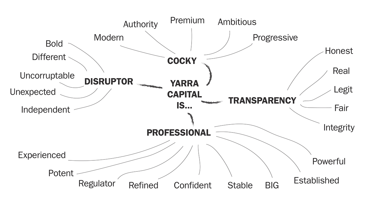
Through a series of interviews and a skeletal brand audit session with the CEO, we mapped out the keywords that would best describe Yarra Capital's identity. The CEO, a no-nonsense charismatic visionary, wants the new branding to spill coolness all over and feel established at the same time. The words he used to describe their business were "Professional", "Transparent", "Disruptive", and "Cocky".

We combed through the definitions of those words and expanded on the thoughts behind them for similar words that capture the essence of the brand better.
In our brainstorming sessions, we concluded that
if the company wishes to be seen as the only viable, credible company in Australian Property Financing, it would dress in progressive professionalism, speak in a confident voice, and constantly move ahead, anticipating the needs of the market, driven by its desire to say “IT’S DONE” to every deal. As such, we selected 3 new keywords to describe Yarra Capital.
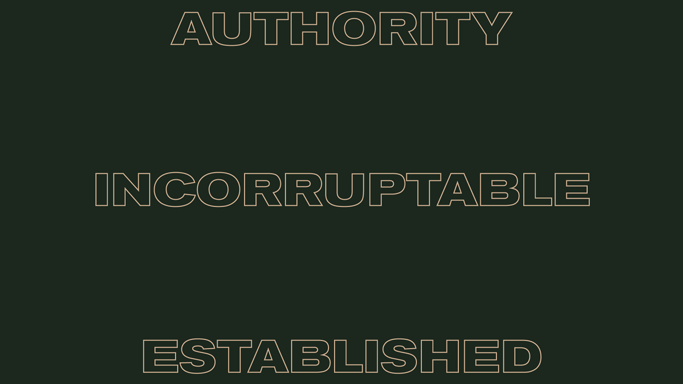
Brand Mantra (Keywords)
Part II: Brand Story
Purpose births positioning. Personality draws believers.
The brand has a purpose and personality, but nothing was set in stone and every employee operated individually. We explained to the upper management on the significance of aligning everyone's vision with the brand.
From there, we developed a simple narrative for the brand based on the new-found keywords.
There’s a gap in Australian Property Financing.
Yarra Capital is bridging it through 9 years of experience in sealing deals.
And we’re doing it the right way, because no one else can.
Part III: Brand Design


Inspirations from the Brutalism movement.
People remember what they see, and the last thing they should remember should be their name, not an abstract symbol.
We approached the design with Brutalism in mind. It may be a trend now, but Brutalism started as far back as the 70s.
It's basically minimalism on steroids;
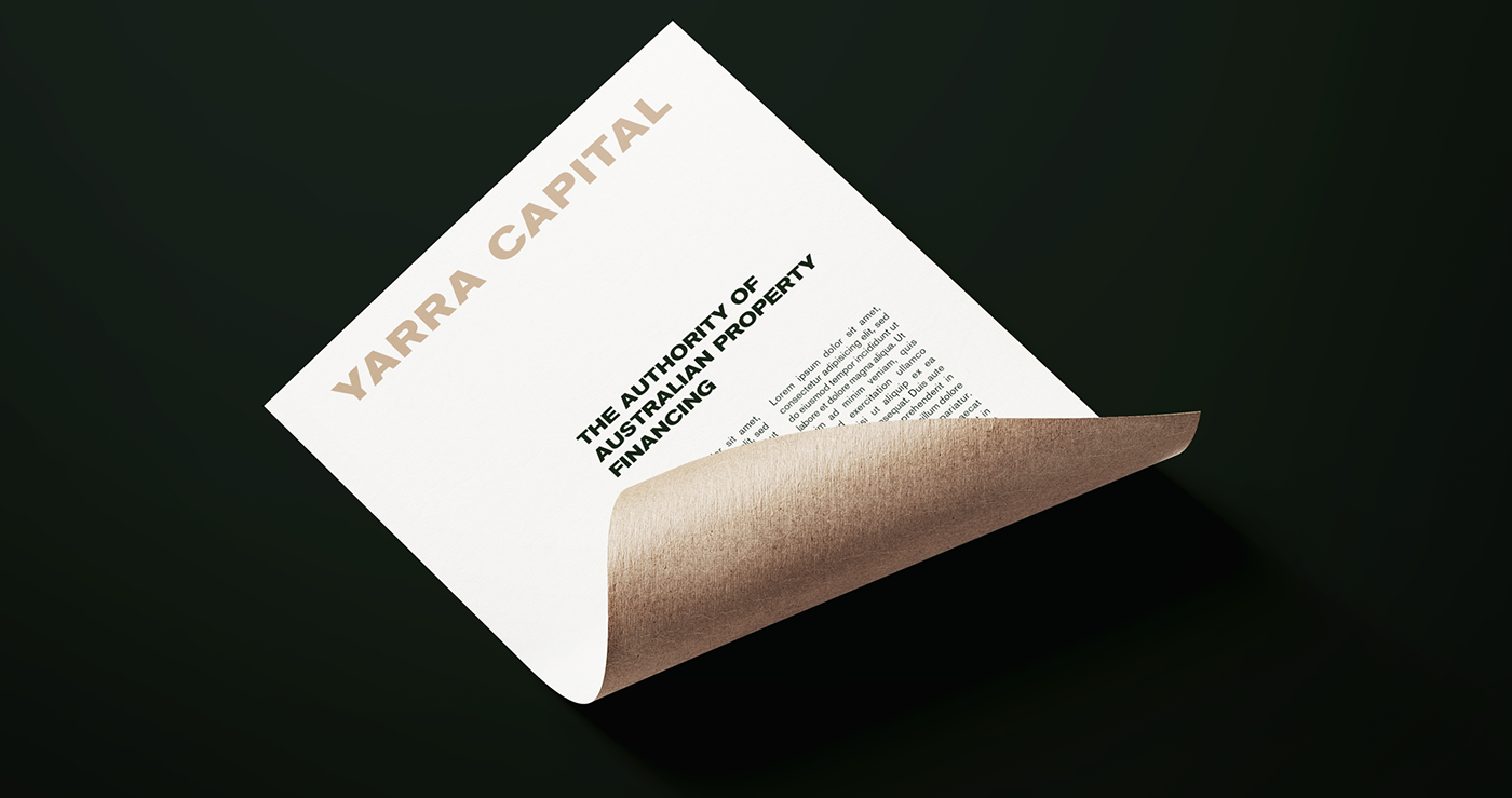
Just what we need for maximum impact with minimal ornaments. And from there, Yarra Capital's new look was born.

Concept Stylescape

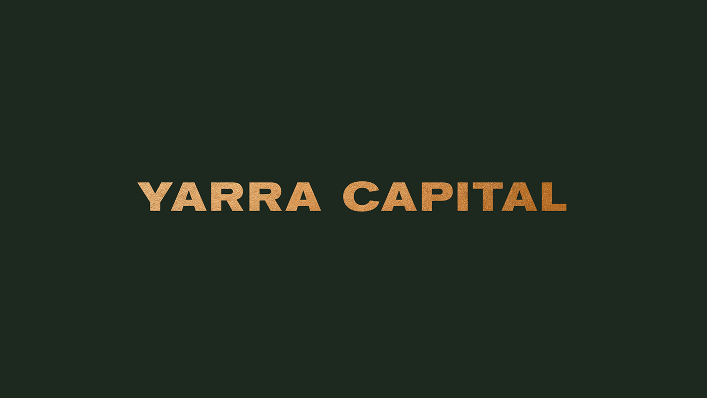
Wordmark Concept

Primary and Secondary Colors, according to the proposed application ratio


Need a fresh start for your brand?
Let's talk about it over coffee at infojeremycreative@gmail.com


