· Saluthè ·
Location:Bologna, Italy
Branding, Consulting, Packaging
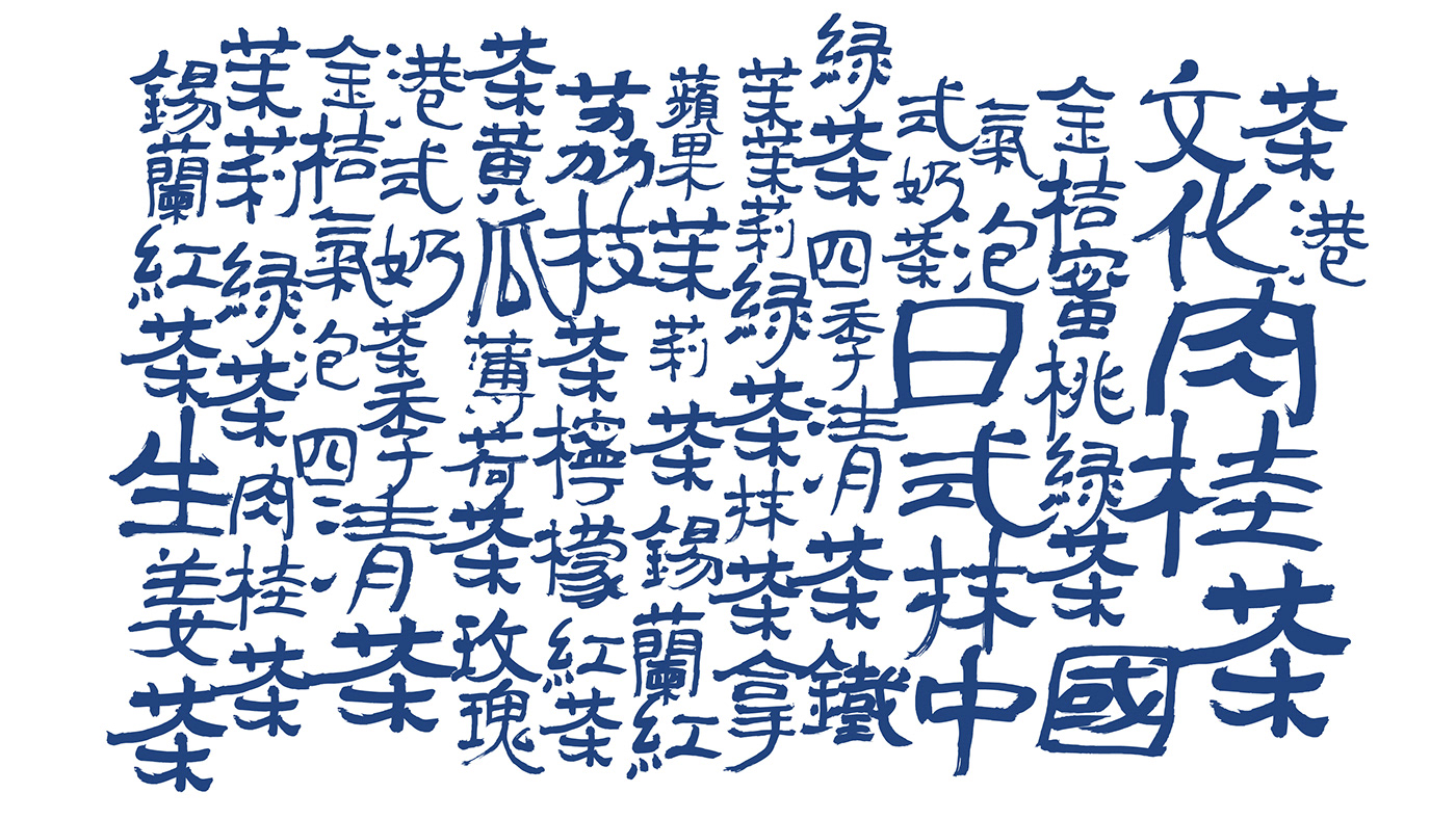
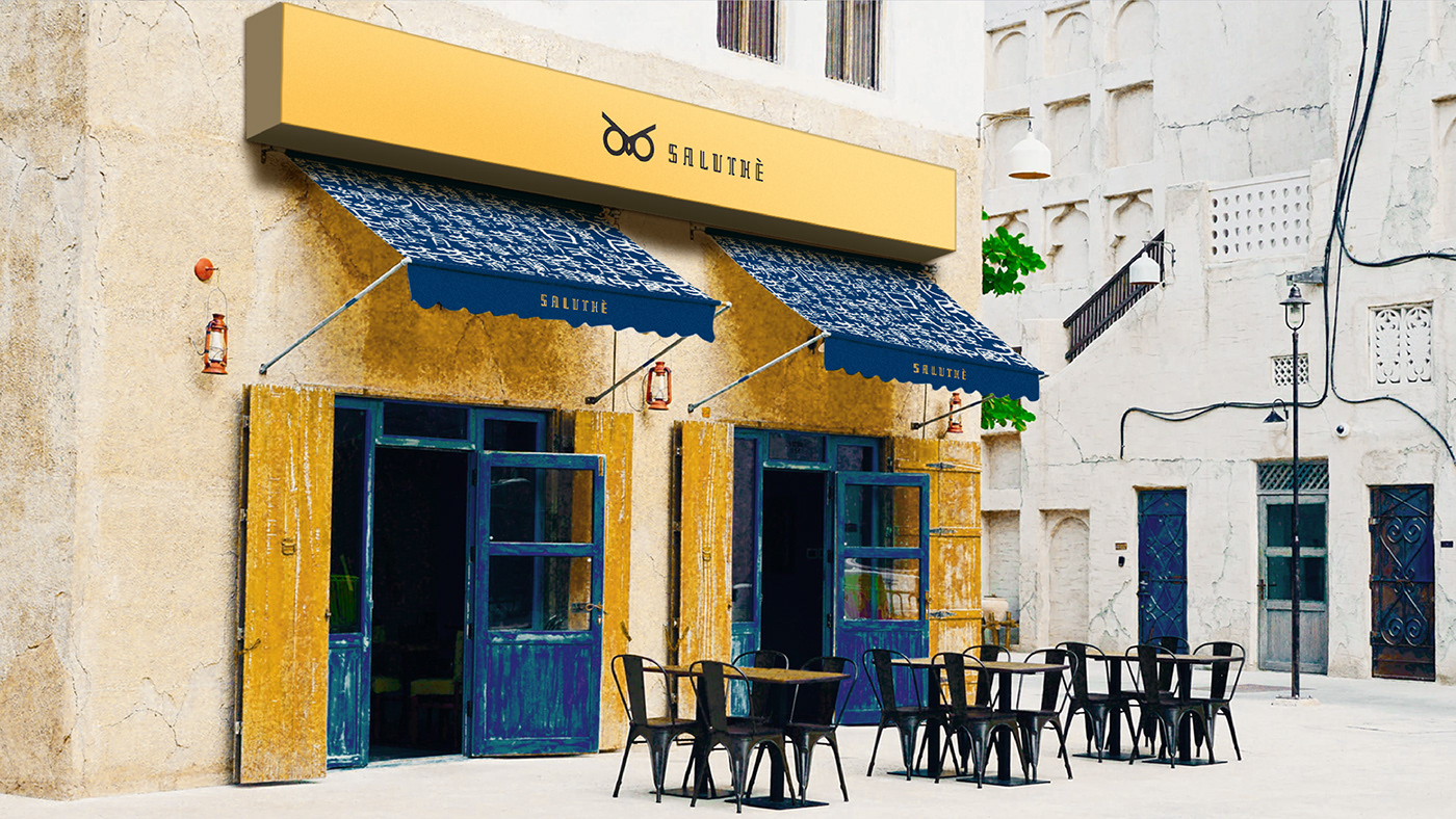
Founded in Italy, Saluthè is a tea brand mixing western aesthetics and eastern flavours. In Italy, people say 'salute' to greet and bless people. We have coined the word 'salute' and 'thè' together to emphaisze the idea that Saluthè is a place where tea and greetings happen.
--- --- --- ---
Saluthè 是来自意大利的新式茶饮品牌,主理人希望品牌能传达出“东韵西情”的感觉并保留其东方血统。"Salute" 在意大利文中是一个积极乐观的词,打招呼、祝福、喝酒都常被用到。而之所以选择 Saluthè 并非 Salutè,是由于前者更能突出以茶饮(thè)为中心的品牌理念。

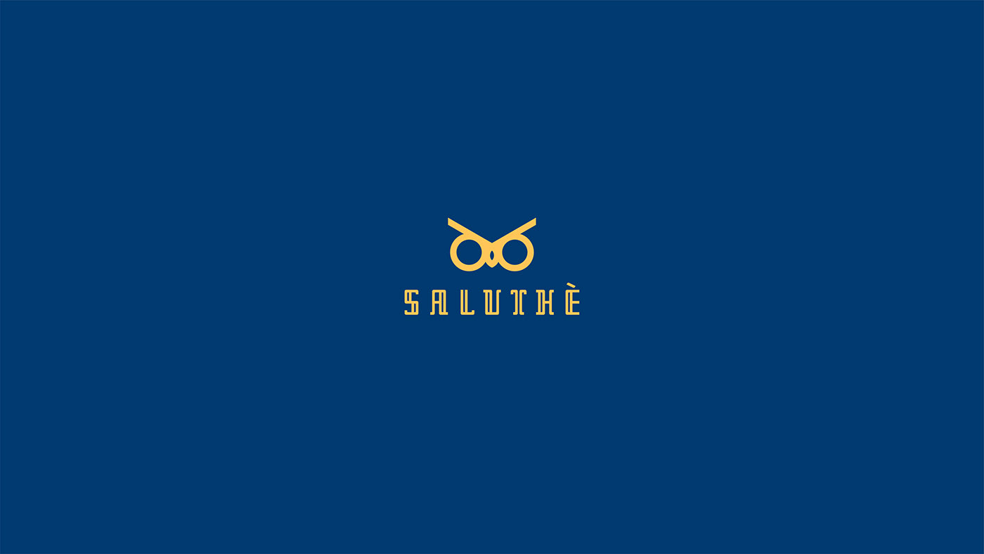
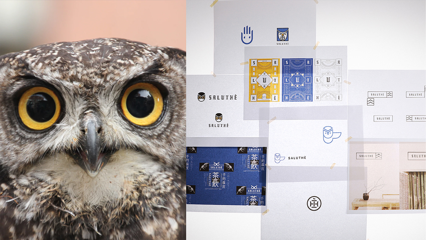
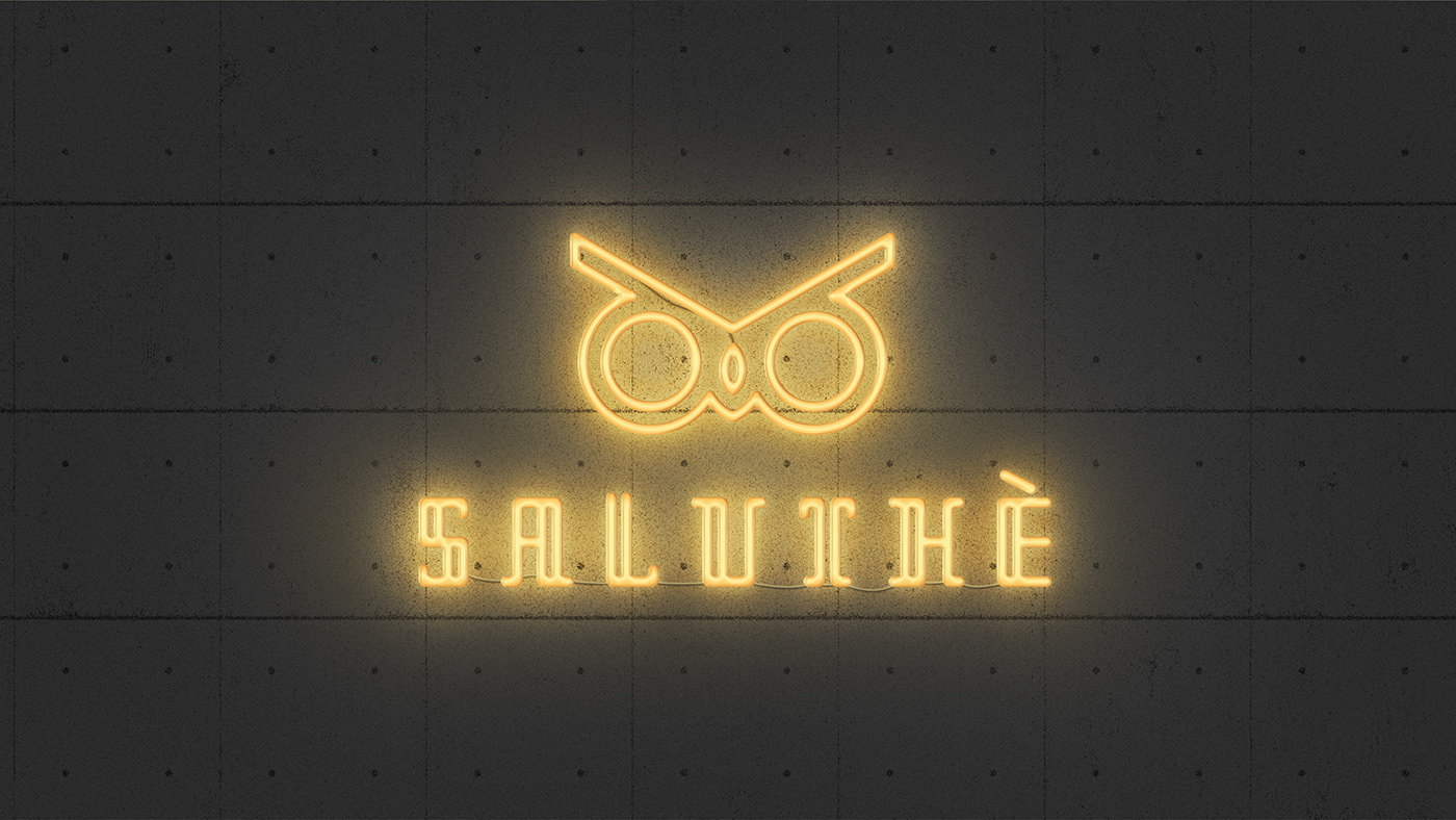
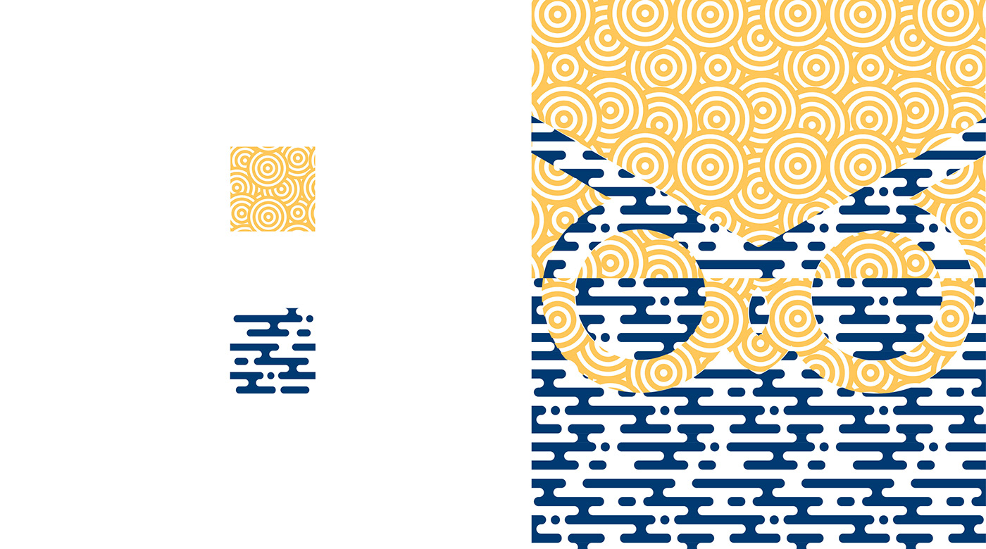
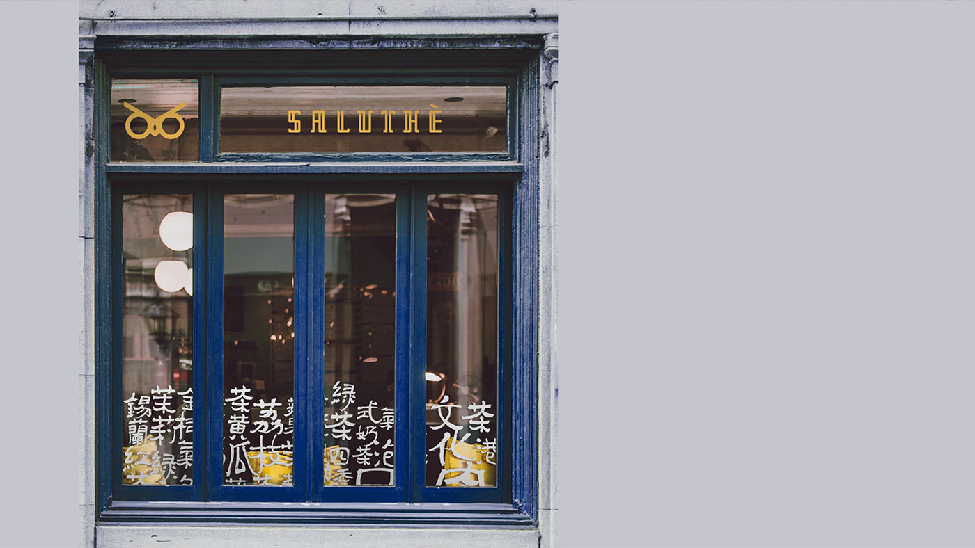
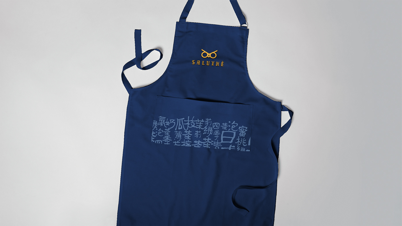
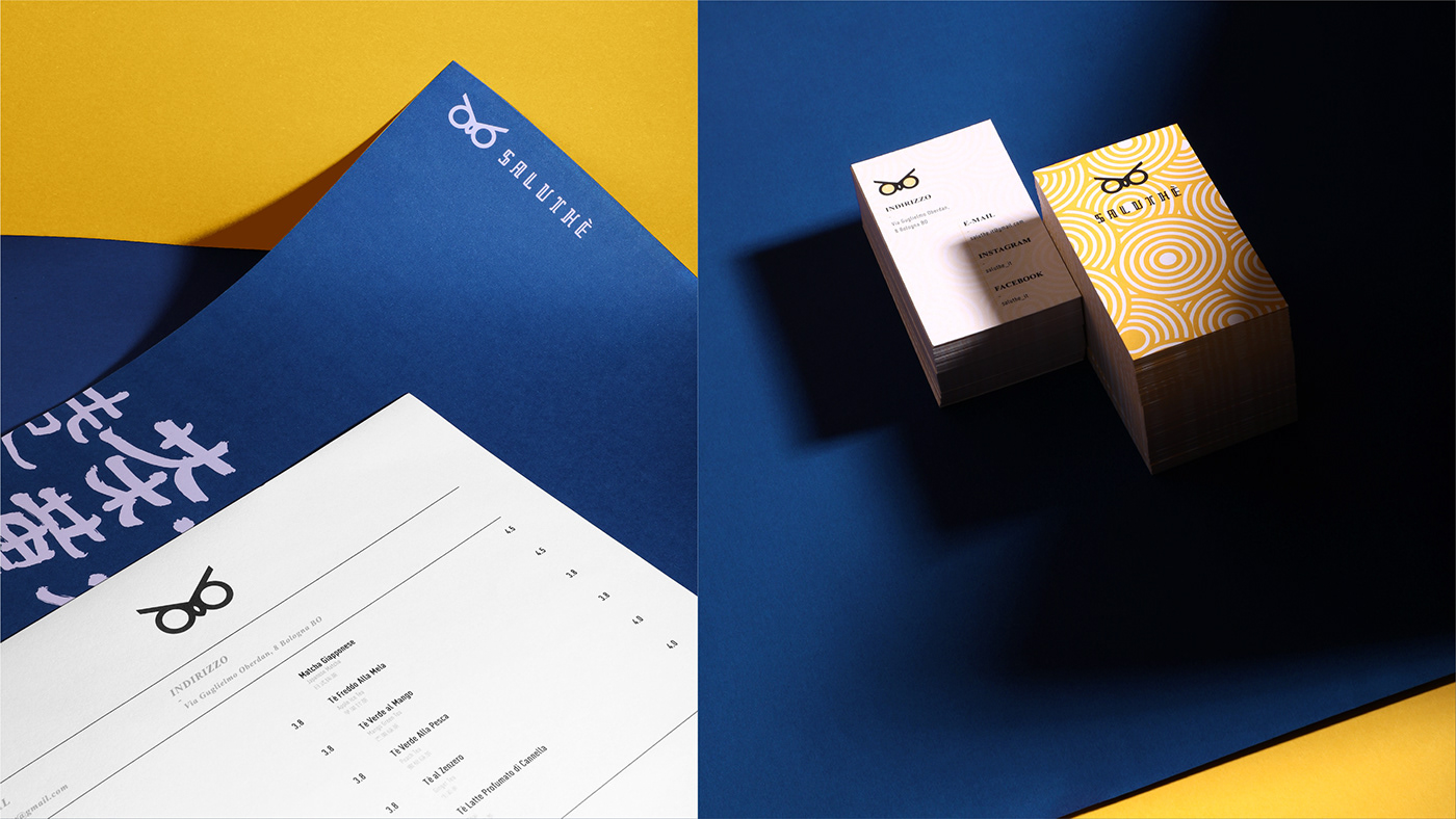
Through the process of developing Saluthè’s brand identity, we decide to take the image of an owl as the logo. An owl represents fortune in Italy and it has a friendly image. The final result is a simple yet symbolic owl logo that is easy to be remembered.
We simplify the owl and eventually showcase a more symbolic, more memorable logo design.
--- --- --- ---
猫头鹰在意大利象征 “好运” 。通过对 Saluthè 品牌的深层挖掘与双方沟通,我们决定採用 “猫头鹰” 作为主体形象。为了统一字体与形象间的东方文化、风格性,我们将猫头鹰图像进行简化与调整,最终呈现为更符号性、顾客能更容易记住的设计。


· Saluthè ·
Design Direction:Jessie N.
Senior Designers: Wayne H., Jaxson D.
Graphic Designer: Yan C.
Photography: Jaxson D., Yan C.
Photography: Jaxson D., Yan C.
Motion Graphic Designers: Sprite Y.
⋆ Grazie!⋆