BON
location: Ukrainian company
function: brand identity for the confectionery and branded cafè
goals: originality and communication with the audience
designers: Aleksandr Yudin, Vladimir Yudin - head designers of the studio YUDIN Design
web-site: yudindesign.com
YUDIN Design studio got the request from an old sweet factory to create the new brand identity that will help the company to be attractive among all other sweets and to take attention of the audience: families, children and teenagers. To decide this marketing issue the designers Vladimir and Aleksandr Yudin proposed a new brand concept. It started from the new name for the confectionery - BON.

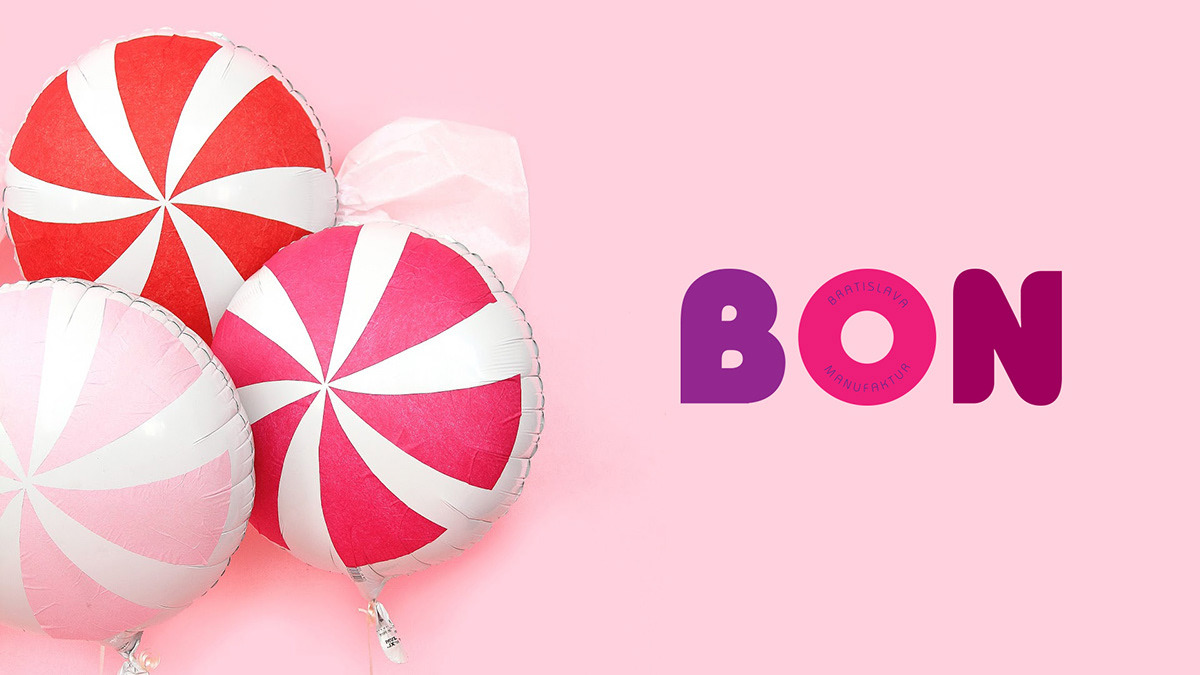
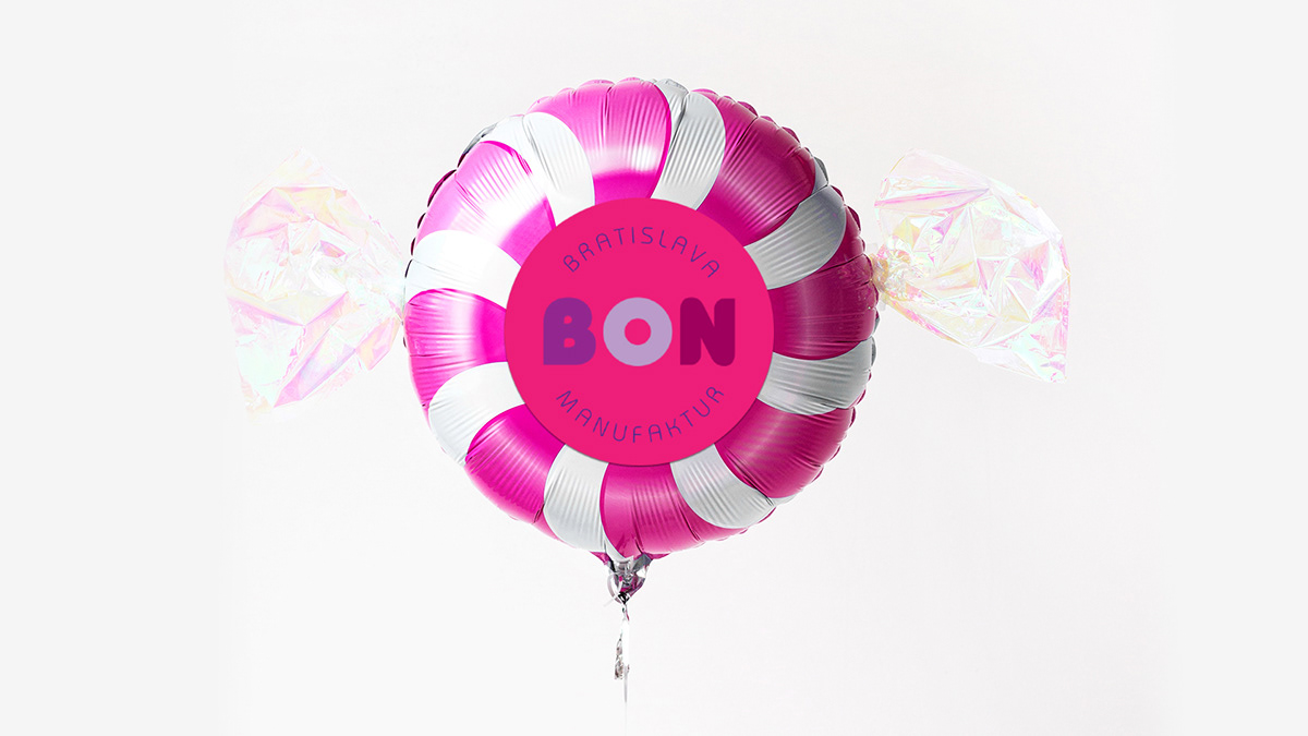
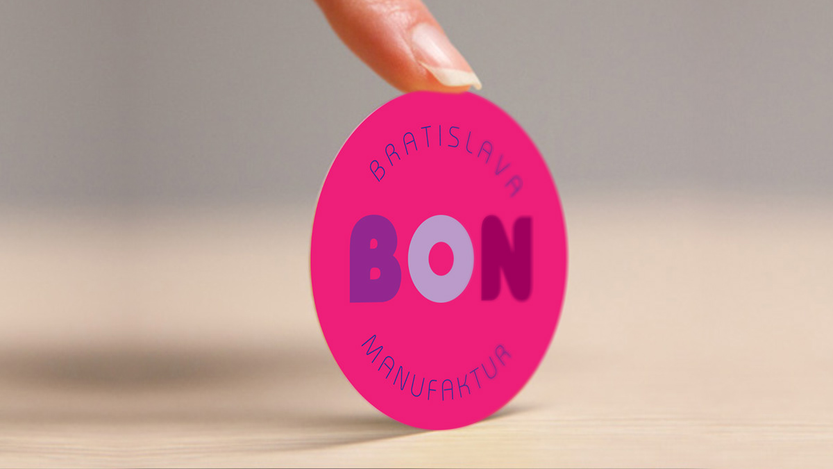
How to make the rebranding for the sweets that people fall in love with it? And what is important, how to spread this feeling between the women, men, kids of different age. Because we know, sweets are not the main food, and people buy it to share their warm feelings with whom they love - in the family and in romantic relationships for example. The Ukrainian studio YUDIN Design decided the shape and the colors of the most classic candy lollipop. For hundreds of years on the market the lollipop got the most common color - pink. Vladimir and Aleksandr Yudin used exactly the color and the shape of this candy for the new confectionery brand identity: logo, advertising, and other promo elements.
yudinbrothers@gmail.com
The brand identity designers, Aleksandr and Vladimir Yudin, decided to use a particular pink, known as raspberry candy, as main color for rebranding. The other colors that also remind us about sweets (mint and strawberry) were used like additional in the brand concept for the confectionery.
yudinbrothers@gmail.com
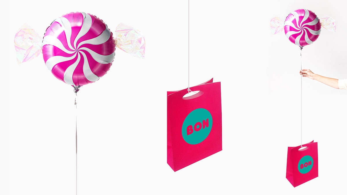
The caramel coloring was also used in the visual identity system for the confectionery. YUDIN Design studio proposed many ideas to promote the sweet factory and to make every kind of the advertising interesting and attractive, reminding about a particular sweet brand.
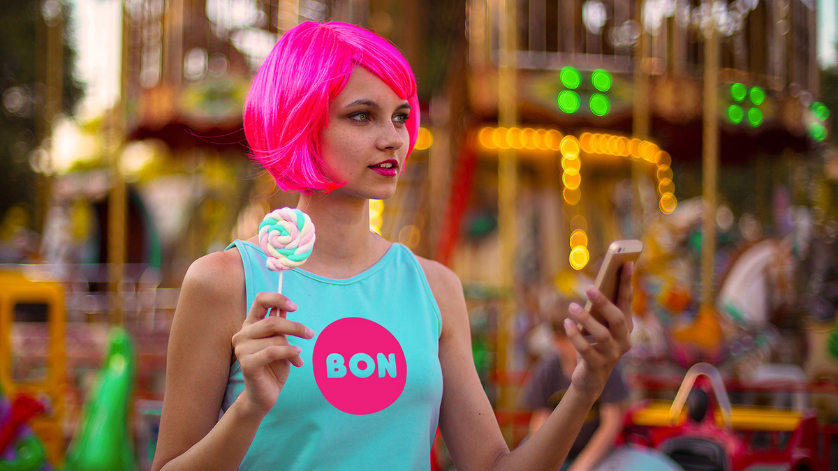
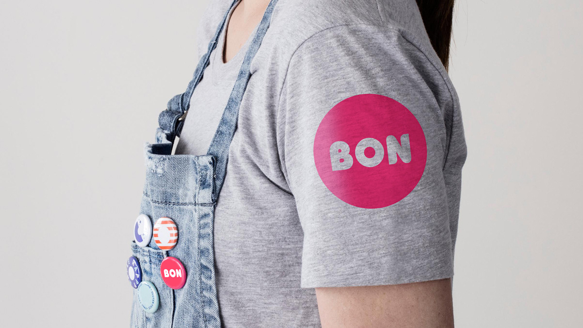
YUDIN Design studio proposed for the staff of the branded cafè and its promoters a recognizable clothing. The easy, friendly and bright dress will make any client easier and friendlier in communication, because the idea of the brand designers was to cause emotions and smiles!
yudinbrothers@gmail.com
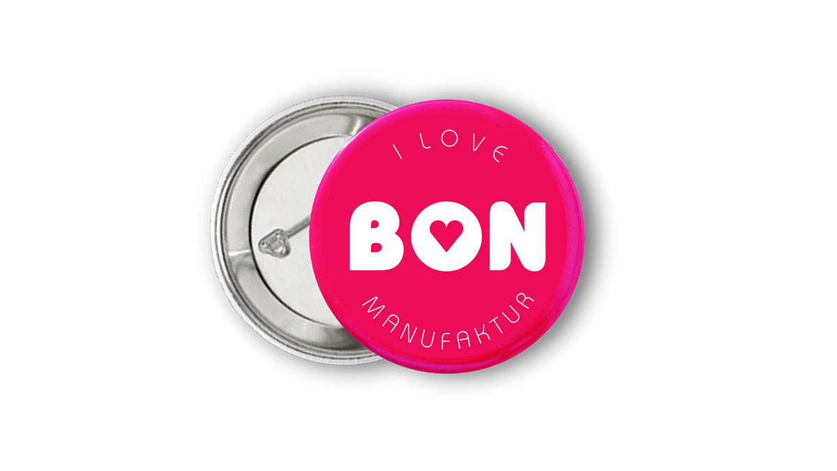
Vladimir and Aleksandr Yudin proposed, as part of the visual identity system, colored badges for the staff with the idea of giving or selling to customers. No matter that part of this pin is just the logo of the confectionery, because this kind of logo from YUDIN Design is so cute that everyone will accept it like something funny.
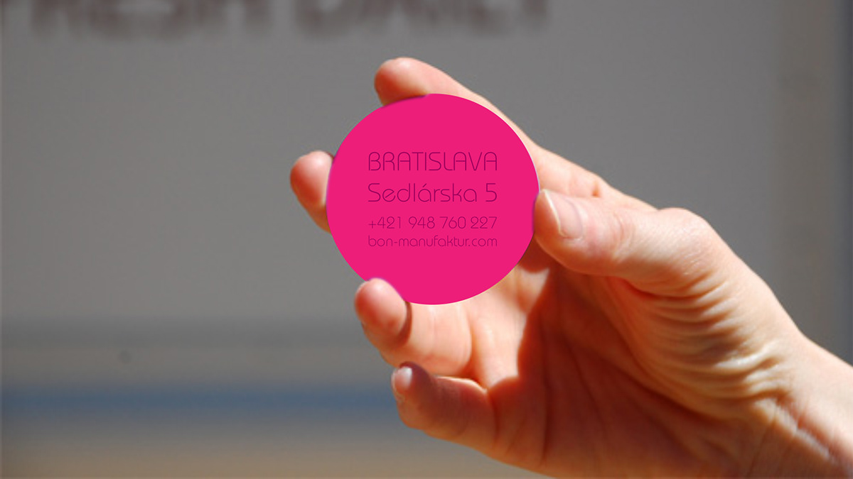
The visit card of the cafè designed in style of lollipop maybe will be only one from thousands of cards of other brands that people will really take and keep! The purpose of creating the design of a visit card that noone will want to lose was taken like challenge by the studio YUDIN Design, working with this promo element.
yudinbrothers@gmail.com
The design of every element must be lovely. YUDIN Design studio is specialized in creating emotional brands that will be always loved by people. They also got much experience working with a brand identity from zero or in the rebranding process.

The brand design for the confectionery was built on the colors that have been used in the candies by many years, becoming common even in the cartoons and able to remind how is to be child, even to grown people. The Ukrainian designers Vladimir and Aleksandr Yudin are sure that every sweet brand must spread a fairy tale, and the brand identity system is the first tool able to help in this!
The sugar bowl has been designed by Brothers Yudin for the branded cafe BON as an accessory. Vladimir and Aleksandr Yudin masterfully combine the functionality and the promotion in their work for different brands and cafès.

The professional brand designers Aleksandr and Vladimir Yudin always really care about future of the brand and about how it will become popular among people. The coffee cups like this, created for the branded candy shop, are done to take a selfie and to make people around watching what you keep in hand!
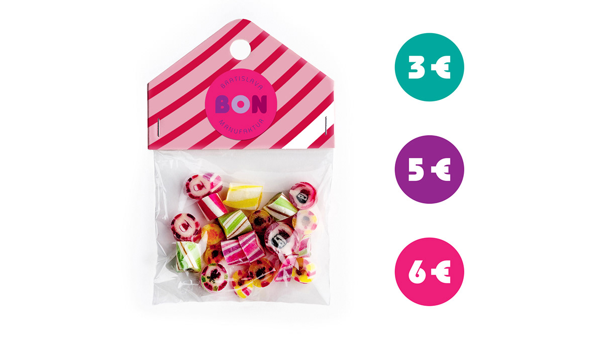
YUDIN Design studio proposed for the small candy pack to use a transparent material, because it looks more attractive and causes appetite. The designers put attention to every element of the identity system, because it is destined not only to the commercial companies but also to people who choose them.
yudinbrothers@gmail.com
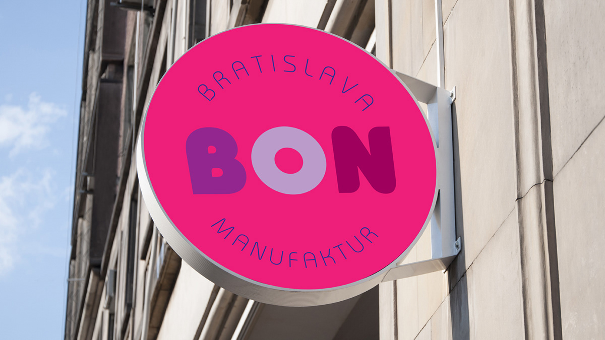
The signboard of the confectionery branded shop also looks like a lollipop. YUDIN Design created such an exterior advertising to give a clear message: it's a sweet shop here!
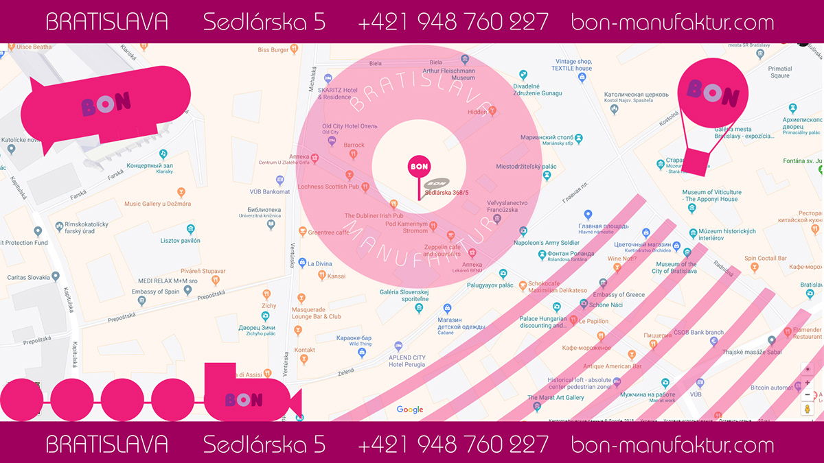
Finally the branded map with the exact shop location. Here YUDIN Design studio created funny graphic pictures of different means of transport crossing around the location. And even here the main color is the chosen by the designers for the brand identity.
yudinbrothers@gmail.com


