Team Productivity Dashboard

A global engineering company’s oil and gas division faced two related issues. The spending on operational costs has been rising contributing to a shortage of engineers resulting in limited growth and investment for other expenditures.
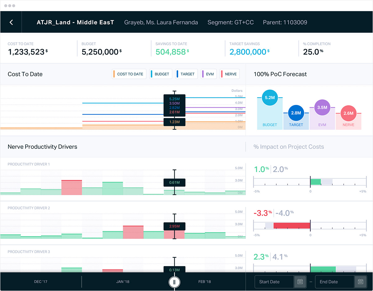
We collaborated with a creative data intelligence firm Quantumblack to design an early warning dashboard for the engineering industry so that management can make better decisions across all projects.

Advanced Charting To Show Progress
The dataset showed an overview comparison between projects for spending (over and underspending) and completion progress.
We opted for the Sanky chart that enables management to see the range of spending, project progress and where savings can be made. The benefit is to distribute expenditures intelligently across the projects.

Detailed Analysis To Find Pain Points
Throughout the dashboard tool, we used a 'traffic light' colour coding system to show positive and negative projects based on customisable variables. This ranged from project savings, spending to completion.
Oil and gas management can then further explore the details of a project to identify what the pain points are and fix the issue.