Year: 2018
Client: Katrina Carandang and Hazel Roldan
Industries: Retail, Sustainable Lifestyle
Deliverables:
Identity, Packaging, Storytelling
Client: Katrina Carandang and Hazel Roldan
Industries: Retail, Sustainable Lifestyle
Deliverables:
Identity, Packaging, Storytelling
---
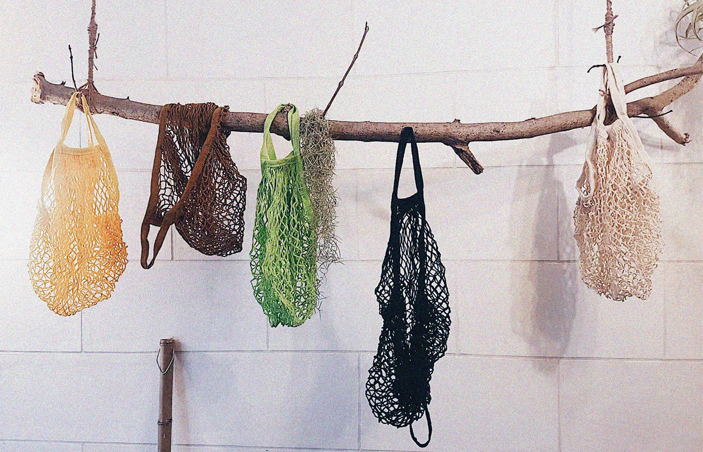
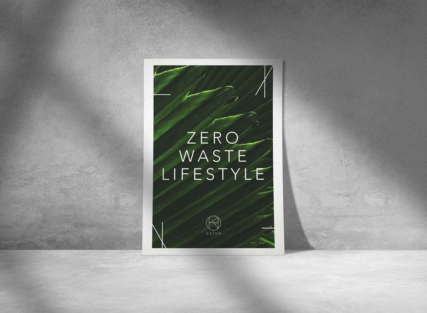
Partners and founders Katrina Carandang and Hazel Roldan envisioned of putting up a zero-waste one stop shop in the PH that allows customers to experience selecting in the store through augmented reality and have an option for those to be delivered to their doorstep, reducing physical and carbon waste while at the same time basking in each product’s story.
Thus, KatHa was born.
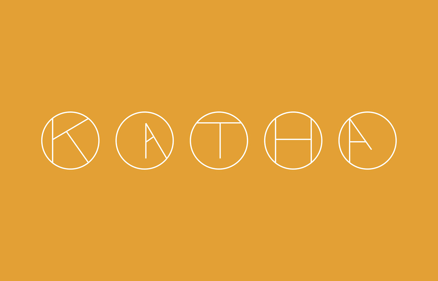
Katha is a Filipino word which means, “creation” or even “legend”.
KATHA.
Noun; A literary composition, creation and craftiness.
Noun; A literary composition, creation and craftiness.
Amazingly, if one breaks it down in two syllables, Kat-Ha and are the first syllables of the founder’s names.
Inspired by the zero-waste ideals, Pencilstate designed the logo to be thin, minimalist, and when printed and produced, would require less ink. The shapes are designed to form all the letters of "KATHA"