
Daishin Securities
Annual Report 2018
Daishin Securities is a household name for finance and investment in Korea with a number of industry's first titles commemorating its long history and tradition dating back to 1962.
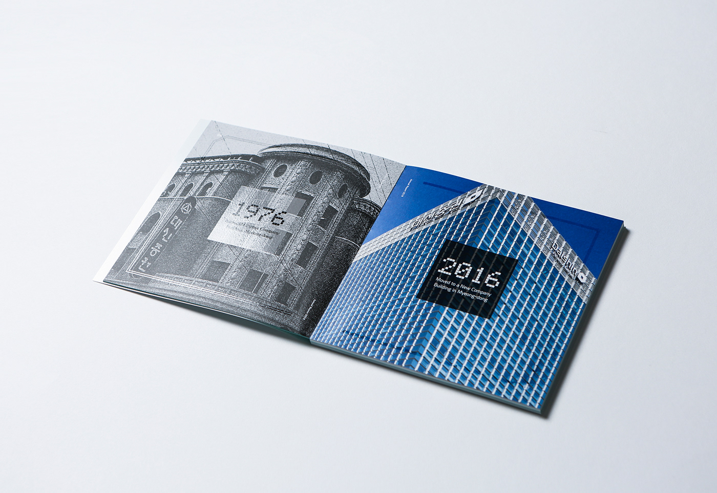
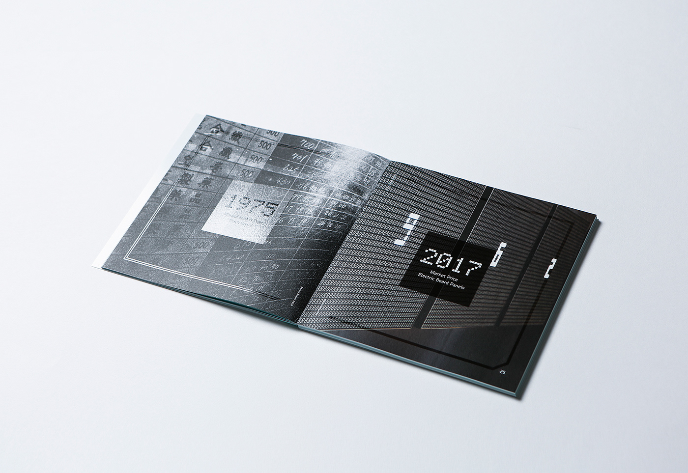
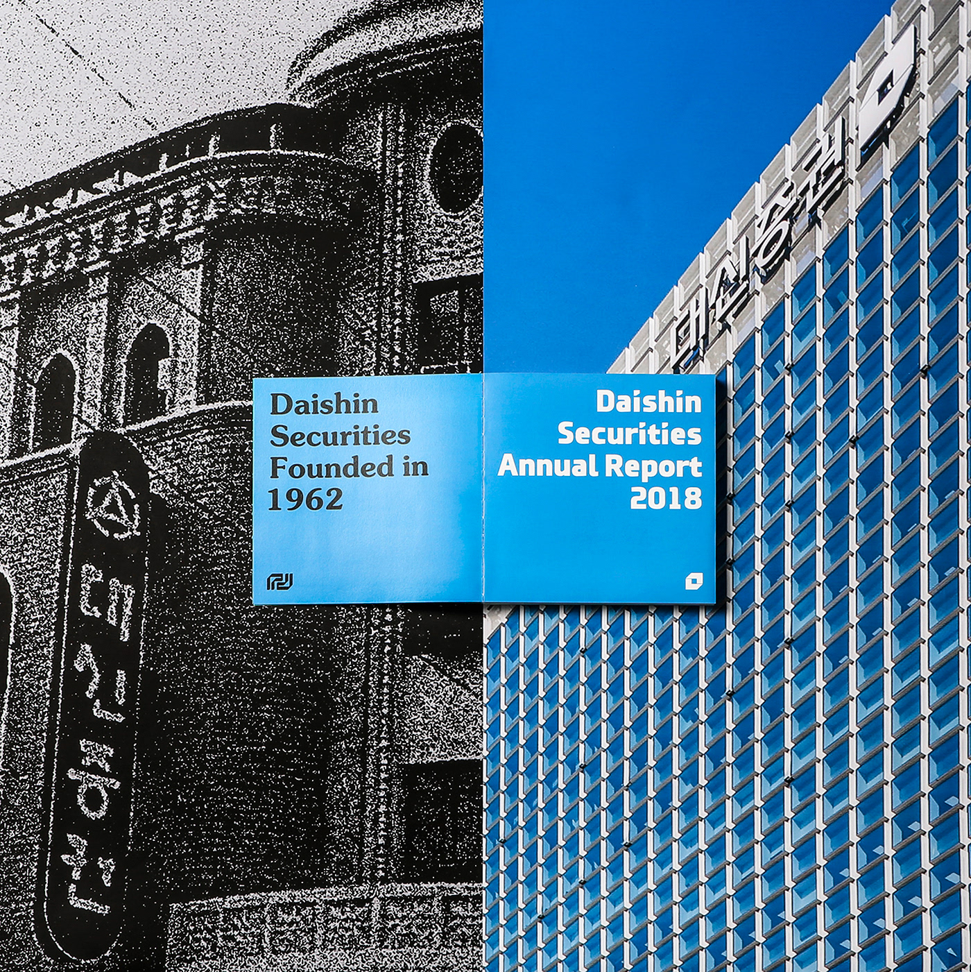
This time project was designed with a concept to represent Daishin Securities' history from past to present. The title page was made of lenticular sheet to overlap the old font and logo with the renewed logo to show the flow of time. Inner pages were designed with the old and new logos located on the left and right side, respectively. The first page of each section represents Daishin Securities' heritage. For instance, the first page of the first section shows the image of the company building in 1976 on the left along with that of the new building in 2018 on the right to represent its history.
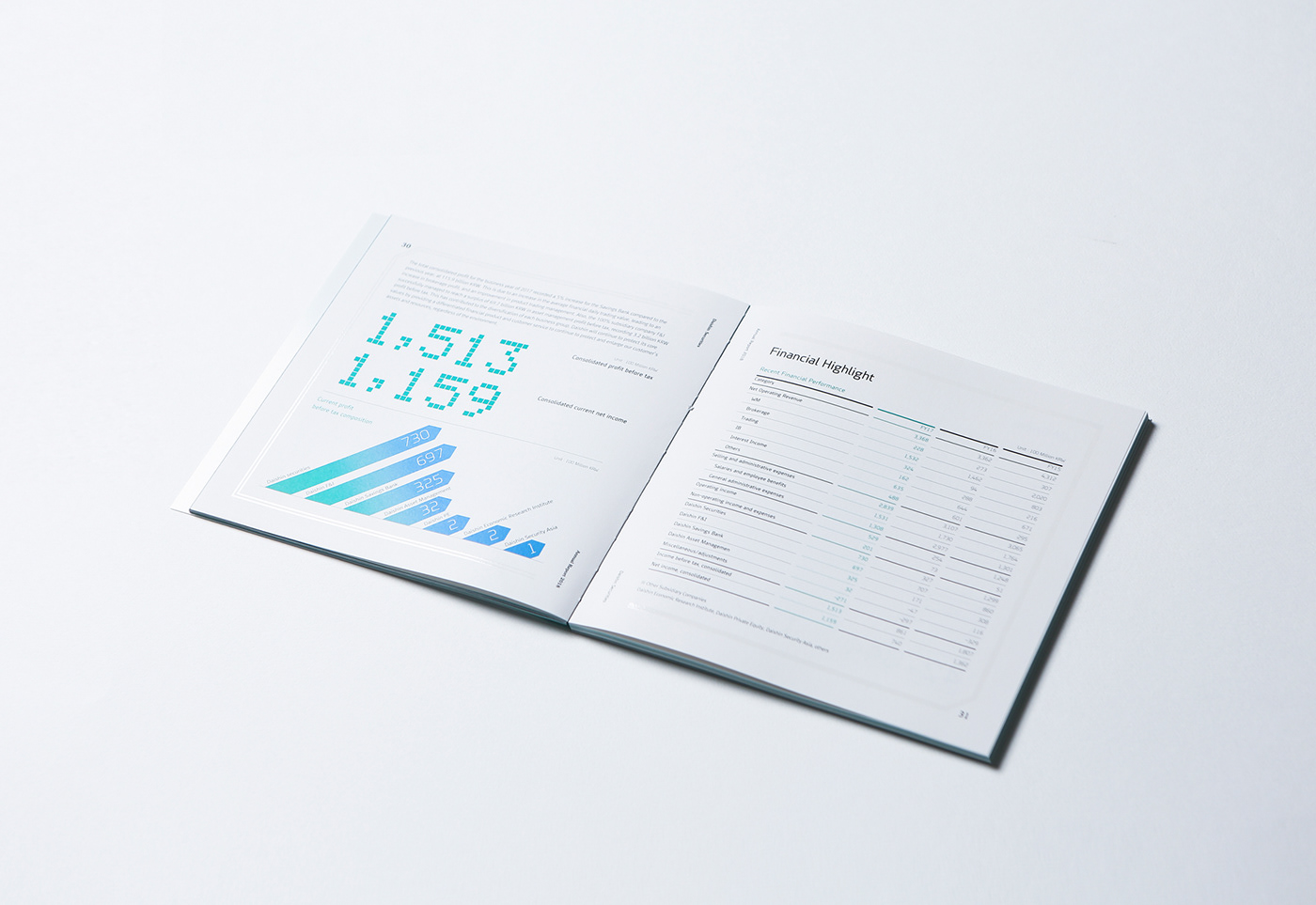
Daishin Securities' CI, as a key design factor, was used in proportion with the size of the book, formats and graphs. Its main colors - blue and green - were applied to print annual reports in two languages.
Information on results and performance for the past year is highlighted with clear color comparison to fulfill the mission of the annual report while key issues and results in figure are expressed in larger fonts.