

COSMOS - Carl Sagan (Redesigned and Illustrated)
WHAT IS COSMOS?
Cosmos is a science book written by Carl Sagan. It was based on a 1980's television series Cosmos - A Personal Voyage (which is an amazing show). The book tells us about how life and civilizations came to be. I really enjoyed reading the book and I'd also recommend it to all designers out there.
side note: Who's also excited for Cosmos: Possible worlds? It's only 2 months left, folks!

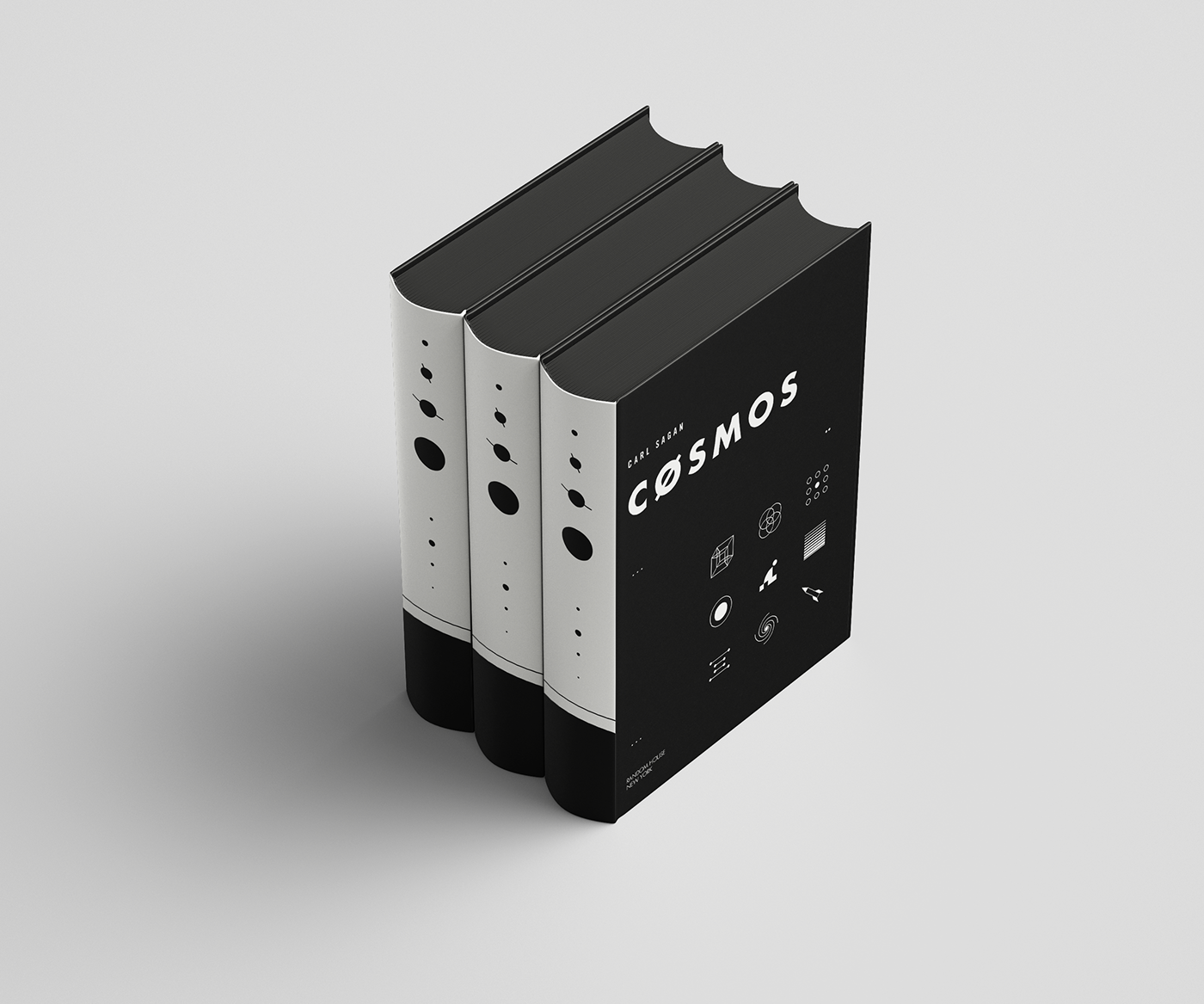
The 9 small icons on the cover represents some of the chapters in the book (such as 4th dimension, Rocket, DNA string, relativity, etc.)
THE CHALLENGE
COSMOS is a thick book that contains a lot of information (yes, I read the WHOLE thing). But unlike any tedious science books out there, I think Carl's style of writing is unique and poetic-- this is where the book shines. It's almost as if he understands how to blend art and science together. Combining those two elements is part of the challenge.
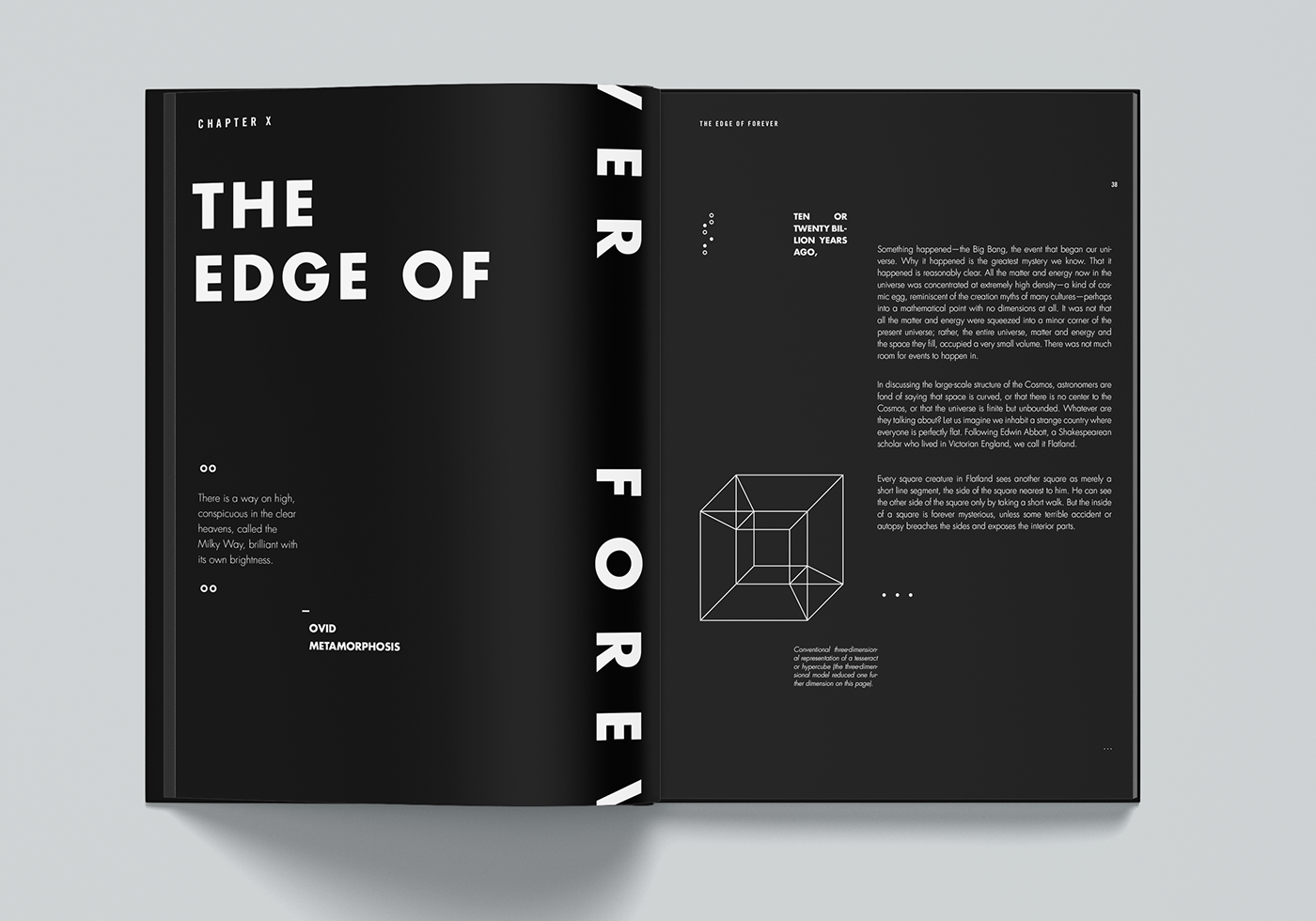
Illustrating and Simplifying billions and billions of star stuff into one single page is ALSO a hard task. I found one chapter in the book explaining about pulsars with a photograph of star stuff surrounding it (it looks complicated as f***). In the original book, almost everything (the header, subhead, paragraphs, caption) is written with a serif typeface. It really is an old book. Time for a redesign!

The side cover depicts our current solar system. (It's also used to Illustrate chapter 3, The Harmony of Worlds.)
THE INSPIRATION BOARD


Glyphs, Geometric Patterns, Morse codes, Malevich, Line art (Al Hirschfeld), Black and White, More Black and White stuff. More on that later. Taken from Pinterest & Wikipedia.

THE COLOR PALETTE
I originally wanted the color palette to be the color spectrum of a light (ROYGBIV) but decided that it was way too complicated to use. Not very practical.
In the end, the only color palette used was black, white, and red. The book pages are black (it suggests the darkness of space and mysteries waiting to be solved), while the remaining elements are pure white (Light, Origin of Life). The focus is on the shape and composition.

THE TYPOGRAPHY
I also tried the typeface Univers (get it?) for the primary typeface but decided that it didn't really complement the geometric patterns and illustrations. Geometric Sans is the answer. Justifying paragraphs into a square shape is used to help the composition.
Glyphs are also used to support the composition. Dots (.) and Ellipses (...) are commonly used to represent stars and planets. It also signifies the Morse code, which is a whole new language that suggests an enigmatic feeling.


Taken from chapter 03 - Darwin's Origin of Species


The Moon & The Sun


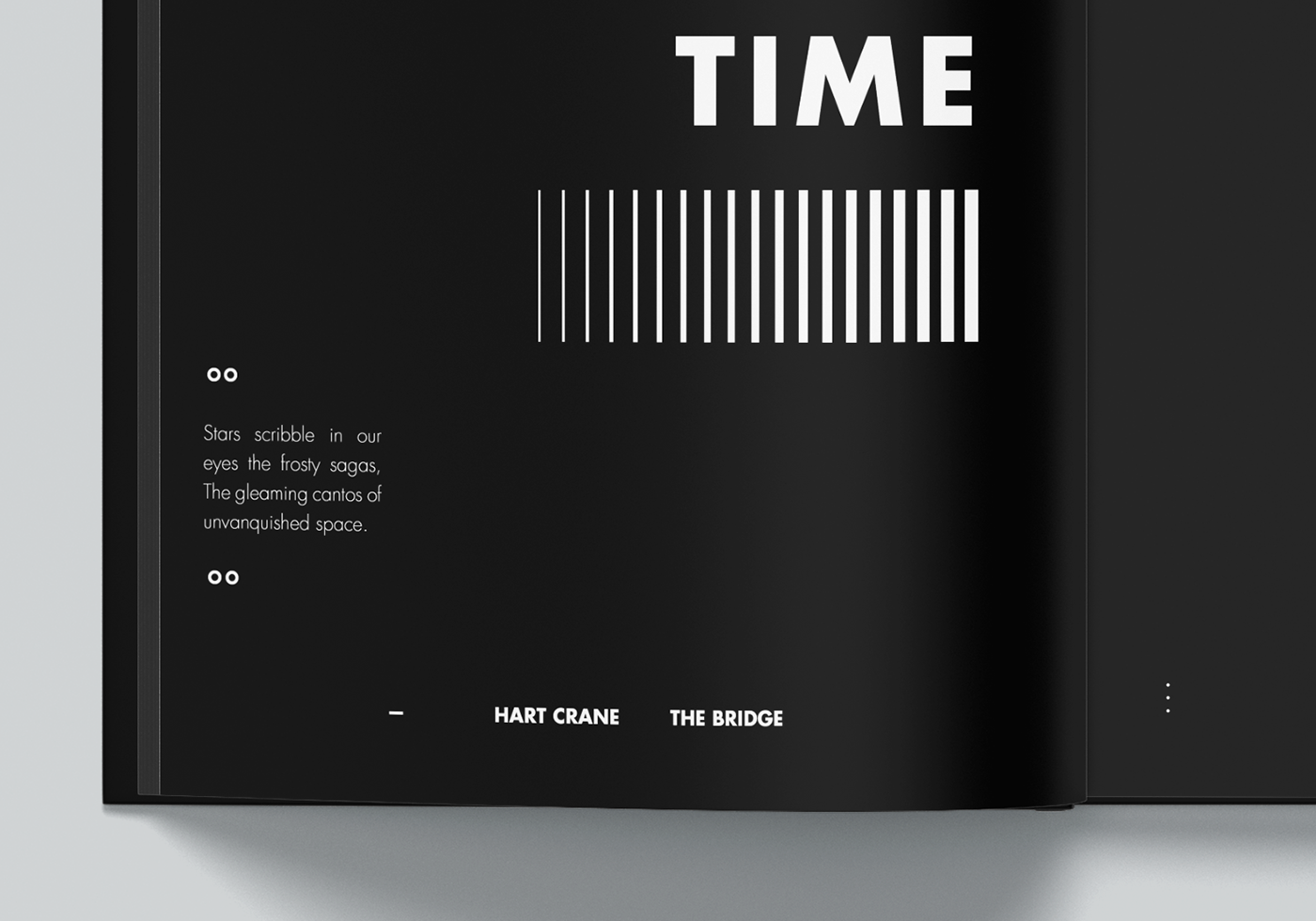
Voyager's Travel Log

Time Relativity

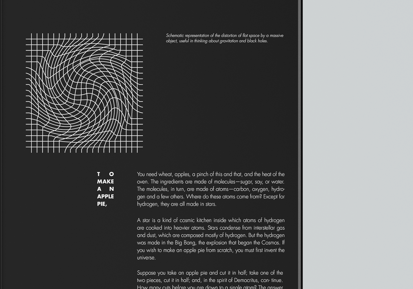
Taken from chapter 09 - Space Distortion

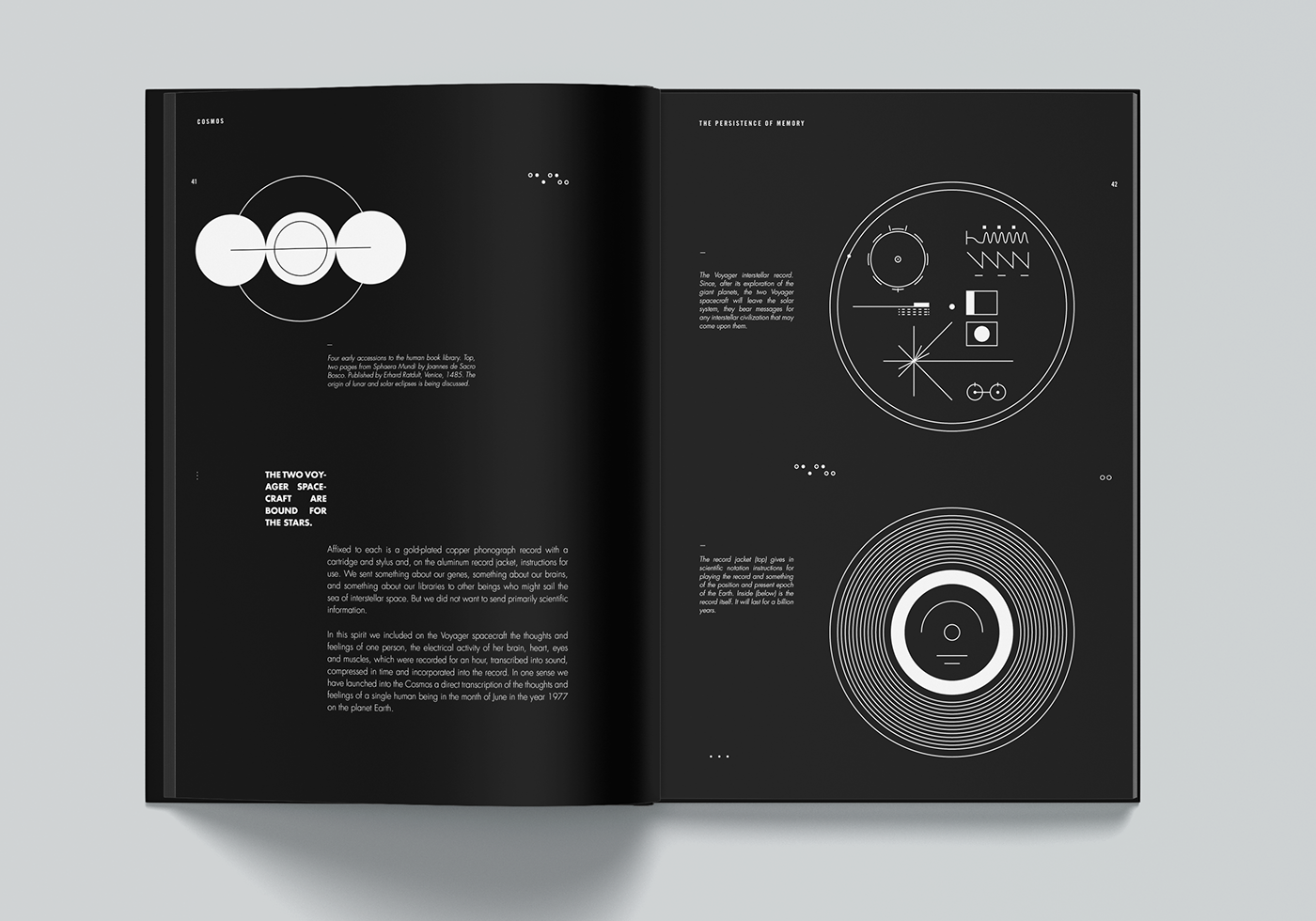
Voyager Golden Record

The chapter in its entirety
Thank you very much. Hit one of those appreciate button if you like it.
Credits
Writer: Carl Sagan & Ann Druyan (Random House Publishing)
Layout & Graphic Design: Samuel O
Writer: Carl Sagan & Ann Druyan (Random House Publishing)
Layout & Graphic Design: Samuel O
Illustration: Samuel O


