

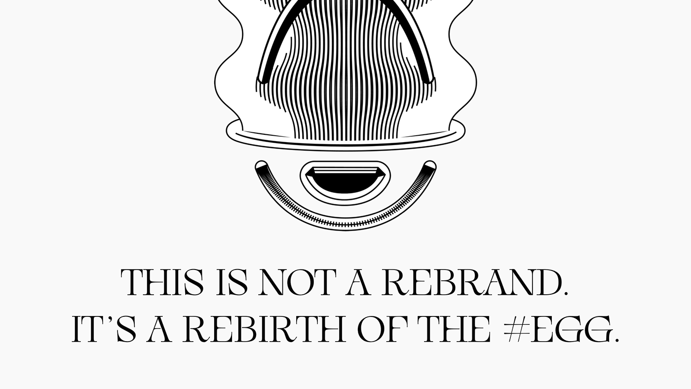
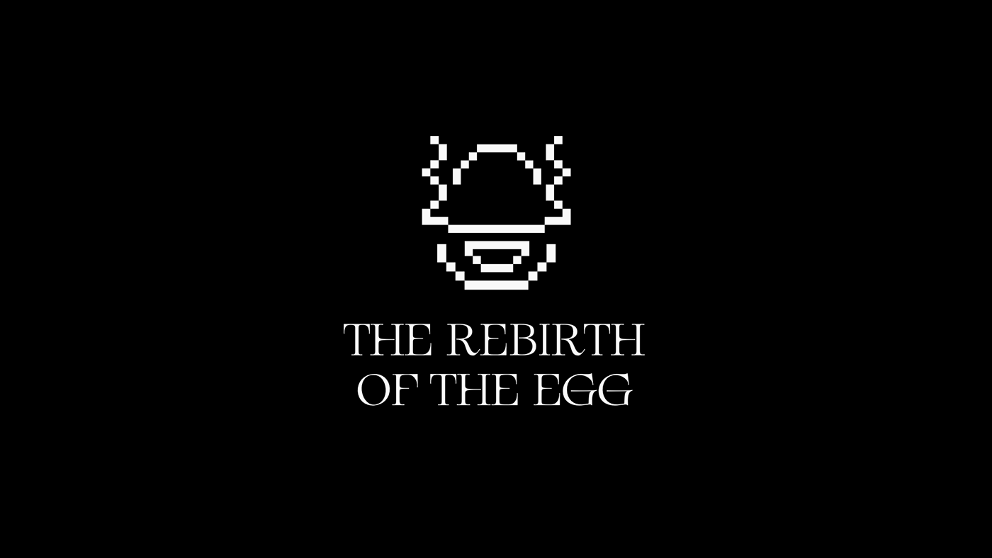
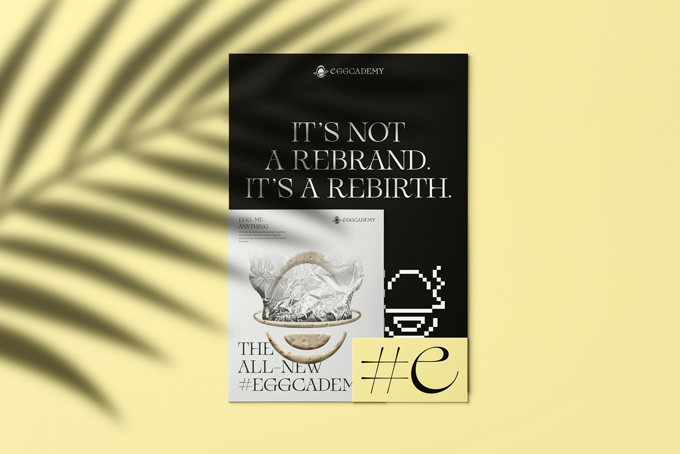
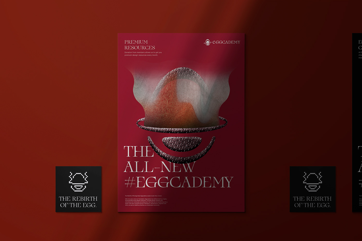
The Rebirth of The Egg helps Eggcademy speaks louder than a brand.
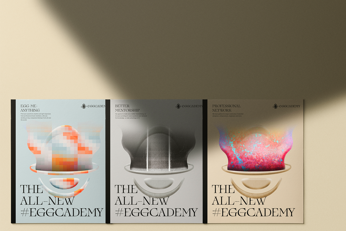
After two years since our foundation, Eggcademy has defined itself as a highly-recommended online design instituition, provided design solutions and consultancy for individuals and enterprises. Now that we are transforming into a larger scale with a powerful group of designers, entrepreneurs, engineers and more, we want to redefine ourselves as a sustainable community.
Scope of Work: Create new brand identity/visual identity for Eggcademy
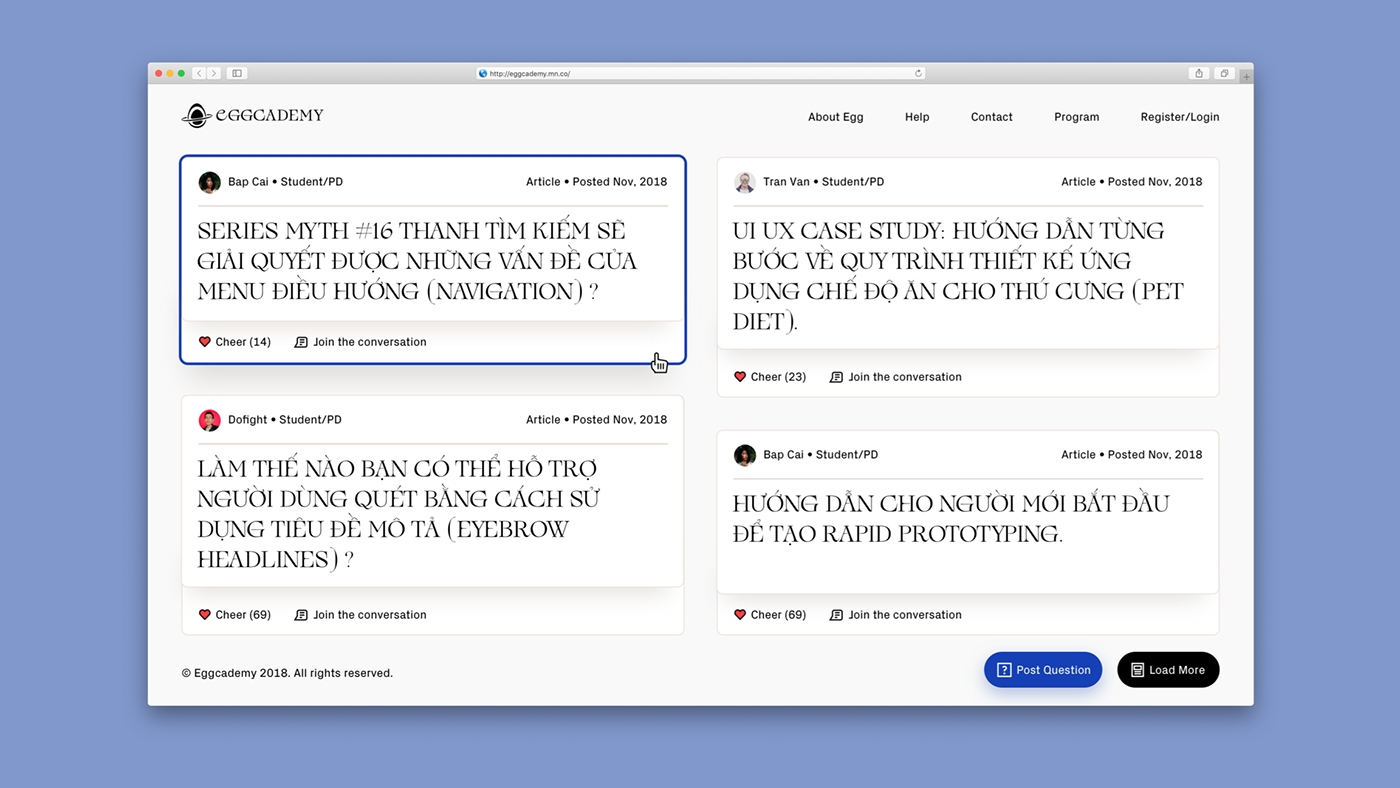
Fields of Work: Brand Design | Type Design | Graphic Design | Web Design
Client: Eggcademy
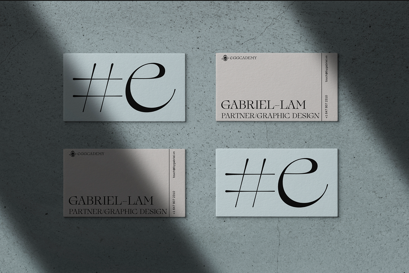
Designer: Gabriel Lam
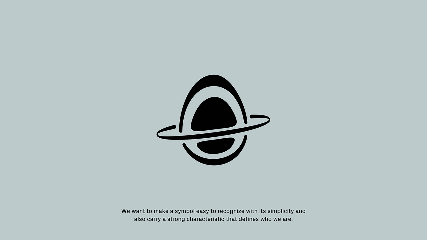
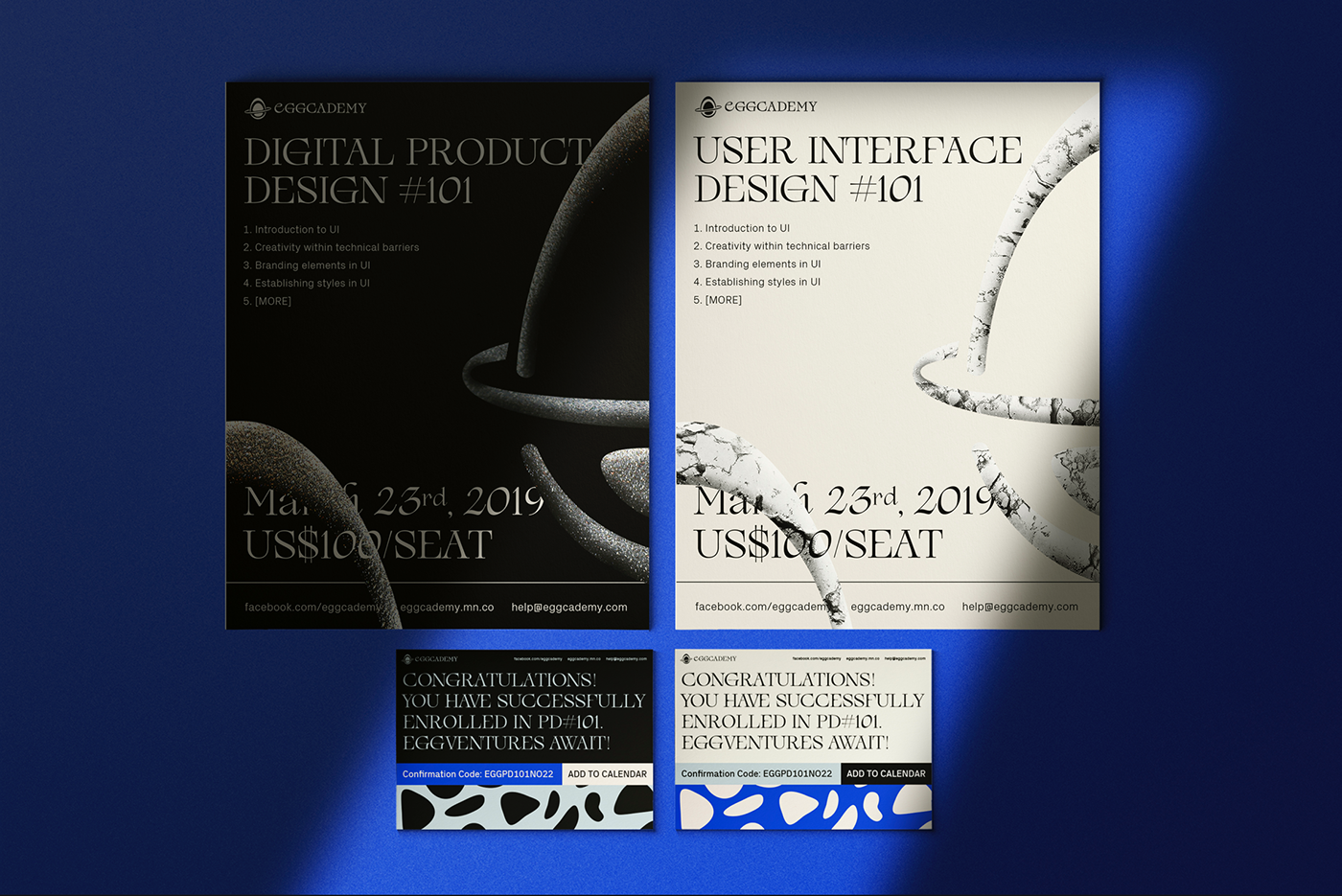
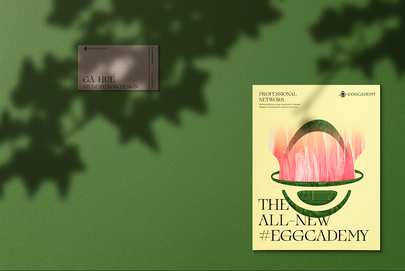
The core value of this concept is about “Transformation”, therefore, we designed a symbol of the egg with an eclipse that stands for the transformation process, the upper part is separated from the lower part helps represent the message more clearly.


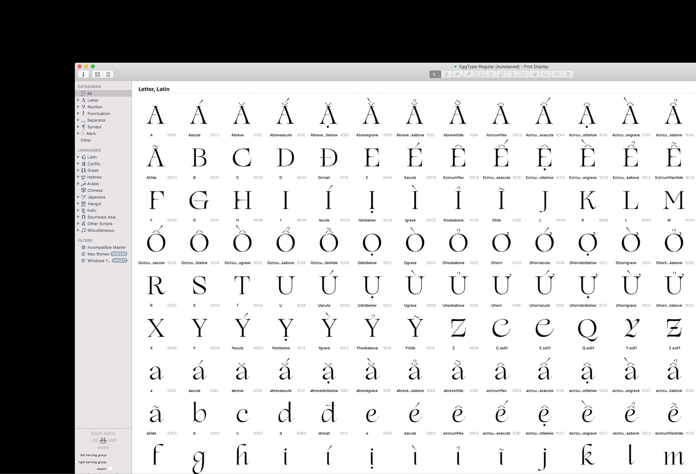
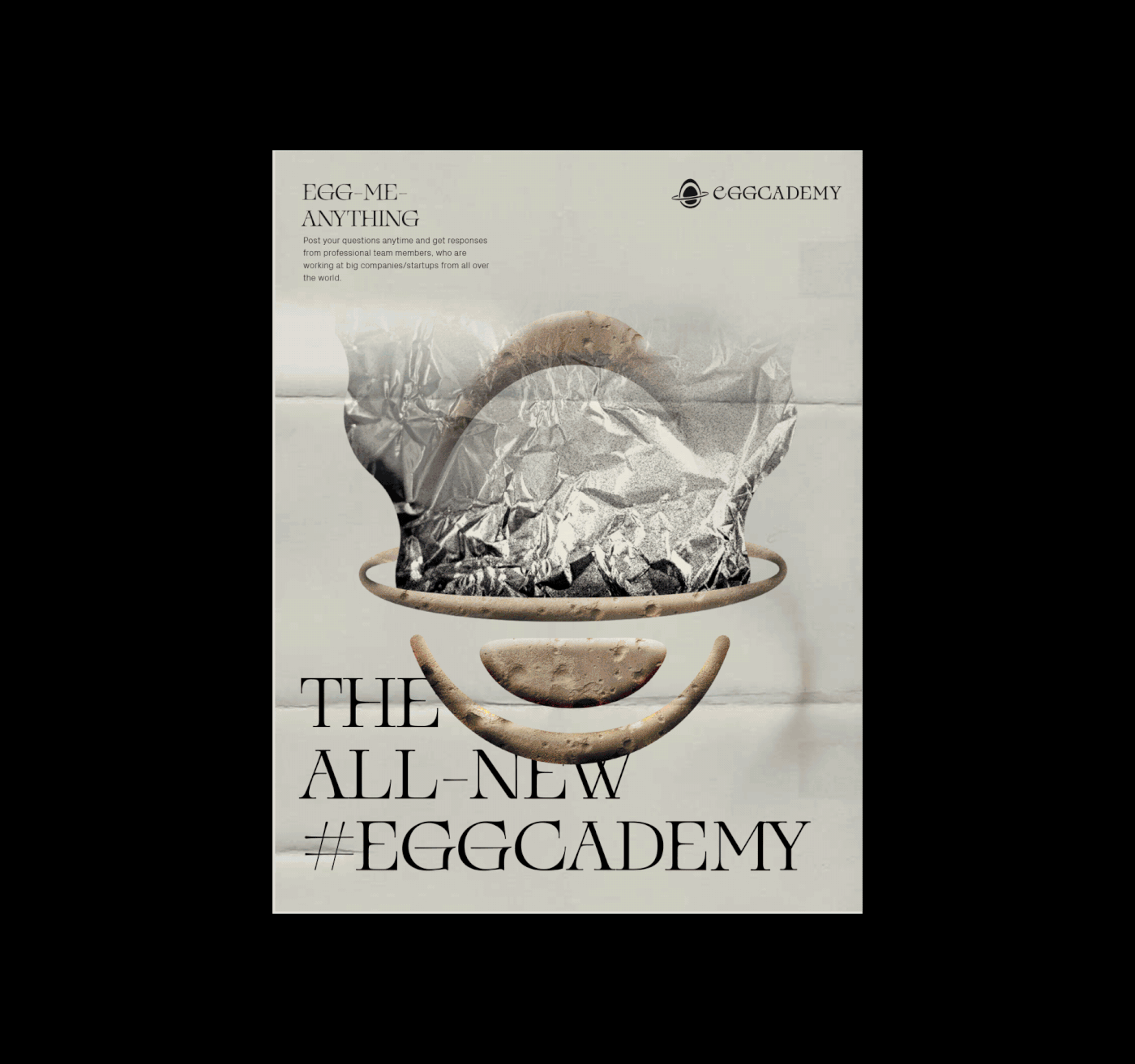
Prot Display is exclusively made for Eggcademy new brand identity. This serif display typeface is made based on calligraphic lettering, with high contrast strokes so that it has an academic look and feel. We want the typeface to be classic yet something modern and experimental, to speak for our vision about design.


Thank you for watching.
Prot Display specimen is coming soon.
Prot Display specimen is coming soon.