________________________________________________________________________________________
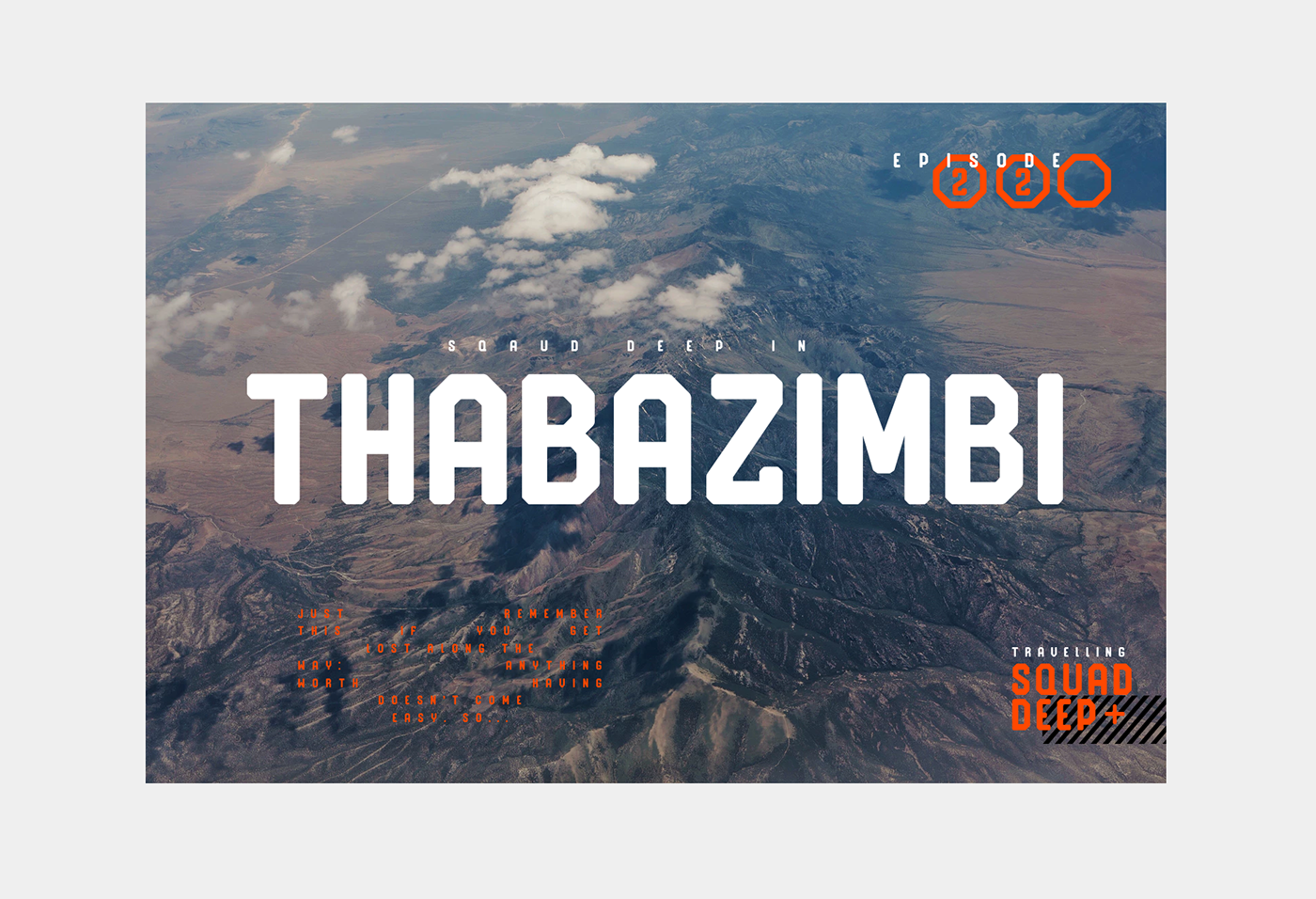
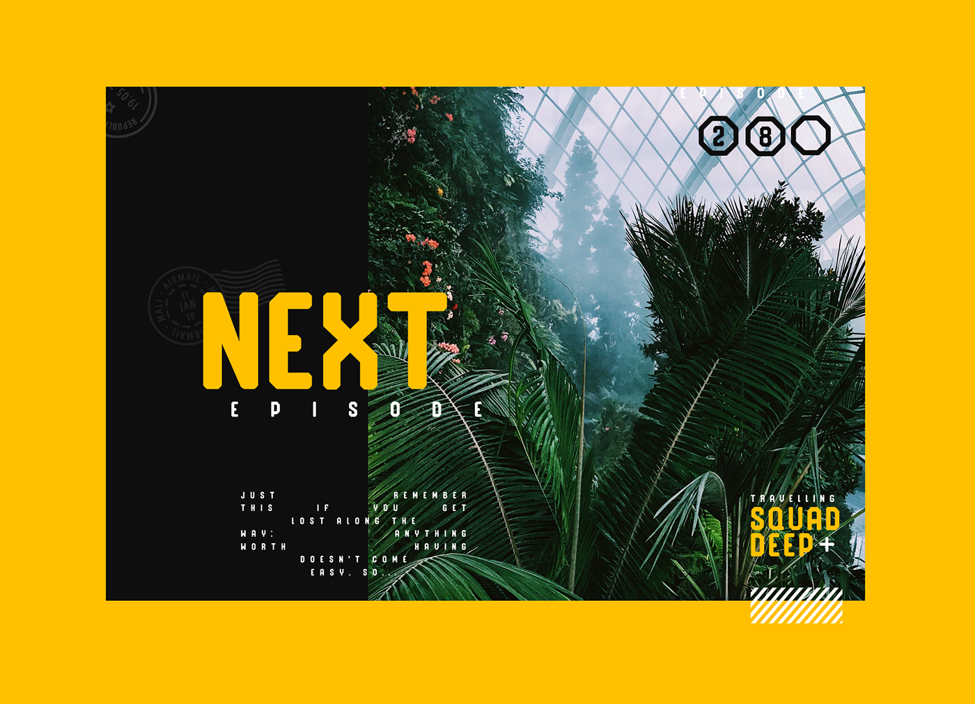
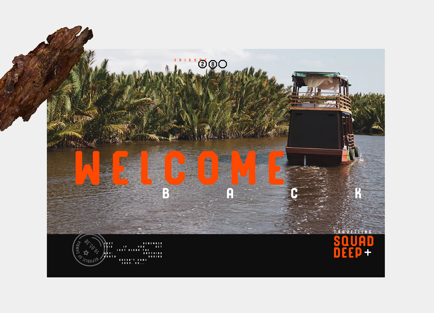
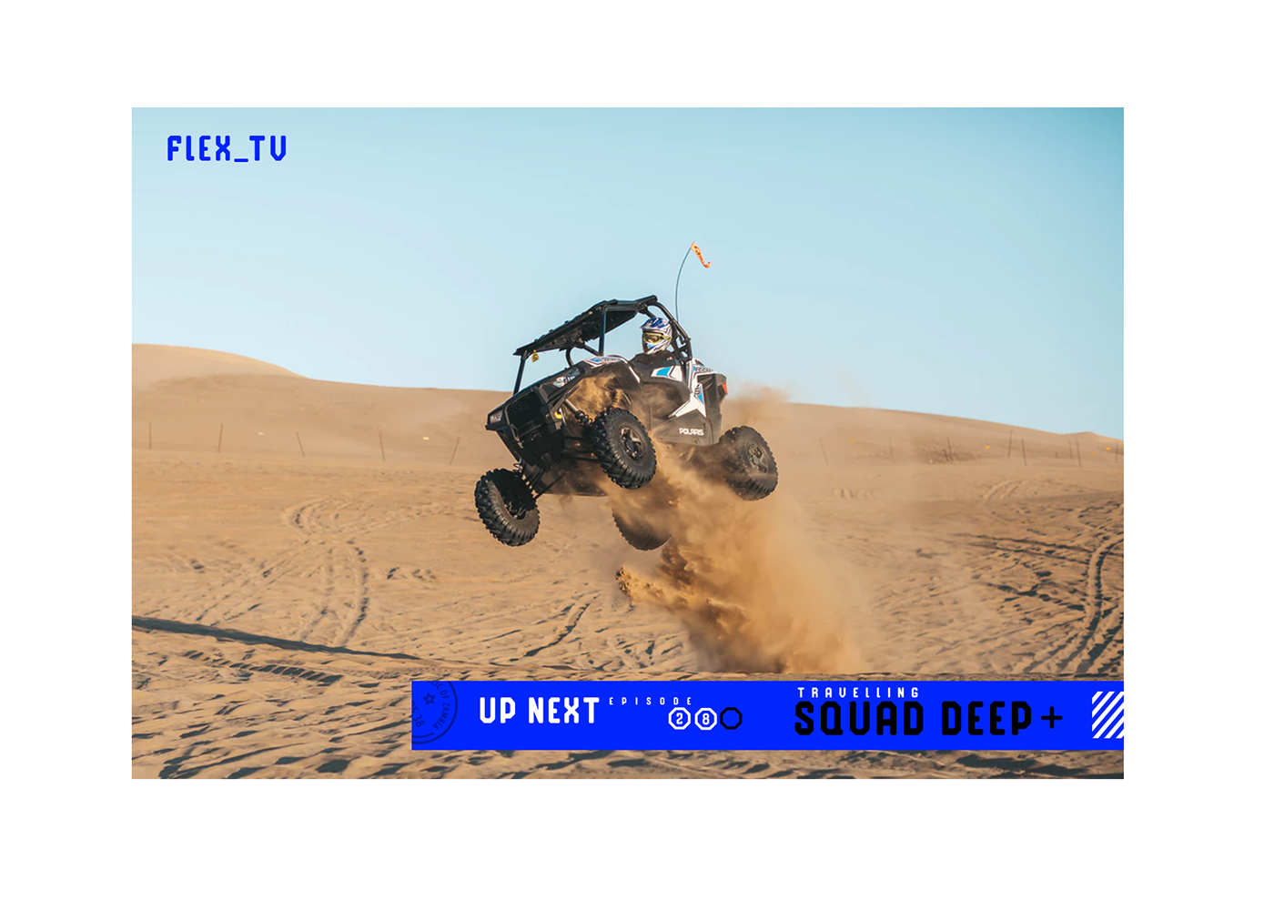
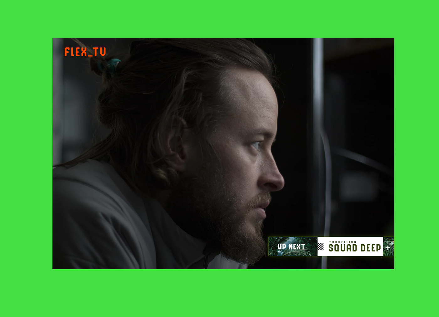
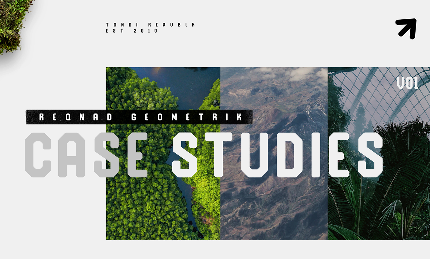
This is a case study for my newly released typeface Reqnad Geoemtrik. In this case study i was exploring a visual identity for a fictional travel TV show, Travelling Squad Deep.
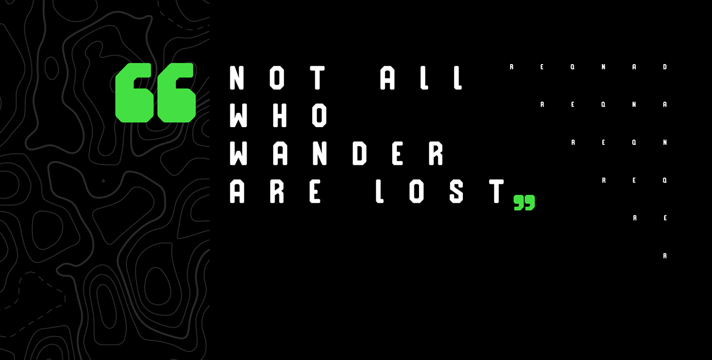
I wanted to give the visual identity a minimalistic look that is anchored around the typeface, color and a dynamic layout system that gives the work a unique identity.
As Mentioned above the typeface in use is Reqnad Geometrik and it is available on [tonditype.com]
________________________________________________________________________________________