Digital Branding / Self Promotion / 2012
As a designer who is so proud of being a Vietnamese, I tend to transport the Vietnamese essence to my every design elements.
At first glance there is the full name of me - Nguyen Phu Hai, which was shortened into Ng. Phu Hai since ‘Nguyen’ is the well-known first name of Vietnamese, accompanying with the diacritics that are exclusive for Vietnamese ( ~ | ‘ | ? ). The diacritics were symbolized in a grid system that was further used in other visual elements.
The logo is finalized by wrapping the full name and diacritics inside a square box, which is only used in white background and colored in black.


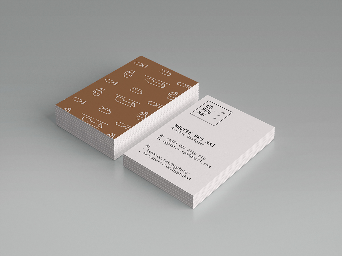

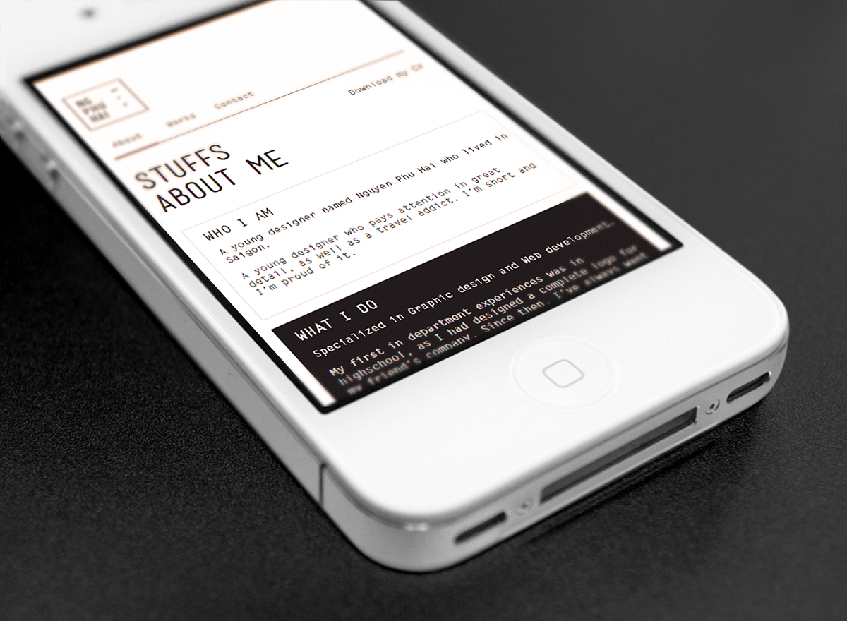
The brand is further expanded into website and stationery. The website is fully responsive with mobile devices and can be updated in Wordpress. Moreover, the website is designed with a fair amount of whitespace, giving space for the actual works and words to shine. Some of the design element is broken carrying the designer’s self meaning of intended imperfection.