


On Fall of 2018, I entered AIGA Orlando's Changemakers Program. Changemakers is designed to unite groups of creative individuals together to provide solutions for local non-profit organizations. Our creative team including Alonzo DeJesus, Laura Arias, and Izzy Martinez were assigned Amanda Kern's organization, Redefining Spina Bifida.
Spina bifida is a non-curable birth defect in which babies are born with an opening in their spine. The first time parents receive the news, they are told their child will need many surgeries, may not be able to walk, and might need more attention than the rest of their siblings. Due to misinformation, monetary constraints, or worries over the various responsibilities, many parents choose to abort their child.
Redefinining Spina Bifida (RSB)'s mission is to redefine the meaning of living with spina bifida by inspiring hope, educating families, and uniting the spina bifida community. Many children, teenagers, and even adults enjoy their lives, attend classes, and receive jobs.


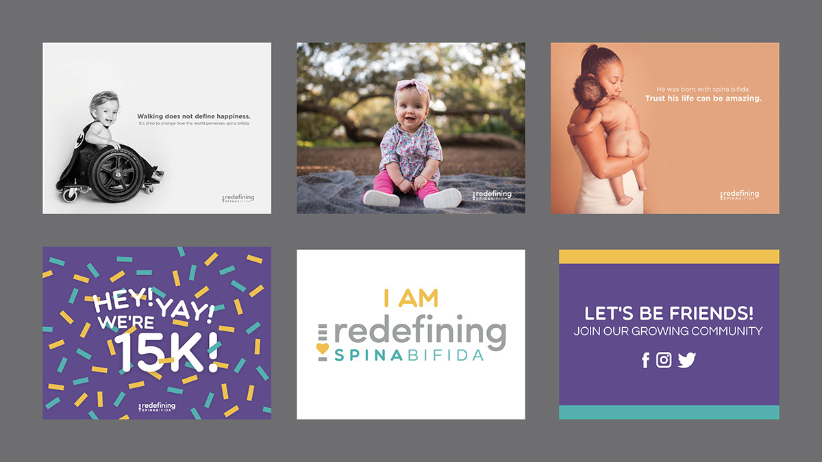
RSB's founder, Amanda Kern, first began photographing families with spina bifida and posting them on RSB's Facebook page. These images show the positivity and joy surrounding the lives of these individuals. The first depiction of RSB's logo began as a simple, typed out representation of the organization’s name.
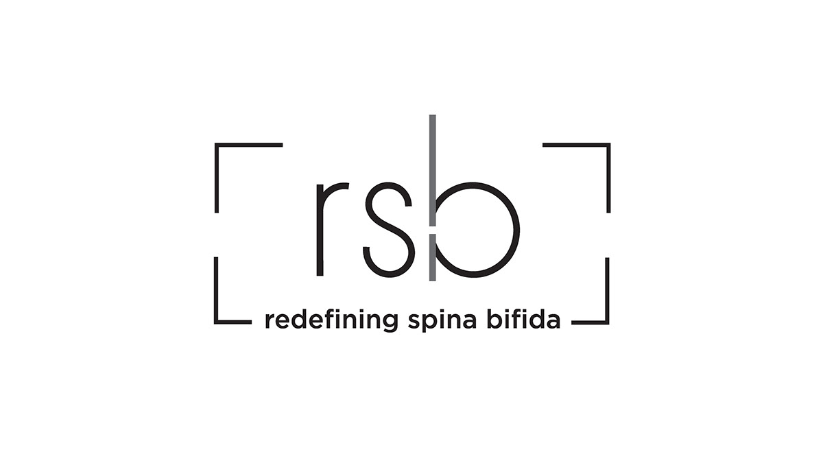
They progressed with the usage of their second logo, which incorporated the symbology of spina bifida with the gap inside the lowercase B. The aspect of Amanda’s photography was also represented with the bracket-like lines surrounding the “rsb”.
The Changemakers team, alongside Amanda, discussed that RSB’s previous logo needed brighter, more inviting colors that would represent and unite the spina bifida community.

With the first logo drafts, I explored concepts that integrated the organization’s abbreviations or could represent the community. After multiple feedback discussions with Amanda, we deviated from sketches involving wheelchairs, puzzles, and babies as it could possibly offend the spina bifida community through misrepresentation.
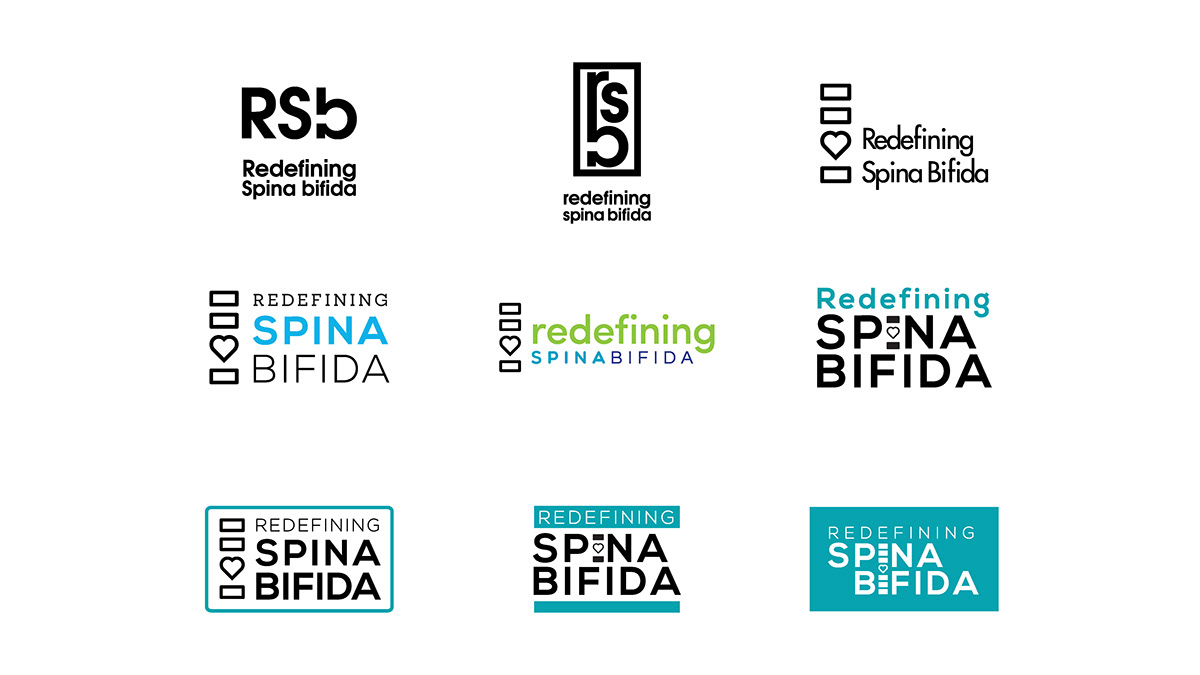
The team began merging the ideas of Izzy, Alonzo, and myself with the next refinement of logos. Izzy primarily explored concepts using the “RSB” as the iconic symbol for the organization and created the first vectorized of the spine and heart logo based off my sketches. I later created several typographical options with different colors. Alonzo merged both ideas together and designed variations for the placement of the heart and spine.
I continued refining Alonzo’s experimentation and created other concepts that played with the placement of the RSB’s words, color palettes, and placement of the icon. Based on Amanda’s feedback, the word “redefining” needed to be more visually important than “spina bifida”, as the entire purpose of her organization is to redefine the meaning of spina bifida. Some colors, such as the pink and green appeared too feminine or eco-friendly, resulting in the neutral appearance of the last logo iteration.

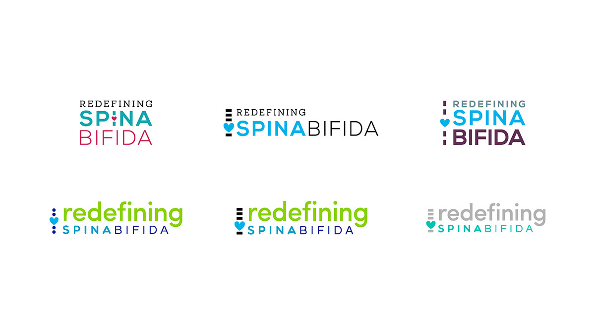
The final logo combined the color palette of teal, yellow, purple, and gray to express the unification in the spina bifida community. The Spina Bifida Association uses a teal blue, while spina bifida awareness colors are represented with yellow.
To avoid confusion within the community, the teal and yellow were tied into RSB’s color palette. The organization also wanted to stay away from overly feminine colors, but needed to express a nurturing and loving aspect which resulted in the incorporation of the purple.
Several color variations of the logo were also created in order to visually integrate the brand colors within backgrounds while retaining a visible logo.

During the initial business cards concepts we designed a range of options including die-cuts, patterns, and bleeds. The die-cut option represents the opening in the spine and how the organization is replacing that gap with nurture and love. By using an open heart in the cards, people are able to see life in the eyes of someone living with spina bifida.
The other business card concepts continued to integrate the spine and heart through patterns the use of patterns as seen on the second concept, but also using different spacing options for the front with the third and fourth concept.

RSB loved the symbolism behind the die-cut business cards, but felt that the rest of the brand’s new color palette wasn’t incorporated enough throughout. The next round of refinements used other colored backgrounds such as the teal, but mostly remained with purple and included addition of teal and yellow colored bars. Right and text alignment for the body copy was also shown in these concepts, helping the RSB’s further narrow down their business cards.

The final business cards include versions for staff and organization use. The staff business cards include the addition of purple icons to the right of the contact information and the Twitter page for RSB. The front of the business card also incorporates every color of the brand’s color palette. The generic organization cards serve as cards that could be handed out during events without being associated to a particular staff member.

During the creation of the stationary, we incorporated similar styles as seen in the business cards, to be create a cohesive brand design for RSB. The contact information was set inside the colors bars, but the line difference between the physical address and online urls formed an unappealing visual distinction.
The second iteration of the letterhead solved the text problem by moving the physical address to the top right and adding the organization’s email alongside its website and social media accounts.
With the final version of the stationary, we reduced the color bar and introduced more white space for better breathing room. A teal heart was placed in between the RSB’s website and social media for separation.
The envelope followed a similar pattern as the business cards and letterhead, with the usage of the tri-colored bar on the edge of the paper. This first version is considered the full brand envelope, which would be the main use for sending out any mail. The second envelope is an in-house friendly, version which is a more budget-friendly design if RSB needs to print their envelopes with their home printer.

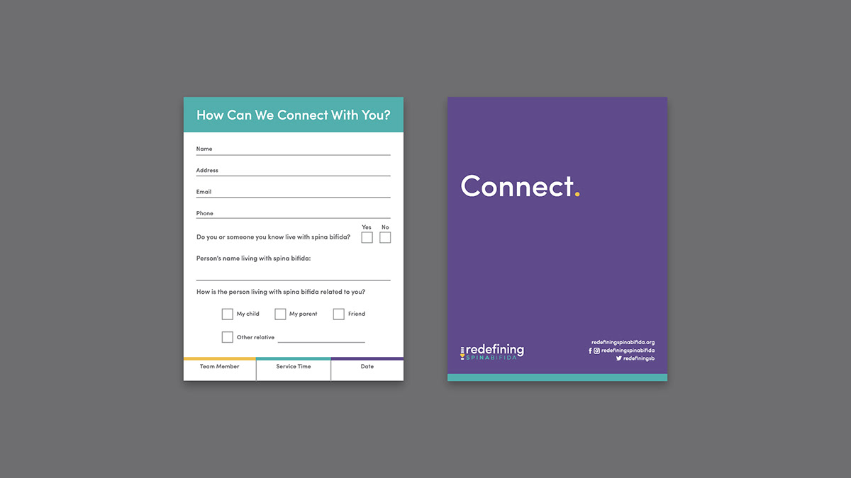
The connect card is one of the pieces created for use at the spina bifida walk event, Walk and Roll. These cards were used for gathering a mailing list within the community and would be filled out by people during the event.
The main goals were for a simple way for people to express who in their lives had spina bifida, whether it was themselves, family members, or friends. With this information RSB would later send emails related to the community.
The front and back of the card continued the similar design of the business card, with the white front and purple back.


Redefining Spina Bifida’s T-shirts include a longer version of the logo on the backs. The placement of the spine purposely aligns with the spine of people wearing the shirt, while the heart represents where the majority of the gaps are for people living with spina bifida.
The other shirt and onesie designs include “I am” before the organization logo, to show how the spina bifida community itself is redefining what it means to live with spina bifida.

The imagery of superheroes is seen throughout many awareness organizations including the Spina Bifida Association. RSB-branded capes were designed for young children attending the Walk and Roll with their families.
To reduce the costs per screen printed design, the team stuck with an all white version of the logo for use on the yellow, teal, and purple capes.

After creating different pieces of collateral and designs for RSB, there was a concern about integrating the “human” part of the organization. Amanda, the founder of RSB, posts many of her photographs onto the organization’s Facebook page. She selected the images that best represented the different age range and diversity of people living with spina bifida. Those images were then used as yard signs for the Walk and Roll, with the organization’s logo and colors on the backside.
Additional celebratory and friendly messaging was included for the Walk and Roll yard signs such as RSB’s goal of 15,000 Facebook followers.

Banners created to hang on RSB's tent at the Walk and Roll and our team member, Alonzo, hanging them at the event.

The printed yard signs in use along the sidewalk in front of RSB's space.

Both RSB spots showing the "Get Involved", "Stories", and "Merch" sections. At the "Get Involved" area, individuals sign up for the mailing list or for volunteering. The "Stories" area includes paper hearts and makers for people to write their story or of a loved one living with spina bifida. The hearts or photographs taken at the event would then be hung on the lines joining both tents. The final "Merch" section provided stickers, shirts, and capes for people to purchase.

Printed yard sign celebrating 15,000 followers on RSB's Facebook page.

The printed connect cards, business cards, and mailing list sign on the event table.

Stickers and business cards at the "Get Involved" section.

Close up of the merchandise, including shirts, capes, and stickers.
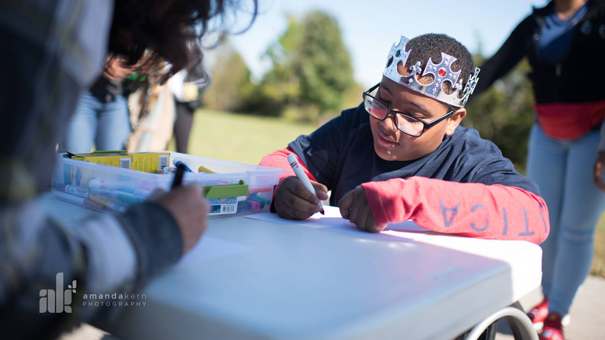
People writing their stories before hanging it on the lines.

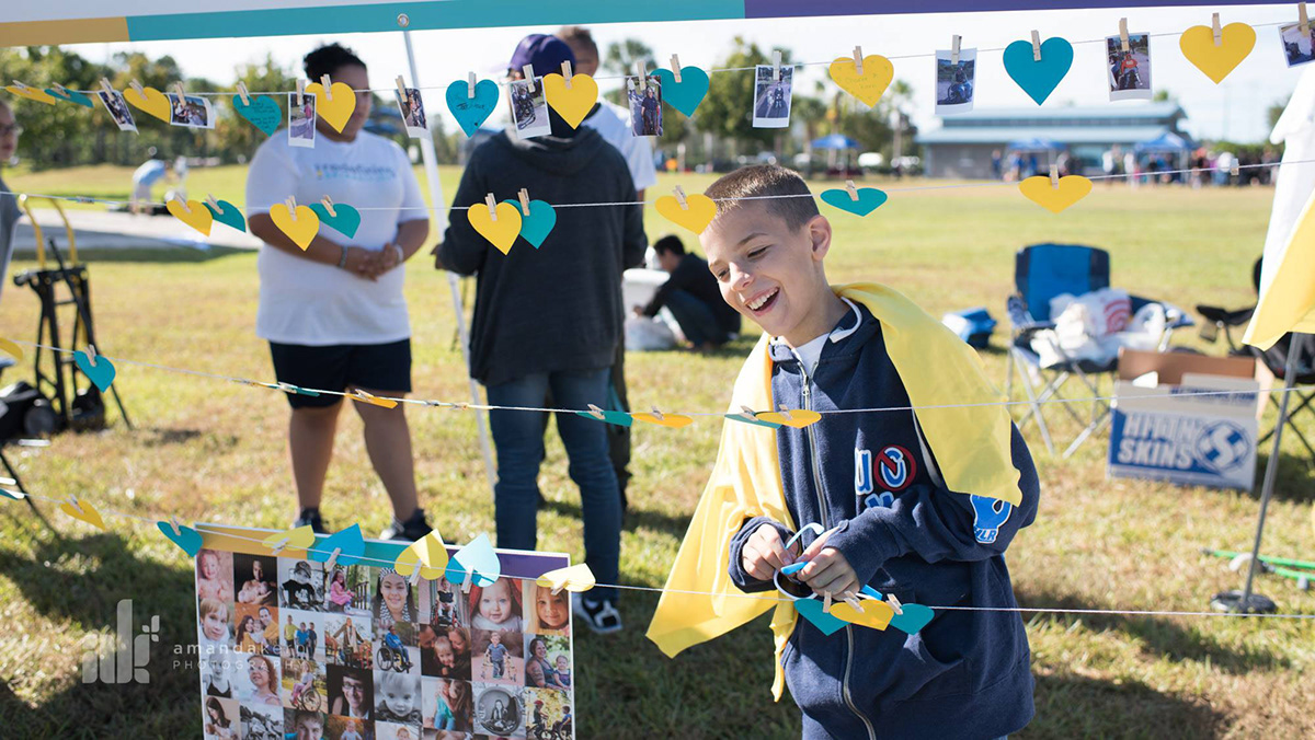
Hanging the stories and photographs.

All of the stories and photographs added onto the line.

Close up of stories and photos.
All event photography courtesy of RSB founder, Amanda Kern.


