Your Humble Narrator needed to design a wine label in the spirit of
Clockwork Orange.
Clockwork Orange.
After designing a wine label for Naked Wines, I was approached by a student of wine studies in Australia to design a label for their wine.
They live in a region called Orange and the wine has been produced in their garage... so Orange Mécanique is a pretty appropriate name really.
Clockwork Orange obviously had to be the inspiration for the design so that's where I went with it.
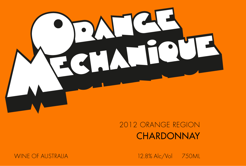
One (unused) idea for the label using the Clockwork Orange font. And yes, it is spelt incorrectly!
I started with using the Clockwork Orange font. There were a few variations of those but I really wanted to go with something more modern.
Stanley Kubrick (director of A Clockwork Orange) was obsessed with the font, Futura, so that was the starting point for the final design.
I don't know the history of the design work for Clockwork Orange but one several iterations it features the stylised clockwork eye. I wanted to incorporate this into the wine label so I made a bunch of grapes with the clockwork one at the bottom.
The accent on the 'e' of Mécanique was repeated to become the stem for the grapes and the surrounding text was tracked to give it a very open, white space (well, orange space) feel.
Stanley Kubrick (director of Clockwork Orange) was obsessed with the font, Futura, so that was the starting point for the design. I knew I'd have all the text in Futura so I then focused on the label's main graphical element.
I started with using the Clockwork Orange font. There were a few variations of those but I they didn't really do it for me so I wanted to go with something more modern.
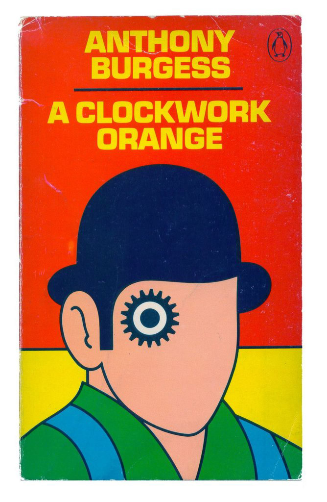
A book cover. Not by me, obviously.
I don't know the history of the design work for Clockwork Orange but several iterations feature the stylised clockwork eye. I wanted to incorporate this into the wine label as it's such a powerful and easily recognisable design element.
I then made a bunch of grapes in the same style with the clockwork one at the bottom.
The accent on the 'e' of Mécanique was repeated to become the stem for the grapes and the surrounding text was tracked to give it a very open, white space (well, orange space) feel.
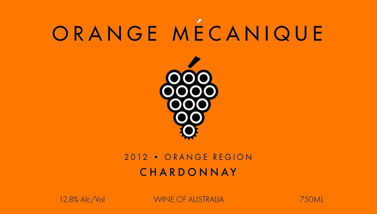
The final design (technical information about sulphites etc. cropped)
I think the end result is quite classy, relatively understated but obviously inspired by Clockwork Orange.
Sadly I've not tasted the wine yet but hope to one of these days; I just hope the label does it justice!

