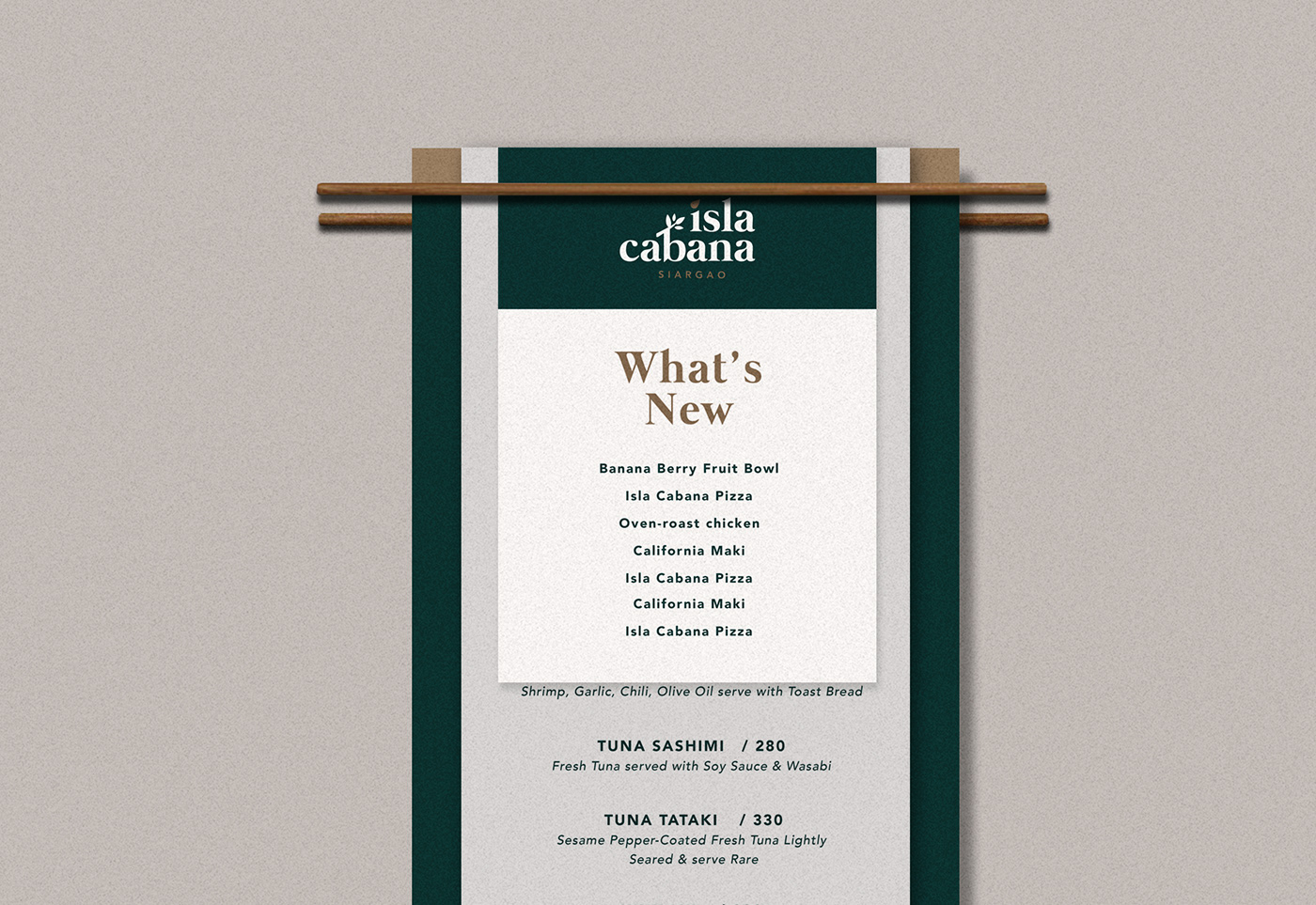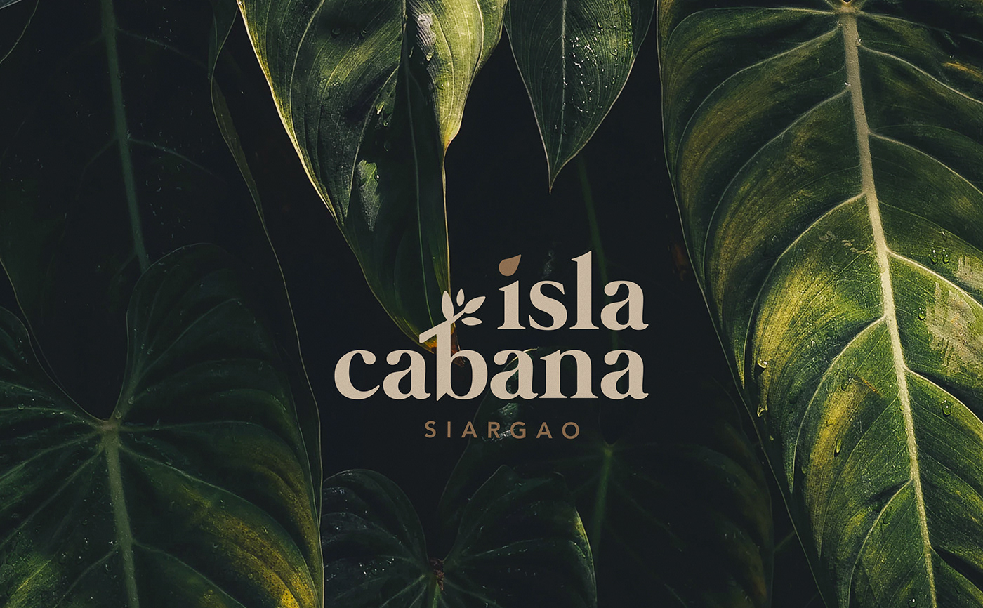
Raw meets refined.
Inspired by the trees, sand, beach and the island itself, the blissful
vibe of Siargao is incorporated to the brand's overall identity. The
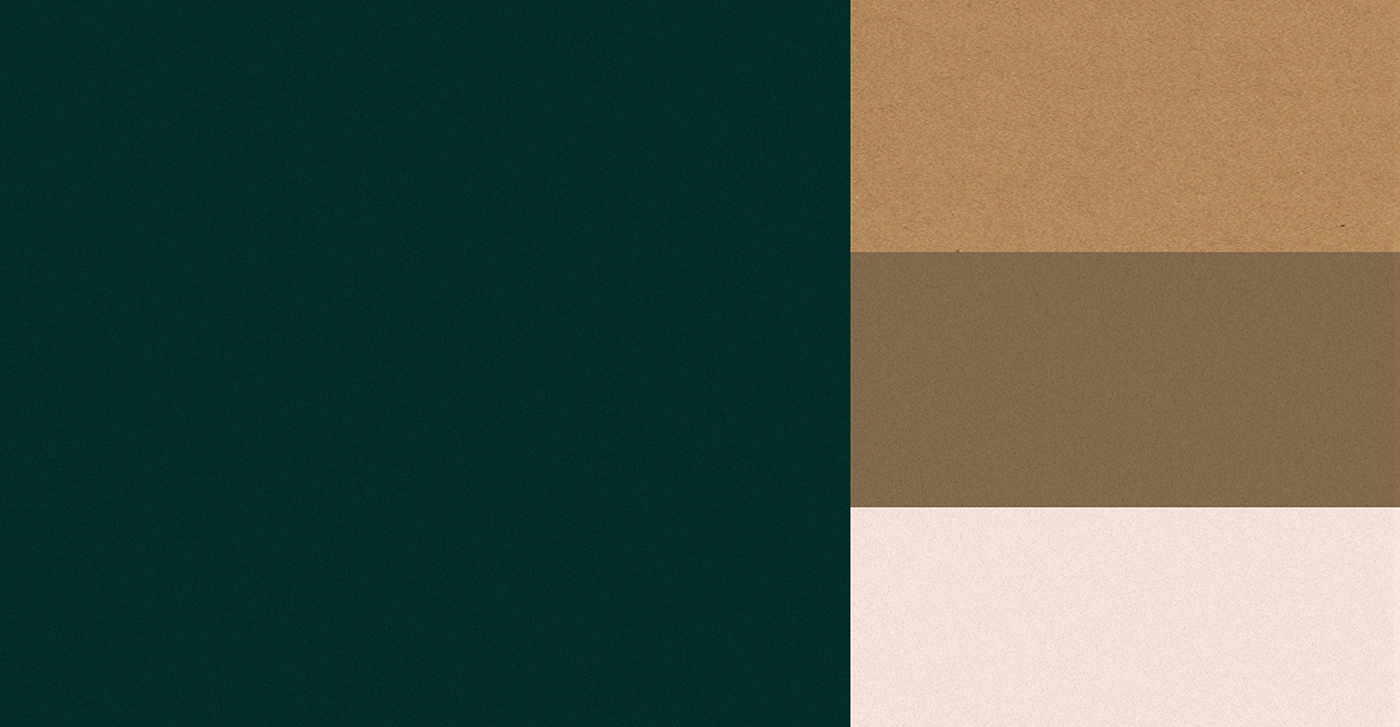
warm and earthy tones that can be seen throughout the tourist spot
are kept while mangrove leaves (from the mangrove trees that capped
the place) and the teardrop-shaped island served as the integral parts of
the logo. Each curve of the letter was also modified to mimic the huge
waves of the beach that made Siargao the surfing capital of the country.
-
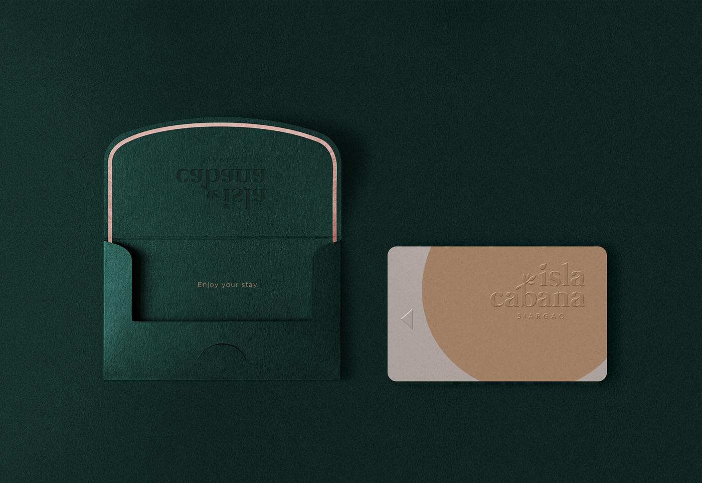
Recycled papers were used as the packaging material to support
Siargao's campaign for reducing wastes.
Objective
To design a full authentic Siargao experience in a luxury
Tropical Hotel setting that is relaxed and clean with
sustainable initiatives, suited for both the upper local
and international market.