

Travel Hard. Party Harder!
When the No Thepla team approached us to redesign their identity we were happy to take on a project with like minded people. Their pre-existing identity had a “cute” look to it that didn't communicate their edginess and the nature of their trips. We strategized their positioning and decided to embrace their “travel hard, party harder” attitude. This ensured they stayed true to their instinct and carved out a niche for themselves in a relatively saturated travel market.


Colour Palette


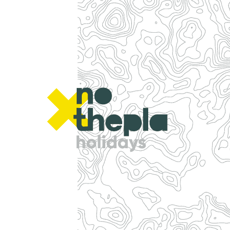
Logo - Before and After


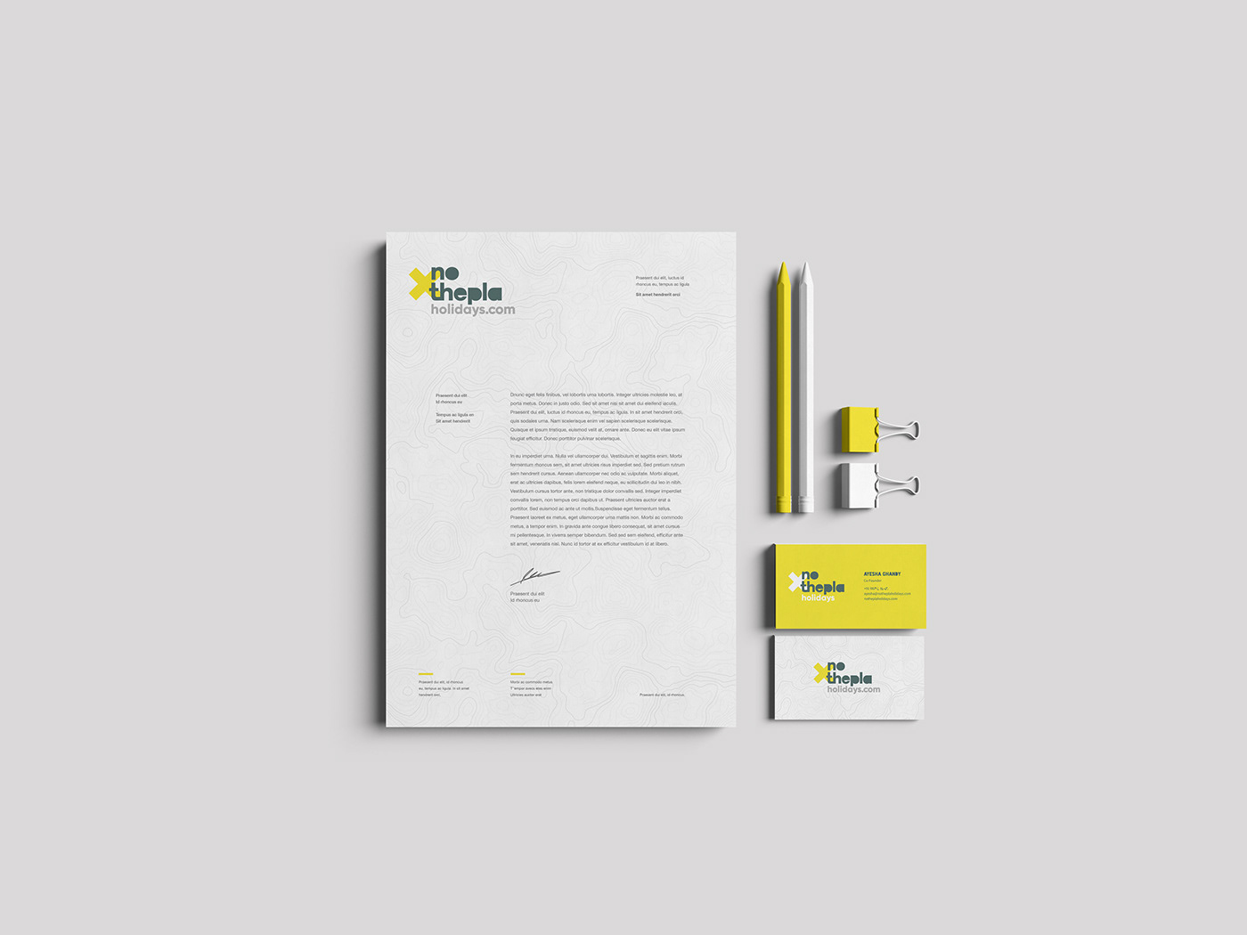
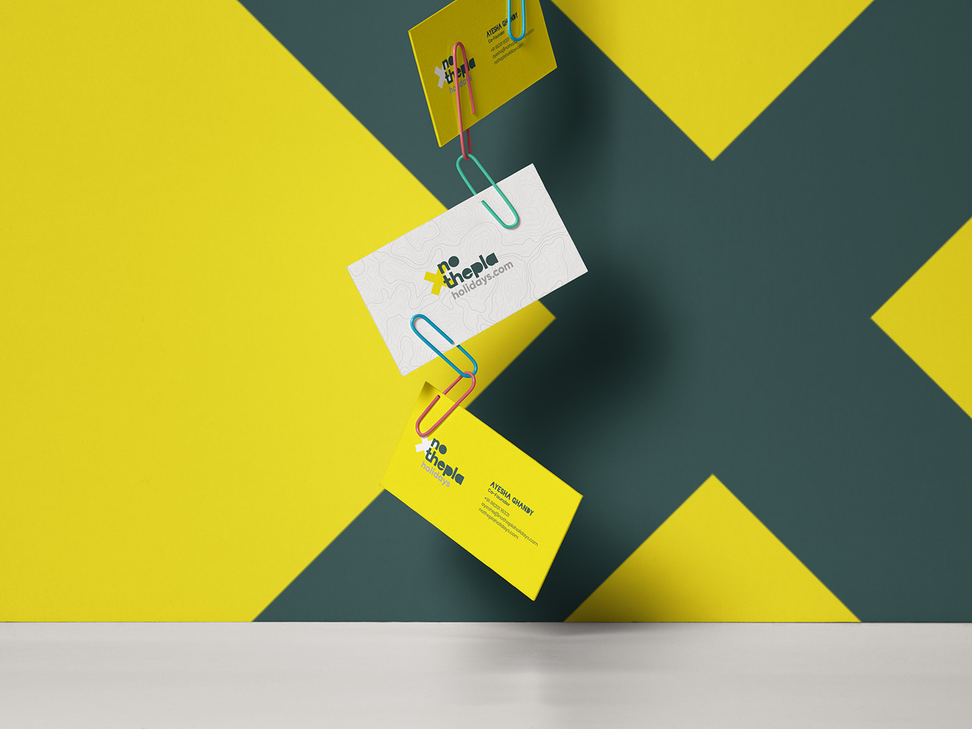
Stationery

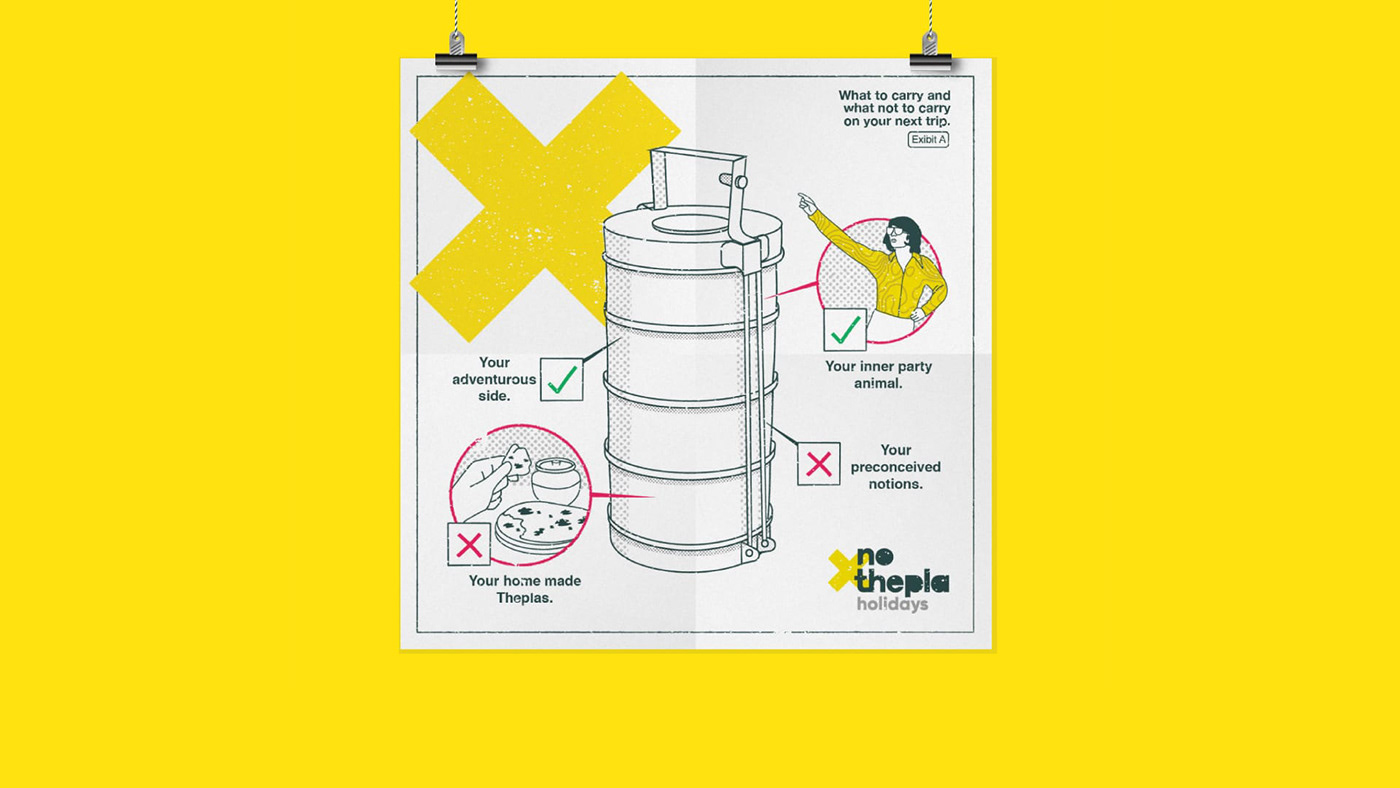
Say it the way it is
We created a unique style for all of No Thepla’s Trip creatives. A combination of vector illustrations paired with some imagery helped communicate the idea behind each trip. Prospective clients knew exactly what they could expect without having to look at overused stock imagery.
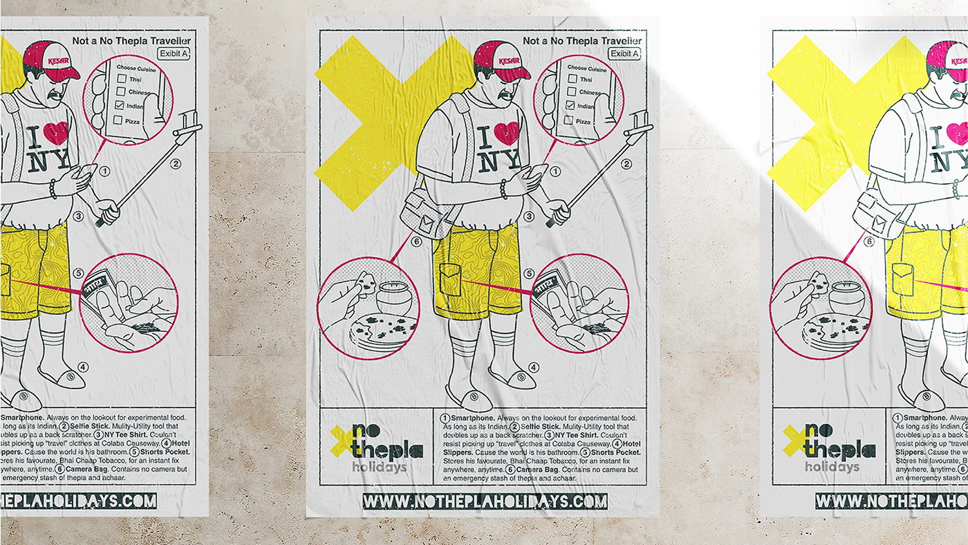
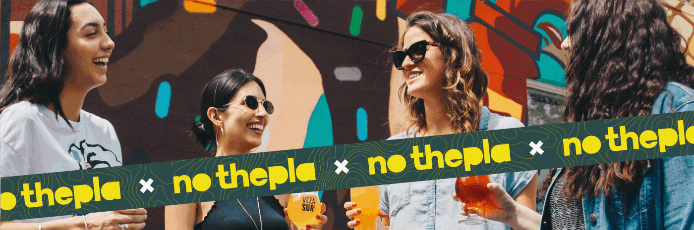
In Addition to trip creatives we created a few engagement creatives for them that their patrons could share on social media. The aim of these engagement creatives was to reach out to travellers whose idea of travel aligned with that of No Thepla.
In Addition to trip creatives we created a few engagement creatives for them that their patrons could share on social media. The aim of these engagement creatives was to reach out to travellers whose idea of travel aligned with that of No Thepla.


No Thepla Holidays was set up by people who are in love with the idea of “taking a break”. Having traversed the globe themselves they figured that starting a travel company would be a sure shot way for them to do what they loved most – Travel.
Client: No Thepla Holidays
Services: Brand Identity, Design for Social Media
Year: 2018


