HIVE ORGANIC HONEY
Nature is Beautiful
My client is a mobile app developer — a tech driven, honey eating, nature enthusiast — and it goes without saying that this well established family business will not remain limited to brick and mortar shoppers — so I prepared in advance.
To jump start my thinking I placed myself in Pooh Bear’s shoes for just a minute or two and… thought… well, Pooh would not care now would he? Honey is honey. But actually he would! Plastic bottles and tacky labels would be a sure sign that the sweet temptation would end up being a bittersweet experience. Appealing to the organic Pooh, yes, he would require the authentic, the beauty of handmade, and the elaborate story it all told.
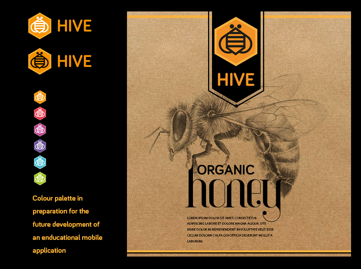
It was decided to use glass bottles, natural paper, limited ink and hand drawn sketches. Blow the budget!
Below I show the reference material that inspired me along the journey. It was a quick journey and a welcome trip down memory lane, thanks to Pooh.
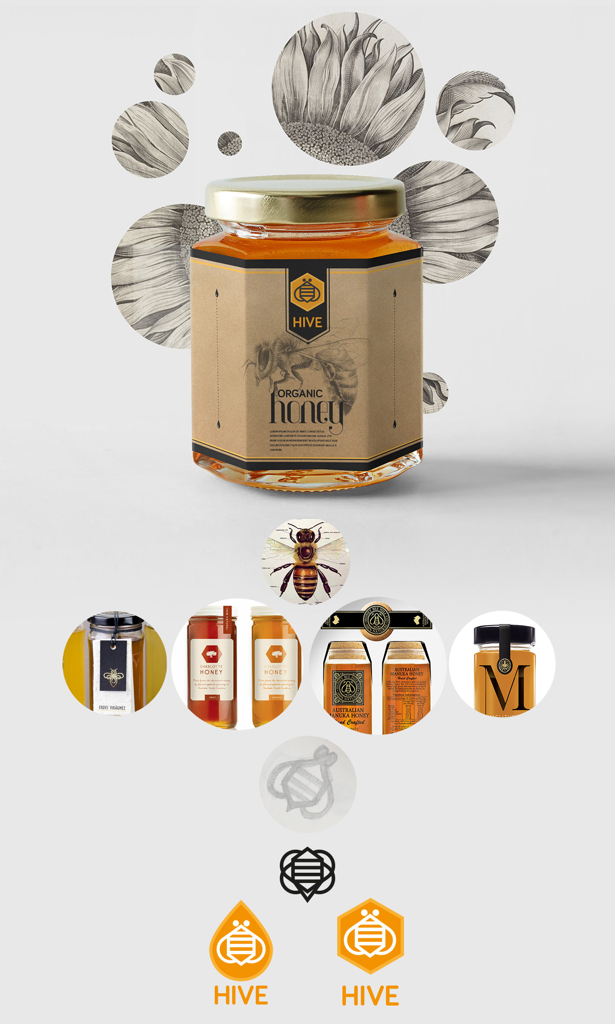
With print being the primary rollout, I selected a sticky sweet (and dripping) font for the "honey" label. I paired this with the beautifully rounded, well proportioned and smooth san serif, Bariol, that would work just fine on digital.
Keeping the prospective mobile app and website in mind, I designed a pixel perfect mark / icon that would work across all media. I included a flowery sweet colour palette that would later be used for instructional purposes.
Scientifically correct, technically perfect and naturally beautiful.