
Mission
Develop a modern logo, corporate identity for a cafe that combines several components — a coffee shop, shop and workshop in one location.
Solution
The company Bananas has been on the market for more than 12 years and all this time has been selling equipment and clothing for extreme sports.
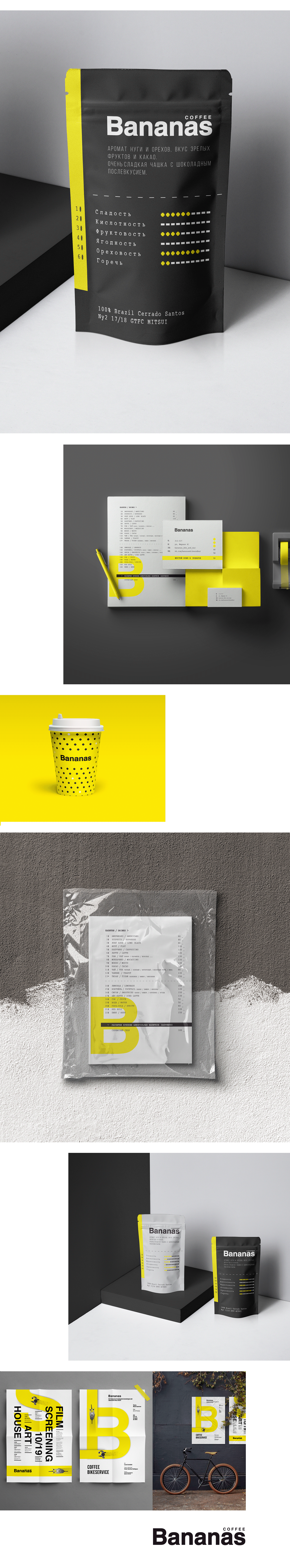
Today, Bananas differentiation is a company that combines several components — a coffee shop, shop and workshop in one location.
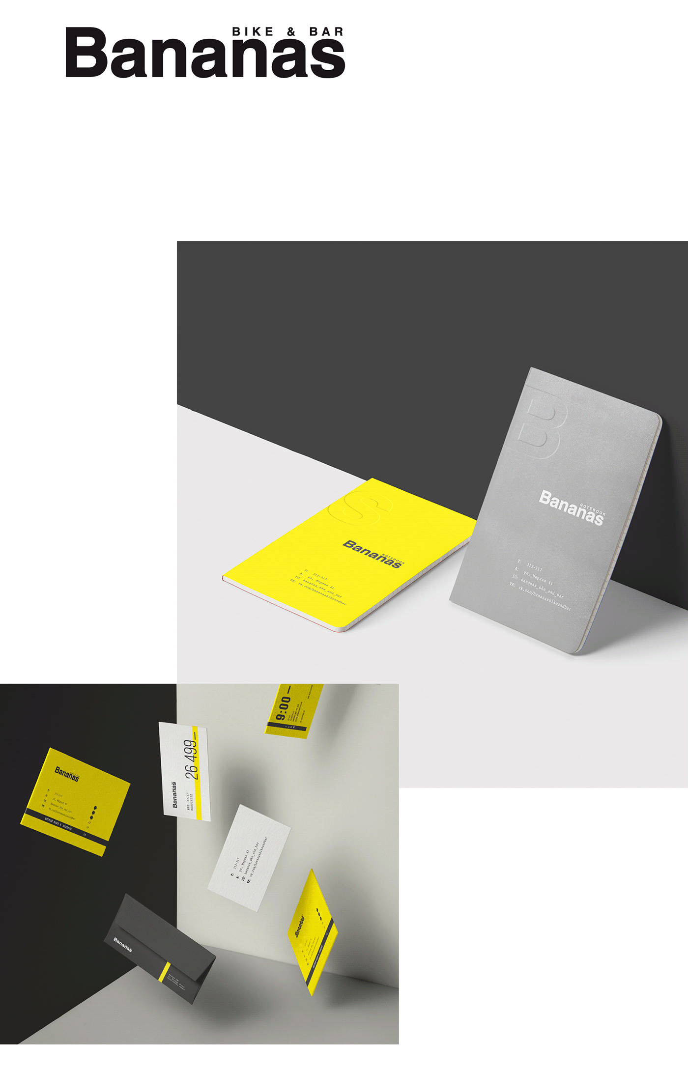
The customer did not want to move away from the naming of "Bananas", because it was from the very beginning of the company's existence and has established itself in the market as a recognizable and high-quality brand of the store. We agreed that the name is well read, well perceived "by ear" and corresponds to the ideas formed in the minds of people. The logo is readable and concise, which makes it easy to portray it on almost all media.
——
Задача
Разработать современный логотип, фирменный стиль для кафе, которая совмещает в себе несколько составляющих — это кофейня, магазин и мастерская в одной локации.
РЕШЕНИЕ
Компания Bananas на рынке уже более 12 лет и все это время занималась продажей техники и одежды для экстремальных видов спорта.
Сегодня Bananas дифференциация компания, которая совмещает в себе несколько составляющих — это кофейня, магазин и мастерская в одной локации.
Заказчик не хотел отходить от нейминга «Bananas», т.к. он был с самого начала существования компании и зарекомендовал себе на рынке как узнаваемый и качественный бренд магазина. Мы согласились, название хорошо читается, хорошо восприниматься «на слух» и соответствует представлениям, сложившимся в голове людей. Логотип читабельный и лаконичный, что позволяет с легкостью изобразить его практически на всех носителях.
Positioning concept
A clear positioning strategy has been developed. Created a simple and clear identity representing vertical and horizontal graphic elements that resemble the road, which symbolizes movement, the way forward. It is easy to read and does not overload the institution and corporate identity holders.
——
Концепция позиционирования
Разработана четкая стратегия позиционирования. Создана простая и понятная айдентика представляющая собой вертикальные и горизонтальные графические элементы напоминающие дорогу, которая символизирует движение, путь вперед. Она легко читается и не перегружает заведение и носителей фирменного стиля.
Thanks For Watching
CREATORS:
layout → www.archigroup.ru
creative and art directors → vitaly razinkov
creative and art directors → vitaly razinkov
designers → vitaly razinkov, irina milenina
FOLLOW US ON:
designed by archigroup © 2017
all rights reserved


