

For my senior capstone project before getting my Bachelor's of Fine Arts - Graphic Design at Lake Erie College, I chose to rebrand Aroma Espresso Bar Israel. My goal for my project was to take the existing branding and update it and help the branding feel like a coffee shop. The existing logo and branding consists of the colors black, red and white. If you don't know how to read Hebrew, it is possible that you may not be able to tell what kind of store the store is. In my effort to make it feel more like a coffee shop, I got rid of the black and used different shades of brown. I also wanted to add the coffee cup as part of the logo.
A significant part of the Aroma Espresso Bar experience, is that with every coffee you order, hot or iced, you get a small piece of chocolate wrapped in a label with the Aroma Espresso Bar logo on it. I wanted to keep with that tradition, so I designed the new label as well as new mugs, to-go cups and the baristas uniforms. Aroma Espresso Bar also offers delivery, so I felt it was important that there was a branded delivery vehicle. In Israel, many of the delivery vehicles you see are cars instead of trucks because they are smaller and easier to get around in. Another thing that I felt was important to show poster announcing new flavors that could hang in the store to show the new flavors that are available. In addition, because of the rebrand, Instagram posts would need to be redone with the new branding and feel, so I created a set of three ads also announcing the new flavors.
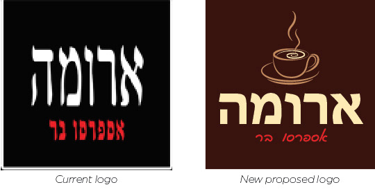
This is the current Aroma Espresso Bar logo and the new logo that I created as a proposed logo that they could use if they wanted to update.


These are all pieces of merchandise that I designed.

This is a car I designed as a delivery car.

This is a poster to be displayed in the store, announcing the new flavors.
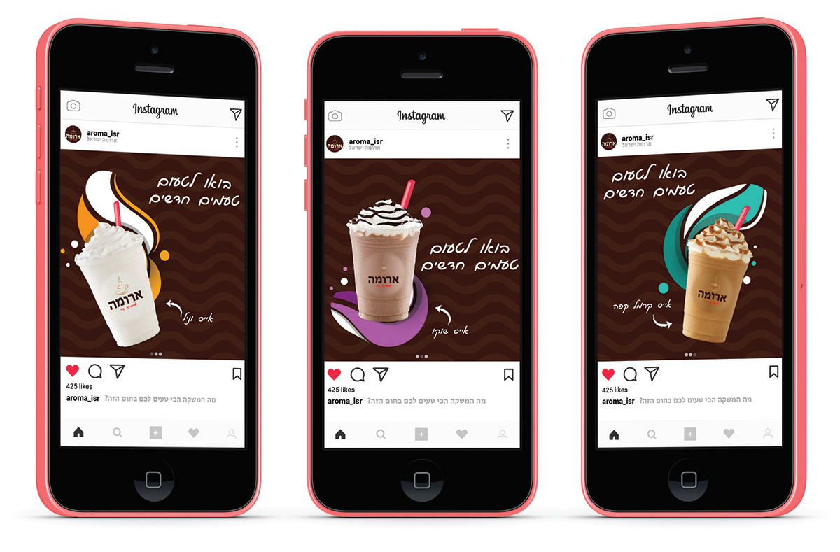
This is a sample series of Instagram ads announcing the new flavors.
Thank you for stopping by!
Like what you see and are interested in seeing more?
Check out:
&
Interested in working with me? Please reach out @ efgraphicinnov@gmail.com


