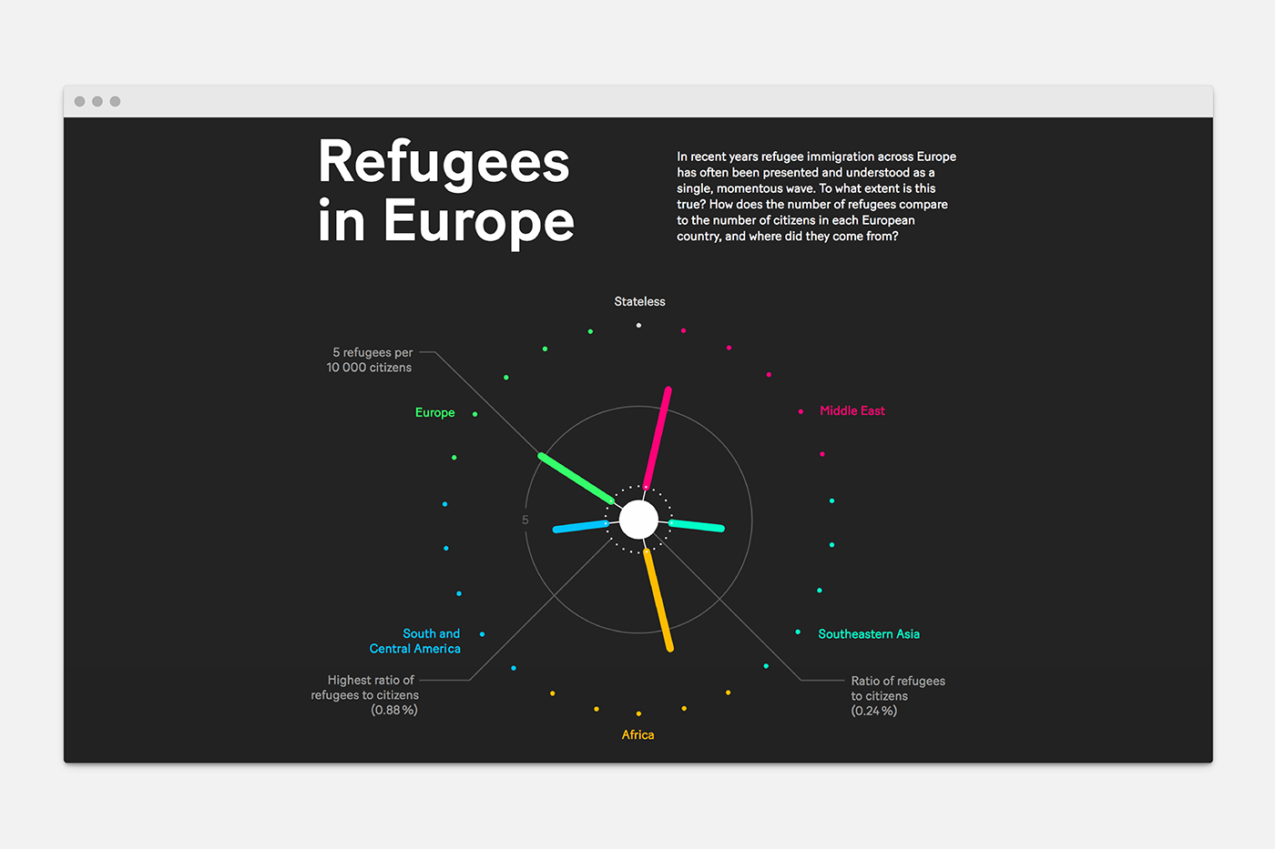
Refugees in Europe
Self-initiated, 2018
In recent years refugee immigration across Europe has often been presented and understood as a single, momentous wave. To what extent is this true? How does the number of refugees compare to the number of citizens in each European country, and where did they come from?
In a self-initiated project, Superdot design intern Laura Gyr developed an abstract, factual data story out of a concrete, emotional topic in order to provoke differentiated discussion and new reflections on the ongoing crisis.
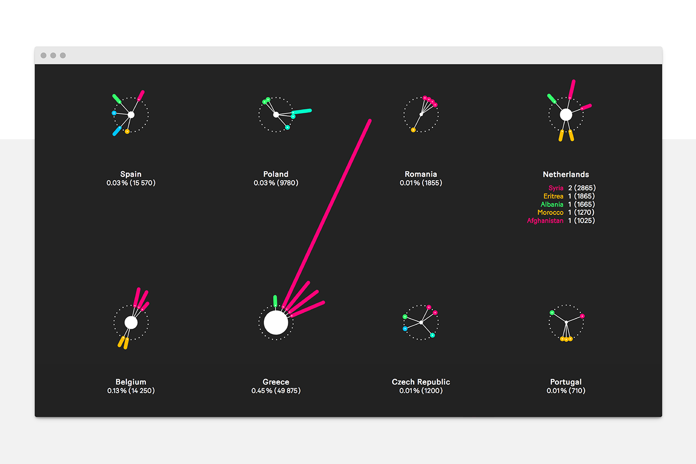
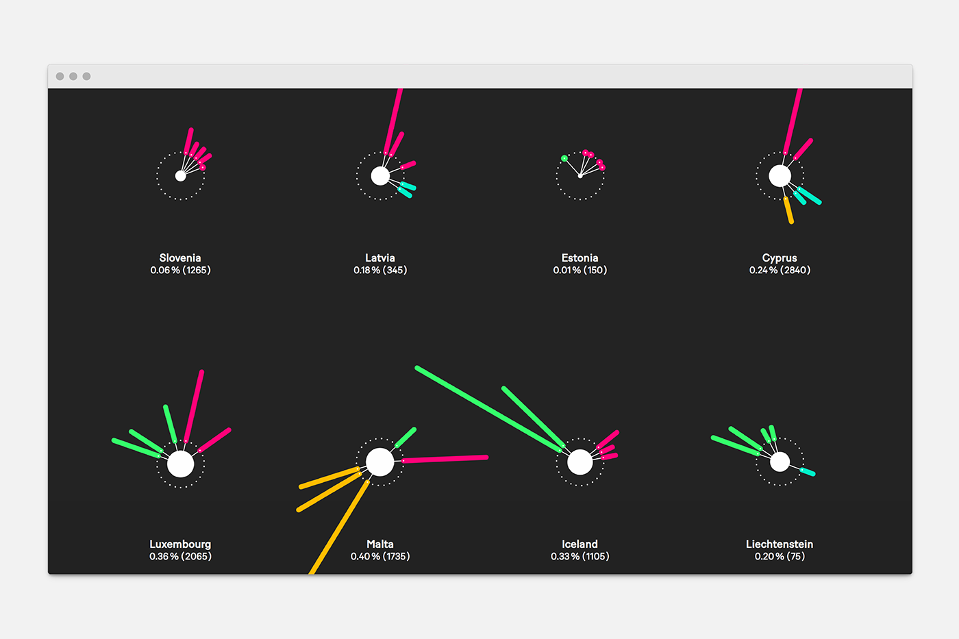
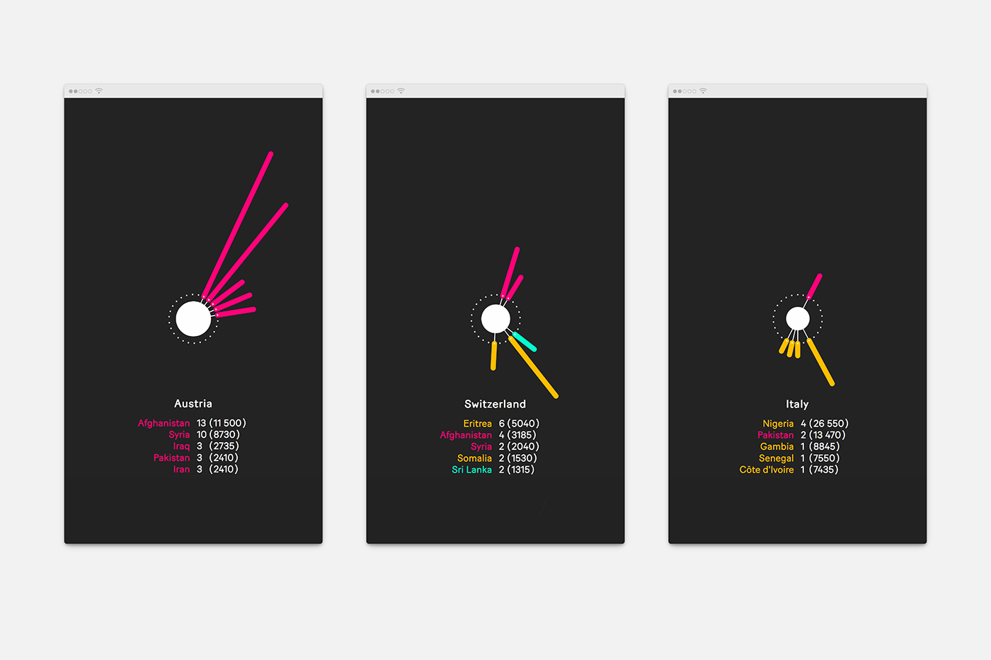
Each diagram shows the total number of people seeking asylum (inner circle) in proportion to a given country's population. This can be compared to the highest proportion of refugees at 0.88% (dotted circle). The number of refugees per 10,000 citizens (beam length) by their country of origin (colour) is also shown.
Among other detailed insights, one can immediately and intuitively see that the story of refugees varies greatly across Europe both in terms of origin and proportion.