The brand: Before launching its products on the market, a new eco-friendly tea manufacturer, specializing in the health tea drinks, approached us to create a brand naming and determine its corporate identity. Tea company sourced its teas from the most natural and ecologically clean regions of Armenia, so naming and visual identity had to reflect the naturalness, beneficence and restorative features of tea drinks of the brand.
The project: Maeutica’s creative team invented «Darman» as naming for the brand, which is translated from the old-Armenian as “cure” or “medicine”. Creating the visual concept, we were inspired by the idea of 100% natural herbs and plants, untouched by anything artificial, herbs created by nature and nurtured by the sun, water, earth and stones.
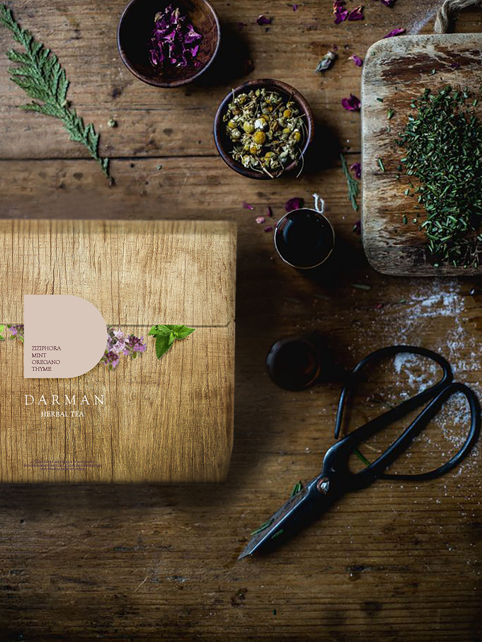
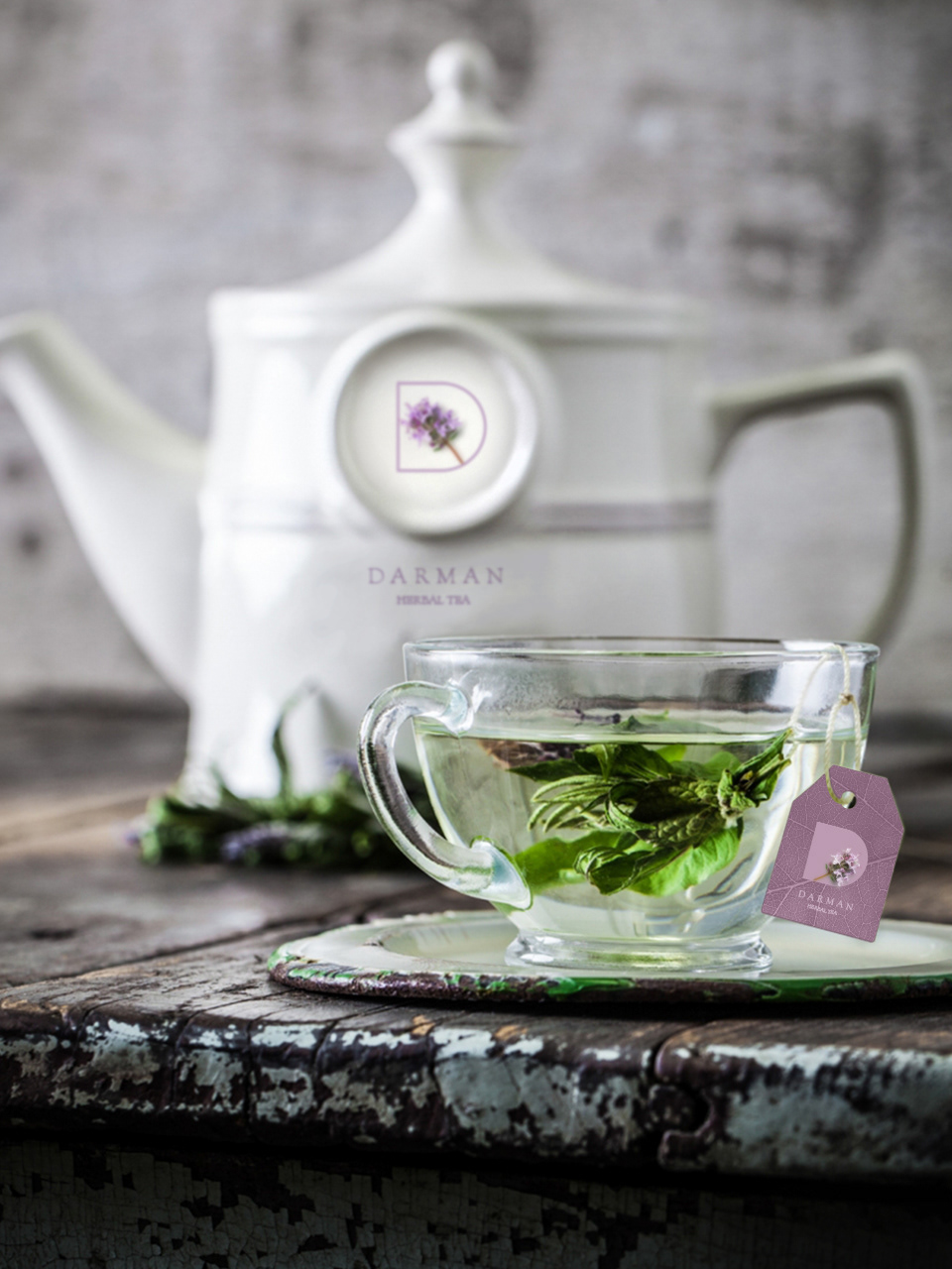
As a result, we developed a corporate identity, packaging and logo that reflect the theme of naturalness. We rejected the idea of the standard design of the logo, leaving it to “the discretion of the nature»: a D-shaped window in the bag with the tea drink to be filled with flowers and leaves of herbs and plants it contains. And the design of the packaging box displays the shapes of the rocks and texture of leaves, so even the packaging becomes a part of nature.
As a result, we developed a corporate identity, packaging and logo that reflect the theme of naturalness. We rejected the idea of the standard design of the logo, leaving it to “the discretion of the nature»: a D-shaped window in the bag with the tea drink to be filled with flowers and leaves of herbs and plants it contains. And the design of the packaging box displays the shapes of the rocks and texture of leaves, so even the packaging becomes a part of nature.
Client: Darman
Naming: Marina Ghazaryan
Design Concept: Anna Margaryan, Astghik Margaryan, Hovhannes Papoyan
Naming: Marina Ghazaryan
Design Concept: Anna Margaryan, Astghik Margaryan, Hovhannes Papoyan
Storytelling: Nika Yepiskoposyan
Project Director: Marina Ghazaryan
Service: brand visual concept, brand mascot, corporate style, business documentation design and communication materials design.