More Than a Pipe Dream
Plumbing Perfectionists Inc. was built on the sterling reputations and superior skills of its partners, Nathan Simpson and James Ryen. Their new partnership centered around the conviction to do every job right the first time and do them on time. They needed a brand that reflected this insistence on perfection.

A Logo That Fits
Their ability to live up to this high standard depended on three qualities: Personal Integrity, friendly customer service, and a dedication to always improve craft. These three qualities are the pillars that support everything they do.
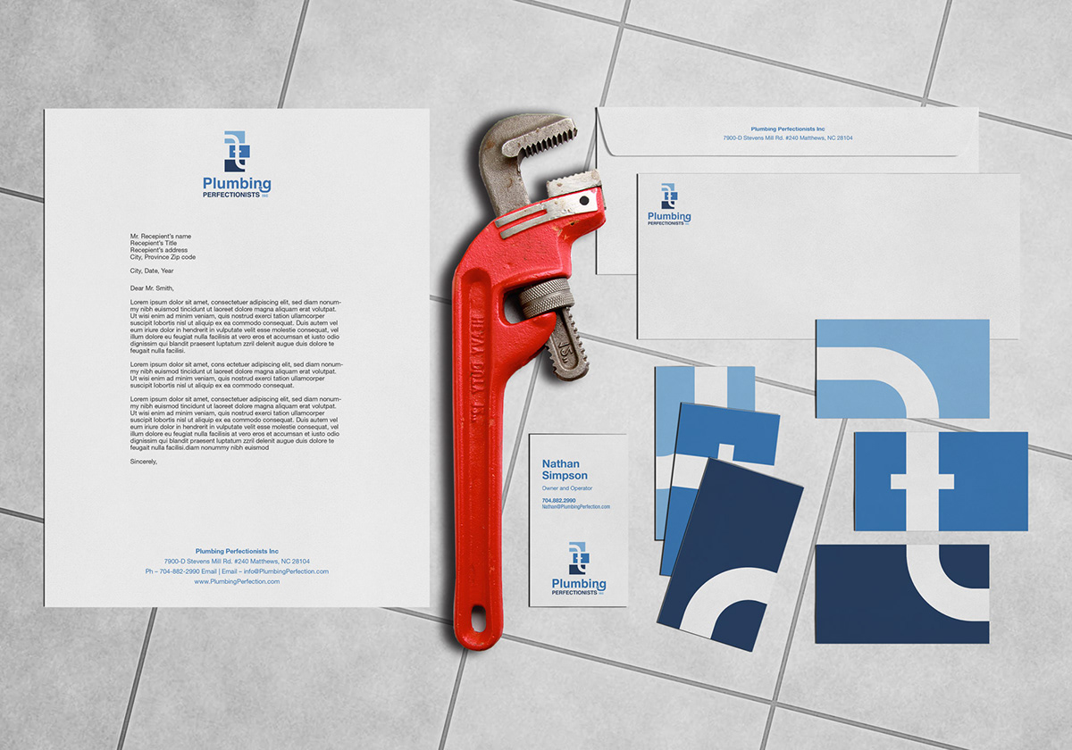
These pillars are represented in the three tiles that make up the logo. To reinforce the idea of excellence, these tiles are measured to the golden ratio. The width of the negative space that illustrates the pipeline is also a golden ratio proportion to each tile. Together these tiles combine to create the perfect flow.
For a brand that represents perfection and professionalism, Helvetica Neue was the obvious choice.


Letting the Brand Flow
Using strict grid systems, this identity transitioned nicely into stationery, and vehicle graphics. Using the mark as a modular system, however injects some playfulness into the brand reflecting the companies personable nature. Printing each tile as a different back to the business cards encouraging people to line up the shapes and creates a memorable experience. This same modularity is also used to create the mosaic motif that gives the van some personality.