


A Scoop on Excitel
Excitel is an internet service brand headquartered in the National Capital Region (NCR) of India. It was established in 2016 by a bunch of high-spirited dreamers with a penchant for technology.
Excitel currently operates in NCR and Hyderabad, bringing consistently high performance internet services built on European technology for limitless home entertainment, to the cities’ digital natives.
Excitel serves its vast and ever-growing family of over 2 lac subscribers (as of mid-2018) with strong support from its regional business & technology partners.
With the growing faith and confidence of youngsters in its services, the leaders envision to expand Excitel’s frontiers to other tier 1 and tier 2 cities of India over the next five years.
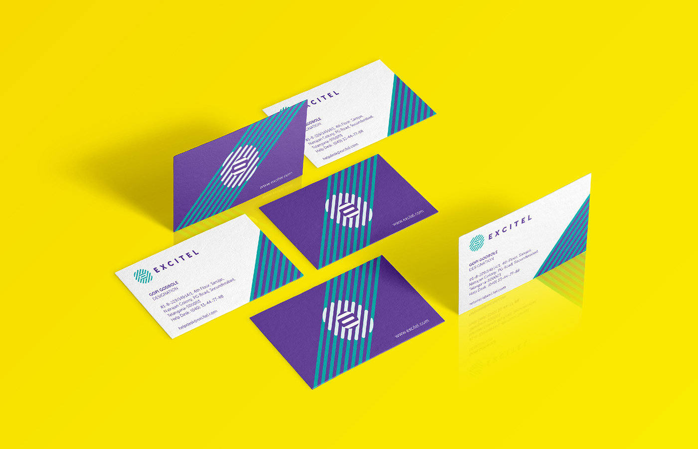
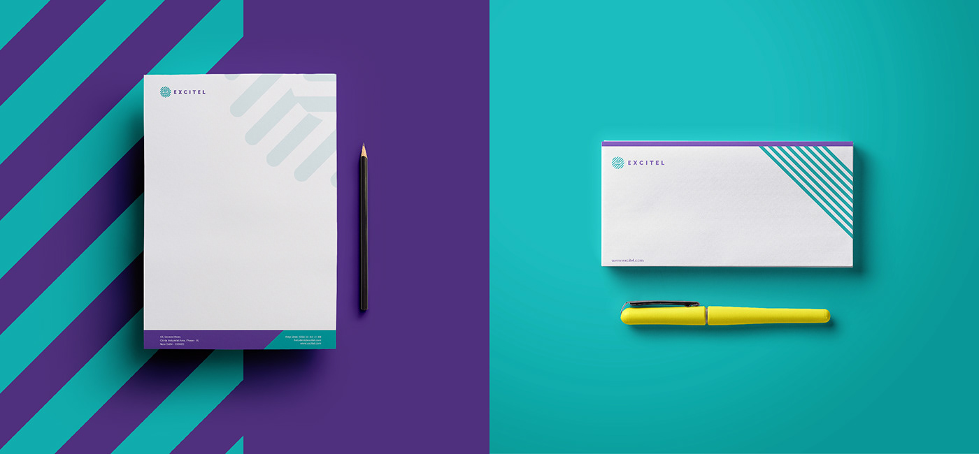
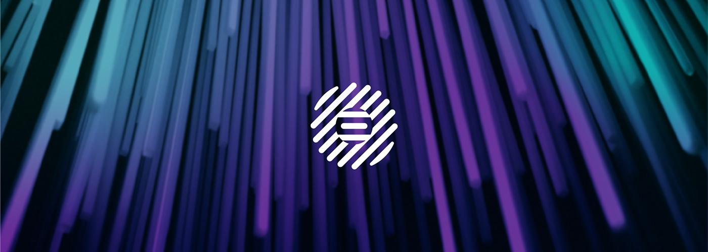
Visual Identity
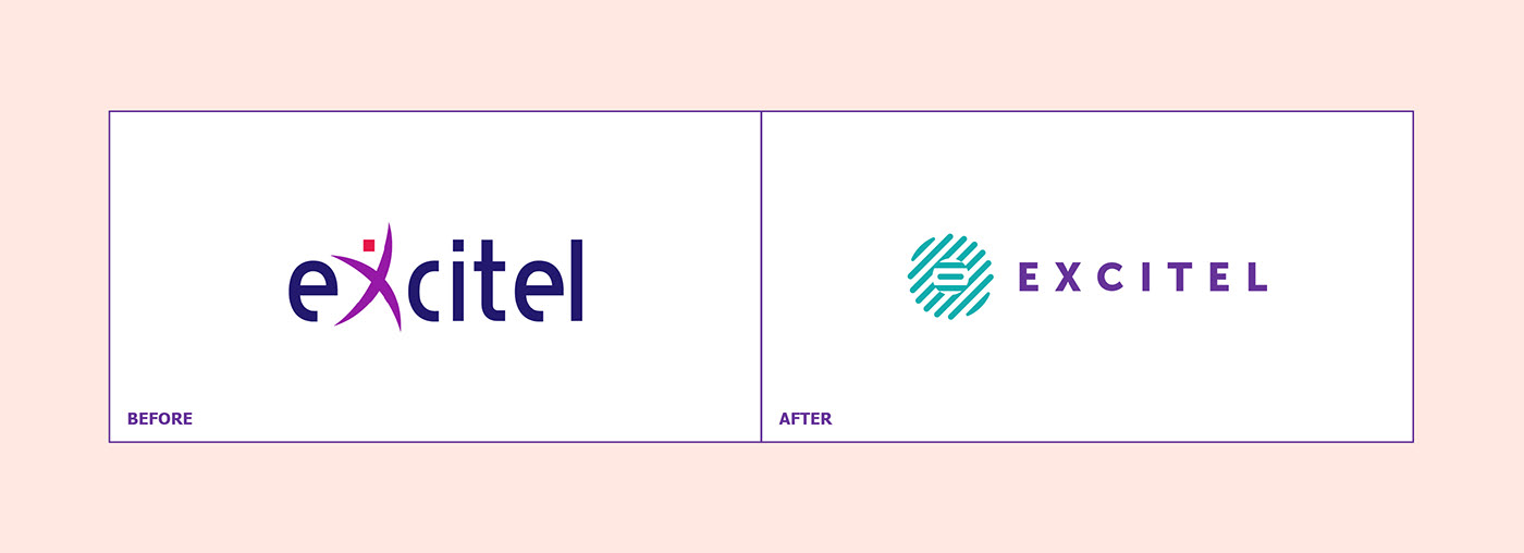
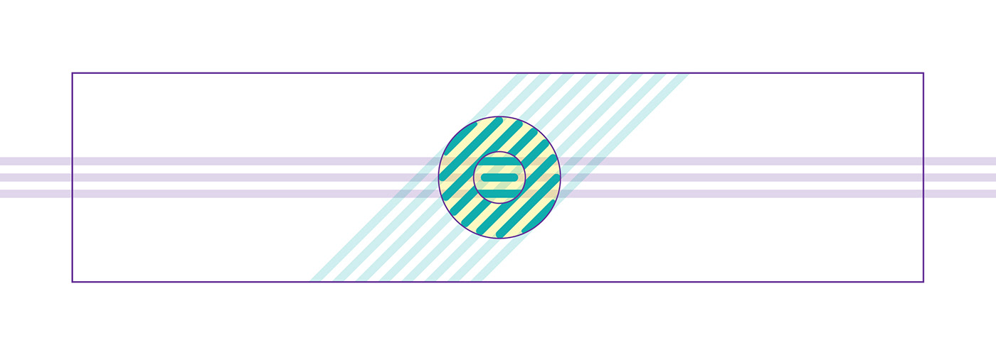
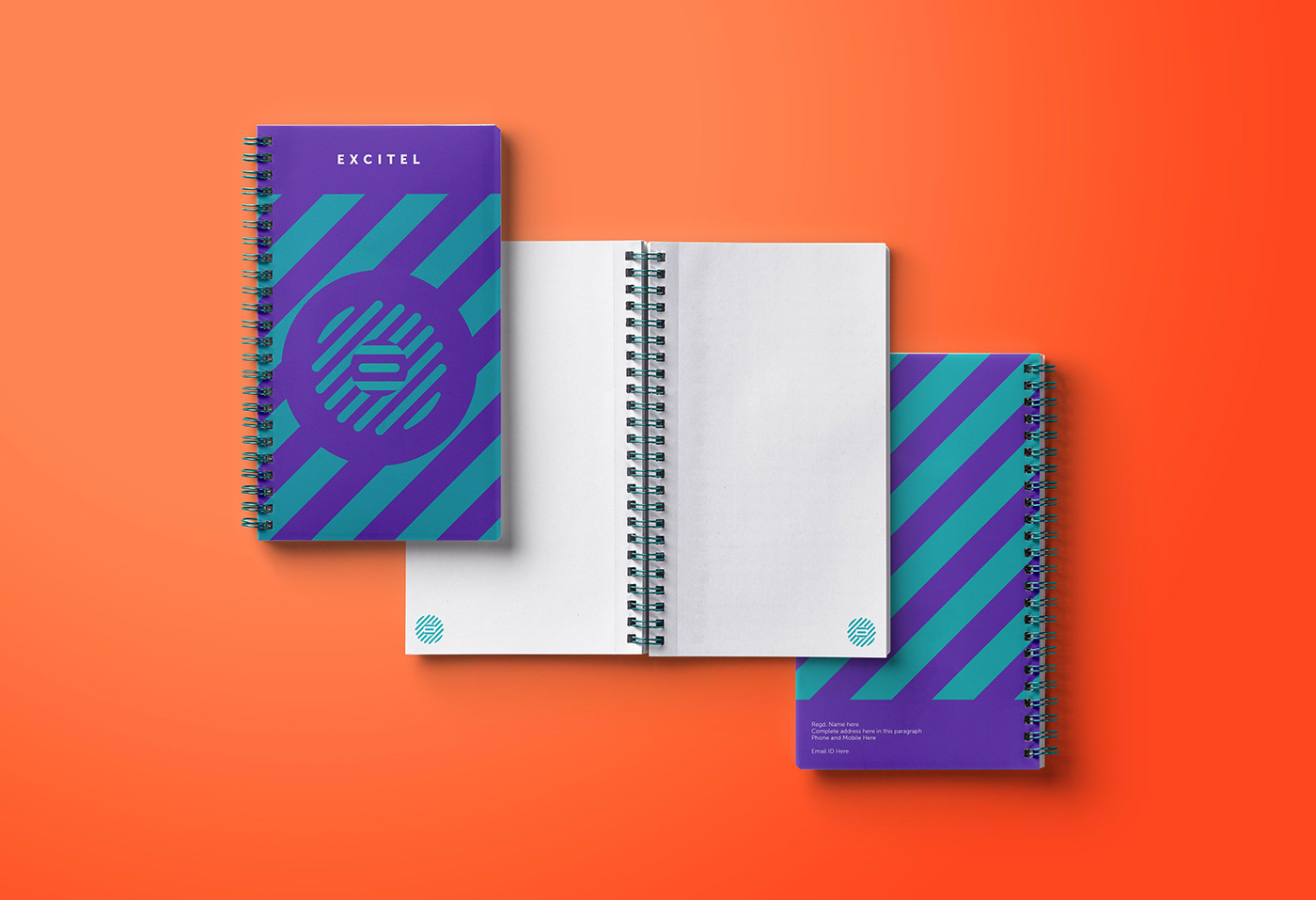
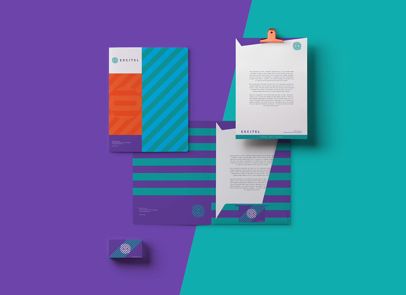
Excitel’s visual identity system lays down the foundation for its visual communication. The new logo consists of four elements.

The first is the brand’s initial i.e. ‘E’ which can be seen in the middle of the mnemonic symbol, establishing the shape as a core. The second and third elements are represented through the circle surrounding the core. This is emblematic of the internet generation as well as Excitel’s fibernet cables, from the front and the side. The last element, the infinity symbol, symbolises Excitel’s endless obsession with entertainment. It employs the colours Cyan and Violet and uses Museo Sans for the font.


Brand Color System
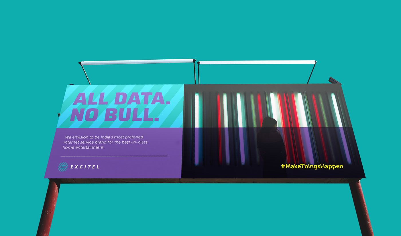
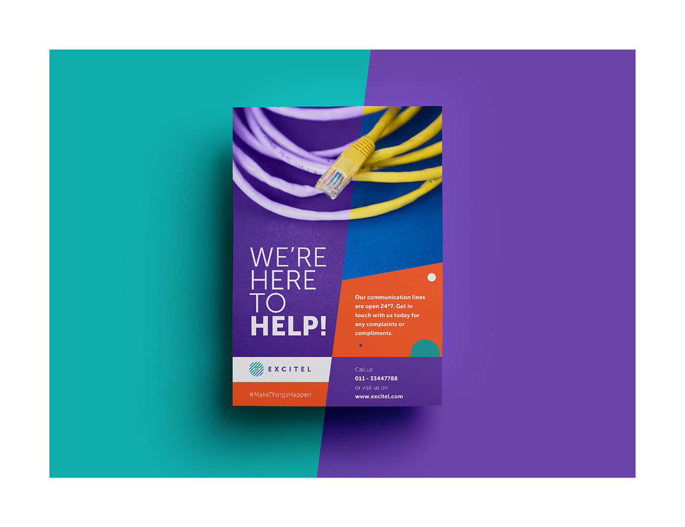
The clearly established brand colour palette helps create meaningful and memorable associations with Excitel. The refreshed look and feel added more vitality and boldness to its visual personality. The colour purple used in the brand logo, combines the stability of blue and the energy of red, to represent Excitel’s dependable nature and youthful confidence.
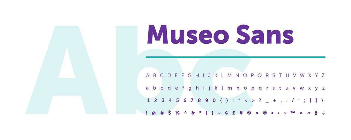
Brand Typography
The primary font of Excitel, Museo Sans, has a sturdy, low contrast, geometric design that works well on all text and display sizes. The clearly defined typographic hierarchy helps to balance out the key information in all brand communications.


THANK YOU
.
.
.
.
.
.
.
.
Facts :
Client : Excitel
Agency : Brands of Desire, New Delhi, India
Content : Divya Rathore
Design and Art Direction :
Sidharth Singh
.
.