Exercise 4: Culminating Work- Battle

Acrylic on paper, 22x30", 2018
Exercise 4: follow, order / communicate, reify
For this project I conveyed the words "follow" and "order" with the orange triangles. When I thought of those words together, it made me think of an army following orders, so I wanted to portray them as attacking the other half of the painting. I conveyed "communicate" and "reify" with the blue squares by having the squares get darker and more solid as they approached the center, but they also seem to be radiating outward, appearing to be attempting to communicate with the triangles, seemingly to no avail.
Exercise 3: Color, Transparency Illusion, and Metaphoric Representation

Acrylic on canvas, 18x24", 2018
Exercise 3: Color, Transparency Illusion, and Metaphoric Representation/ "Follow and Order"
For this piece I conveyed the words I used in a pretty straightforward manner. I depicted the big red square as an obvious leader, with the other squares following it in an orderly fashion. I selected red as a color because it is attention-grabbing and commanding. I chose blue as a color to represent loyalty, and the purple-ish gradient I intended to represent higher ranks, the squares get redder to symbolize that they have more authority, since they're closer to the leader.

Acrylic on canvas, 18x24", 2018
Exercise 3: Color, Transparency Illusion, and Metaphoric Representation/ "Communicate and Reify"
For this one I wanted to convey the idea of "reify" by having the circles get larger and less transparent as they move up the piece. The idea of communication is suggested by the overlap between the circles as they continue to "reify".
Exercise 2: Space Through Color and Atmospheric Perspective

Acrylic on Canvas, 9x12", 2018
Exercise 2: Space Through Color and Atmospheric Perspective/ Soft Edges Versus Hard Edges (1)
In this one I wanted to imply depth purely through shades and blurred edges, so I didn't include any overlap or scale changes.

Acrylic on Canvas, 9x12", 2018
Exercise 2: Space Through Color and Atmospheric Perspective/ Saturated Versus Neutralized Color (2)
In this piece I implied depth with both overlap and by having the orange shapes be neutralized with more and more blue as they moved back in space

Acrylic on Canvas, 9x12", 2018 (artist: Katie Montag)
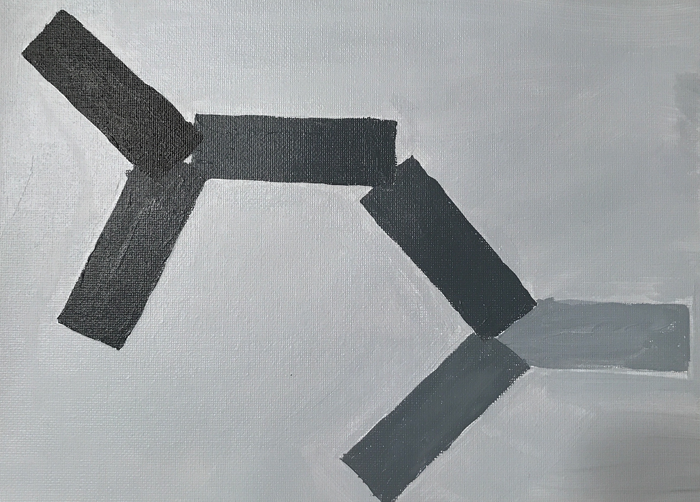
Exercise 2: Space Through Color and Atmospheric Perspective/ Warm Versus Cool Color (3)
In this I intended the foreground to be the small blue triangle, and as they moved back in space, they picked up more and more yellow. The shapes also overlap, making it clearer that they are moving back in space, even though they get bigger and bigger.

Acrylic on Canvas, 9x12", 2018
Exercise 2: Space Through Color and Atmospheric Perspective/ Tinting, Toning, and Shading (4)
With this piece, I implied depth by having the triangles get lighter as they moved back, and also having them all overlap one another. I feel like this one one of my most successful works for this exercise.
Exercise 1: Overlap and Scale

Acrylic on Canvas, 9x12", 2018
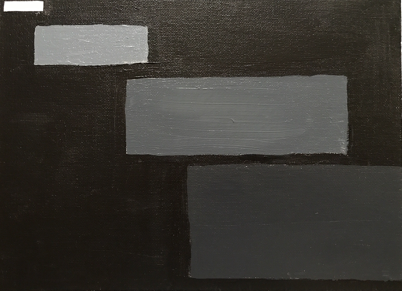
Exercise 1: Overlapping (1)
With this work, I had each rectangle overlap each other at the corners, and I painted them darker and darker as they moved back.
Acrylic on Canvas, 9x12", 2018
Exercise 1: Overlapping (2)
In this piece, I intended to imply depth by having the rectangles overlap one another in two fan shapes and having them get lighter, although whatever sense of depth is shown here does feel more shallow.
Acrylic on Canvas, 9x12", 2018
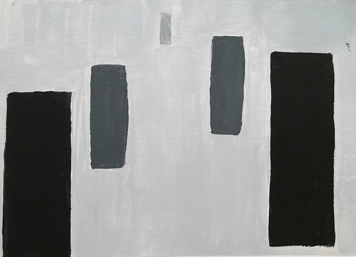
Exercise 1: Scale (3)
I feel like this is my most successful piece in this first exercise, as the depth implied in it is very deep. I have large black rectangles in the front, one even goes off the bottom edge of the painting, and in the far back there is a small light rectangle.
Acrylic on Canvas, 9x12", 2018
Exercise 1: Scale (4)
In this work I wanted to imply that the larger shapes were extra large by putting them further back in the space. I did this by having them getting darker and darker, like the background.

Acrylic on Canvas, 9x12", 2018
Exercise 1: Overlap and Scale (5)
In this work I had the rectangle in the forefront be the largest and the lightest, and the other rectangles getting smaller as they moved back, while also being overlapped by the larger rectangles.
