

MILTON GLASER EXHIBIT POSTERS
PHOTOGRAPHY | TYPOGRAPHY | ARTIST'S WORK & PORTRAIT

Set of three posters, each focused on a different design element
THE DESIGN PROCESS


I had a lot of fun with the thumbnail sketches for this project; I'm a big fan of classic rock and psychedelic artwork from the 60s and 70s, so this was a joy. I purchased two books full of Glaser's work - Milton Glaser: Graphic Design and Milton Glaser Posters: 427 Examples from 1965 to 2017 - and flipped through them for hours. The vast scope of his portfolio was inspiring!
Drawing is my favorite art form, so creating three posters WITHOUT illustrations was a real puzzle for me. I went through a lot of different ideas before settling on the final drafts.
POSTER ONE: PHOTOGRAPHY

Poster One: Photography
This ended up being a more retrospective design; although the theme addresses Glaser’s work from the 60s and 70s, the crisp photograph of my dad's guitar came off as somewhat modern. Rather than try to age the photo of the guitar headstock, I elected to add a retro typeface to blend the old with the new. I feel this is appropriate for Glaser, as he has maintained an influential career even in the modern age of computerized graphic design.
POSTER TWO: TYPOGRAPHY
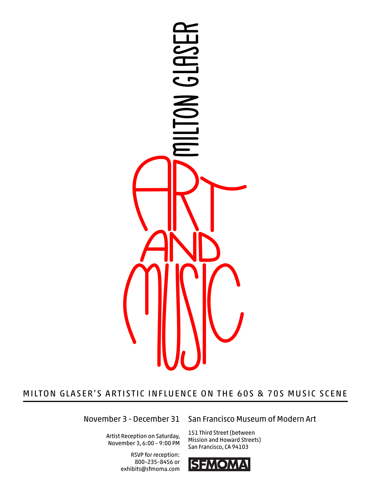
Poster Two: Typography
The curved and highly-stylized “art and music” text in this image are a nod to Glaser’s rounded, psychedelic typefaces of the 60s and 70s. Combined with the artist’s name, the title text creates a rough outline of an electric guitar; this lends a concrete theme to the text without actually using added images. The bright red and black on a stark white background are in honor of his most famous work, the “I [heart] NY” logo.
POSTER THREE: ARTIST'S WORK & PORTRAIT

Poster Three: Artist's Work & Portrait
This poster evokes a psychedelic vibe and transports me back to the 60s / 70s rock era. The retro typeface is vintage and playful without being overbearing or detracting from the message. The green backdrop was inspired by the colors used in many of his posters from this era.
This poster is unquestionably my favorite of the three; I love the focus on Glaser’s beautiful Bob Dylan poster coupled with his striking portrait. The three portraits of Glaser are outlined with strokes of cyan, yellow, and magenta in honor of his graphic design career.


