Posters made in a workshop on typography within the subject typographics elective, at the Willem de Kooning Academie, Rotterdam. With the graphic designer Niels Vrijdag, alumni of the WDKA. The tutor of the subject and the project was Britt Möricke.
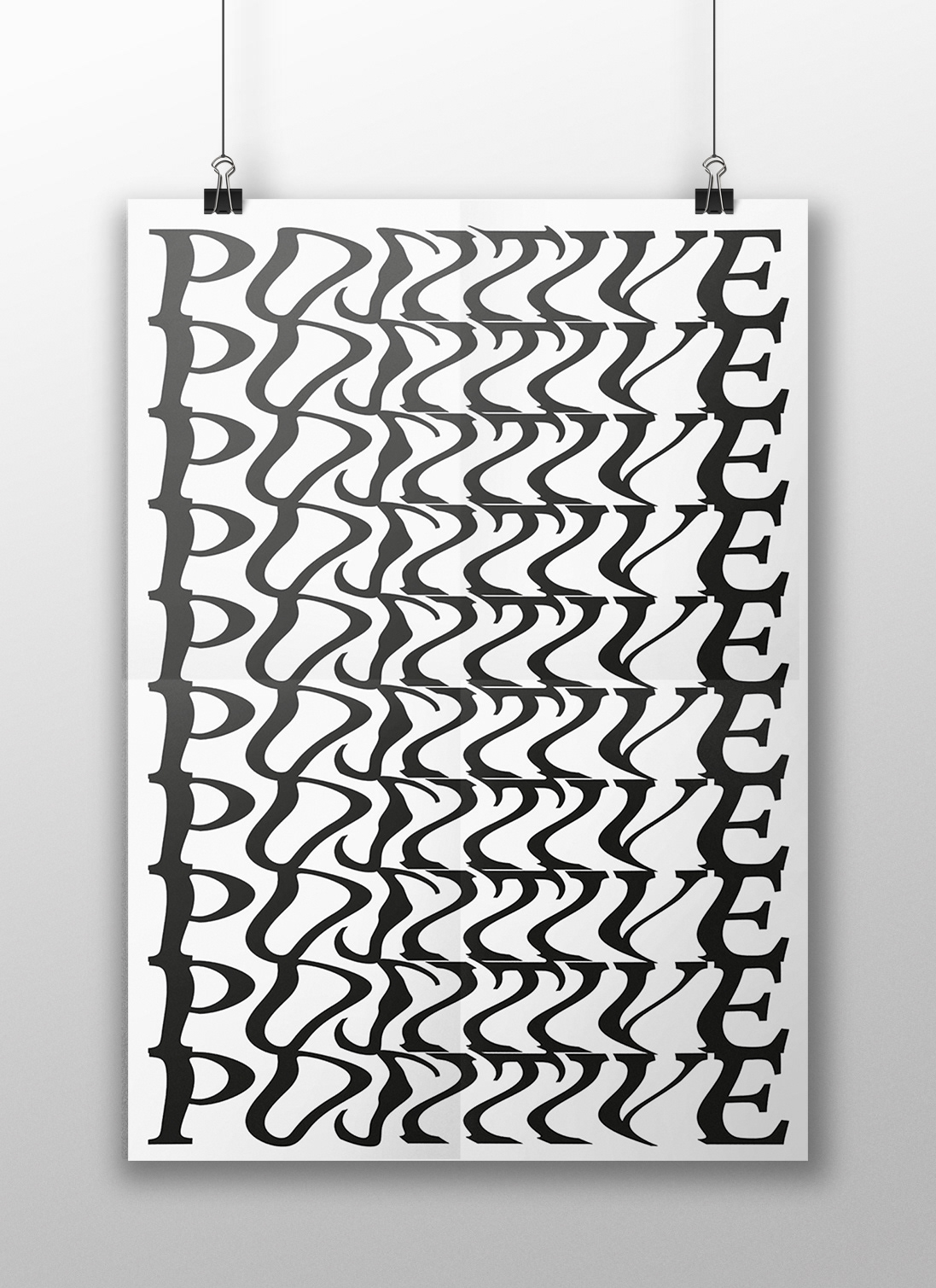
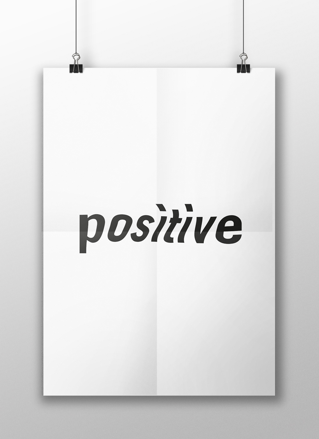
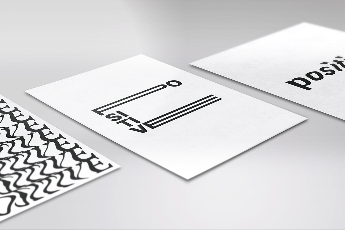
The workshop consisted of taking a word, and making a poster with a typohraphy which a priori does not seem attractive and haven't got relation with the concept of the word. However through our retouches, composition, designs all this leads to a meaning.
In my case I have chosen the word "positive" and I have used the font Minion pro. Through the deformities I wanted to play with what means the word positive and the "double face that has", when sometimes tell us that something is positive or good but it is not so. Like hiding the bad with a positive word.
—
A2, poster