

The Company
Axel and Co. create a men’s grooming brand for men from around the world to use our products. We use the highest quality, natural and organic ingredients to offer the most effective men's skincare and grooming products available. Axel and Co. were created to defy the demographic stereotypes behind men’s grooming product. Any men, any age, any creed, and race, anyone would be appealing to our products. At Axel &Co. we strongly believe men should start and end their day both looking and feeling good. Our family owned and operated team takes pride in crafting naturally effective grooming products that epitomize confidence.
The Problem
Axel and Co. wanted to take a step away from other companies on the market that are playing on gimmicksor on trends. Their brand should be welcoming to all the men who cares about their skin and hair. All of their products are affordable, how, ever the brand needed to show quality and craftsmanship.
The Solution
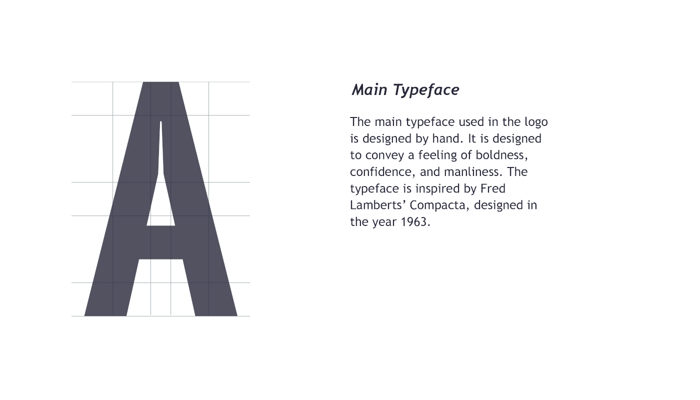
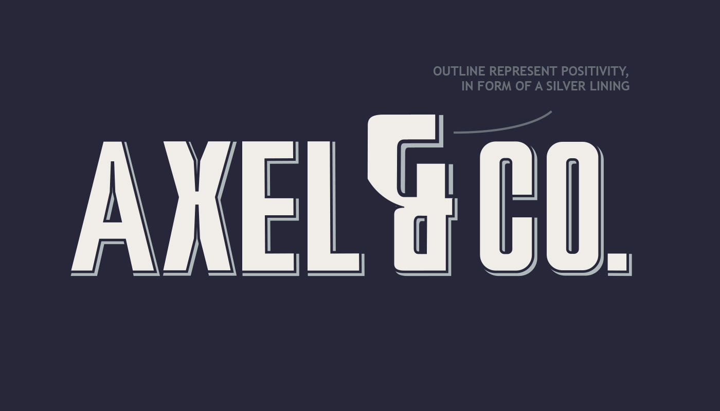
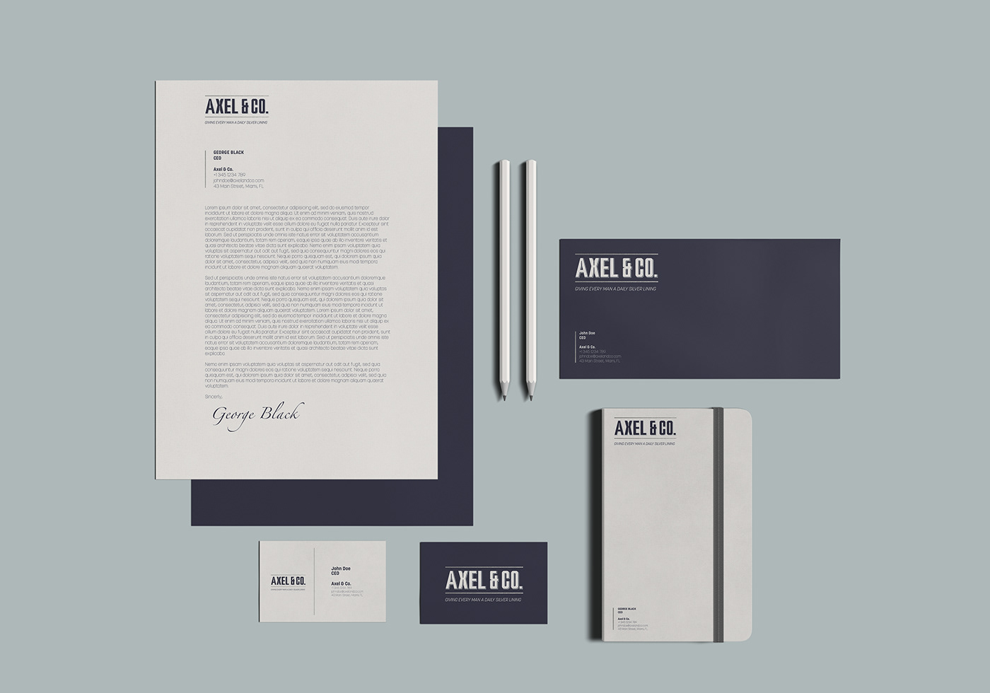
Starting with the logo; the logo design is made from a custom-designed typeface. The design of the typeface is taking inspiration "Compacta", designed in 1963* by Fred Lambert. "Compacta" was chosen due to its general appearance, the representation of the year it was designed, and how it works in the context of a logo. The "drop shadow effect" used, is representing positivity in form of a silver lining; whether you are having a good or a bad day, the products of the company should be something positive.
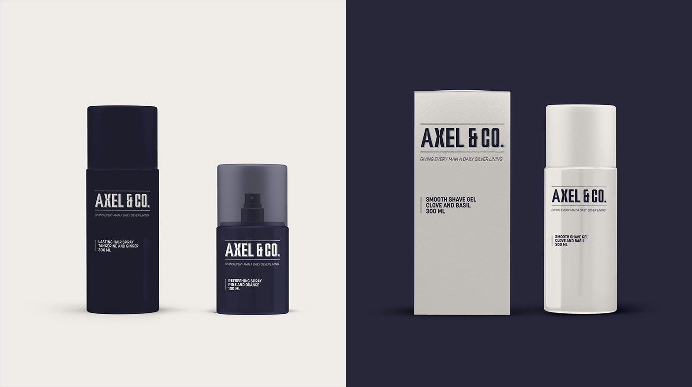
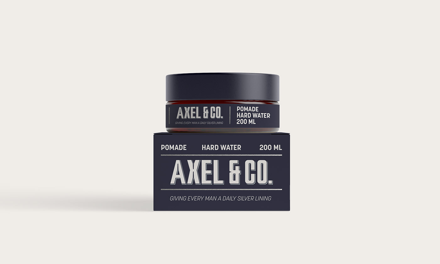
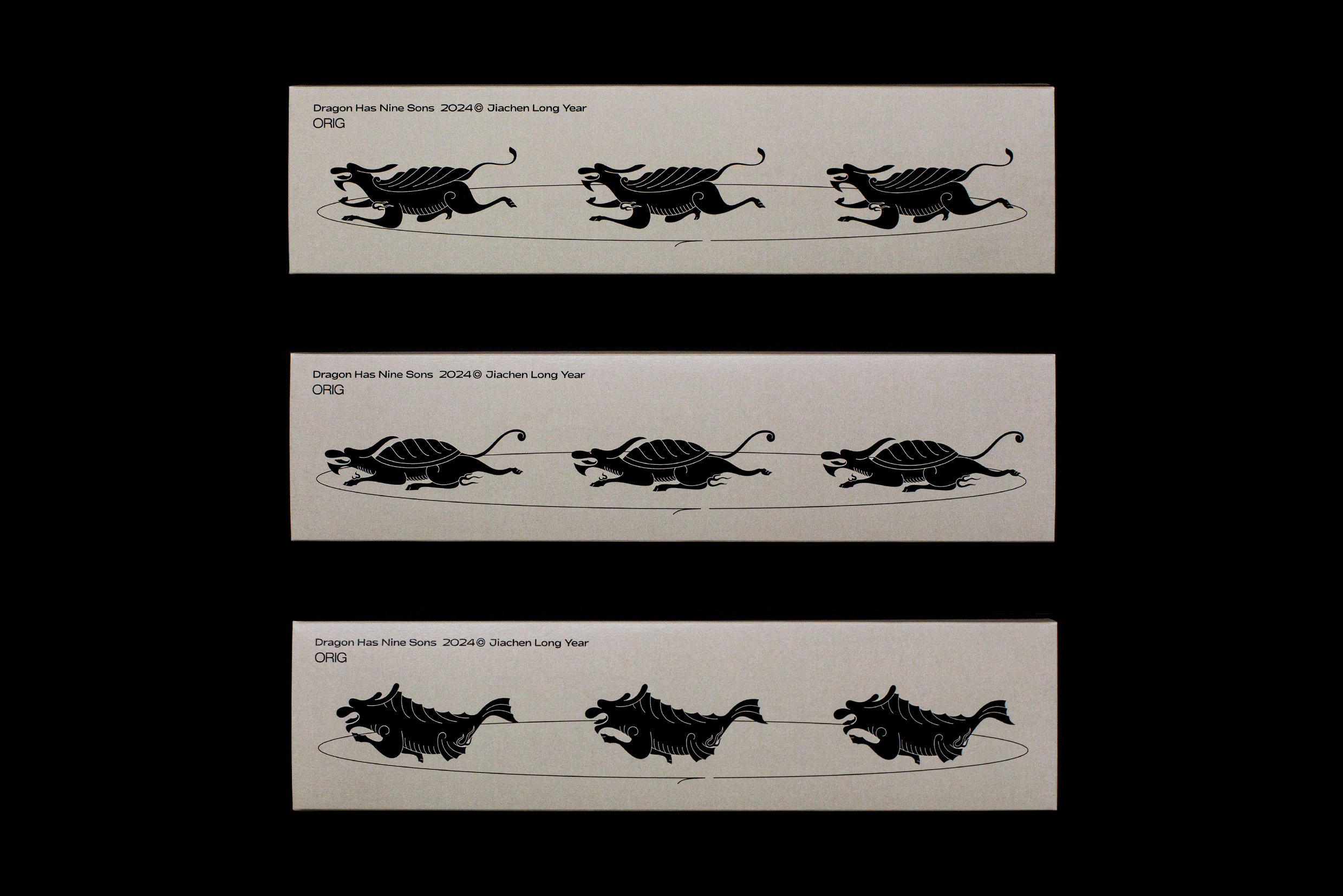
When developing the packaging I had three main key points in mind; to differentiate against the competitors, have a clean look, and create emphasis on the actual product. The base structure of the packaging is to have the logo accompanied with three pieces of information about
the product. The information displayed is: what type of product it is, the traits of the product, and what size the product comes in. The goals are to put more value into the products, and differentiate against the competitors. Further information is displayed on the sides and back of
the packaging.
*1963 was a big year for the civil rights movement in the USA.
In that way it both ticks the boxes of having historical look, and also
representing unity between men, something the company wanted.
In that way it both ticks the boxes of having historical look, and also
representing unity between men, something the company wanted.