


Galaxy Coffee is a full brand concept design for an independent coffee shop geared toward students and remote workers. I designed a full host of branded deliverables for a grand opening including a style guide, logo, color scheme, and landing page for an opening event. Below you can see my design process as I honed in on a colorful, playful look and feel to keep in line with the business' local, laid back clientele.
Color palette. For this brand, I wanted a space-themed color palette that was still lively. I had originally used a cool-toned indigo for the accent color, but the palette lacked depth and was a little too sleepy. The yellow accent grabs attention and complements rather than fights the bright main color.

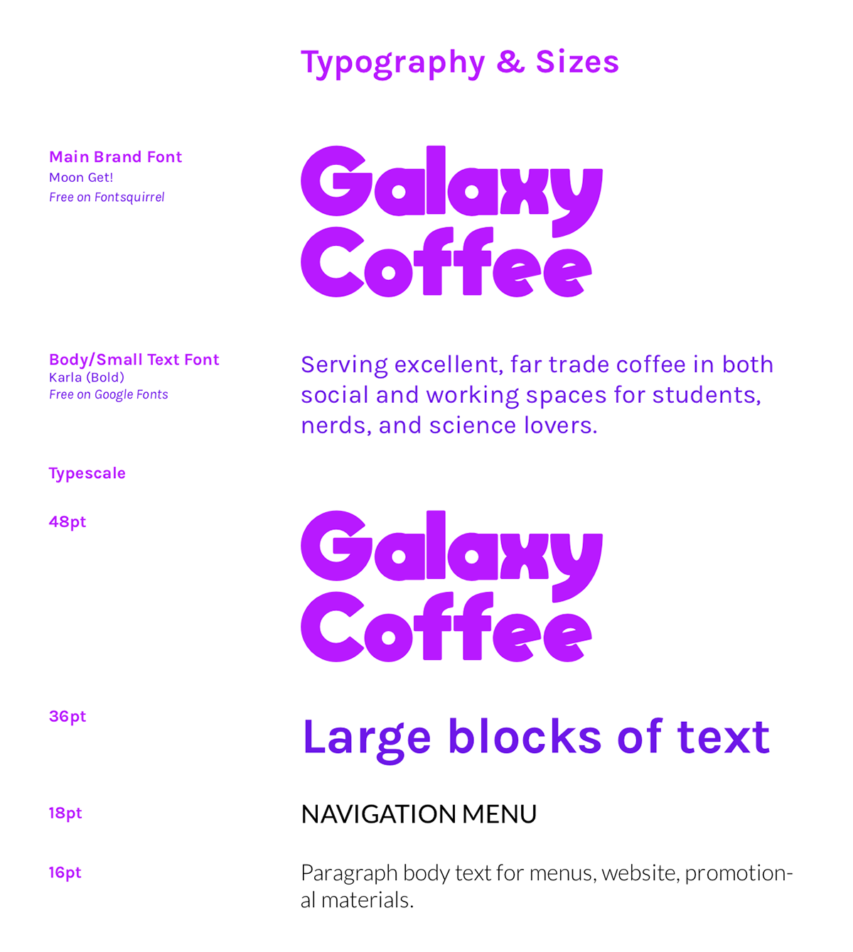
Type scale. For the type scale, I wanted a fun and chunky display font for major headings and some clean, easy-to-read fonts for all other text. The Header font is called Moon Get!, and is based on the title font for the space-themed Nintendo video game Super Mario Odyssey. It was important to me to have a heavy, thick font that would show off the bright main color, which it does! The body and smaller headings text is in font Karla, a sans serif that is both readable and casual.
Logo design process. Using Adobe Illustrator, I went though several iterations of a common concept: a planetary cup of coffee. The original designs were a bit too muted, especially when it came time to create a landing page that would get users to interact with the call to action sections. I eventually settled on using a contrast color, yellow, with the final logo to make it look dynamic against the punchy primary purple color. I also simplified the logo into a cookie shape instead of a cup with stars.


Logo variations & social media. Once I had the cookie design for white backgrounds, I also created variations for use on the main and secondary colors. I also designed some wrong examples of the logo's use for use in the style guide: on colors outside the palette and on patterns. Once I had a logo using all three brand colors, I created Facebook header mockups in Photoshop with on-brand imagery.


Landing page. The final component of the project was creating an exciting landing page for the Galaxy Coffee grand opening. The page had to include information about the event, a call to action for signing up for the mailing list, menu items, testimonials, and contact information. My goal here was to create a page that was minimal enough to avoid clutter while presenting users with an invitation, call to action, and general information on the business. The color palette may not be for the faint of heart, but the brand imagery and strategic use of whitespace balances out the bright colors and invites the page visitor to interact with the site.
Below are a first and final draft of the landing page, designed in Photoshop. The first was in the initial design stages, where I realized that my first choice for an accent color wasn't vibrant enough. The first page is a little flat and uses too many font colors in the same area. For the final draft I had an updated logo design, added the yellow accent color, and updated the brand imagery to reflect the social, co-working atmosphere of the café. Small changes, like making the text colors consistent in each section (with the one punchy yellow SOON in the contact area), made the different types of information seem independent while still cohesive to the overall design.


