

Lydspecialisten (the soundspecialist) is one of the leading companies in distributing high-end Hi-fi, surround, picture and multiroom in Denmark. They have been in the hi-fi industry since 1992 and are still going strong. Price, quality, performance, durability and design are the keywords in the company.
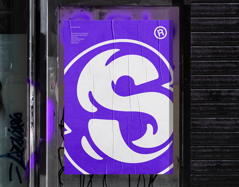
“Meget mere end bare lyd” - which in English means “Much more than just sound” is the new slogan for the company. Their old logo and identity were focused on the speaker, which is a problem because they aren’t just selling speakers - but experiences. The other reason the speaker is a wrong message to send is that they are selling a lot of other stuff too, e.g. subwoofers, televisions, record players, cables and much more.The new identity is more exclusive and dominant. The brandmark is a symbol of sound which is more suitable for the company. They now have an identity that is strong on all platforms, with a high level of recognizability. Hej Kevin Ka ndu se mine ændringer live bette ven


The primary colors are black, grey and white and are for branding their Lydspecialistens own brand and when designing their stationary line.
When advertising for their products are they using the more colorful palette
When advertising for their products are they using the more colorful palette


