BRANDING -
UBERPIPS
- Brand Logo & Identity Design
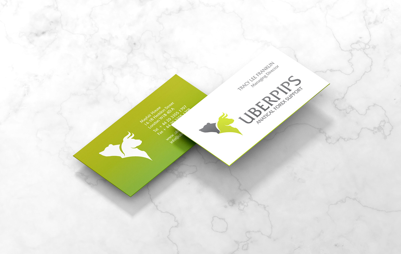
- Stationary Design
- Tag Line
- Stationary Design
- Tag Line
---------------------------------------------------------------------------------------------------------------------------------------------------------------------------
THE DEAL
Design a corporate Brand Logo and Identity for Uberpips, a London based financial startup that specialises in Forex trade and support.
It's all about supporting the greens! Pun unintended.
THE DOPE
This was an exciting project to work on as the client had come across our website and loved our previous brand logo design projects. She had very high expectations which is always challenging to start with. It isn't unwelcome but I do help the client understand that different fields have different requirements and their brand logos tends to reflect it.
We need to have a functional design approach that enhances the brand and communicates their business clearly.
The client was passionate about finance and forex trade. She wanted to provide support to others who were entering the field so as to minimise their financial risks. She suggested the use of a myriad of symbols to represent forex, bull, bear, currency symbols, japanese candlesticks (?)
Huh? I know. Definitely a typo mistake.

We researched the world of Forex trade and currencies. Majority of brand logos revolved around globes, currencies or staid typefaces. In our opinion, using currency symbols within a logo would be restrictive as the global forex market trades in hundreds of currencies. Globes would also be very vague in this context. We needed to show the personality behind the brand. So we decided to change paths and head to the animal kingdom as we learnt that bulls and bears have quite the ring seat in this market.
Yup. Read on.

A bull market is characterised by rising prices and optimism. According to investopedia, the opposite of a bull market is a bear market, which is characterized by falling prices and typically shrouded in pessimism. The use of "bull" and "bear" to describe markets comes from the way the animals attack their opponents. A bull thrusts its horns up into the air, while a bear swipes its paws downward. Conversely, bears and bulls were widely considered to be opposites due to the once-popular blood sport of bull-and-bear fights.
If you've ever been on a forex trading floor, this wouldn't be so far fetched.

This symbolism was a great kickstarter and gave us the creative direction we needed. We opted to create a bold emblem symbolising strength, stability and communicating the brands intent.
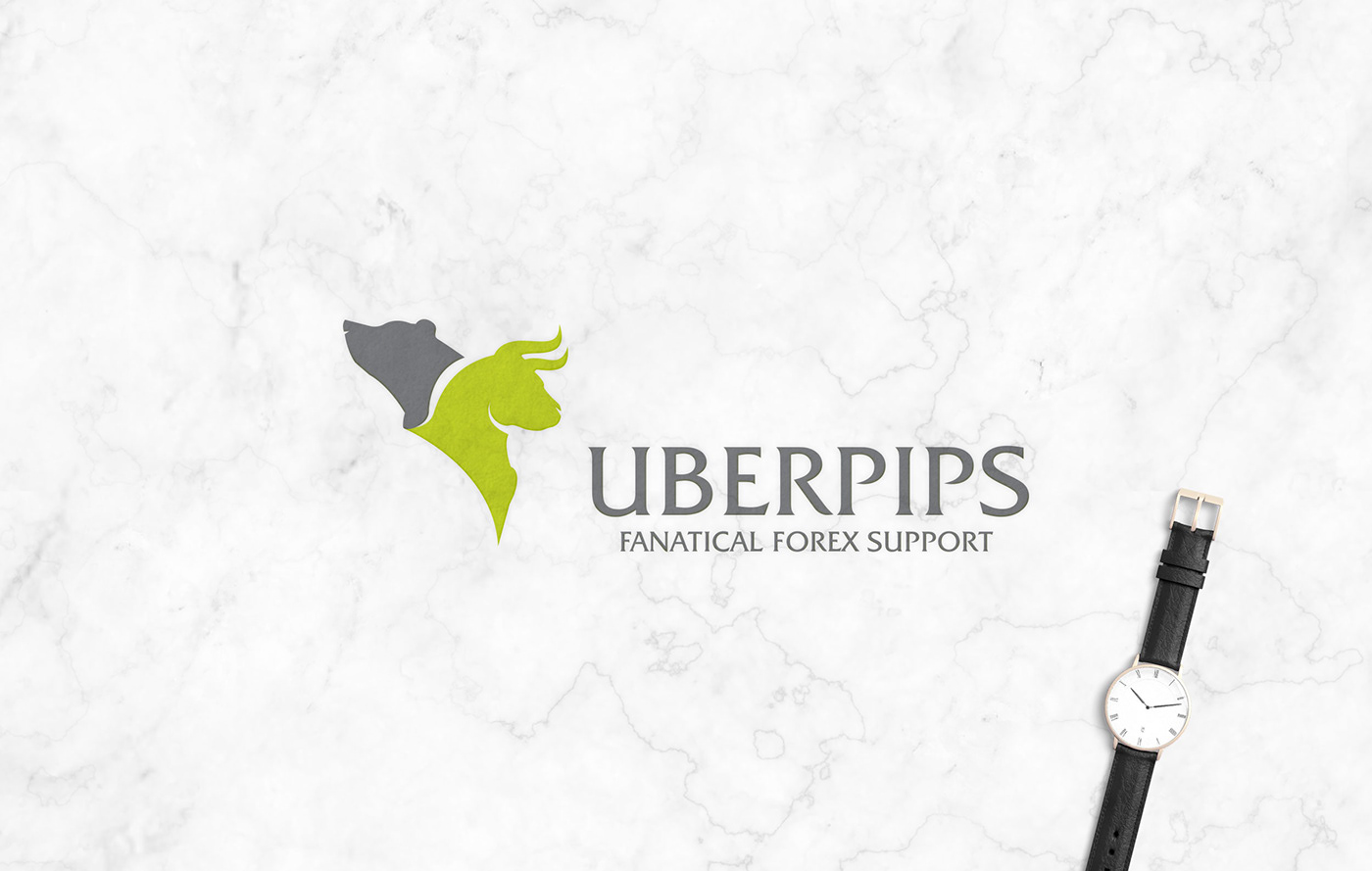
Being optimistic ourselves and since the client was providing support to minimise financial risk, we chose to place the bull front and center while the bear balanced him from behind – a way of showing two faces of the forex world.
Ying and Yang.
The bull was symbolically aligned to face foward at UBERPIPS, a bold serif typeface and we underlined it with the tagline, Fanatical Forex Support to symbolise the brand's passion.
We opted to use corporate grey and mint green to represent positivity, growth and the universal color of money. We designed the brand stationary using this color pallete thereby infusing the brand with energy and optimism.
So there you have it. The Bull and Bear locked in the eternal battle of optimism and pessimism. That's some serious money dope, y'all.