
いいタイトルは、絵を何倍にも魅力的に見せてくれると思います。なので絵が完成した後は、早く公開したい気持ちを抑えながら、タイトルを考えます。「A.M.10:00」「青い午前」など、それっぽいありきたりな言葉をいくつか経て、最終的に鳥を擬人化してみたところ、いいのが出ました。
I believe great titles make pictures look much better. So when I finish the painting, I take time to think of a nice title, resisting the temptation to post it on SNS immediately. As for this painting, I thought of some plain titles such as "10:00 a.m." and "Blue Morning". But finally a best-fit title occurred to me when I tried comparing the bird to a human.

最近は使う色を先に決めてから、何を描くかを考えています。今回は薄いベージュをメインに、グレーがかった青色と、コントラストをつけるために深みのある茶色をちょびっと使います。
Lately I decide what colors to use before deciding what to draw. For this painting, I decided to use pale beige as a main color. In addition, I wanted to use grayish blue, and a little amount of rich brown for the purpose of contrast.
ベランダの絵を描きたいぞ~と以前から思っていたので、この配色で試してみます。なんだかいい感じに描けそうです。
I had wanted to paint a balcony for a long time, so I tried sketching one with the colors I selected, and it seemed to go well.
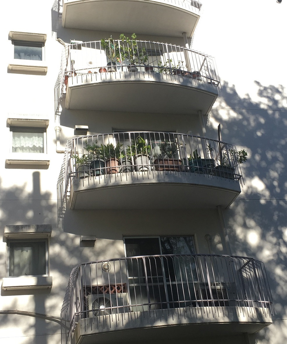
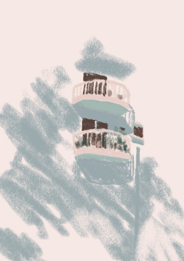
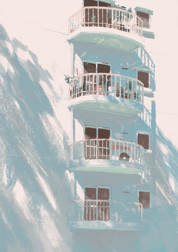
近所を散策していい感じのベランダを見つけました。資料はネットで検索することも多いですが、自分で撮った物のほうが解像度も高いし、著作権など気にしなくていいので使いやすいです。
I took a photo of these nice balconies during a stroll near my house. I prefer using photos taken by me as reference materials, because they tend to have a higher resolution and I don't have to worry about copyrights.
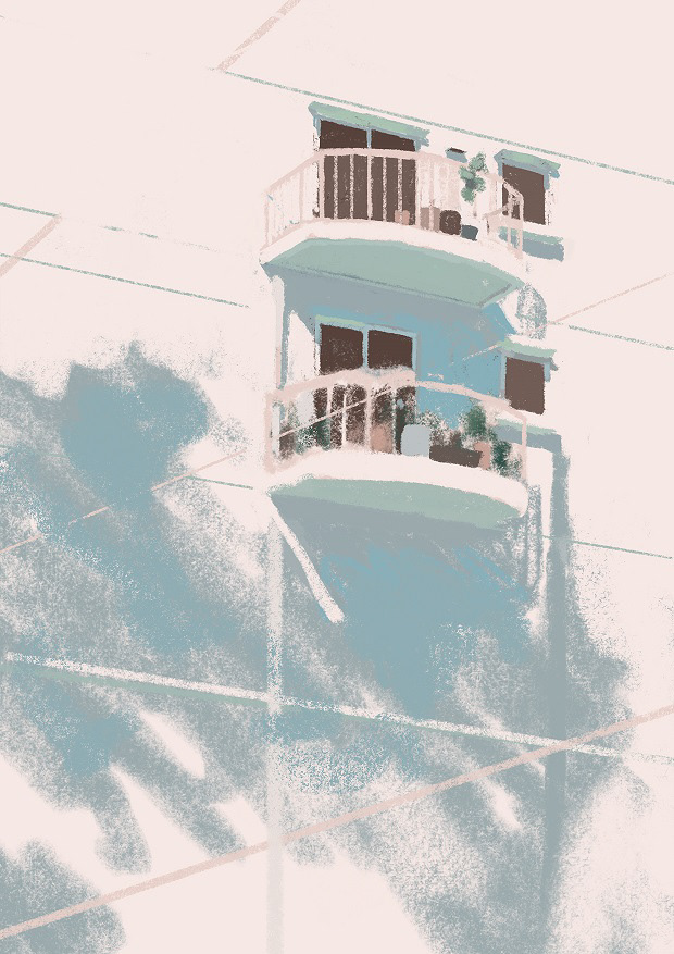
準備は整いましたので、写真を見ながら描いていきます。
I started to paint, referring to my photo.
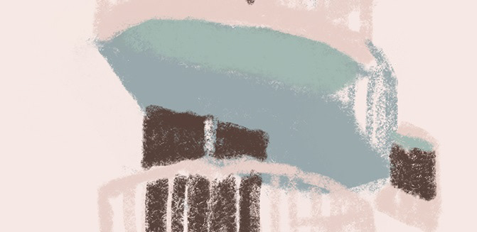
突き出ている部分の下面は、地面からの反射光を受けるので、壁の影の部分よりも少しだけ明るくなります。
Receiving a reflected light from the ground, the undersides of the balconies are a little brighter than the shadowed area of the wall.
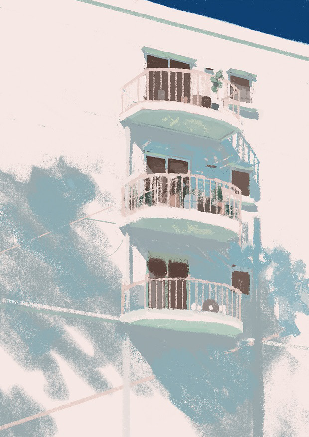
反射光を使いすぎると絵が写真っぽくなっていくので、普段はあまり使わないのですが、今回は絵が魅力的になる気がしたので使っていきます。
I seldom consider the reflected light because it makes my painting too realistic. As for this painting, I decided to use it because clearly it would make the dark areas attractive.
パースがわからなくなったのでパースガイドを上から描きました。
Added some perspective guides.

影に少しだけ強めの青を加えました。
Added a little stronger blue to the shadow.
試しに右上に空を追加してみました。パッと見いい感じなんですけど、今回は壁にかかった影の絶妙な色合いを見せたいので、無駄に目を引いてしまう空はやっぱり消すことにします。
I tried filling the upper right area with the sky. At first glance, it looked nice, but I wanted viewers to feel the sensitive color transition in the shadow, so I erased this distracting sky.
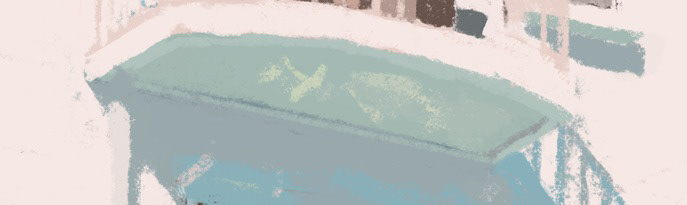
ベランダの下面に、さらに明るい光を入れました。鉢植えの葉っぱに当たった光が反射しているイメージです。実際こんな現象が起こるかは知らないんですけど、絵に透明感を与えてくれると思います。
Added some light to the undersides of the balconies. I imagined the light reflected on vegetation on the balconies...don't say I'm being unscientific. I believe it will bring the area to life.
壁の影をデジタルの力で斜めに引き延ばします。
Stretched the shadow.
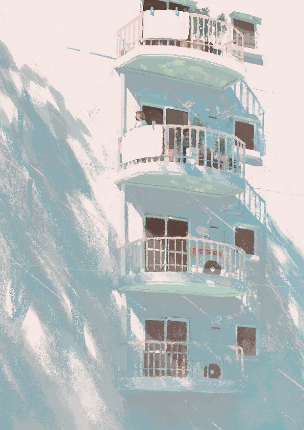
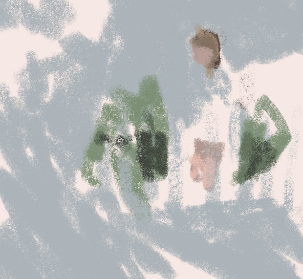
人を追加しました。
Added a girl.
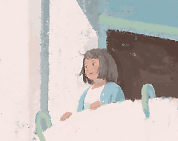
( 珍しく笑っている…!)
Oh, she is smiling…! ( I seldom draw a smiling face.)
ここで電線に止まっている鳥たちの影を描いてみました。画面がうるさくなるのでやめました。
I added the shadow of the birds and the electric line, but it was messy, so I erased it.
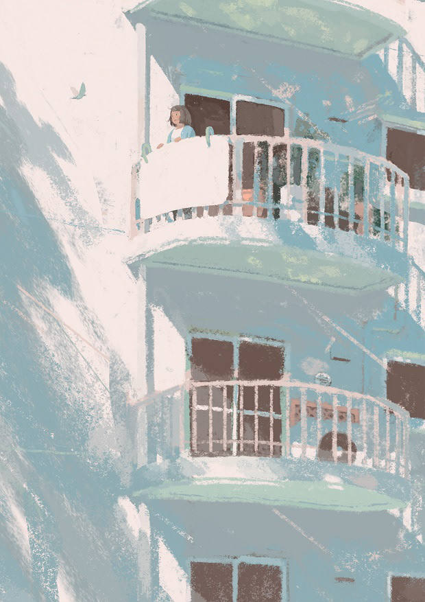
鳥を1羽追加しました。本当は鳥の影も壁に描いていたのですが、影が鳥自身と同じくらい目を引いてしまうので描かないことにしました。書籍の表紙を想定していたので、もう少し顔が見えた方がいいよな、と思い、ズームして完成です。
Instead, I added a flying bird. I also painted its shadow on the wall, but the shadow looked as conspicuous as the bird itself, so I decided not to paint the shadow.
Finally, I trimmed away unnecessary part so that viewers could see the girl's face more clearly.
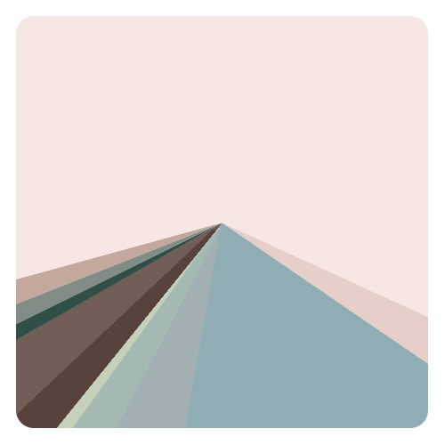
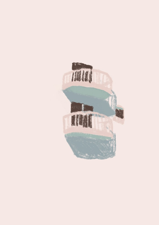
最終的にはこんな色を使っています。基本的には、元の3色+それぞれの似た色のみを使用したので、全体的にまとまったかな。
This is my final color palette. As I used only the three colors I had originally intended to use plus very similar colors, the painting looks well organized.
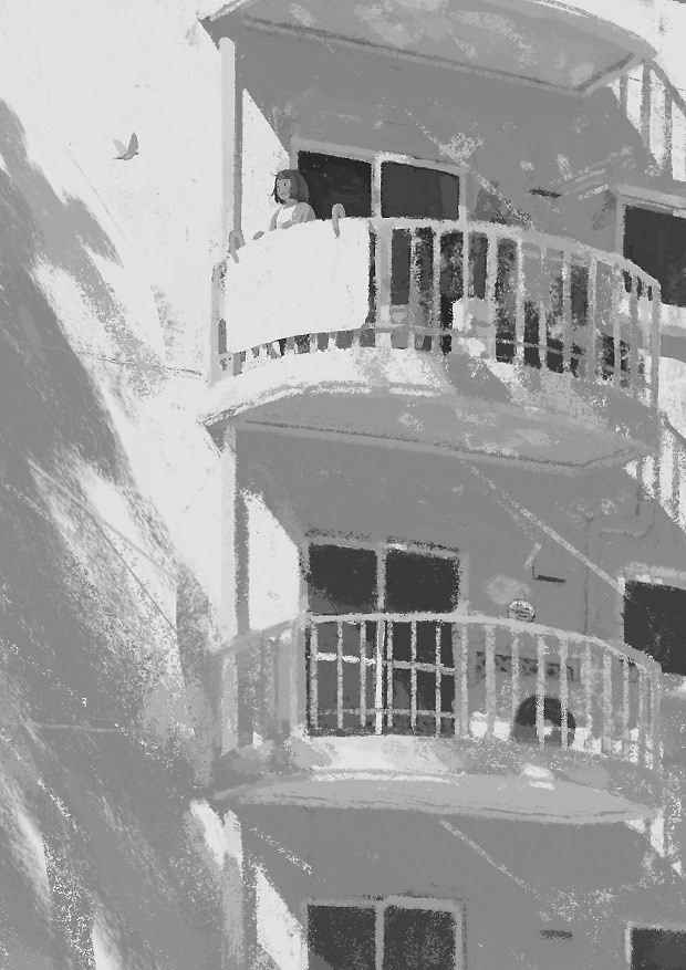
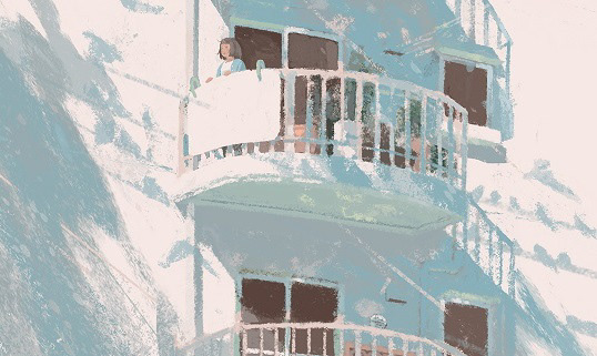
人間の視線は、コントラストの強い部分に向かうそうです。この絵でも、真っ白な布団と、ほかの窓より暗い窓を隣接させて、自然と人物に目が行くようにしています。
I hear that we automatically see areas which have the greatest contrast.
In this painting, I placed the whitest mattress next to the darkest window to lead the viewers' eyes to the center of interest ----the girl.
In this painting, I placed the whitest mattress next to the darkest window to lead the viewers' eyes to the center of interest ----the girl.

