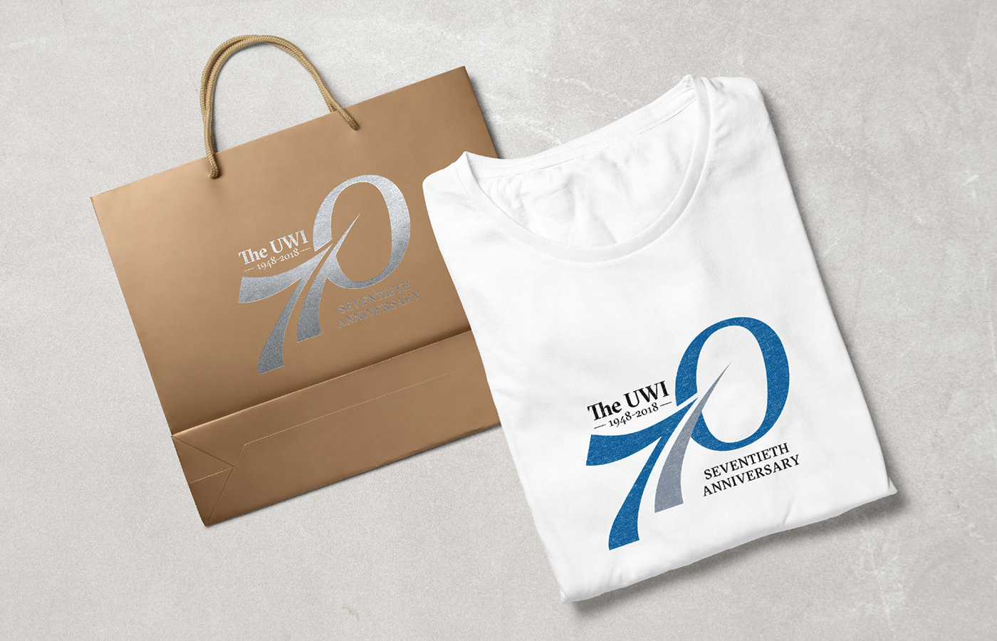
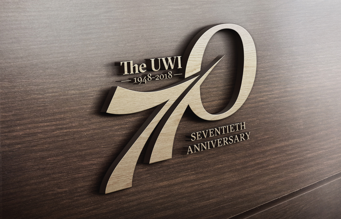
UWI 70TH Anniversary Logo
The milestone of reaching three scores and ten, is a testament of the strength and resilience of the University to stand the test of time. I wanted to depict this journey through the stylized road vanishing into the distance. This road forms part of the seven and represents the University’s innate drive to keep moving, surviving and persevering. It also symbolizes the remembrance of the past while preparing for the future. The seven also forms an arrow that is advancing diagonally towards the zero (representing a target). This symbolizes the University’s commitment to their goal of enhancing and developing the welfare of the Caribbean People. Additionally, the arrow exudes a sense of movement and progress, characteristics that are synonymous with The University of the West Indies. The blue and grey color scheme is meant to work in harmony to evoke a feeling of confidence, stability and strength.
The intent of the design is to provide the viewer with a modern and stylized visual representation of what it means to be the largest, most longstanding higher education provider in the Commonwealth Caribbean. The dynamic and versatile design can be easily adapted for different purposes.