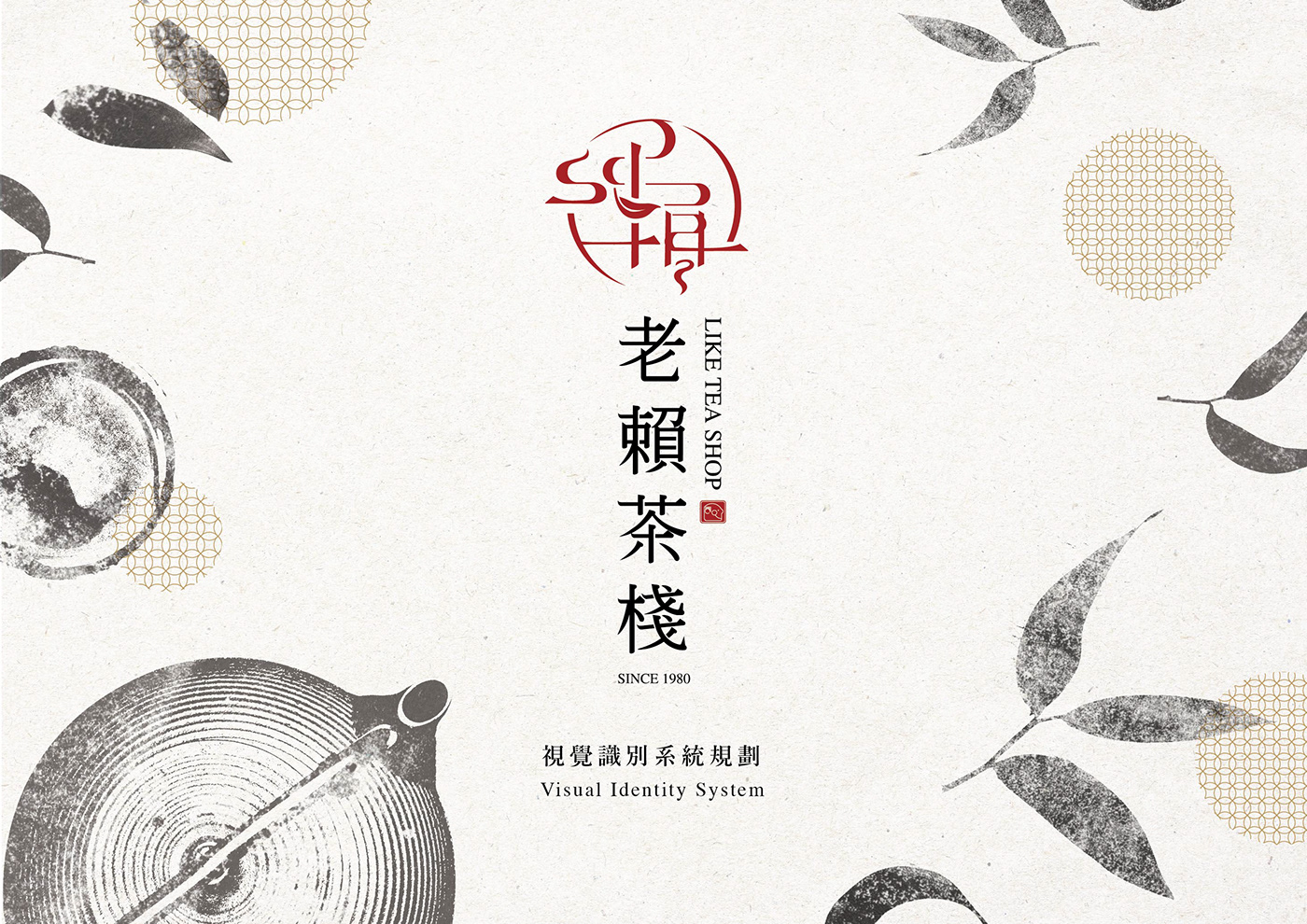
老賴茶棧 | VIS品牌形象識別重塑再造 / 2017
Like Tea Shop | Brand Identity Design / 2017
Client | 老賴茶棧 Like Tea Shop
Art Direction / 藝術指導 | Wan Chen Liao
Concept and Visual System Design / 概念及視覺系統設計 | Wan Chen Liao
Chinese Typography Design / 中文標準字設計 | Pan Guan Liang
Like Tea Shop | Brand Identity Design / 2017
Client | 老賴茶棧 Like Tea Shop
Art Direction / 藝術指導 | Wan Chen Liao
Concept and Visual System Design / 概念及視覺系統設計 | Wan Chen Liao
Chinese Typography Design / 中文標準字設計 | Pan Guan Liang
Space Design / 空間設計 | 晴天見設計 Sky Eye League
Food Photography | Stanley
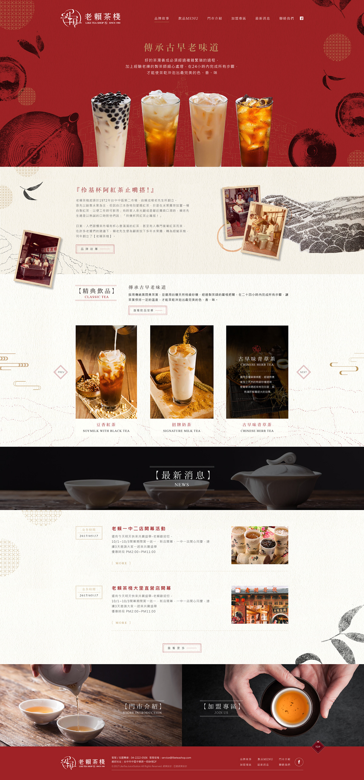
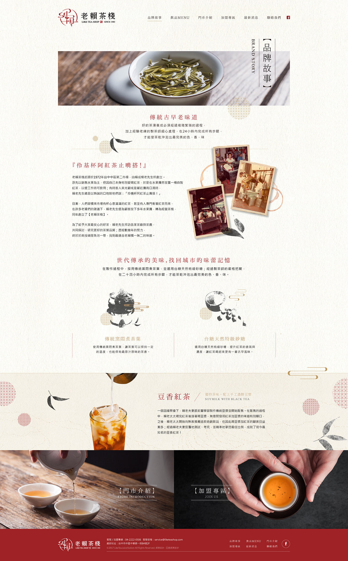
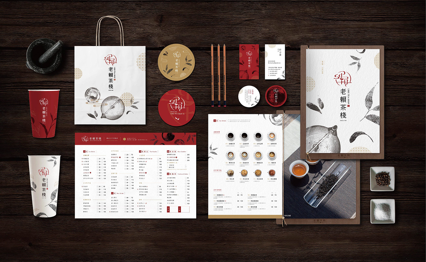
在既有的品牌基礎上,進行重新評估、定位、設計。 將品牌識別 (VI) 重新設計,並搭配調整的產品市場組合與銷售通路,針對新的目標客群作宣傳溝通,使品牌換裝成功,創造出包裝新價值!
Revaluate and orientate the present brand identity based on its fundation. We aim to propagate to young customer groups by regulating product combinations and marketing strategy, making the brand create its best value.
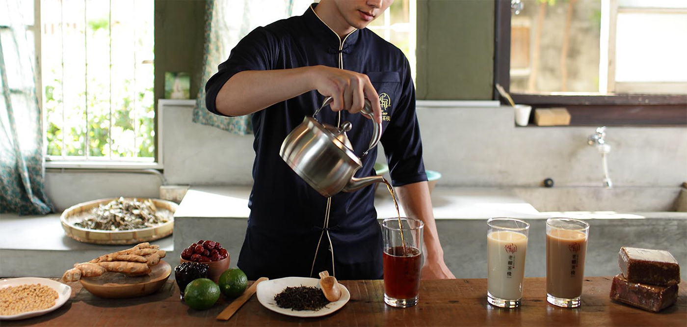
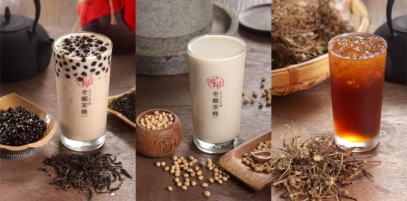
Food Photography | Stanley
在既有的品牌基礎上,進行重新評估、定位、設計。 將品牌識別 (VI) 重新設計,並搭配調整的產品市場組合與銷售通路,針對新的目標客群作宣傳溝通,使品牌換裝成功,創造出包裝新價值!
Revaluate and orientate the present brand identity based on its fundation. We aim to propagate to young customer groups by regulating product combinations and marketing strategy, making the brand create its best value.
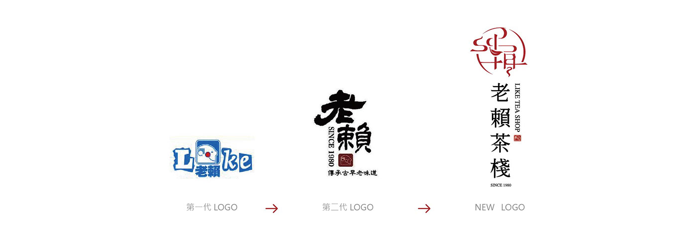
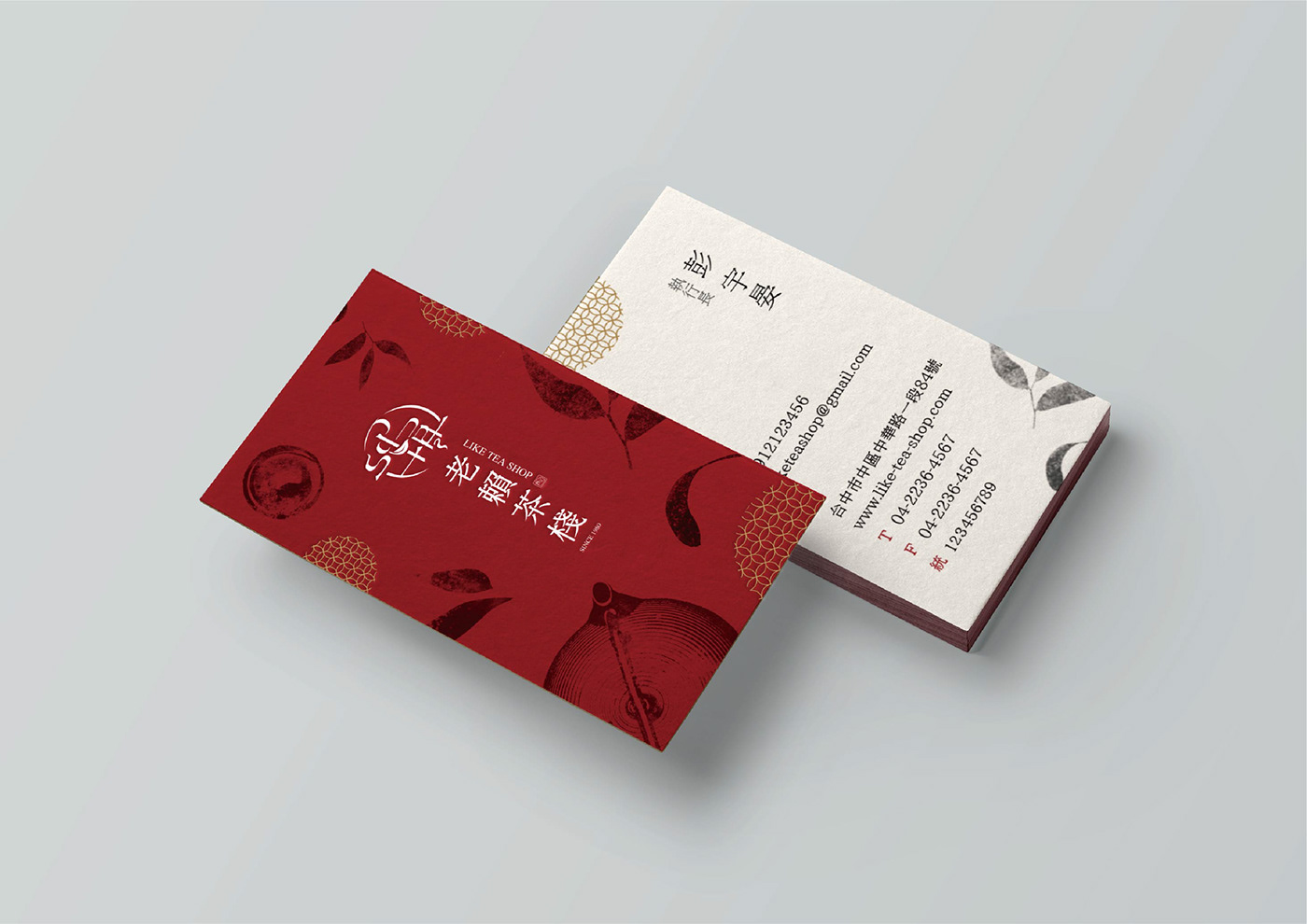
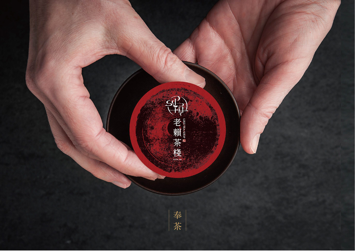
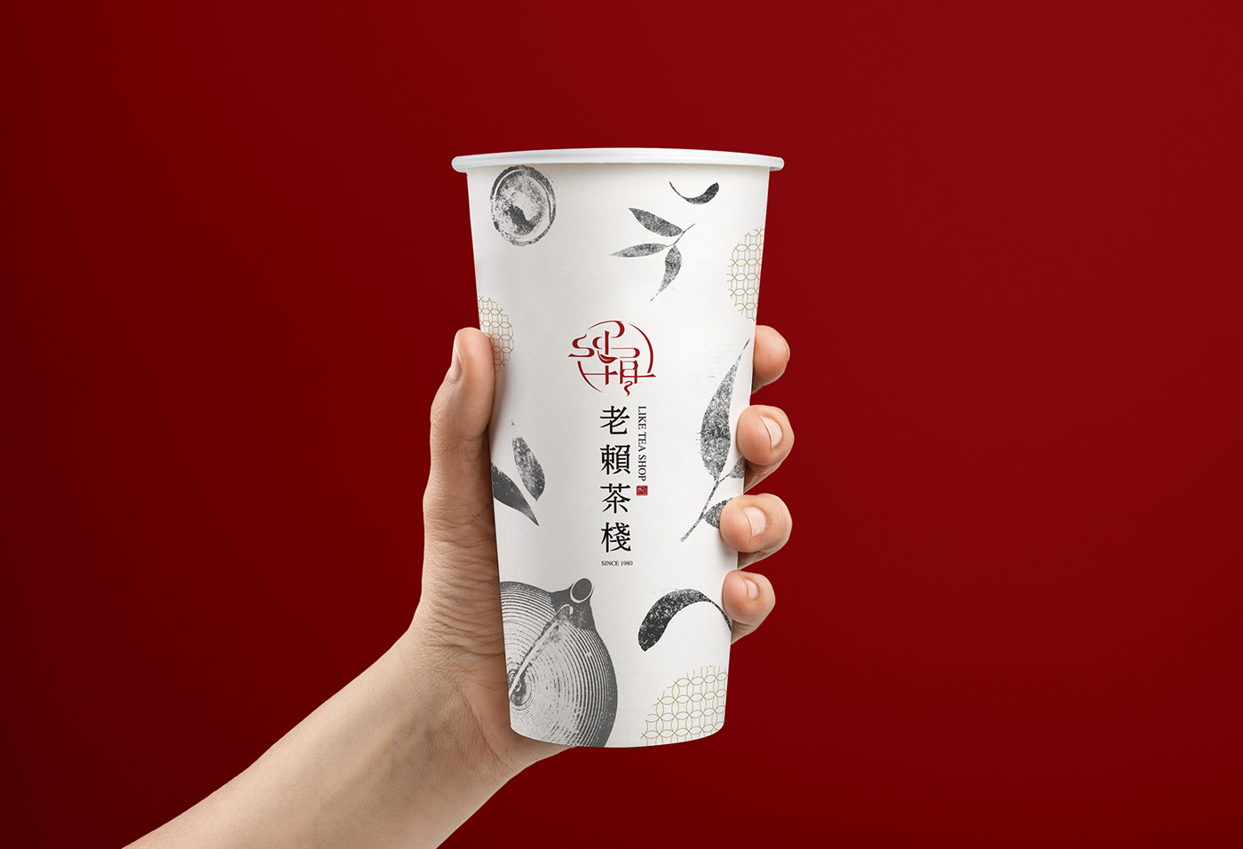
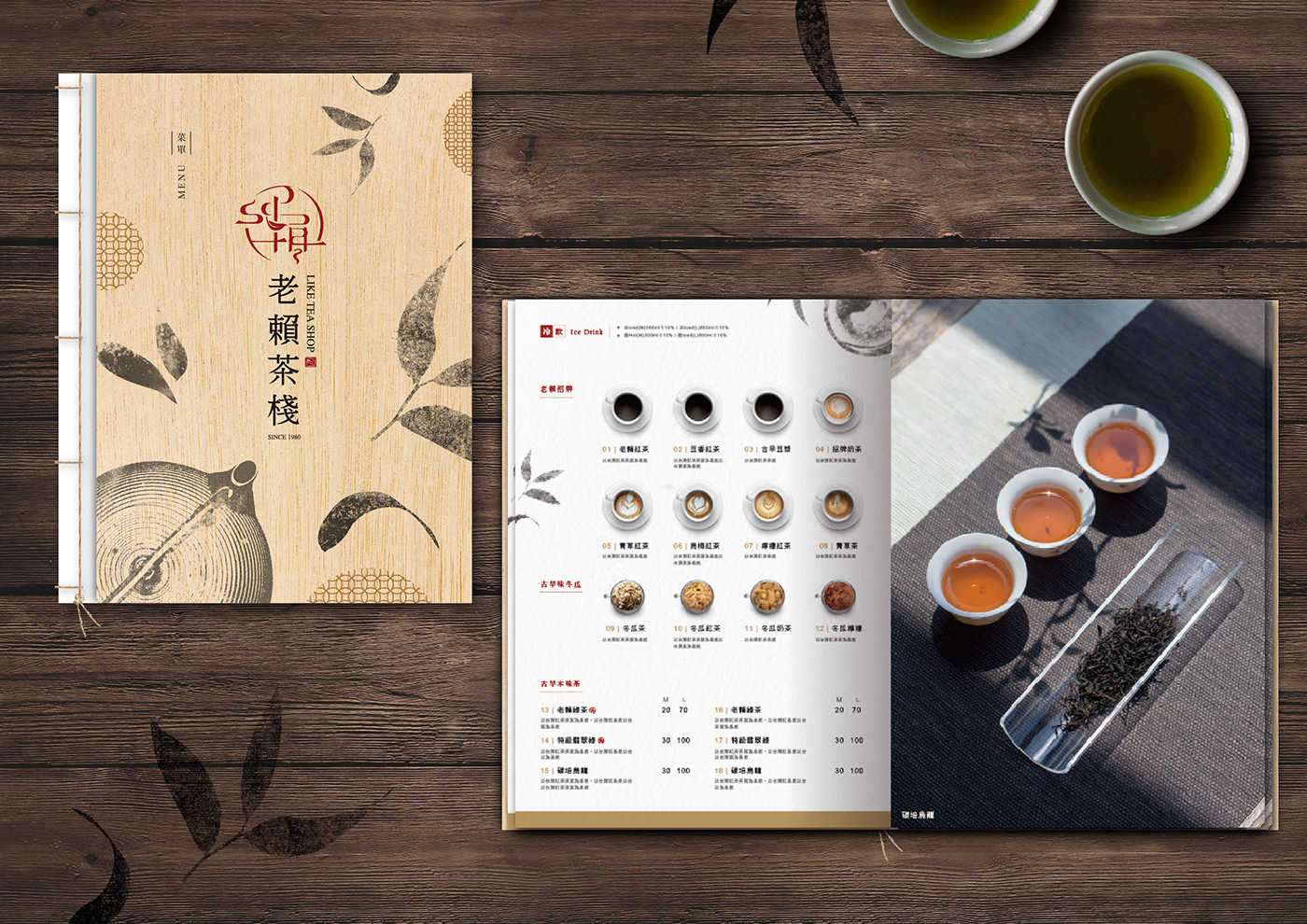
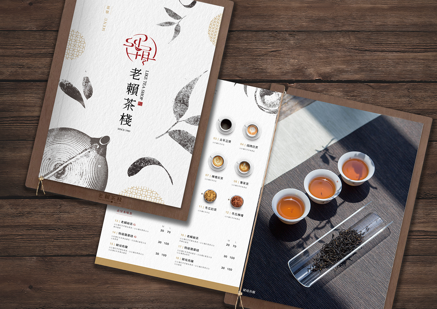
以老賴字樣為整體的形象識別,仿中式金文「老賴」的樣貌簡化,並融合茶葉與茶香的意象,彰顯出台中人共同的老賴回憶與人情之味。 在LOGO設計上,有著三道茶香的優雅體態,象徵著老賴茶棧傳承至三代的意象。而第四道茶香則代表著三代老賴的持續傳承,並如傳統文字般的永續發展。
The brand identity is recognized as Chinese letters “Lao Lai”, we simplify the words in Chinese bronze inscriptions, blending with the symbol of tea leaves, as a way to promote the nostalgia emotions and the memories in Like Tea Shop that Taichung folks commonly share.
There are three aromas containing in the logo desin, which represents Like Tea Shop as a three-generation-inherited enterprise. As for the fourth aroma, it means the further expansion and sustainable operation.