Corporate Identity for Primary school no 3 in Rybnik
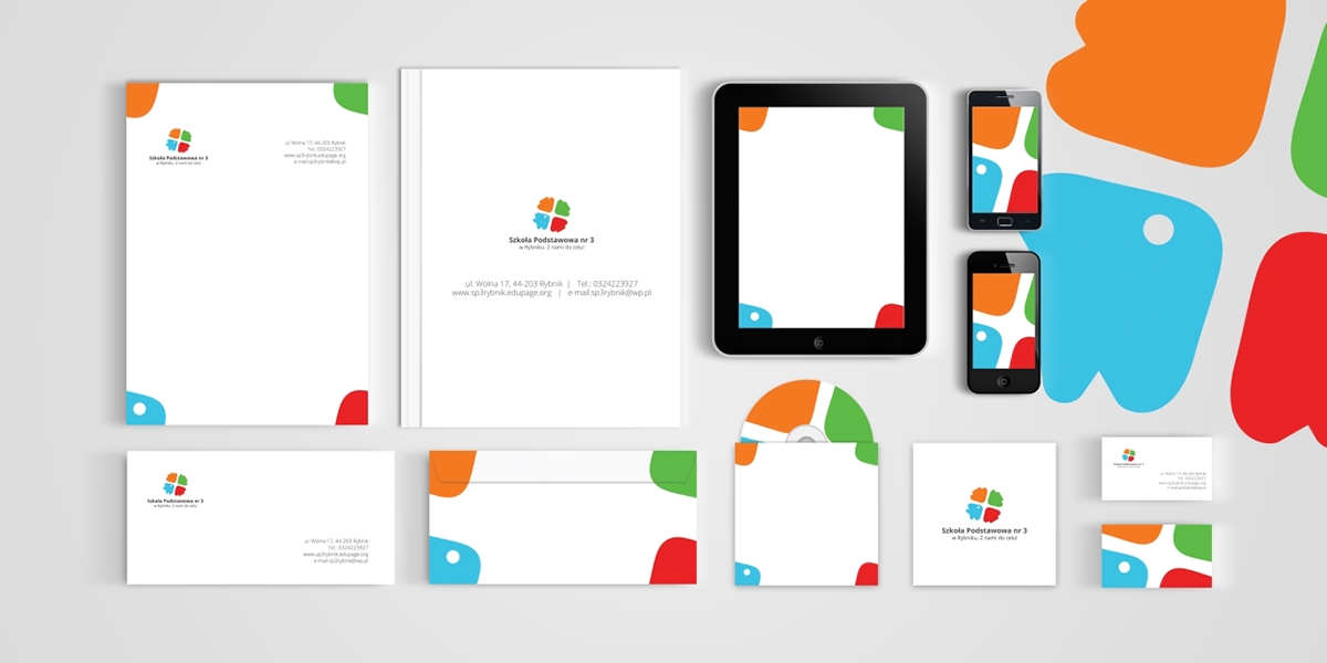
Strong and fine CI for SP3 in Rybnik. Our goal was to create the logo which were inspired by Rybnik CI. And this is how it was made - the colour and the fish. We decided that the base of our logo will be arrows. The arrows mean to aim to achieve the goal. And one of the arrows is a fish - Rybnik accent. The fish is directed up. It symbolised the progress.