
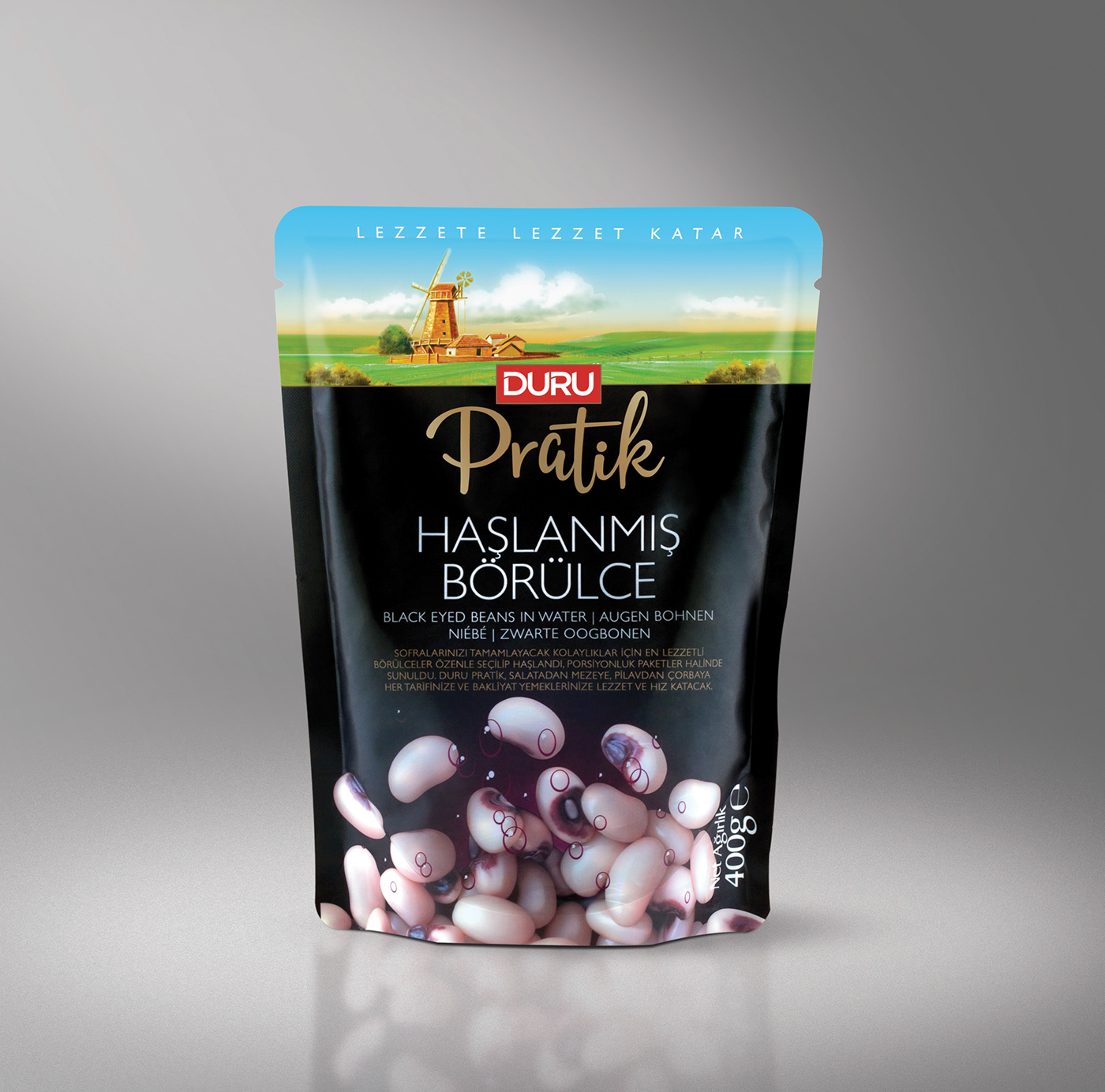
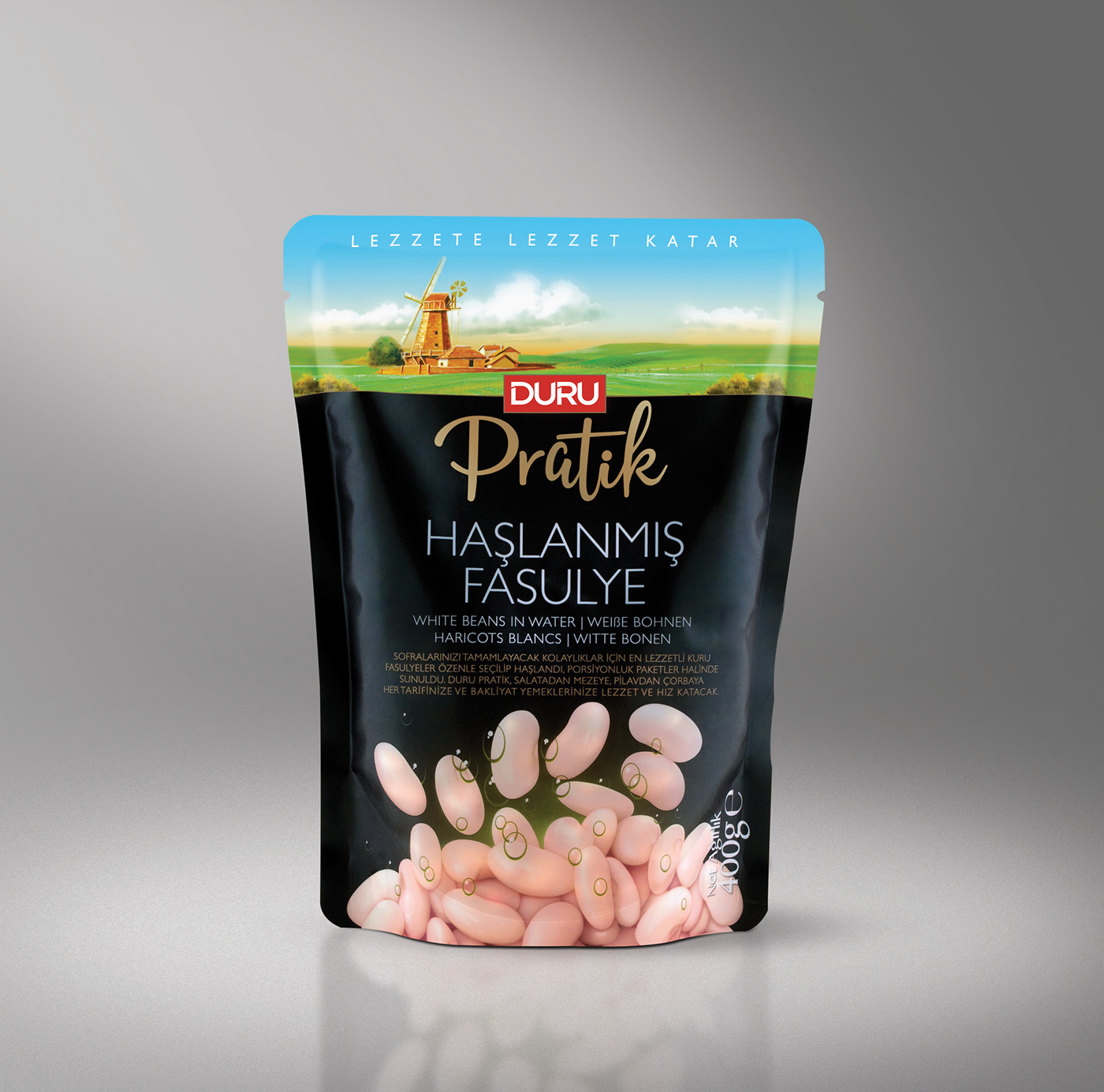
Duru Pratik canned legumes
packaging design.
Certain things become much more valuable in modern city life. In this sense, time is one of
the most significant concepts. When a busy work schedule combines with a two-hour period
lost in traffic every day, there is not much time left for the working people to spend
on their social life.
Duru Pratik stands out as a savior for the people who care about both their time and health and taste while working in a demanding work schedule. For this reason, we named the brand as PRATİK, which means “Practical” in English. We used black as the dominant color and the caption on
the can is slightly gilt so that it can be a premium product and can stand out amongst the other products on the supermarket shelves. Legumes illustrations were depicted to explain that
the product has been boiled and is ready for consumption.


Client: DURU BULGUR
Agency: GENNA ISTANBUL
Packaging Designer: KAYHAN BAŞPINAR
Customer Relations Director: Arzu Yaraş
Packaging Designer: KAYHAN BAŞPINAR
Customer Relations Director: Arzu Yaraş
PRODUCT ILLUSTRATION: EMRULLAH ÇITA

