
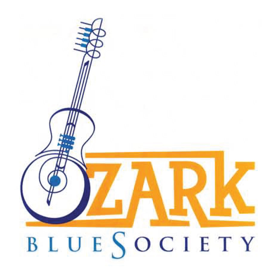
The Ozark Blues Society held a logo competition for a new look they could use on collateral.
The brief: A logo that speaks to the sophistication of the blues and the fun of the Ozarks.
I chose a quarky font for the word Ozark that emulates the whimsy in the community and the free spirit of the people that live here. I created the illustration to encompass a few instruments into one making it interactive for the audience to find what instrument they see first. I didn't like the repetition of the "S" for "Blues" and "Society" so I chose to merge them into one word to say both at once.


