


AER LINGUS INFLIGHT ENTERTAINMENT
GUI (GRAPHIC USER INTERFACE)
While working with Inflight Dublin I saw an opportunity to develop their services to offer professional UI/UX design for both embedded systems and personal device streaming. So when the opportunity arose to work with Aer Lingus to redesign their GUI I lead the project. The project would encompass 2 phases of design development over a 3 year period.

UI REDESIGN
The main aim of the first phase was to take the existing UI and give it a refresh. We were limited in what we could change with regards to buttons and the positions of elements. However there were definitely things we could improve on. One of those being to remove unnecessary visual elements. This immediately made the UI less cluttered. Another key requirement was to bring the seatback UI inline with Aer Lingus’s current digital brand guidelines and utilise their existing icons.
RACK TESTING
Once the design was approved and implemented by the design team using a CMS the next step after internal QC was rack testing. This means working with the hardware supplier in this case Panasonic to review the new design on actual seatback monitors and redo the QC process in order to catch any issues both UI and UX before launch.


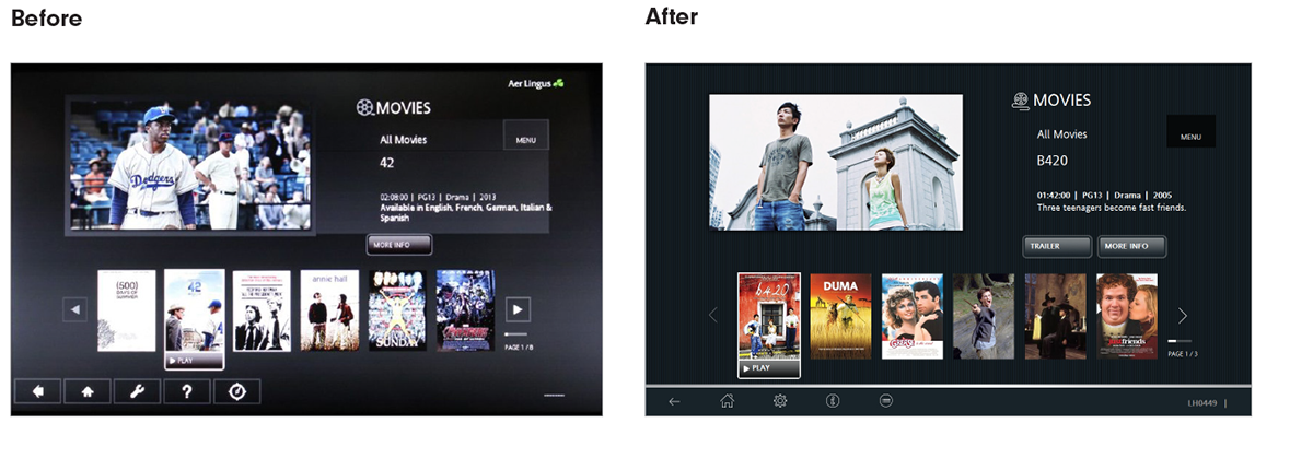
2ND PHASE
For the 2nd Phase our brief was to create a new intuitive UI/UX design for the Aer Lingus Embedded Seat Back GUI for both Economy, Business Class and Kidzone. This was to be completed in line with an update to the seat back screen hardware and software supplied by Panasonic. In this phase there were less restrictions and there was more opportunity to be creative with the design. Our goal was to highlight Aer Lingus’s wide range of inflight features and entertainment available to its passengers and displayed them clearly and elegantly within the new seat back GUI design.

BUSINESS CLASS
The business class design was developed to give an elegant professional feel, with shadows and deep greens to echo the new Aer Lingus Business Class brand. We carried this feel through the interactive with subtle glows and hints of metallic lines to emphasise key interactive points.
ECONOMY CLASS
Aer Lingus wanted a fresh modern look for the Economy GUI. We used a subtle gradient to create a sense of depth with accents of green for key buttons and small embellishments. This resulted in a clean and crisp environment for the user to navigate the inflight content.

KIDZONE
Kidzone areas were designed to be playful and visually appealing to a younger audience. We used a combination of blue and red to add definition to the interactive elements of the system to help the younger user navigate efficiently throughout the interactive.

NEW FEATURES
We were also challenged with designing a set of innovative features for the inflight entertainment system that had yet to be implemented within this GUI format. We tackled this by producing wireframes and workflow diagrams to understand the user journey and impact to development.

PROJECT TESTING AND DELIVERY
For the duration of the project we worked closely with both Aer Lingus and the Panasonic team. The end result was a fully delivered interactive in the two specified designs with all supporting features produced and designed on time.
Post-delivery we were invited to rack test the new interactive at Panasonic. The goal to fully user test the new GUI in situ and complete a comprehensive evaluation of all aspects of the new interactive for both Economy, Business Class and Kidzone.


