


Client
Affiliate network AFFRUNNER
Project
Logo design, Brand Identity
Location
United States
Design
Edwin Correa, Stamina Creative Studio
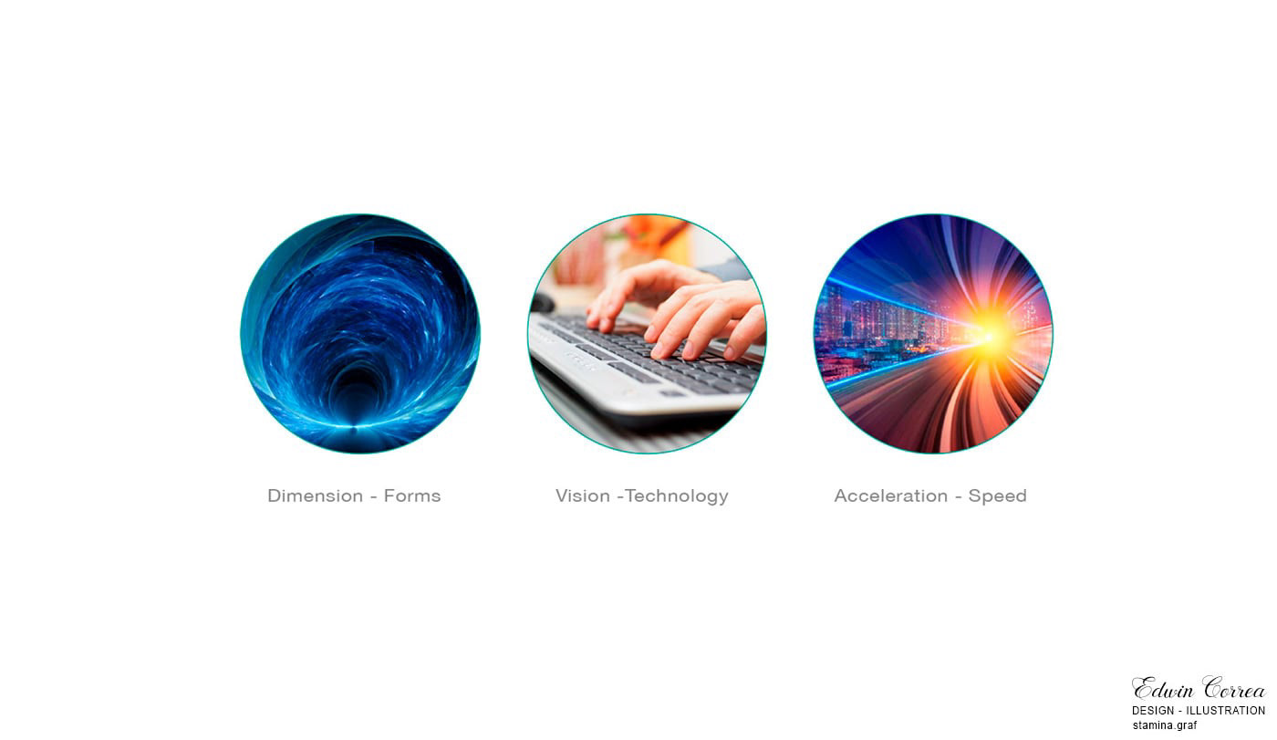
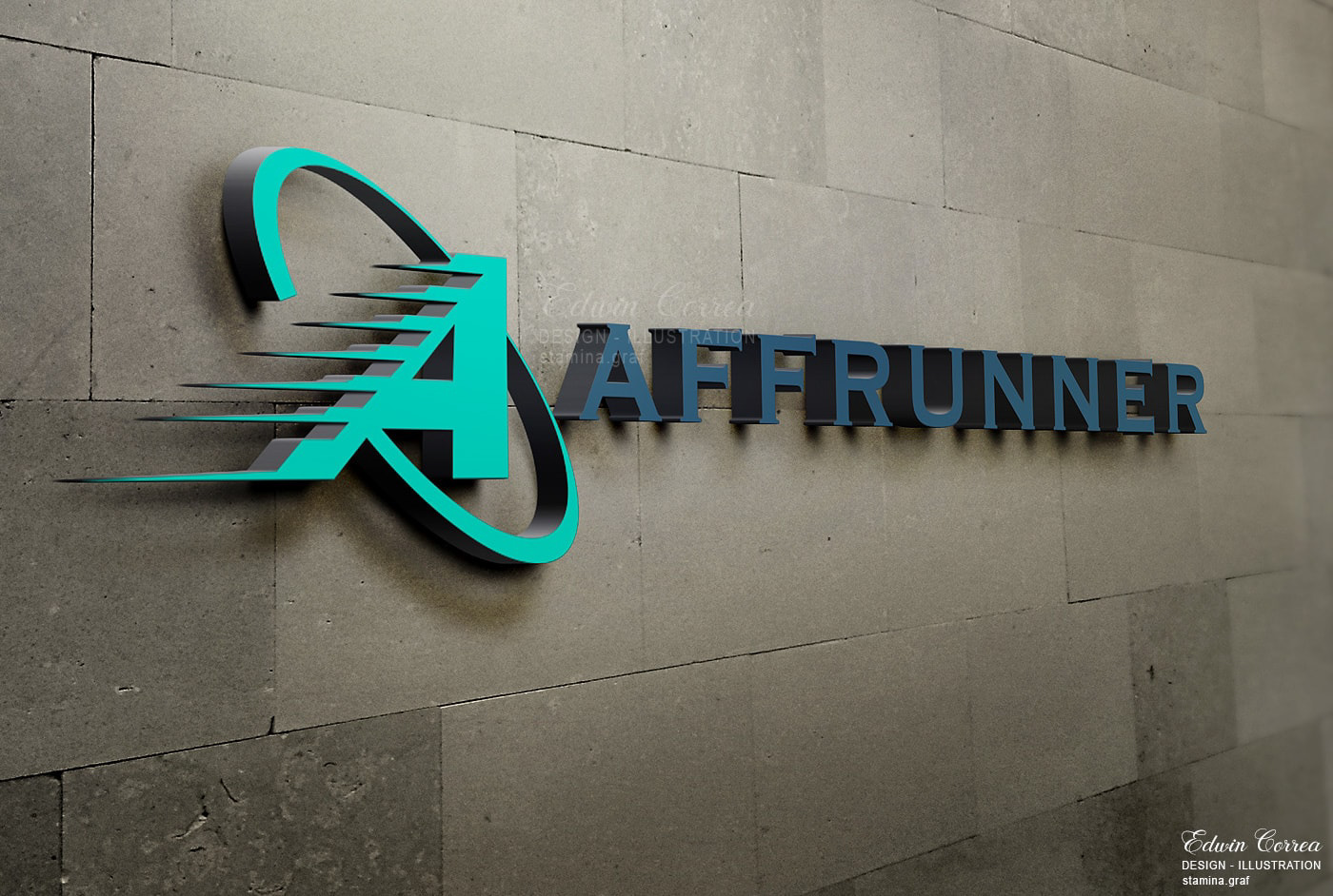
The Affrunner logo draws inspiration from a vision that embraces connectivity, strategy, and dynamism in affiliate networks. Every visual element has been carefully selected to communicate professionalism and excellence in a world where strategic vision drives success.
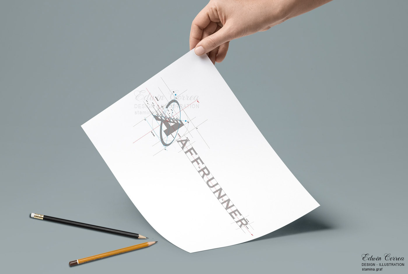
Isotype
DEVELOPMENT
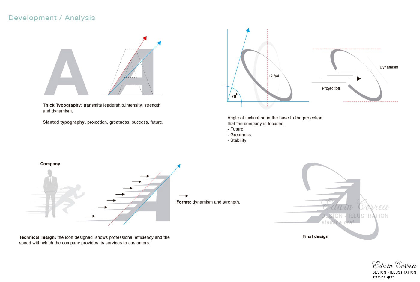
The Affrunner brand construction merges speed and connectivity with elegance and clarity. Every element, from the moving letter "A" to the dynamic color palette, communicates the agility and excellence that define the world of affiliate networks.

Affrunner blends speed and technical aesthetics in its branding, featuring a dynamic letter 'A,' precise intertwining, a strategic color palette, and functional typography. This combination conveys agility and technical competence, reflecting Affrunner's strength in affiliate networks with a distinctive professional identity.

The Affrunner icon stands as a symbol encapsulating the essence of solid connections and constant movements in the world of affiliate networks. Its design reflects the professionalism, agility, and strength of Affrunner in the affiliate space.
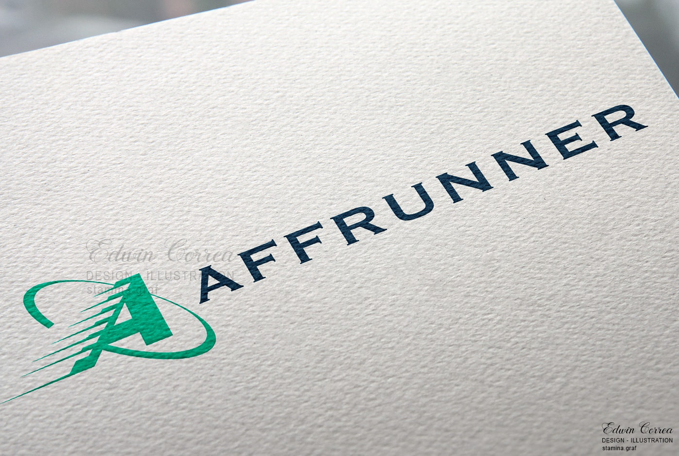
Logomark
DEVELOPMENT

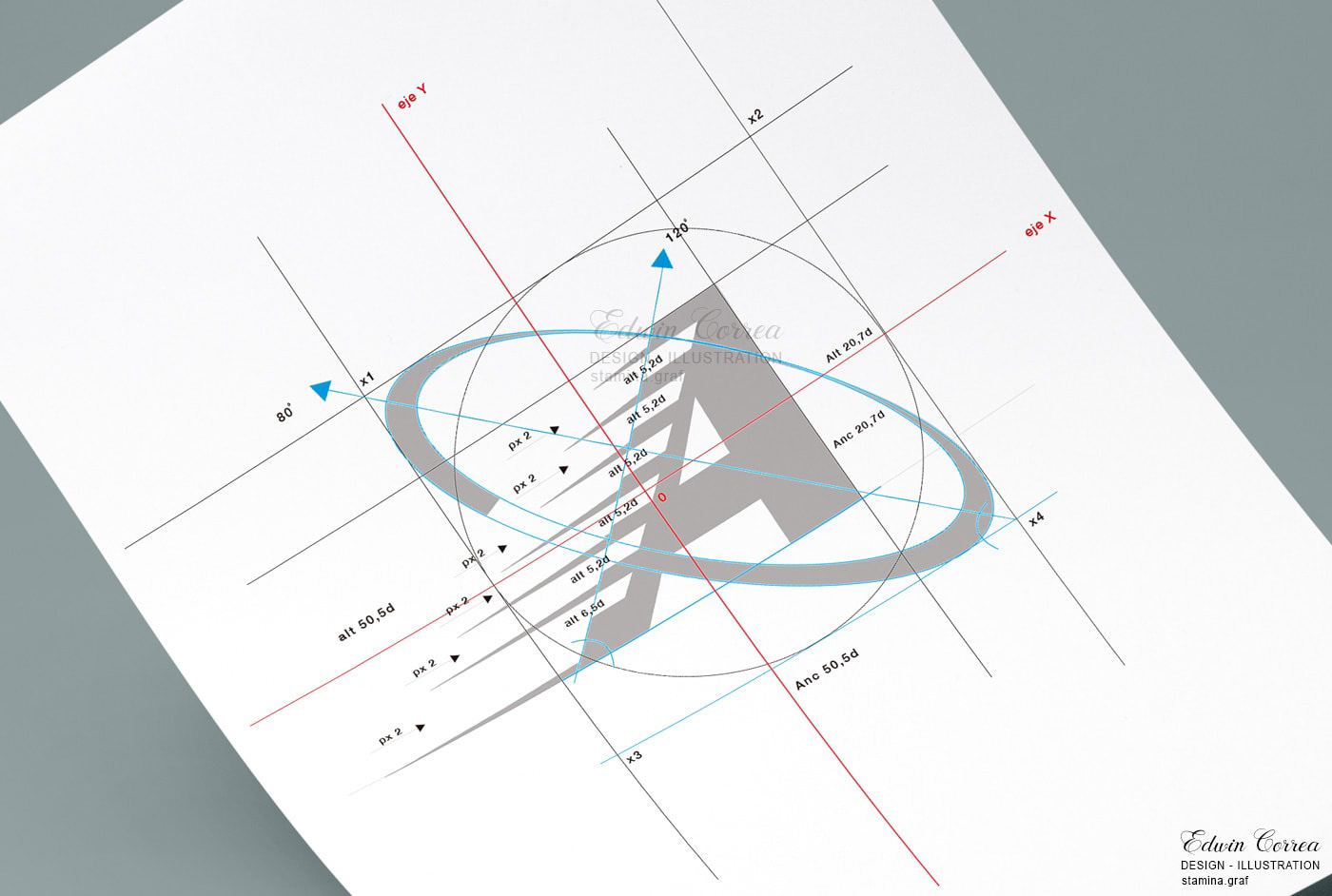
The logomark of Affrunner establishes a visual link with excellence in the affiliate arena. With its typographic elegance, interwoven connections, and dynamic gradients, it conveys Affrunner's ability to lead and thrive in a dynamic and professional environment.
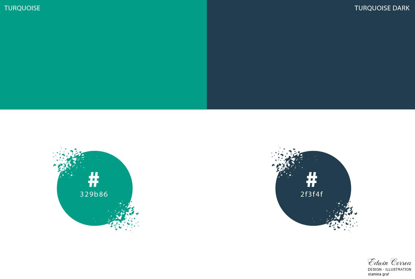
Vibrant Turquoise: Confidence and Vitality: Turquoise brings vitality and freshness, conveying confidence and stability. It evokes an image of reliable professionalism, essential in the affiliate marketing environment.
Sophisticated Navy Blue: Depth and Elegance: Navy blue adds depth and elegance. It suggests professionalism and trust, contributing to the perception of Affrunner as a solid and expert entity.
This color combination reinforces the solidity and technical competence of Affrunner in the competitive field of affiliate networks.

The positive and negative versions of Affrunner showcase its versatility and elegance in all scenarios. Whether in vibrant tones on light backgrounds or refined contrasts on dark backgrounds, Affrunner maintains a professional and distinctive identity.
Corporate
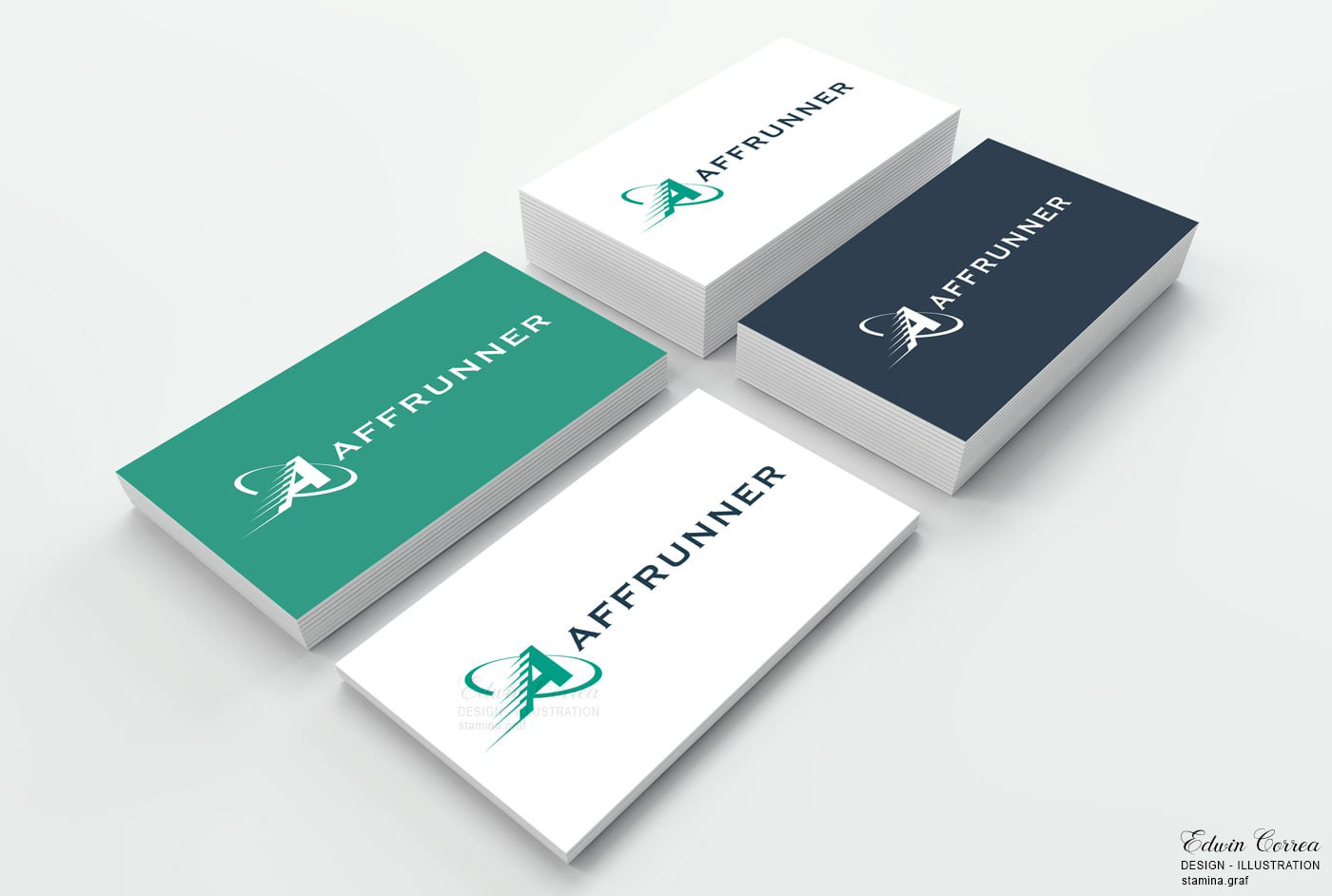

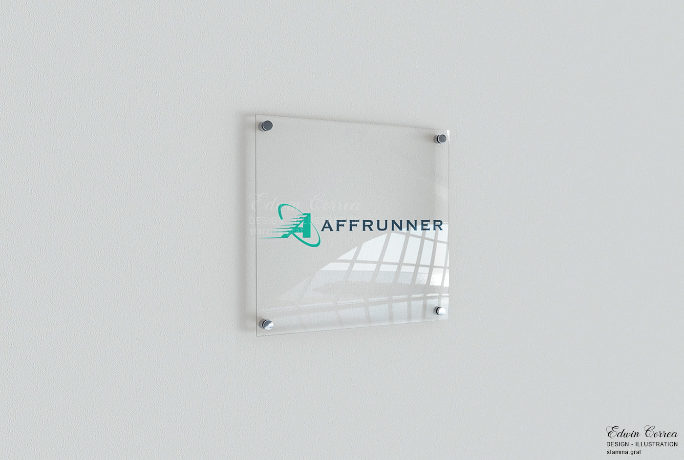

The corporate applications of Affrunner reflect the elegance and consistency that define the brand's identity. From corporate stationery to online presence, each element has been carefully designed to convey a professional and solid image in all business interactions.

Copyright ©
The images displayed on this BEHANCE network are entirely my creation, by 'Edwin Correa / Stamina Creative Studio,' and they come with tracking codes or pixels, which are protected by all applicable laws and regulations for this project. Therefore, if they are used or published without my permission or rights, it will be subject to penalties under the full force of the law, whether national or international.


