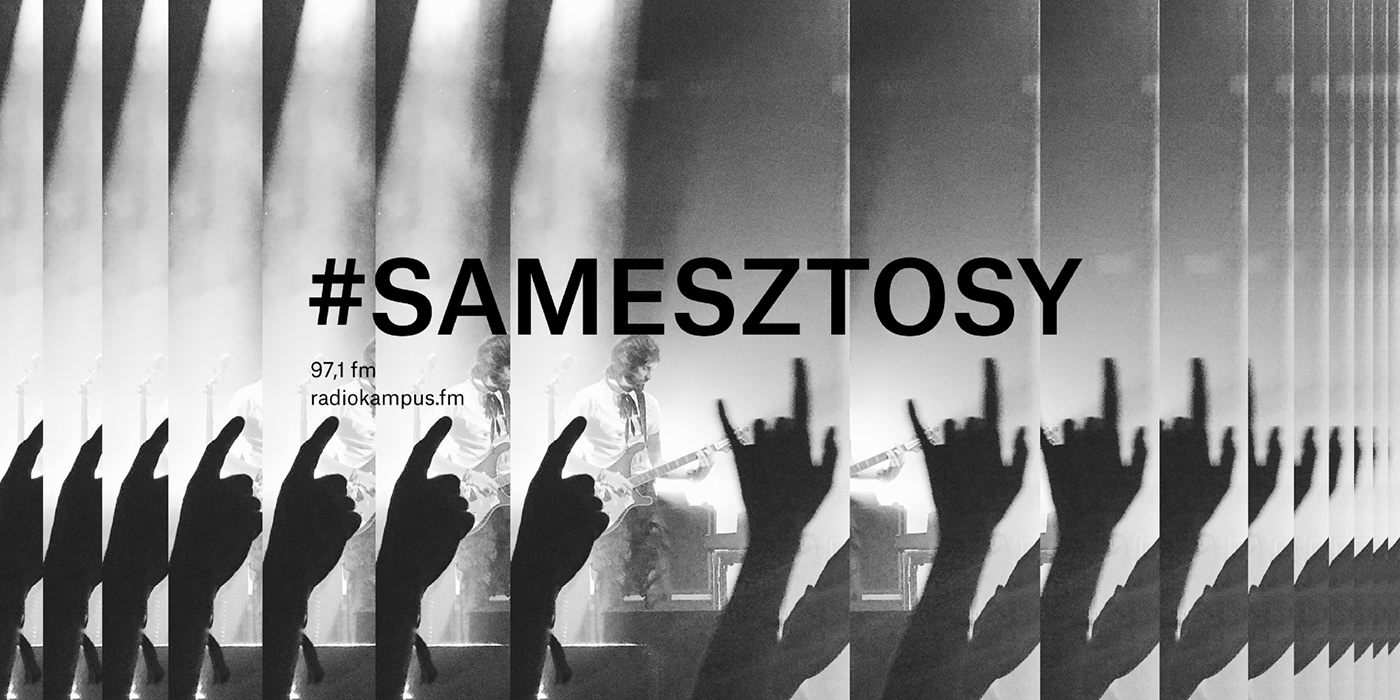
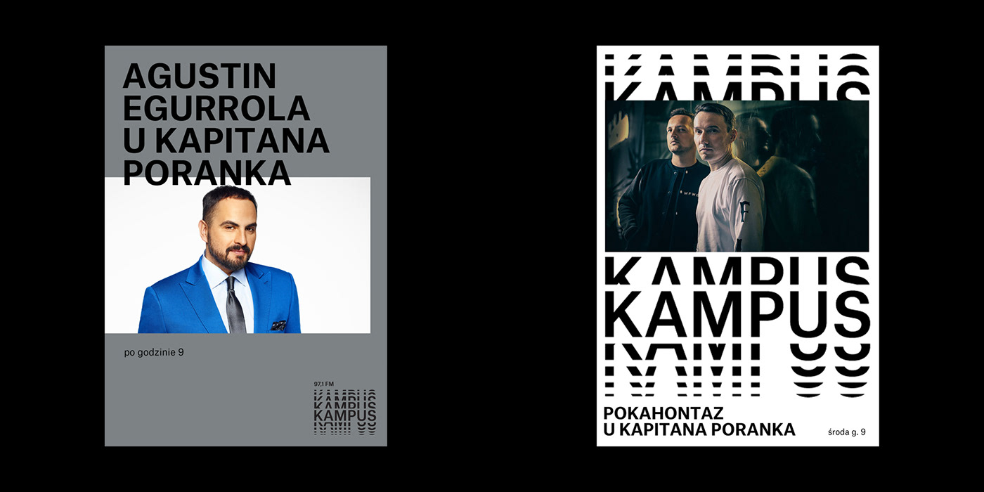
The new logotype for Radio Kampus speaks metaphorically of sound. We minimized the graphic form resulting in an optical typographic sign. We drew a lot of inspiration from 1960s and 1970s modernism which favored intelligent graphic solutions.
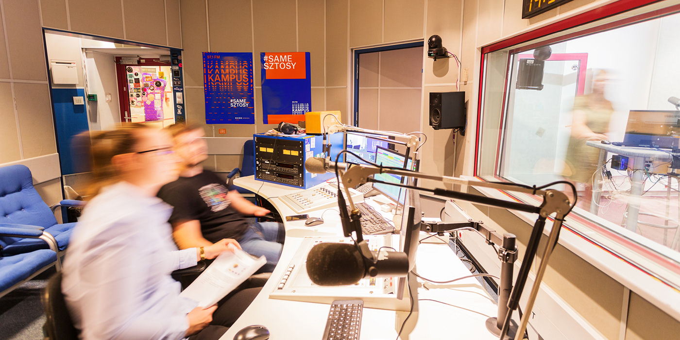
Just as Radio Kampus is a dynamic and variable structure, in the same way the logo can behave in multiple ways - it can be static, filled with textual content or it can be a graphic element in itself. The logotype is visually neutral since it has to encompass a large spectrum of topics which are discussed at Radio Kampus - culture, science, student life and last but not least - music, also ranging from electronic to heavy guitar music.
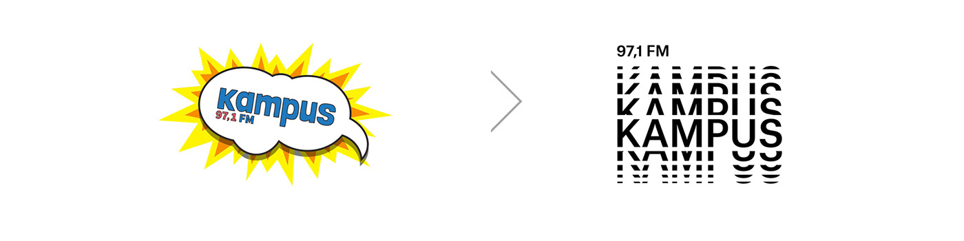


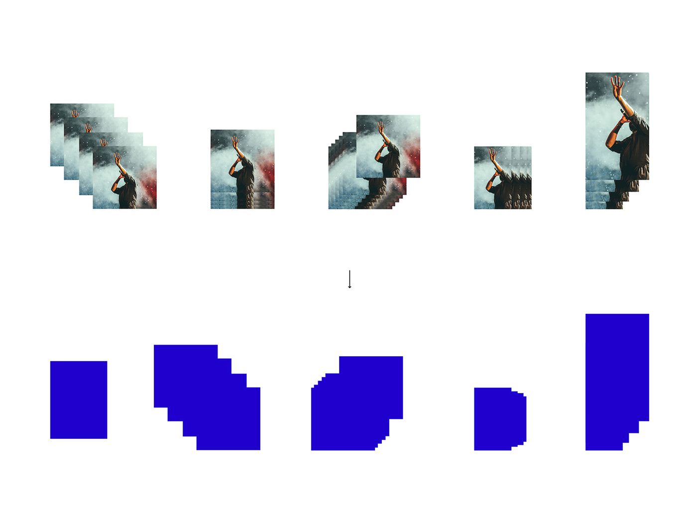


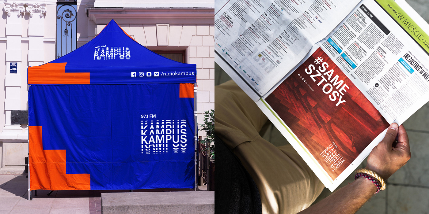

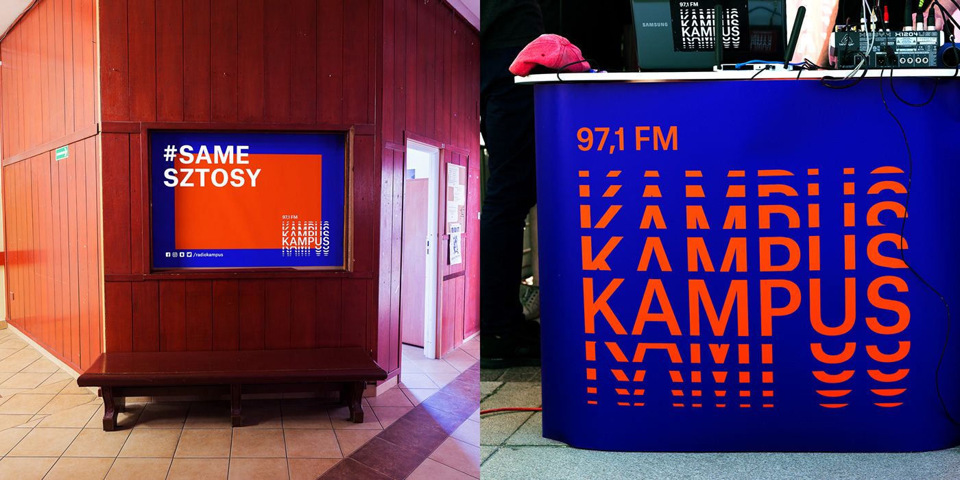


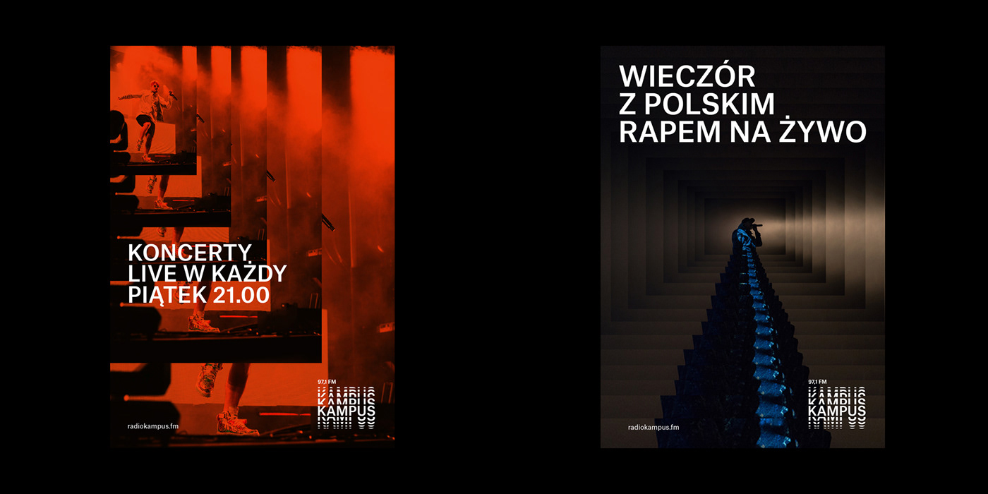


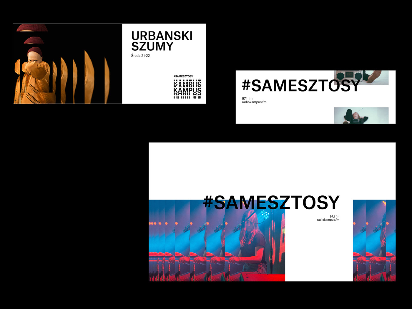
The graphic language we created is simple so it would allow the radio employees to create layouts on their own. Its simplicity allows them to execute it well using the brand manual alone. This was one of the greatest challenges of this project.


Creative Direction: Jacek Walesiak, Robert Mendel
Art Direction: Jacek Walesiak, Robert Mendel
Graphic Design: Jacek Walesiak, Marta Czuban
Video: Absurd studio
Music: Urbanski
Photos: Aleksandra Pavoni
KTR Silver Award 2018 (Identity)
Polish Design Award 2017 (Rebranding - Gold)


