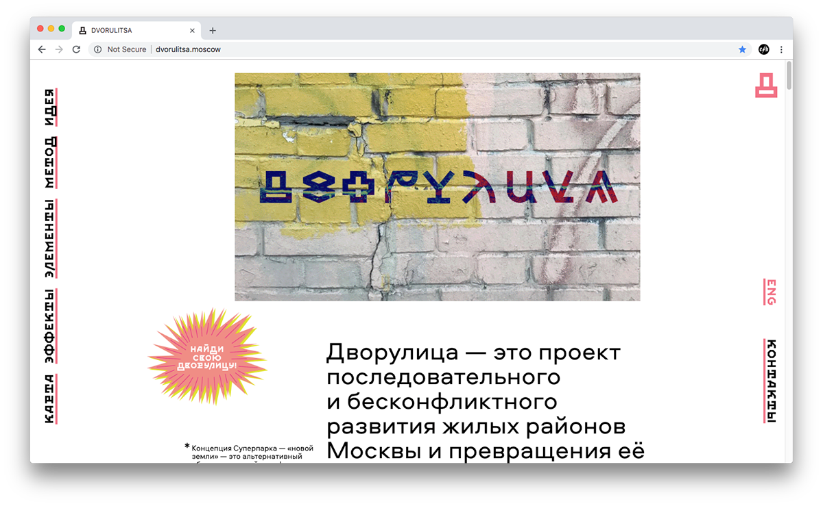
DVORULITSA is a project dedicated to consistent and seamless development of the residential districts of Moscow and to transforming its periphery into a "superpark".
We designed the identity, based on the street graphics and colours.


Эскизы логотипа
Logo drafts
Logo drafts


The seesaw-D became the symbol of the project


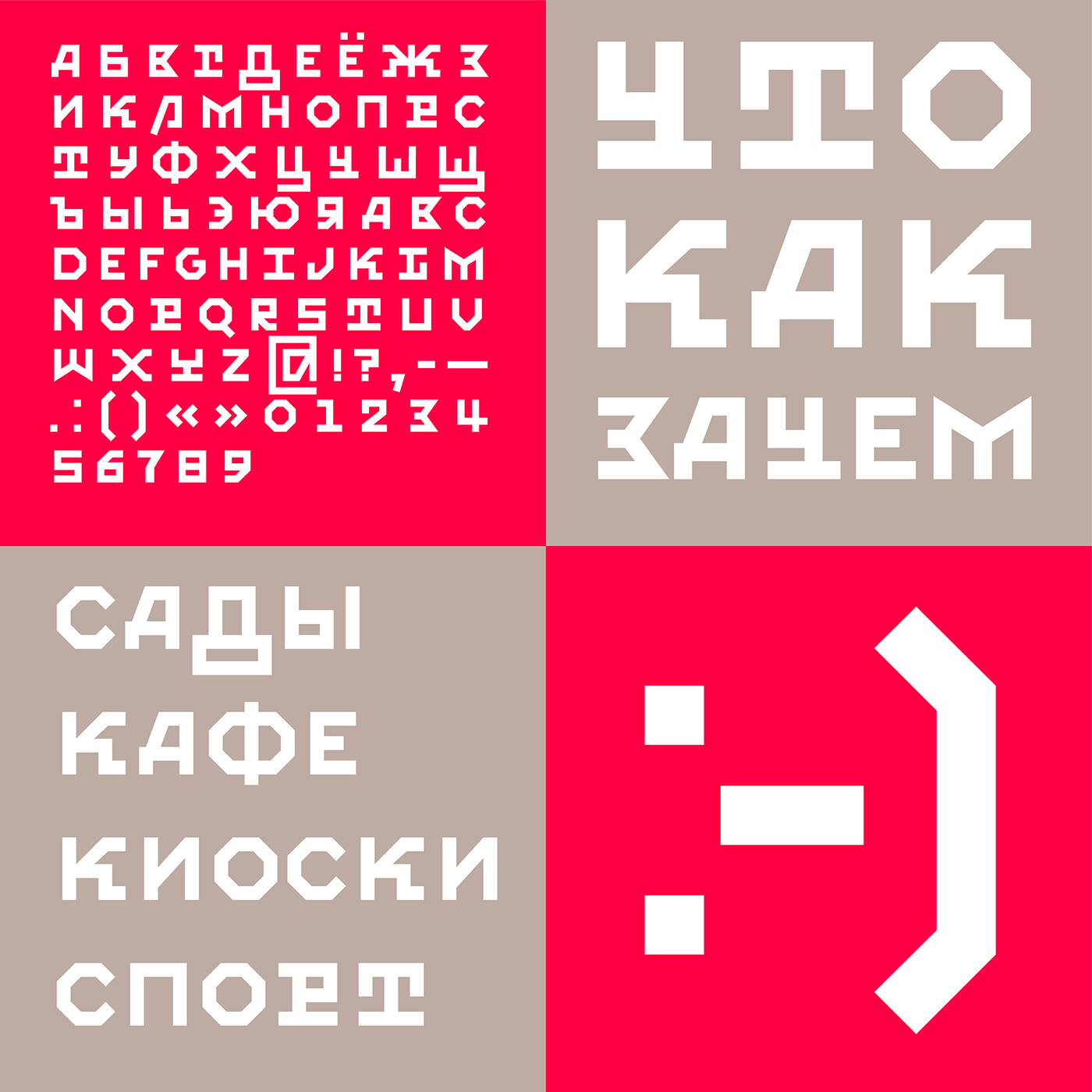

Custom font Dvorul Grotesk inspired by DIY constructions, that can be found in yards in Moscow and amateur typography.


Иллюстрации для сайта
Illustrations for the website
Illustrations for the website


Интерактивная карта Москвы
Interactive Moscow map
Interactive Moscow map


Design: Ekaterina Daugel-Dauge, Valera Kozhanov, Phillip Tretyakov
Art-direction: Valera Kozhanov
Map design in collaboration with Urbica
Dvorulitsa inventor: Alena Shlyakhovaya
Client: Meganom
Art-direction: Valera Kozhanov
Map design in collaboration with Urbica
Dvorulitsa inventor: Alena Shlyakhovaya
Client: Meganom
Year: 2018
—