
A Waft of Fresh Heartland Air.
Homegrown brand KELE started in the early eighties from a home kitchen in the western heartlands of Singapore, supplying traditional style cookies and pastries to friends and family. Words of mouth and excellent taste meant that things escalated quickly and the family’s facility soon grew into a mid-sized industrial kitchen.
Fast forward to today, the second generation owners took on the tricky and sometimes arduous task of reinventing KELE. The company found themselves having to reach out to an increasingly younger audience while making sure the brand does not lose its loyal supporters.
Same Same but Different.
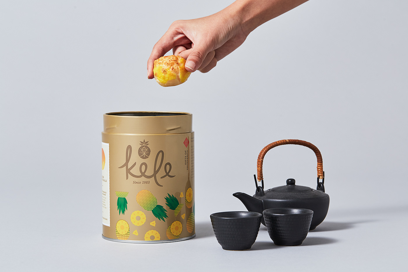
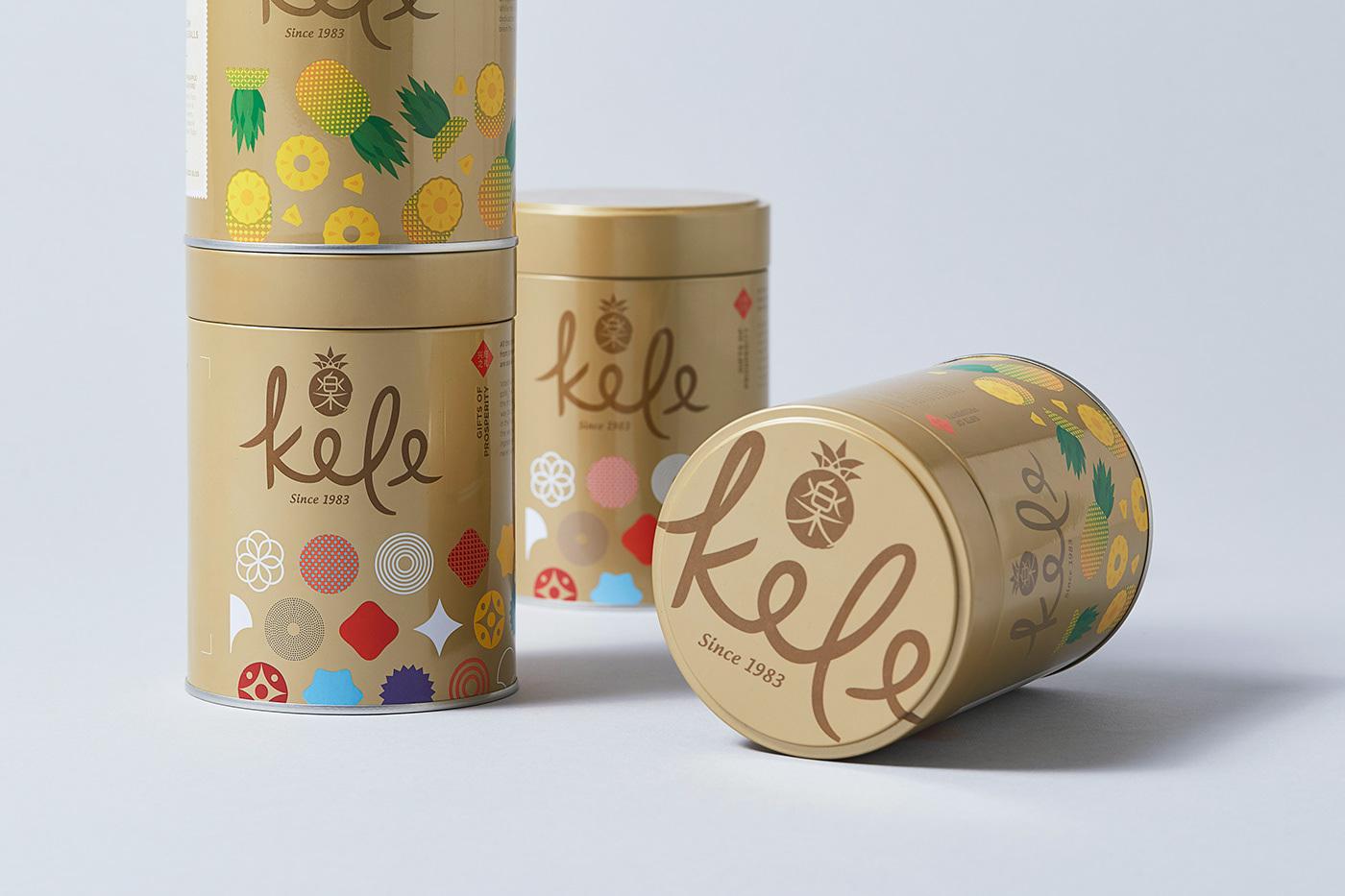
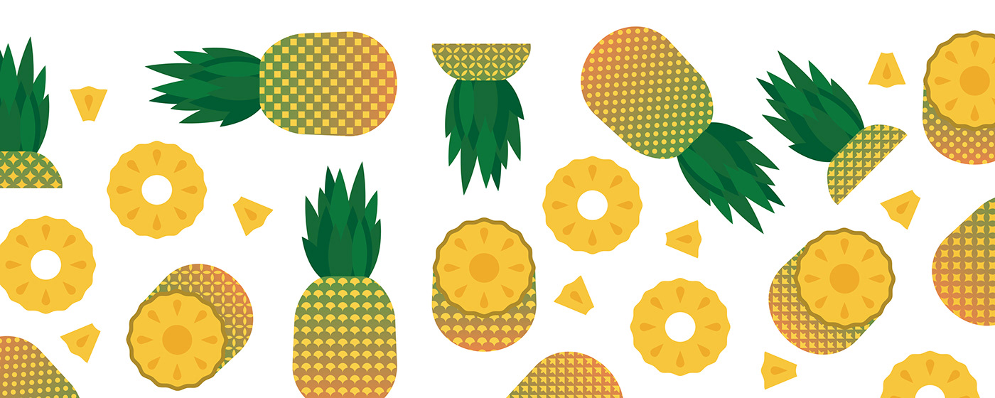
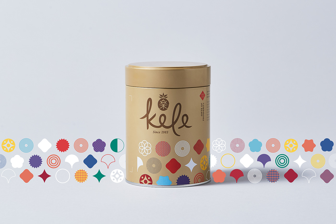
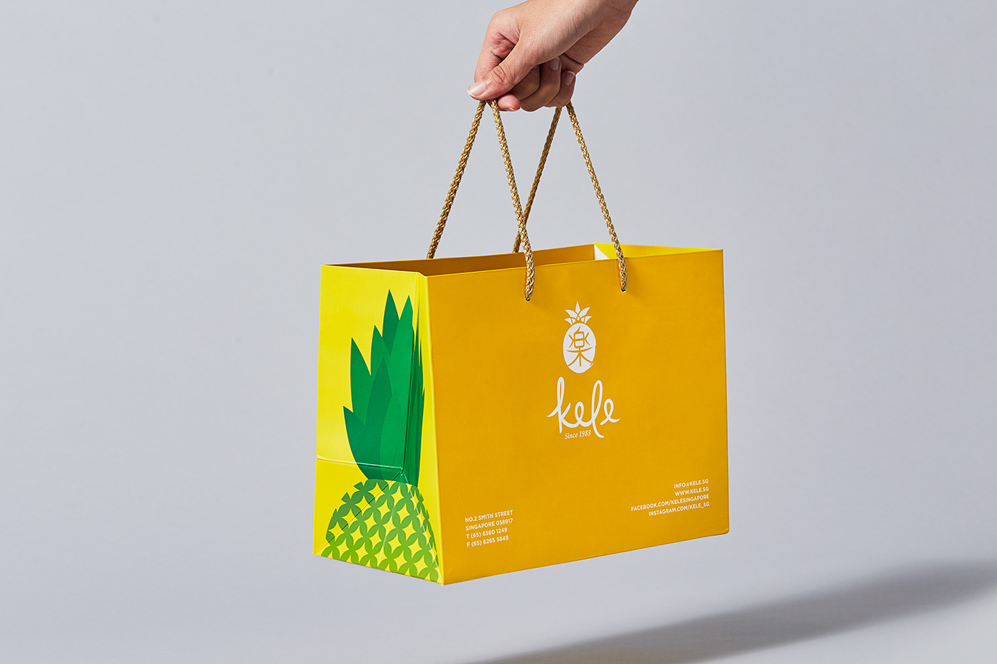
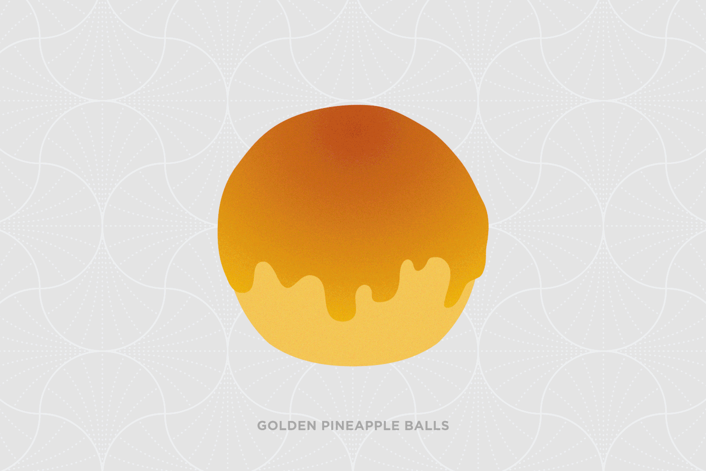
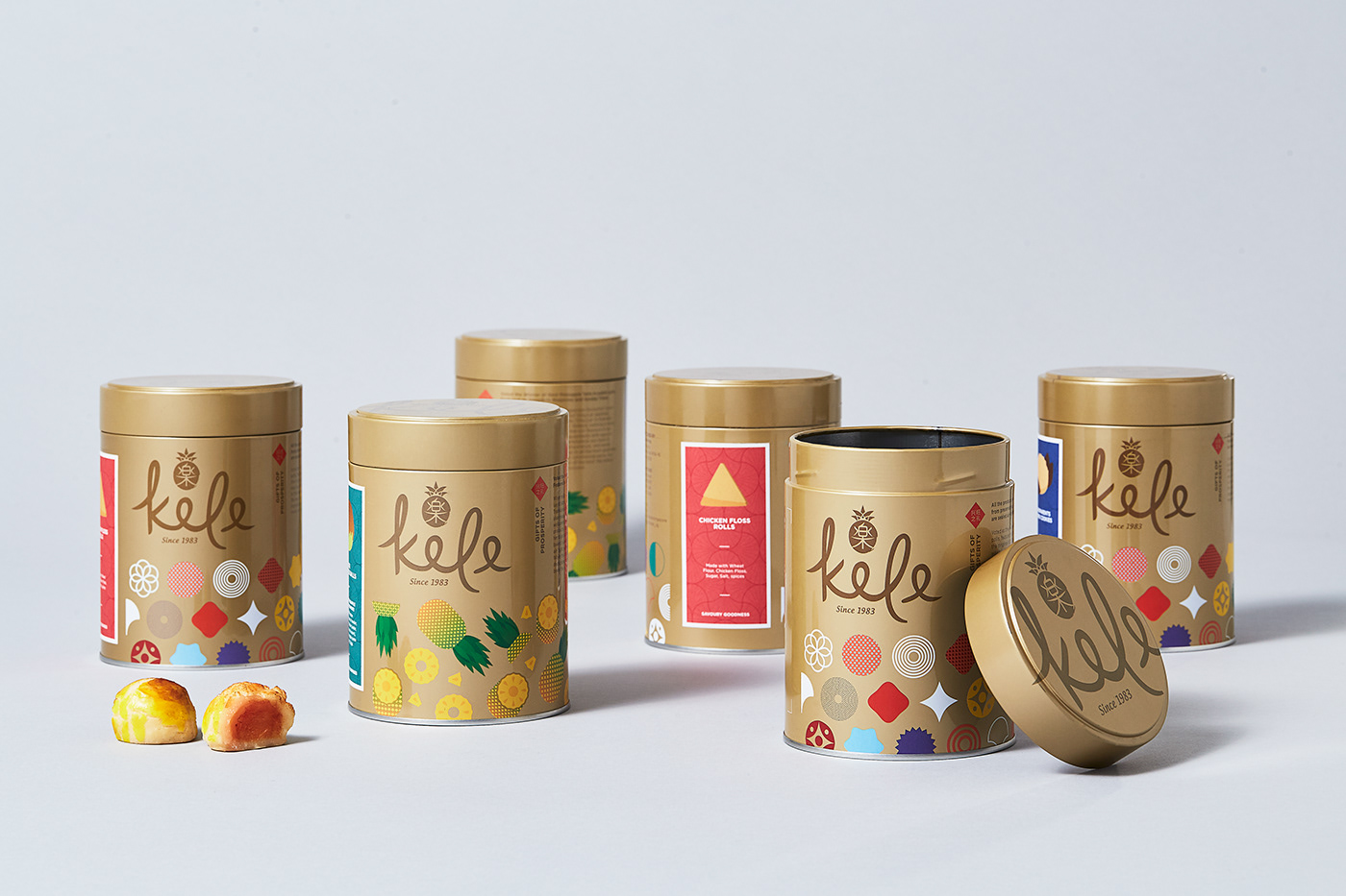
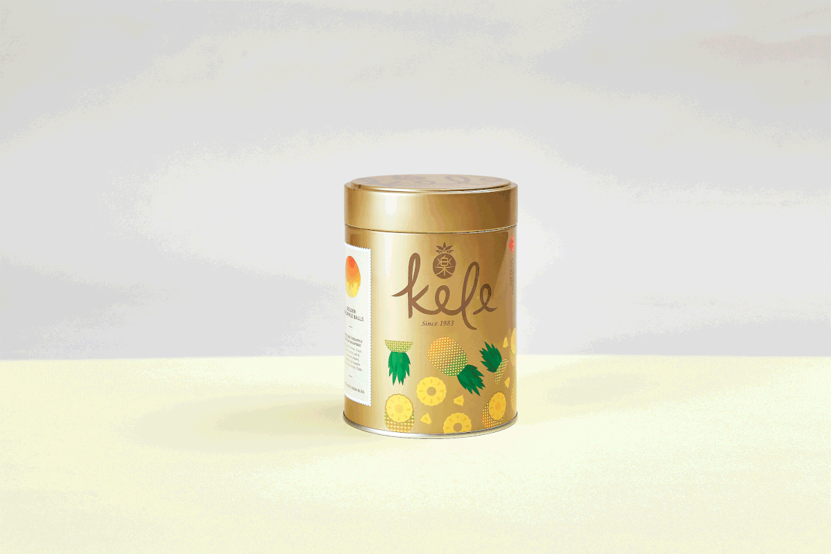
Instead of going for the shock and awe by throwing out everything, we retained the distinctive gold coloured tin container that KELE foodie fans recognise. We then developed an illustration style to inject new life and energy into KELE’s gold tin design.
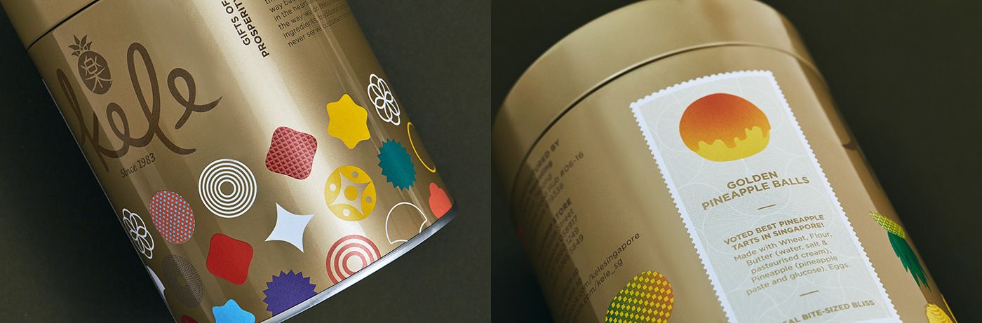


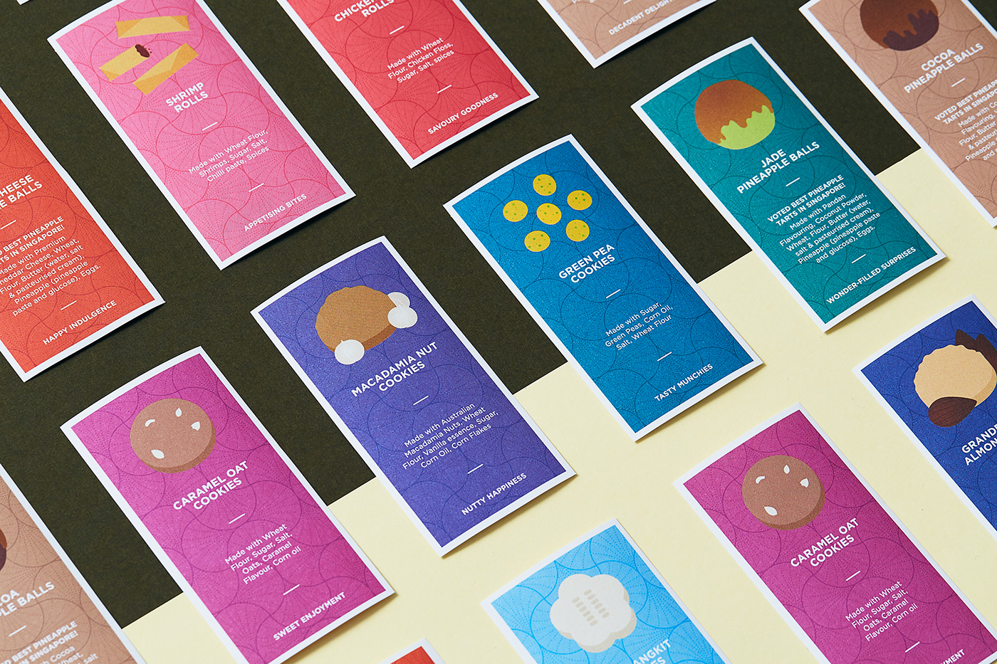
An amazing selection of flavours is often the bane of any food production business faced with a space crunch. Instead of printing a different tin design for each product type and having to store all of them, KELE’s tins carry a single generic design. Its content is then differentiated by a separate label with clear and friendly illustration. This allows KELE to manage demand and supply with great flexibility while at the same time being space efficient, since the labels are only applied when orders are being fulfilled.

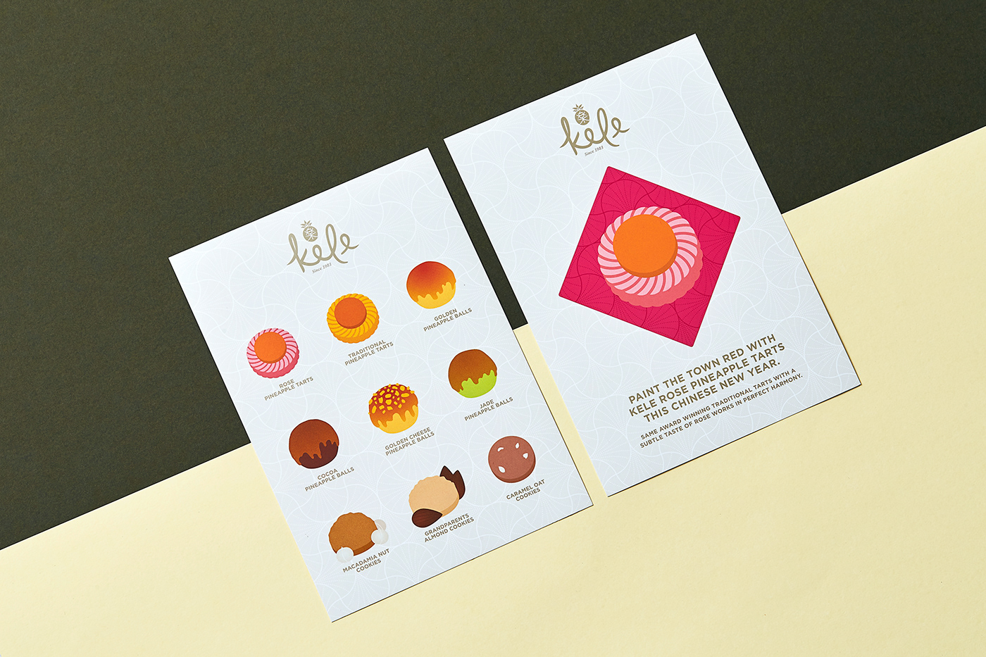
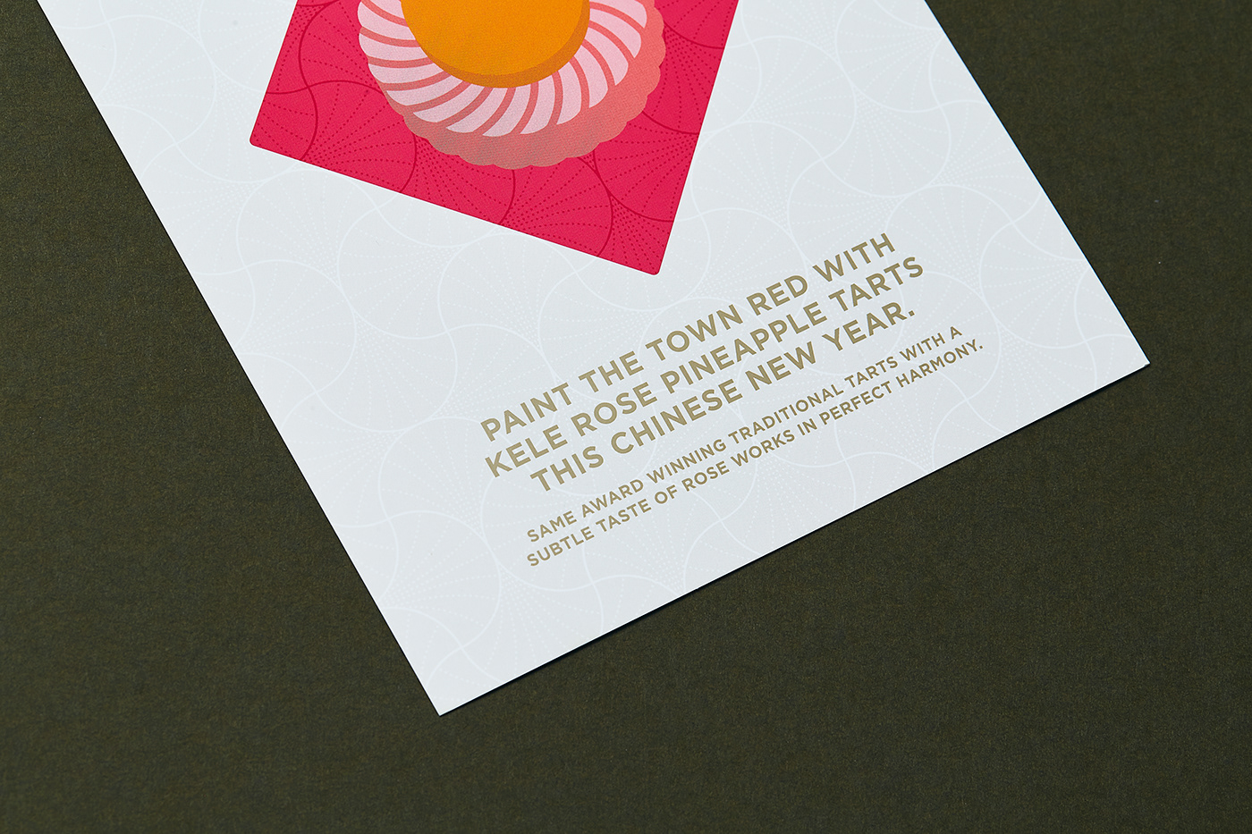
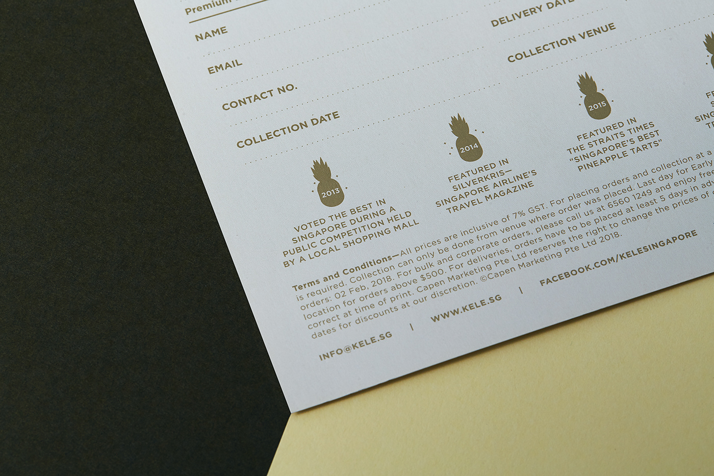
The design elements created were artfully deployed throughout various marketing touch points such as social media posts, flyers and in-store posters.
Client — KELE Singapore
Creative Direction — Kai Yeo
Design — Tan Chun Yong
Year — 2018
Creative Direction — Kai Yeo
Design — Tan Chun Yong
Year — 2018


