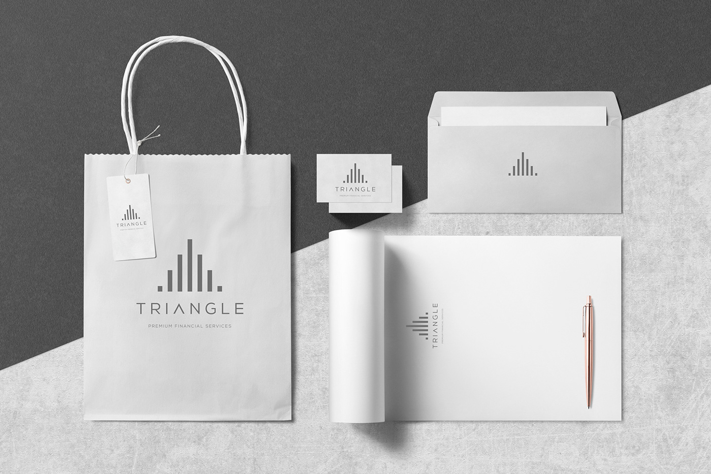
Designing branding for an accounting office may, for some, look like a procedural and common application of visual communication rules or translate into an innovative and subversive withdrawal of the existing market trend. The subject itself, essentially having very specific principles and possibly limited creative references to the field of design, is likely to complicate our work. However, our approach was focused in realizing the dream of a new entrepreneur with a willingness to create, than an existing atherosclerotic line of design for similar businesses. Taking into account the need of the season for fresh ideas as well as the excellent Triangle naming, we set up a signal with minimal principles ending up with the triangular symbol created by the bars you may encounter in mathematical, accounting and statistical studies. We stayed colorfully in very basic shades of gray and created a typographic combination based on cropped lettering techniques that dominate contemporary design over the last five years. The overall depiction of this signal created a combination of robustness, professionalism and a fresh approach to the design of the accounting industry.