Platform 4
Identity &
Identity &
Development
"Platform4 is a non-profit user-driven venue that experiments with technology in combination with artistic genres such as music, theatre, contemporary art, design, hacking, architecture and much more. Focus is put on creating an optimal framework where people can have great experiences, create, and develop new skills."
I was tasked to create a new identity system complete with identity guidelines and a new logo that would reflect the experimental vibe of the venue. It was a great collaboration with the client that has lasted for a long time.
I was tasked to create a new identity system complete with identity guidelines and a new logo that would reflect the experimental vibe of the venue. It was a great collaboration with the client that has lasted for a long time.
Early ideations
Most of the first ideations focused around combining the typographic part with the conceptual background. Because of the history of the venue being intertwined with tech, a lot of early solutions were derived from that or from the literal naming of the place. There were a couple of deconstructive ideas tested out and a strong focus on the flexibility of the identity, so it could be applied across all platforms.
There was also a second round of ideations - seen on third card. It was a proposal based on Conway's Game of Life, where the concept was working out a system for the client with a extensive grid and rules for using that. In that combining the inventiveness of the place with the fact that it has become a lively venue.


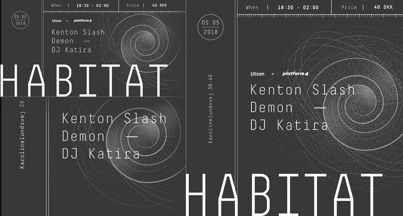
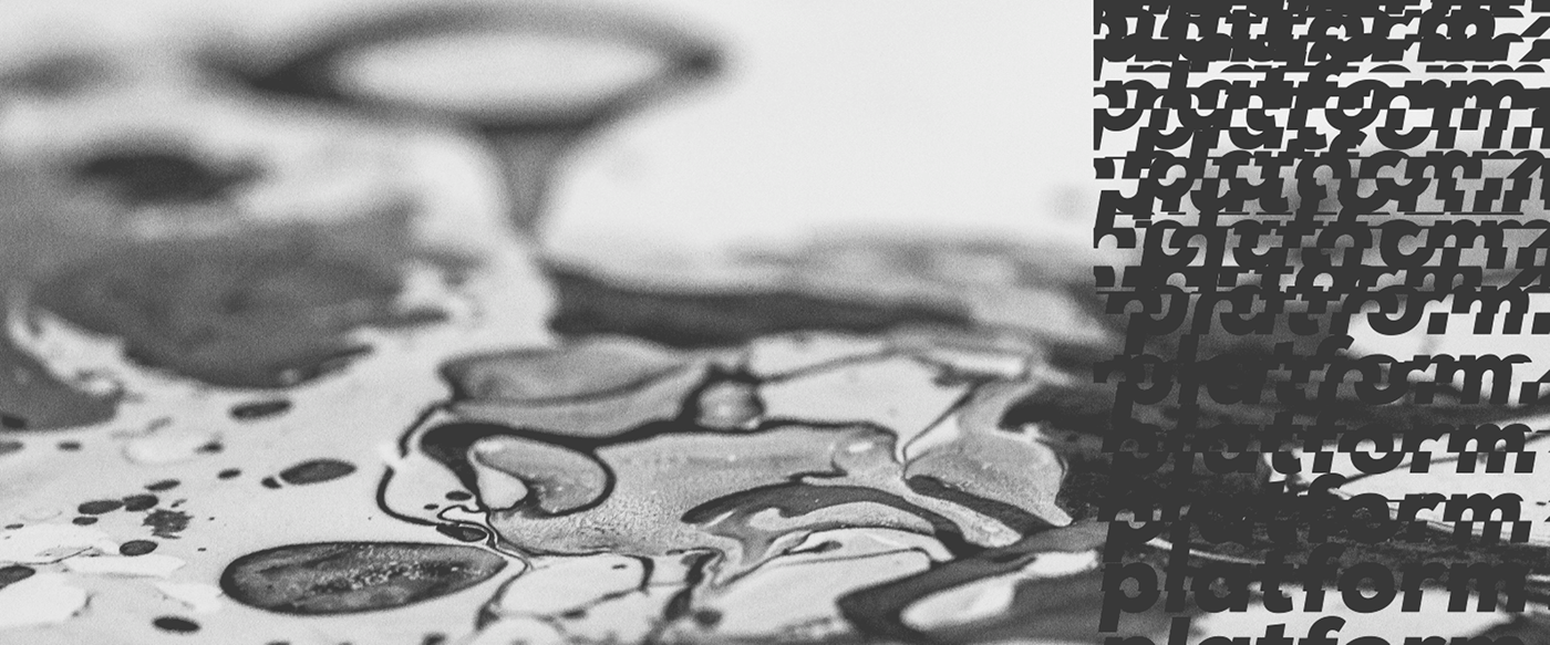
Logo & Guidelines
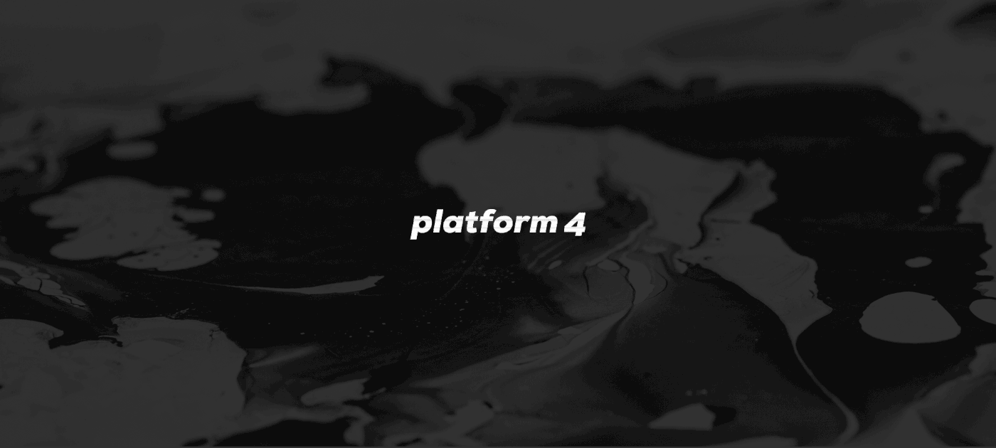
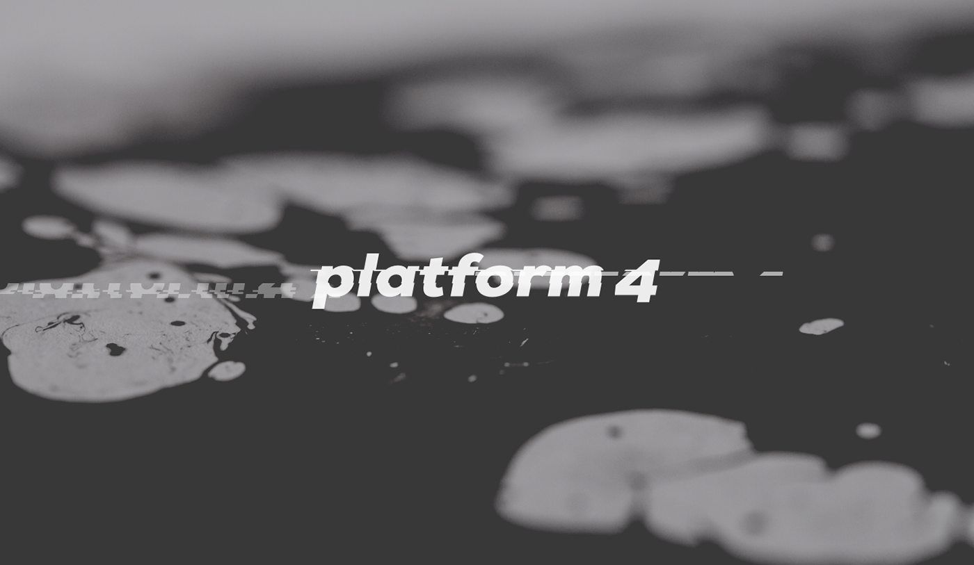
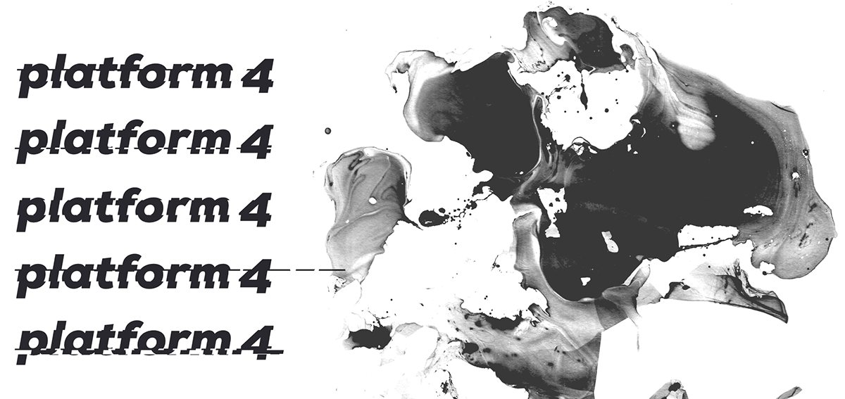
After discussing the first drafts with the client, we realized it would be a good time to step back and start from a clean slate, envisioning the future of the venue. As the place was growing more in a direction of music, experimental dark electronica and a general social space, the tech aspect of it seemed less important. The logo needed to be something fairly bold, modern and legible, to establish the new direction. After some trial and error, a bold, italic typeface seemed to have the best fit and feel.
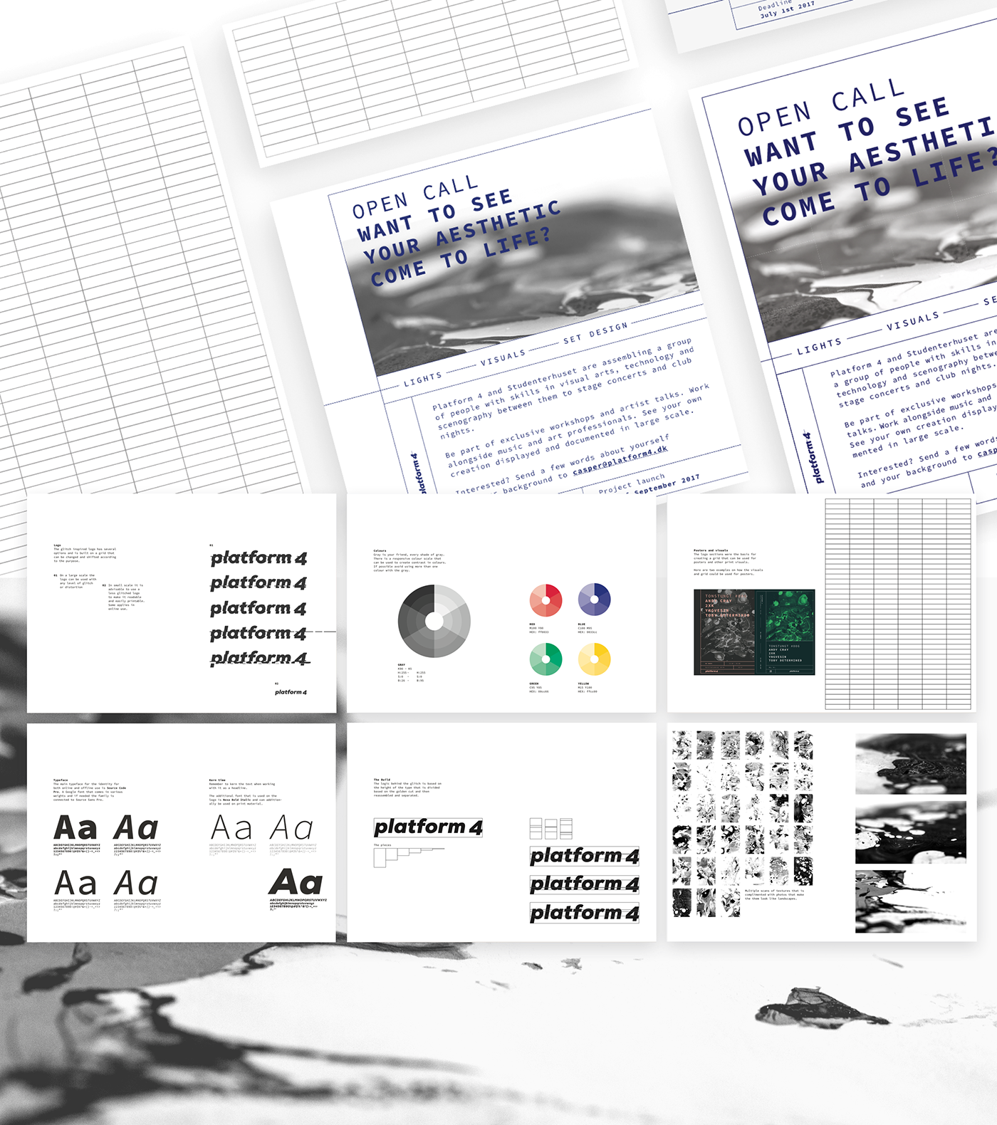
To make it an unique and flexible mark, a grid system was developed based on the golden ratio, taken from the height of the text. It was used to dismantle and glitch up the logo. Eventually 5-6 versions were exported for general use. It also made it easy to make it in motion graphics.
The visual guidelines were built around the logo, and an extensive grid system that could unify the materials. The main supportive typeface was chosen to be - Source Code Pro, as to represent the creativeness of the venue. To explain the use of the grid and visuals some examples were put together.
The visual guidelines were built around the logo, and an extensive grid system that could unify the materials. The main supportive typeface was chosen to be - Source Code Pro, as to represent the creativeness of the venue. To explain the use of the grid and visuals some examples were put together.
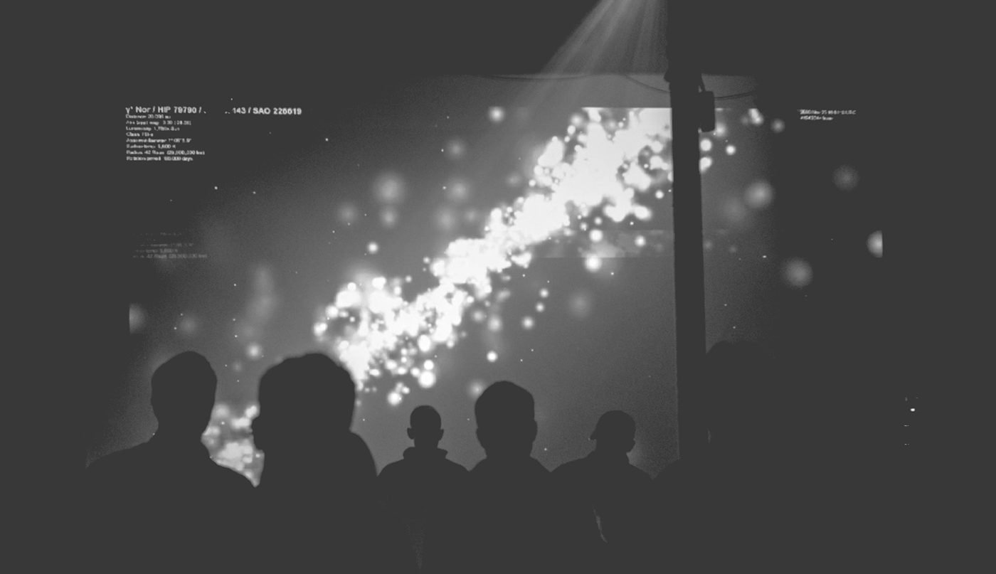
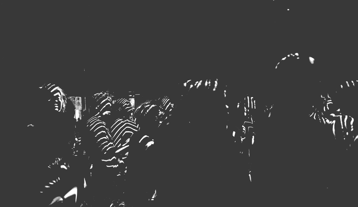
Visual language
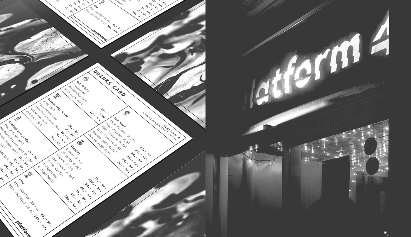
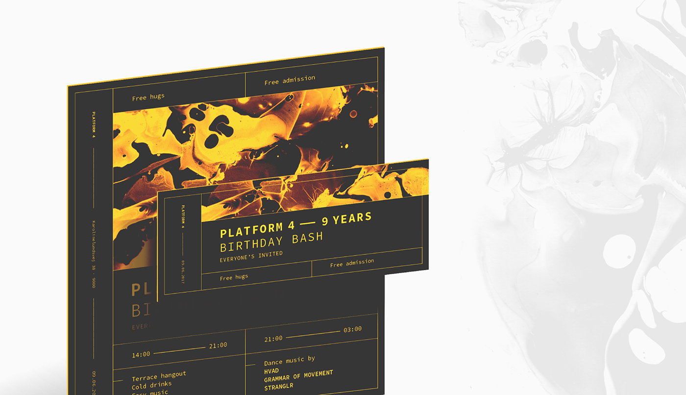
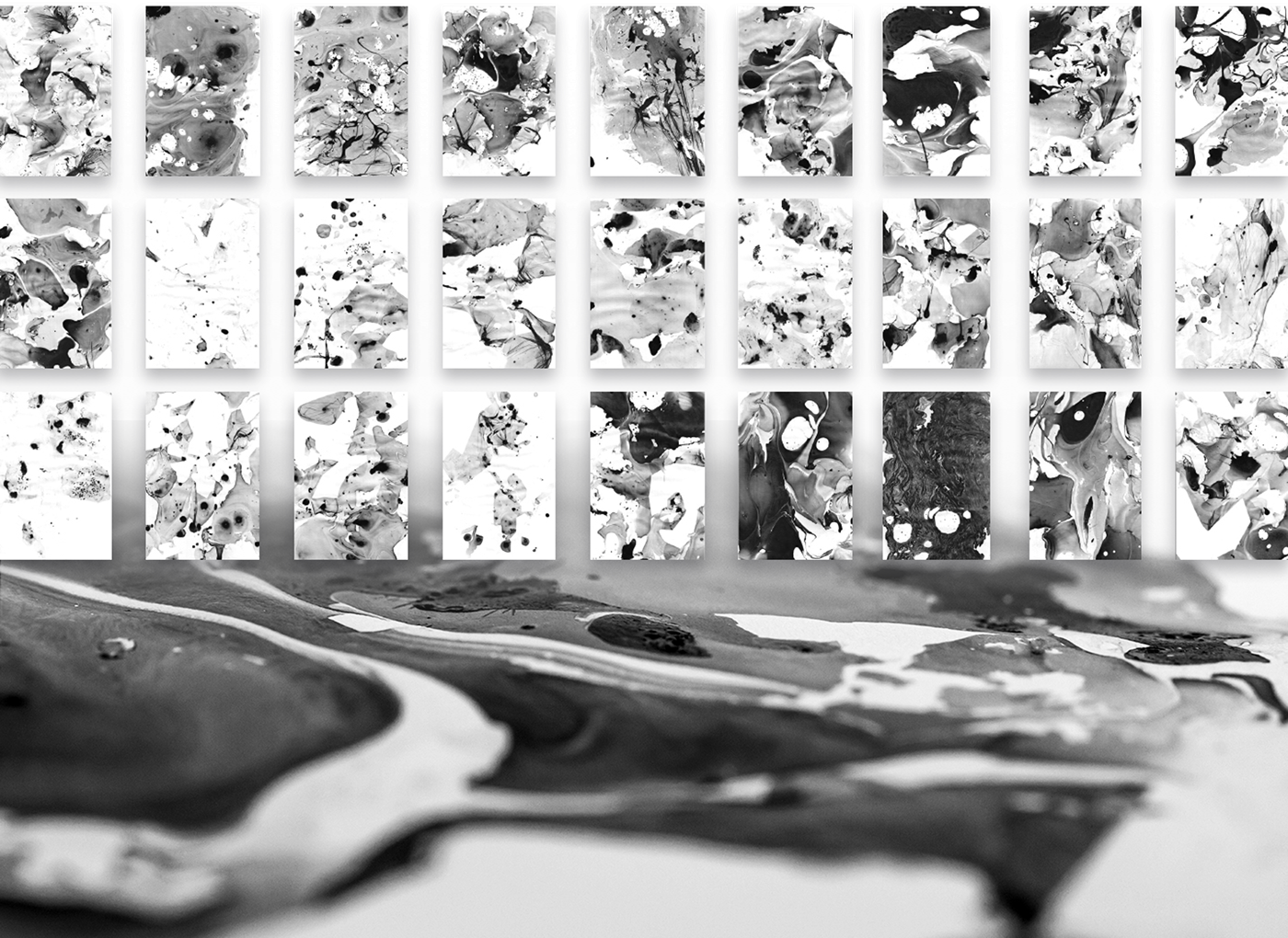
With the logo, typeface and grids established, the identity also needed defined visuals to create a strong presence in the scene. As the venue is about music and experimenting, the question became how to depict that through images. Idea of creating visual landscapes that would look like sound. After some experimentation with various materials I ended up creating a series of abstract textures with water and black paint. After drying them out and pressing them flat they made up a big set of 27 different textures.
They still needed to look like landscapes, so a talented photographer was brought in. The assignment being finding landscapes in the textures. All of these made up an extensive collection of available visual materials, that created extensive variety in the materials.

Social
For most of the social profile a simple number 4 is used with the added textures.
I have been very fortunate to be working with such a great project and a creative solution. Big thanks to the client, the photographer - @dukkefar, and you for watching
I have been very fortunate to be working with such a great project and a creative solution. Big thanks to the client, the photographer - @dukkefar, and you for watching