
BRIEF AND OBJECTIVES
Quantum Energy Squares is a company from Santa Monica, California, with a product which is as innovative as it is special. Made from seeds and healthy natural ingredients, it incorporates the power of caffeine for those who need a kick of energy in their daily lives and exercise regimes.
The company decided that 2017 was the year for a qualitative and quantitate leap, taking on challenges such as a new brand positioning, updating and modernizing their design and brand experience, improving their visibility and impact to grow beyond their local area, and expanding at a national scale and amongst a younger demographic.
Erretres led the global rebranding project, focusing on improving their strategy and positioning, visual and verbal identity, and renovated packaging to gain visibility in the saturated North American market. They now compete successfully within said market thanks to a clear and efficient brand and product impact.


LOGOTYPE
The Quantum logo was developed from the combination of a cup of coffee and the letter “Q” together with a lightning bolt. The construction and animation of the logo build an image based on the energy and strength of caffeine.


TYPOGRAPHY & COLOR
A wide colour palette containing bright tones with plenty of presence and strength. The flavours are denoted by colours, and create a hierarchy in the presentation of the products.
Sharp Grotesk is a condensed typeface with an exuberant personality, allowing for the composition of titles with strength and power. Its unique design allows messages to be imbued with the brand’s personality, whilst its legibility aids the reading of explicatory text.

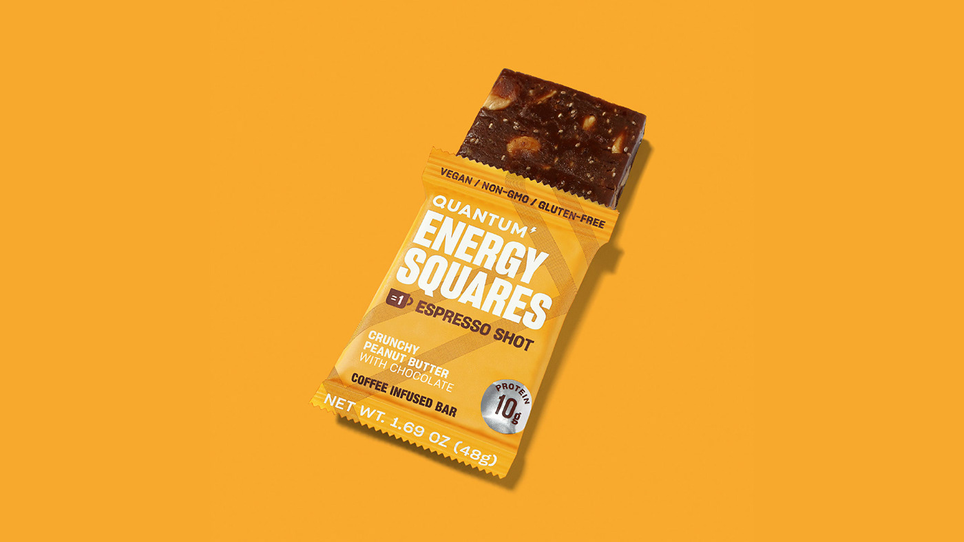
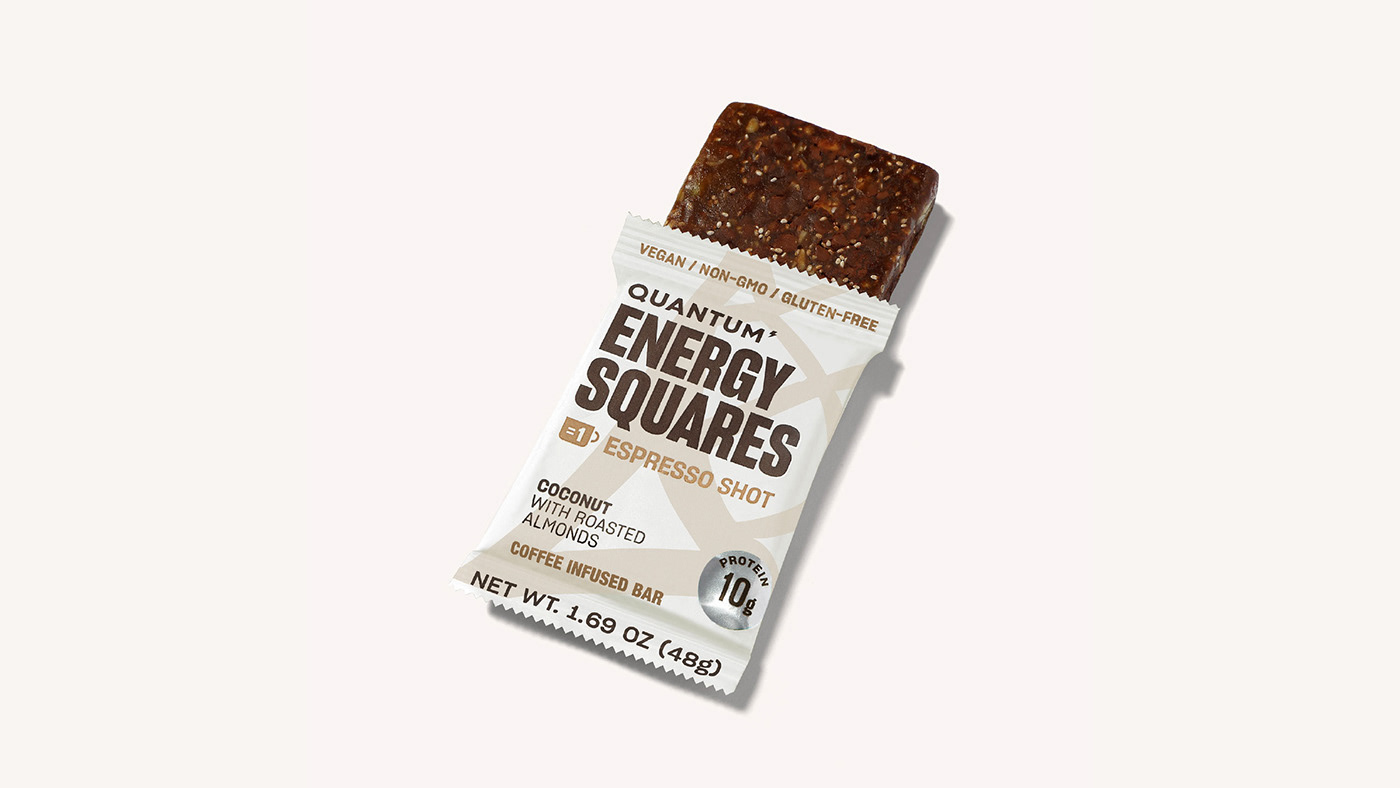
PACKAGING
The balance between mass consumption and performance training was created using a powerful graphic language in which the base element is always coffee. We looked to gain visibility in the saturated North American market by renovating their style and presenting more information on a smaller package by using an interesting composition and playful typography.


PHOTOGRAPHY STYLE
A focus on individuals which incorporate their passion for sport in their daily lives, combining it with their work and other moments which arise throughout the day. Athletes who live and breathe sport with a constant and long-term motivation. A product photoshoot which seeks to move away from the typical visual language of performance and mass consumption. Taking the product out of context with a coloured background which enhances the look of each flavour and makes the colour an essential communication element.


APPLICATIONS
The copy is related to daily training for sport lovers and also emphasizes power and the effectiveness of the training. The impact of the typography reinforces the messages in the copy. They are equally descriptive and motivational, highlighting the tone of the whole project.


