Online Banking Logoff Confirmation Page
The Challenge: The marketing team converged for a three-day sprint to revisit the design of the logoff confirmation page. Several goals were established at the outset:
• Position advertising for better engagement
• Evaluate copy selection
• Determine navigation needs
• Improve overall user experience
Outcome: Logoff page with clear confirmation messaging and prominent ad messaging.
My Role: Rapid prototyping, user interviews and user testing.
Timeline & Tools: Three days, June 2018

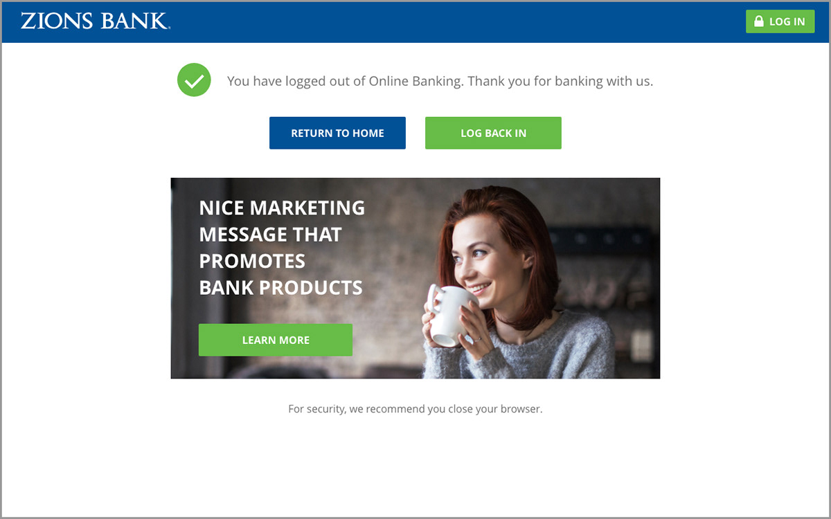
Original logoff page.
The most obvious problem was that the advertising messaging appeared below the fold for the majority of users.

Preliminary Research
Secondary Research
Several sources on the web were referenced for logoff best practices.
The UX Logout Lapse
• Consistency—Site branding
• Confirmation—Reassurance message
• Acknowledgement—Thank you
• Signposting—navigation back to home page or login
• Engagement—promotion/cross-sell
Every Touch Point Matters — Optimize the Logout Thank You Page
• Is this the right place? — consistent branding experience
• Am I logged out? — clear confirmation
• Are you grateful? — thank you
• Whoops I forgot something? — login button
• Is there anything else interesting? — 1–3 opportunities to engage
Competitors
Notable competitor sites were referenced for logoff page design.
User Interviews
Six site users were shown the existing logoff page and interviewed.
• All said this is what they would expect to see when they log out
• All of them said it is clear that they have been logged out
• All of them said they would know how to log back in
• Two of them were unsure how to navigate back to the home page
• One commented about the headline being too wordy/redundant
• Several commented about how they noticed the log in button right away
Main Problems Identified Through Preliminary Research
• Ad appears below the fold
• Headline is too wordy and redundant
• Branding is incongruent to Online Banking experience
• No navigation to home page
• No acknowledgement (Thank you)
Initial Prototype
Four layout options were presented. The fourth option was chosen by the group for implementation.


User Testing
A prototype of the chosen design was shown to users and four key questions were asked:
• Is this what you would expect to see?
• Is it clear that you are logged out?
• What would you do next?
• How would you find information on other Zions Bank products?
No major usability problems were found through user testing.