

Yes, I know. This is a very strange name and that's why I got interest in this case. This client asked me for a branding design which looks like bistro but his store is actually a coffee shop mainly focus on brunch. He said that his plan was to gradually turn it into a real bistro.
He said that he wanted to combine home and crew and that's how the name came from (he speaks in Taiwanese and didn't understand the weird point of this name at all). I really couldn't figure it out and I tried hard to convince him to change the name because his food is actually great. The restaurant deserves a good name. I explained the weirdness to him but he insisted. He thought that would be humor, which I doubted. But I have to say that he is really a cute and very nice guy.
Finally, we just made the deal.
I said "Okay, fine, "Homescrew" it.".
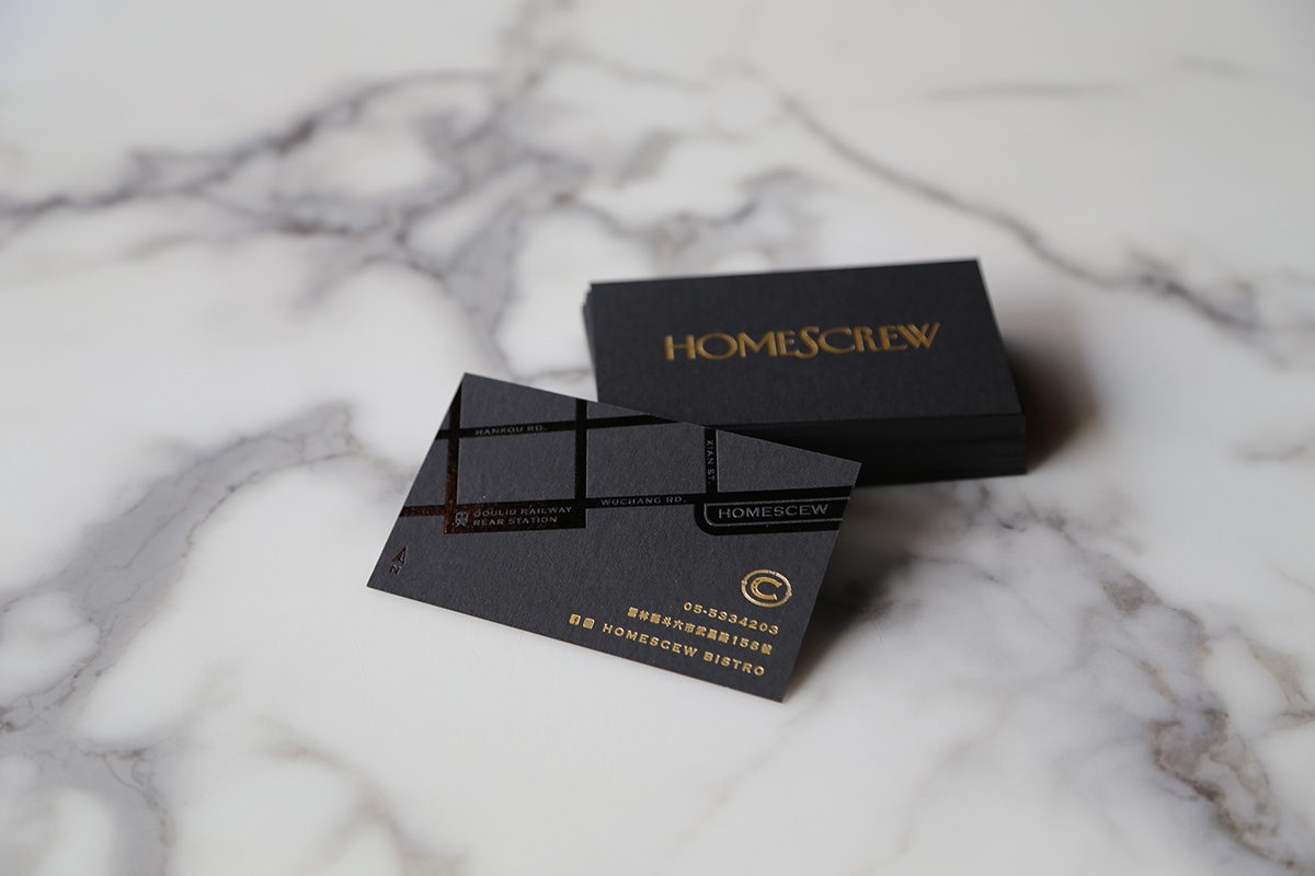
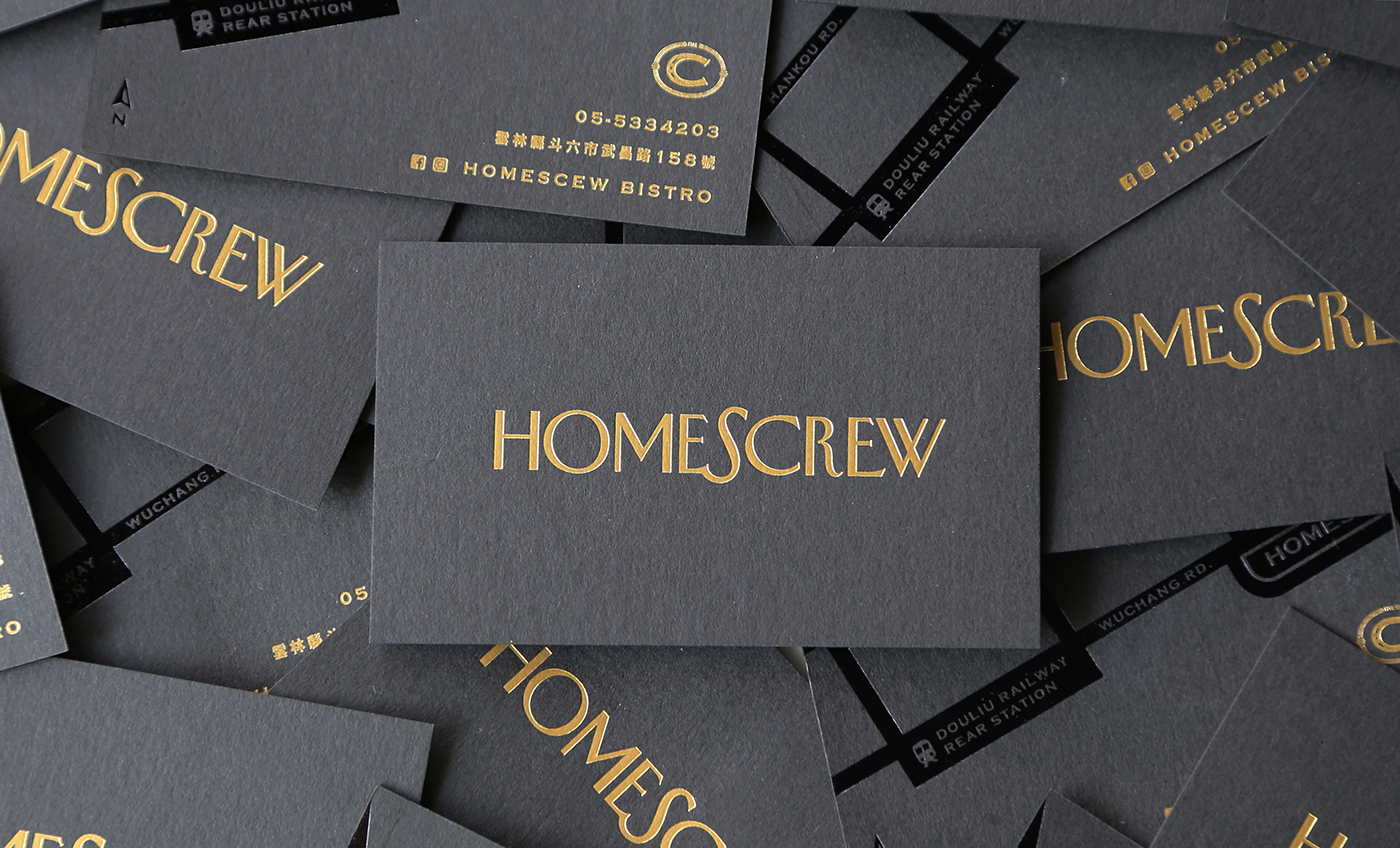
The business card was tooled in gold double sided and the back side of the card was pressed, forming a map to show the location of Homescrew.
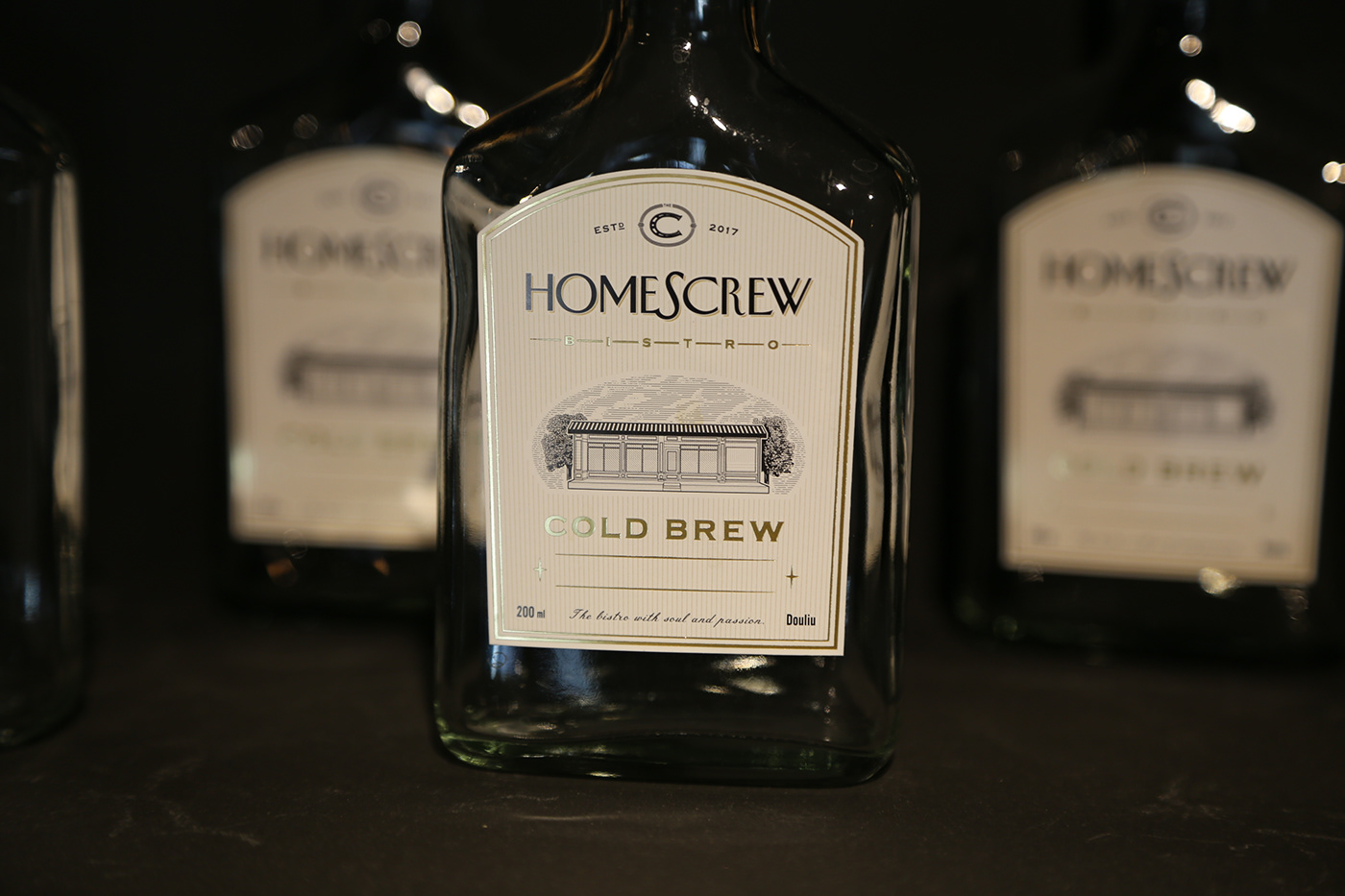
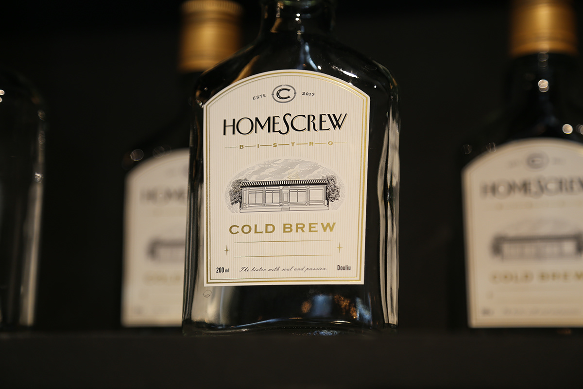
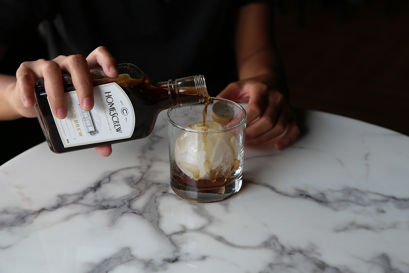
The sticker of the cold-brew coffee bottle, tooled in gold. The bottle is available for customer to bring away with them, so the blank below was left for writing customer's name. I fantasized the restaurant's out look a little bit. There are no trees beside the restaurant actually. The client said that he will definitely plant trees after.
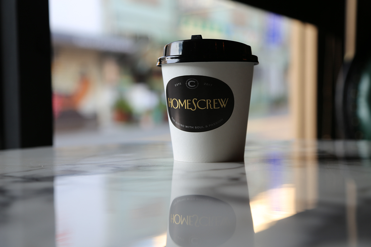
The sticker for coffee to-go, also tooled in gold.

Thanks for watching!


