Exercise 4: Culminating Work - Battle

Acrylic on paper, 22x30", Nov. 2018
Exercise 4: Love, Obey, Mislead, Diversion
In the previous exercise each student was given four words, we used those words in two separate paintings with two words in each. Now in this exercise we have been tasked with creating a battle between all four words in one painting. The words that I received are: love, obey, mislead, and diversion. Due to the words, love and obey, I decided to make my piece about a domestic violence relationship. With this piece showing a relationship between two figures I wanted my figures to feel like characters rather than shapes on a canvas; to accomplish this I added multiple meanings behind each part. The pink orb represents love, it is snuggled into the wave and radiates its pure intentions and feelings towards it. The orb trusts the wave and is completely vulnerable towards it. The entire wave represents obey, the wave is so large it reaches far off the canvas. This wave is complex it has many meanings within it. The wave has slowly taken over and is beyond the space provided to engulf the orb which loves the wave more anything else. The small arm around the orb is apart of the wave yet it feels like something else. The reason this part feels different than the rest of the wave is because this part is presenting itself as a loving and protecting figure, yet it actually is misleading and diverting the orbs attention. The arm is wrapped around the orb to divert its attention away from the wave that is about to engulf it. The light red on the interior of the arm around the orb is the wave presenting a more loving, almost valentine type red, convincing the orb that it is still loving and vulnerable yet it has actually become a dark and corrupt red.
Exercise 3: Color, Transparency Illusion, and Metaphoric Representation
Acrylic on canvas, 18x24", 2018
Exercise 3: Color, Transparency Illusion, and Metaphoric Representation/ Obey and Mislead (1)
For this project four words were given out to be used as meaning behind the forms used in the piece. The words that I received are: love, obey, diversion, and mislead. I chose to group obey and mislead into one painting with love and diversion in the other. In this particular piece the large rectangle is misleading the smaller rectangles into battle, as shown in the many layers behind the color that is being presented to and mimicked by the smaller rectangles. The large rectangle is clearly the leader of the others as it sits in the front lines leading the others. The formation of the rectangles and the color is very important to the meaning behind the piece as well as the background which transitions from the second painting into this one.
Acrylic on canvas, 18x24", 2018
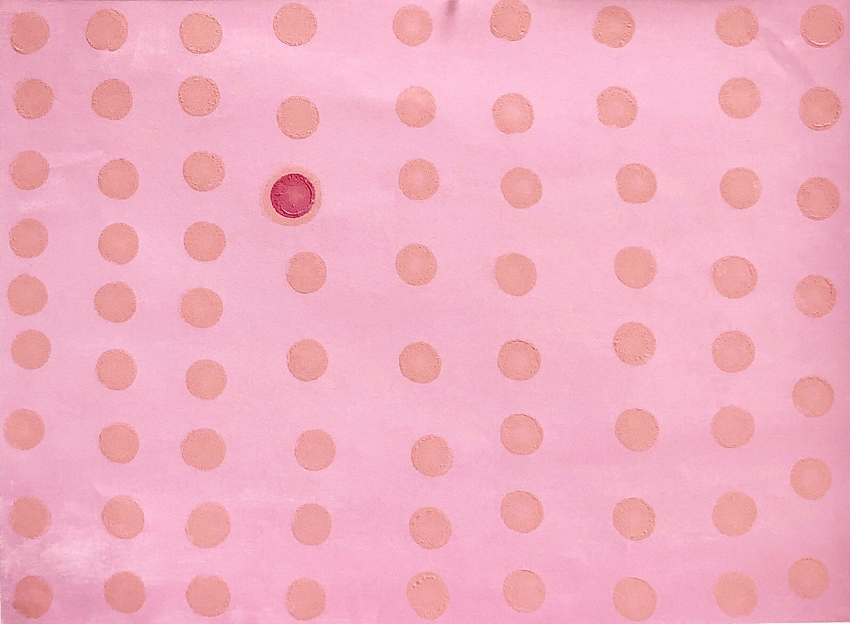
Exercise 3: Color, Transparency Illusion, and Metaphoric Representation/ Love and Diversion (2)
For this project four words were given out to be used as meaning behind the forms used in the piece. The words that I received are: love, obey, diversion, and mislead. I chose to group love and diversion into one painting with obey and mislead in the other. In this particular piece there is a swarm of dots playfully placed into relaxed lines, these dots represent a loving group that all have one purpose and are transparent with nothing to hide. Yet there is one dot that differs from the rest, it has the outward appearance of mimicking the rest but is internally different.
Exercise 2: Space Through Color and Atmospheric Perspective

Acrylic on Canvas, 9x12", 2018
Exercise 2: Space Through Color and Atmospheric Perspective/Soft Edges Versus Hard Edges (1)
In this exercise we were asked to use grey toned colors to show depth in the piece by lightening the color as it recedes and picks up the color of the background and the edges begin to soften. I chose to have my piece mimic a mountain range as it is something that I see daily and shows this technique in a strong way.
Acrylic on Canvas, 9x12", 2018
Exercise 2: Space Through Color and Atmospheric Perspective/Saturated Versus Neutralized Color (2)
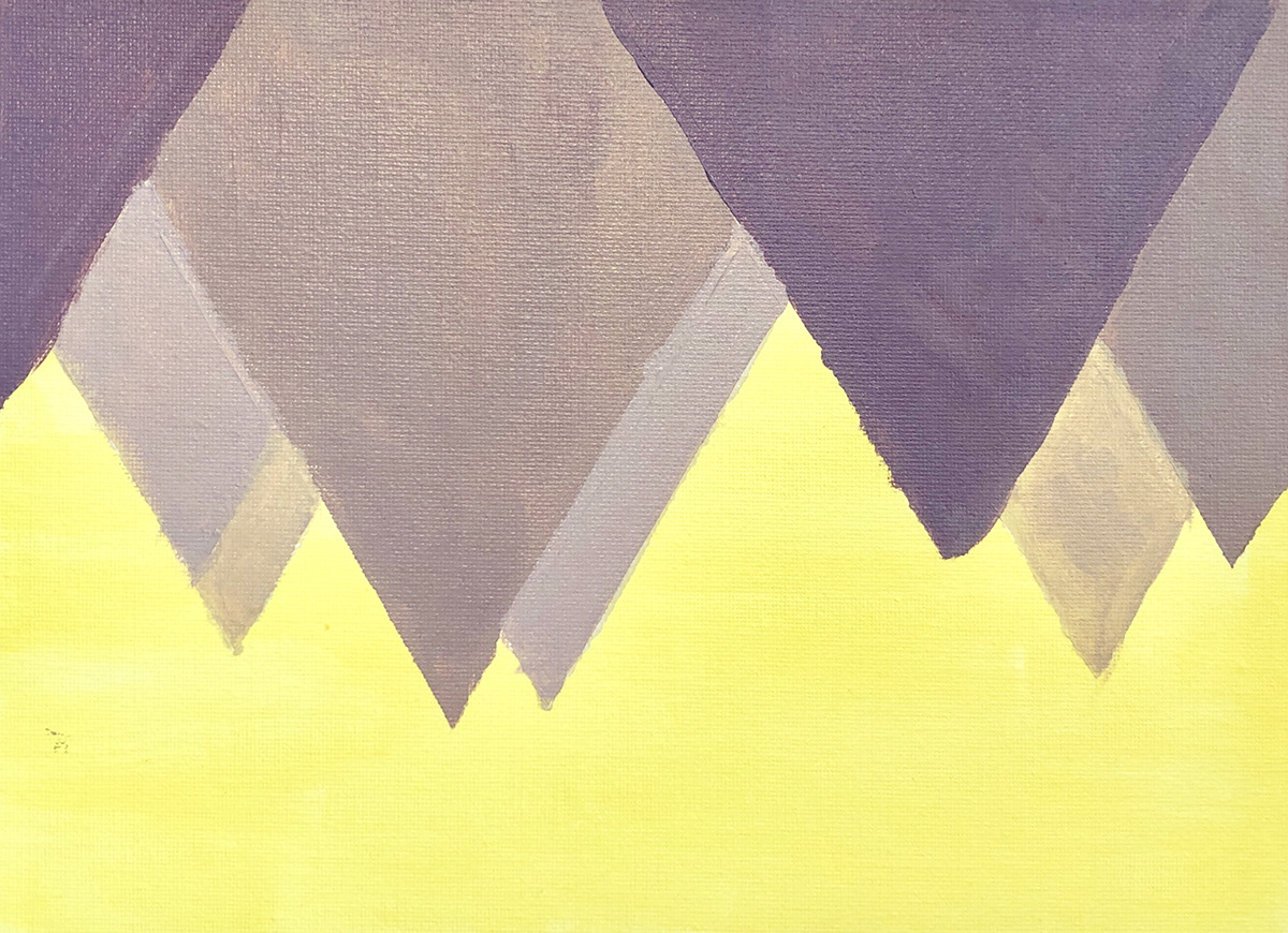
In this exercise we were asked to take a beautiful color and using its complimentary color neutralize it into the background. I chose to use a lavender color neutralizing it is using, its complimentary color, a pale yellow. The piece consists of a group of triangles hanging from the top like the interior of a cave.
Acrylic on Canvas, 9x12", 2018
Exercise 2: Space Through Color and Atmospheric Perspective/Warm Versus Cool Color (3)
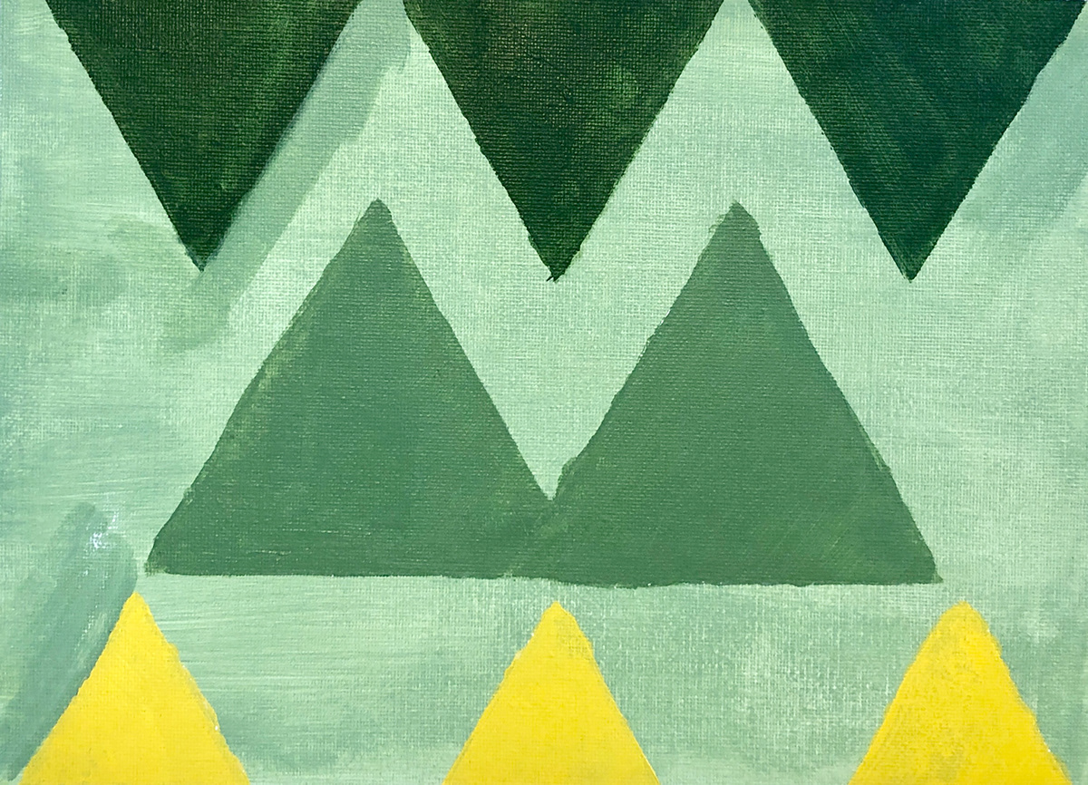
In this exercise we were asked to take a very warm color and transition it into a cool color by introducing its cool complimentary color. I chose to cool a yellow color into a rich dark green color. The piece consists of 8 triangles that are set into 3 rows with the transition happening between these rows.

Acrylic on Canvas, 9x12", 2018
Exercise 2: Space Through Color and Atmospheric Perspective/Tinting, Toning, and Shading (4)
In this exercise we were asked to create a piece that uses either tinting, toning, or shading in monochromatic color scheme to created a composition. I decided to tint a lovely royal blue color. This piece consists of a small mountain range framed by two vertical triangles.
Exercise 1: Overlap and Scale

Acrylic on Canvas, 9x12", 2018
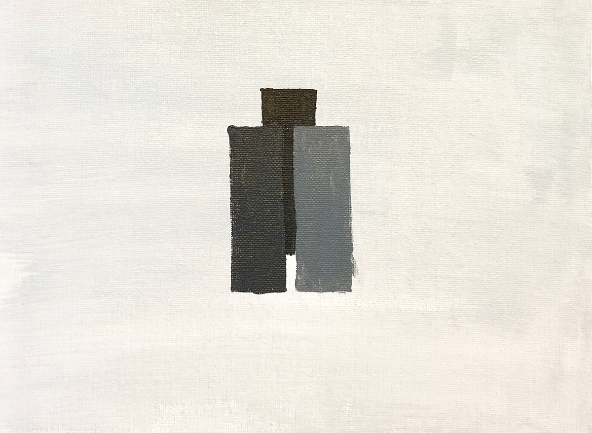
Exercise 1: Overlapping (1)
In this exercise we were asked to use overlapping to create depth among grey scaled rectangles. In this piece I was hoping to create an shallow space, like a table top with a stack of blocks or dominos.
Acrylic on Canvas, 9x12", 2018
Exercise 1: Overlapping (2)
In this exercise we were asked to use overlapping to create depth among grey scaled rectangles. In this piece I was hoping to create an image that reflected a group of buildings.
Acrylic on Canvas, 9x12", 2018
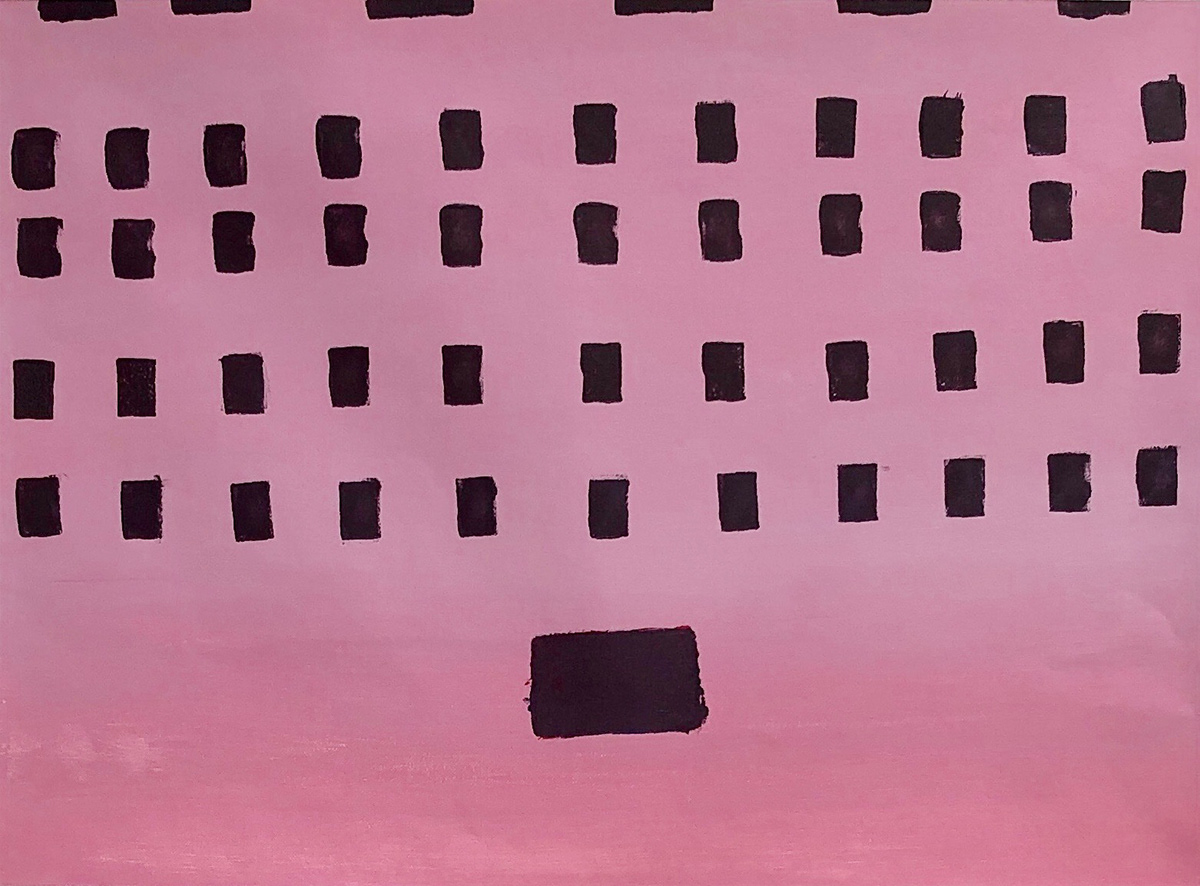
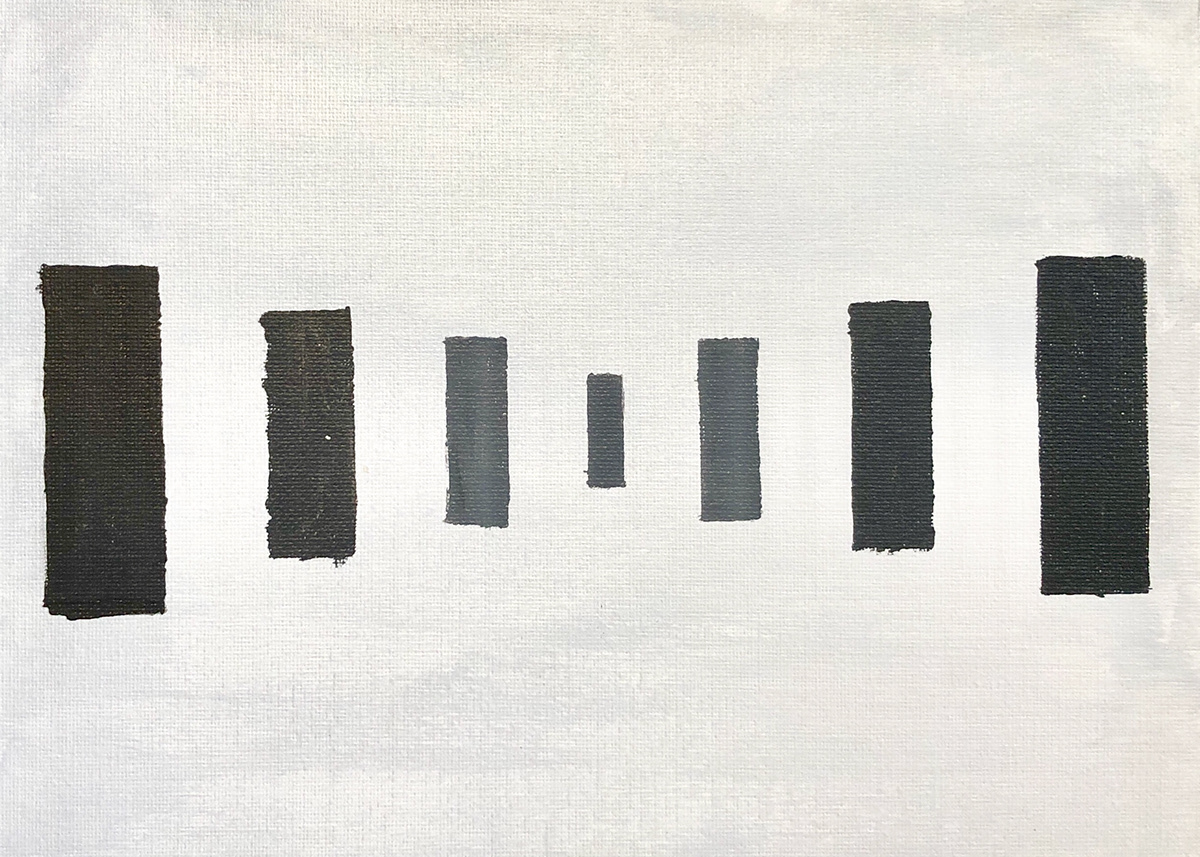
Exercise 1: Scale (3)
In this exercise we were asked to use scale change to create depth among a group of grey scaled rectangles. I was hoping to create a composition that reflected a hallway full of door ways suck as that from 'Scooby Doo'.

Acrylic on Canvas, 9x12", 2018
Exercise 1: Scale (4)
In this exercise we were asked to use scale change to create depth among a group of grey scaled rectangles. I was hoping to create a diamond shape that progressively grows and shrinks. The colors of the shapes have made this composition as strong as I was hoping.

Acrylic on Canvas, 9x12", 2018
Exercise 1: Overlap and Scale (5)
In this exercise we were asked to use overlapping and scale change to create depth into one cohesive piece. I was hoping to make a shallow piece with some confusion in the layering order of the shapes.

