The APPLECAFE’ isn’t a simple store.


The APPLECAFE’ isn’t a simple store. It is a physical transposition of a virtual space, that one of the blog applecaffè.net , a web community in which people take and give information about the Apple’s word.
As such, this place reflect its virtual alter-ego and makes the blog knowable with a modern design but at the same time with a convivial atmosphere.
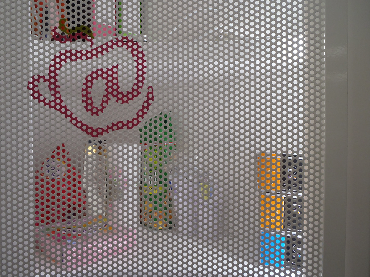
The symbolism expresses by the logo of the blog, that is composed of three main elements: the apple, the @ and the cup of coffee...
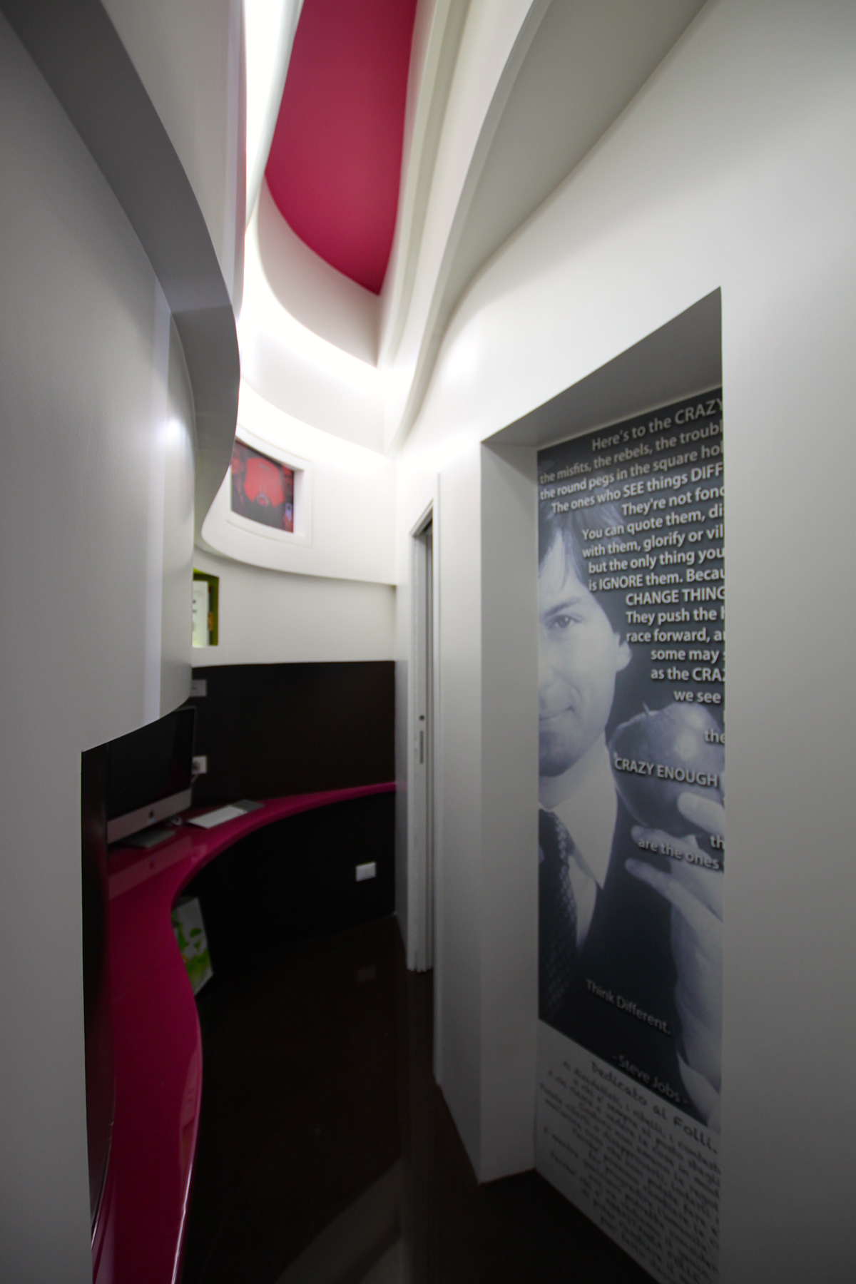
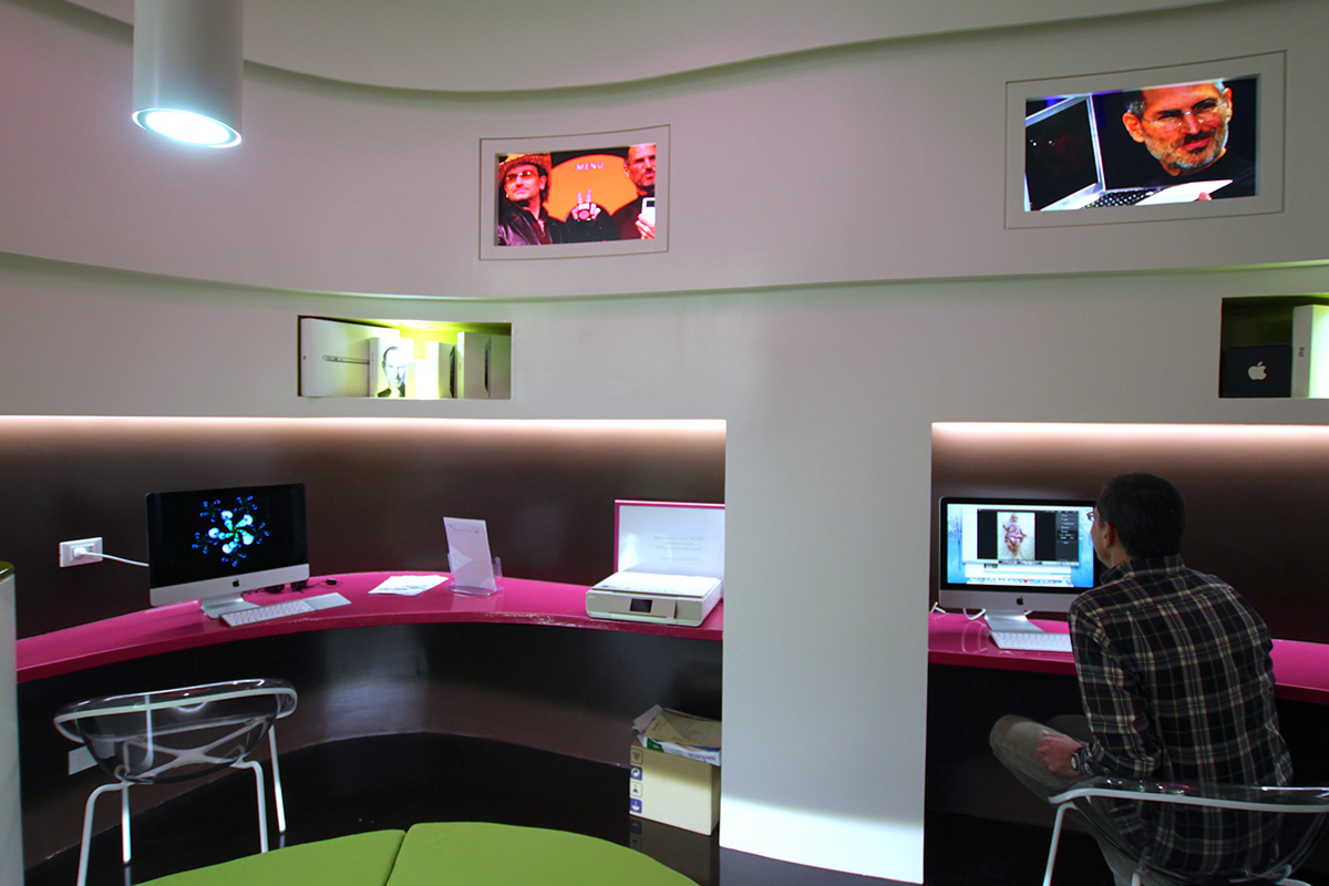
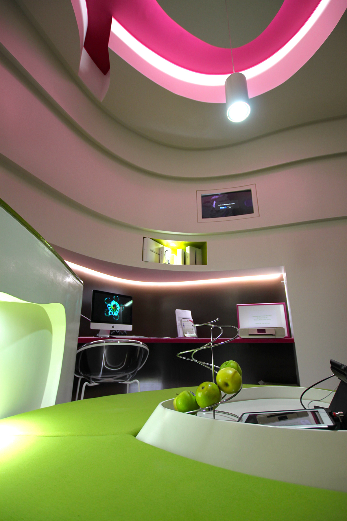
This is developed designing into the space a big carved apple, in which are included light beams that create the convivial and modern atmosphere. All the internal elements are then connected at the logo. In that vision the couch and the bar counter are shaped as the internet @, which is also recall from the main illumination system on the ceiling and makes completely recognizable the blog’s logo.
Then, to emphasize the image of the place, all materials are carefully chosen to respect the atmosphere of the blog. So, are present its strong colors, such as purple and green, in contraposition with a candid with. These are accentuated by the particularity of the floor in coffee brown resin, which reflect surroundings with its glossy finish, and gives amplitude and brightness at the interior space.
www.ciccalotti.it/